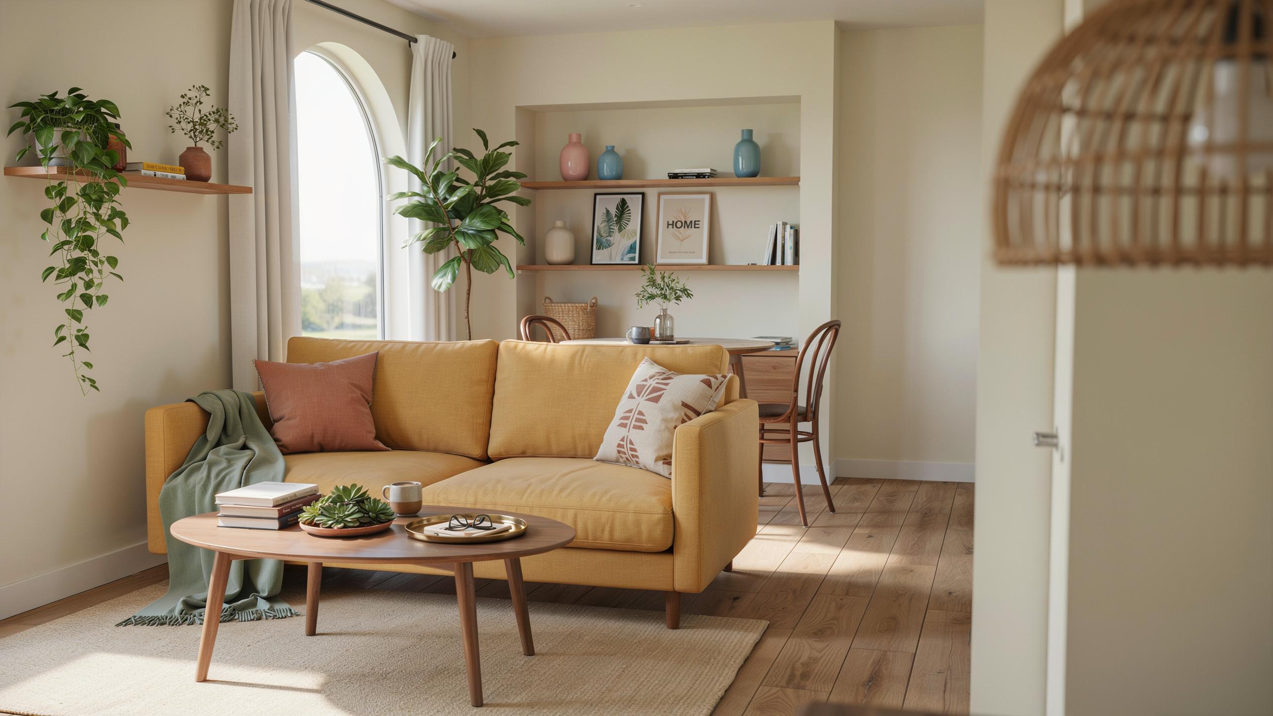
Essential Home Decor Color Ideas For Tiny Houses
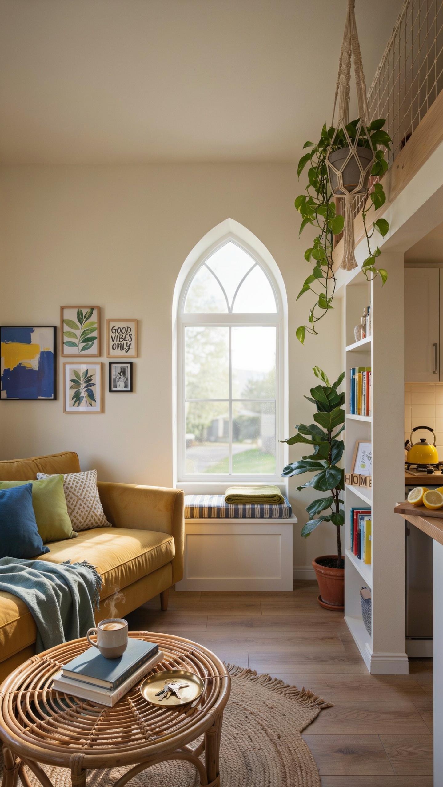
Embracing Light Neutrals To Open Up Tiny Rooms
Light neutrals shrink visual clutter and expand perceived space. Whites, creams, and soft grays reflect light and eliminate visual boundaries. These colors work on walls, ceilings, and larger furniture pieces. The strategy is simple: lighter surfaces bounce light around the room, making confined areas feel larger than they actually measure.
Neutral walls create a stable backdrop for functional living. You layer in accent colors through textiles, artwork, and accessories. This approach gives you flexibility to change the mood without repainting. Light neutrals also hide dust and everyday wear better than darker shades, reducing maintenance in tight quarters.
Using Soft Pastels To Create A Calm And Airy Atmosphere
Soft pastels add personality without overwhelming compact spaces. Muted blues, greens, pinks, and yellows maintain airiness while introducing color. These tones work best on accent walls or trim rather than all four walls. Pastels reflect light differently than pure neutrals, providing subtle visual interest without closing in the room.
Pastels support relaxation and reduce visual fatigue in spaces where you spend extended time. Choose low-saturation versions of pastels to preserve the open feeling. Pair them with white trim and light-colored flooring for maximum effect. This combination keeps tiny homes feeling calm and intentional rather than cramped or childish.

Coordinating House Decor Color Palettes To Maximize Small Spaces
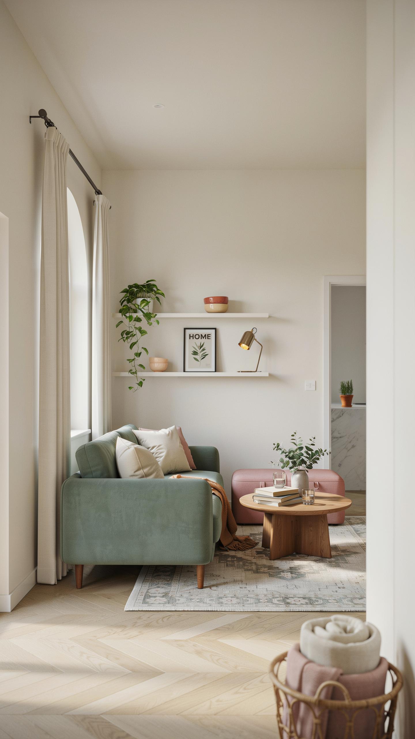
Monochromatic House Decor Schemes For A Seamless Look
Monochromatic schemes use one color in varying tints and shades. This approach eliminates visual clutter that divides tiny spaces into smaller segments. When walls, furniture, and accents share the same color family, your eye moves continuously without stopping. The result is perceived spaciousness because nothing breaks the visual flow. Light monochromatic schemes reflect more light, which physically brightens compact rooms.
Implement monochromatic design by selecting a base color, then choose three to four shades of that color. Use the lightest shade on walls to establish the foundation. Apply mid-tones to larger furniture pieces and accents. Reserve the darkest shade for minimal trim, door frames, or small decorative elements. This layering creates depth without introducing competing colors that fragment the space.
Harmonizing Warm Earthy Tones For A Welcoming Vibe
Warm earthy tones include ochres, terracottas, warm browns, and muted golds that derive from natural pigments historically used in early design traditions. These colors work in tiny homes because they feel grounded without overwhelming compact dimensions. Warm tones advance toward you visually, making rooms feel cozier rather than cramped. The psychological effect triggers comfort, which counteracts the confined feeling small spaces often create.
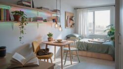
Combine warm earthy tones by anchoring with a neutral base like warm beige or soft tan on walls. Layer in terracotta or rust-colored textiles and wooden furniture that contains warm undertones. Add small accents in muted gold or ochre through lighting fixtures, artwork, or ceramics. This approach maintains cohesion while introducing necessary variation that prevents monotony in limited square footage.
Bold Home Decor Ideas Living Room Green Couch Stylings
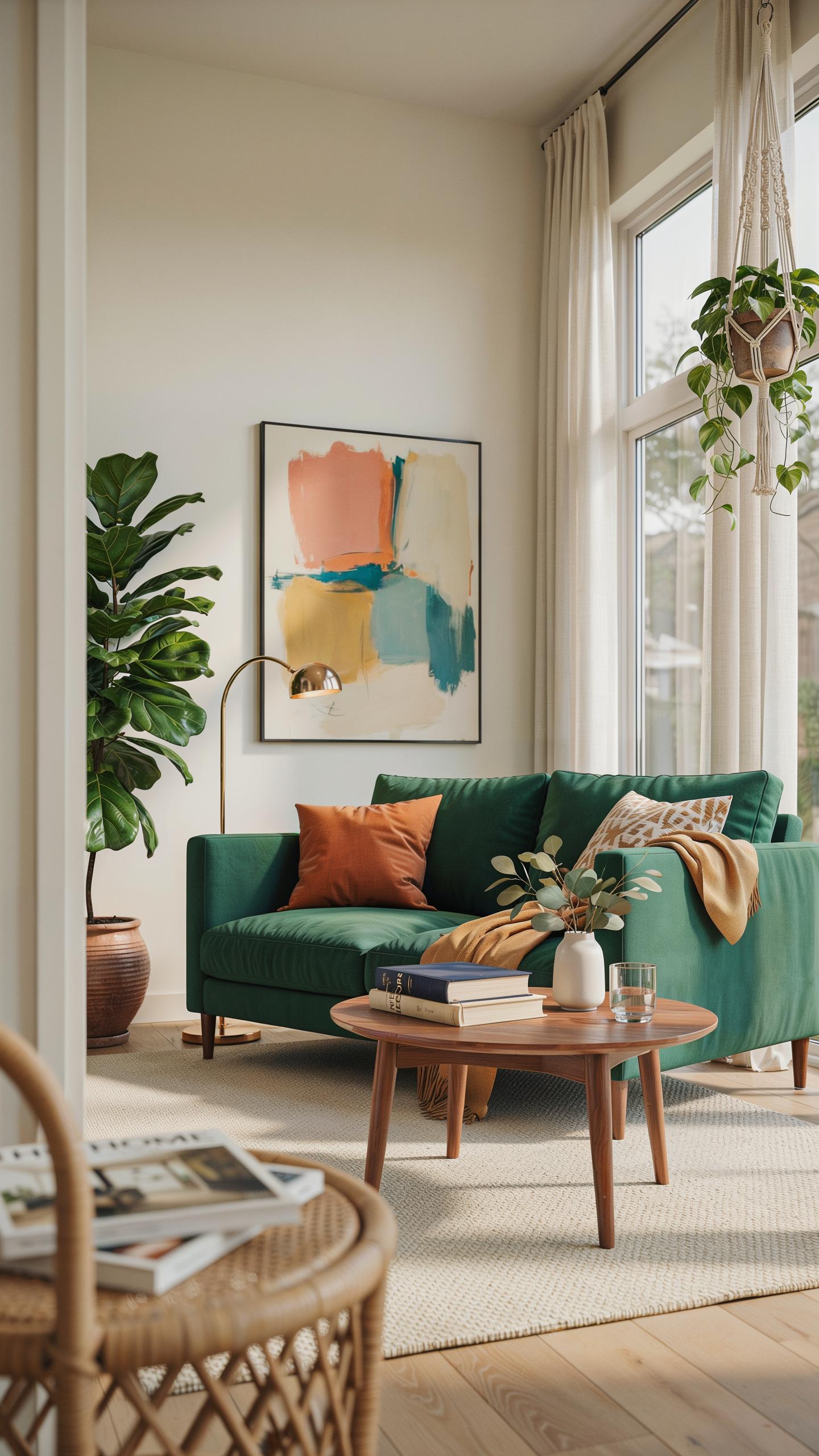
Anchoring A Small Space With A Forest Green Centerpiece
A forest green couch works as your visual anchor in tiny homes because it commands attention without consuming perceived square footage. Dark greens recede visually, which makes rooms feel larger than they are. Place the couch against your longest wall to establish a clear spatial hierarchy. This positioning forces traffic patterns and defines zones in open-concept layouts common to tiny homes.
Forest green pairs strategically with warm wood tones and cream-colored walls. The combination creates depth without clutter. Your couch becomes the dominant design element, allowing you to minimize other furniture pieces. This constraint actually simplifies decision-making and reduces visual noise that shrinks tiny spaces mentally.
Balancing Strong Colors With Neutral Backgrounds
Strong colors like forest green demand neutral walls to prevent overwhelming compact square footage. Use off-white, beige, or soft gray as your base layer. These backgrounds let your green couch perform its design function without competing elements. Neutral walls also reflect more light, which matters in tiny homes where natural light entry points are limited.

Introduce accent colors through textiles and small decor items rather than additional furniture. A cream throw blanket on your green couch, neutral area rug beneath it, and one accent wall in a complementary tone create balance. This approach maximizes visual interest while maintaining the breathing room tiny homes require. You control where eyes travel instead of overwhelming the space with multiple strong colors.
Elegant Green Couch Living Room Decor Inspiration
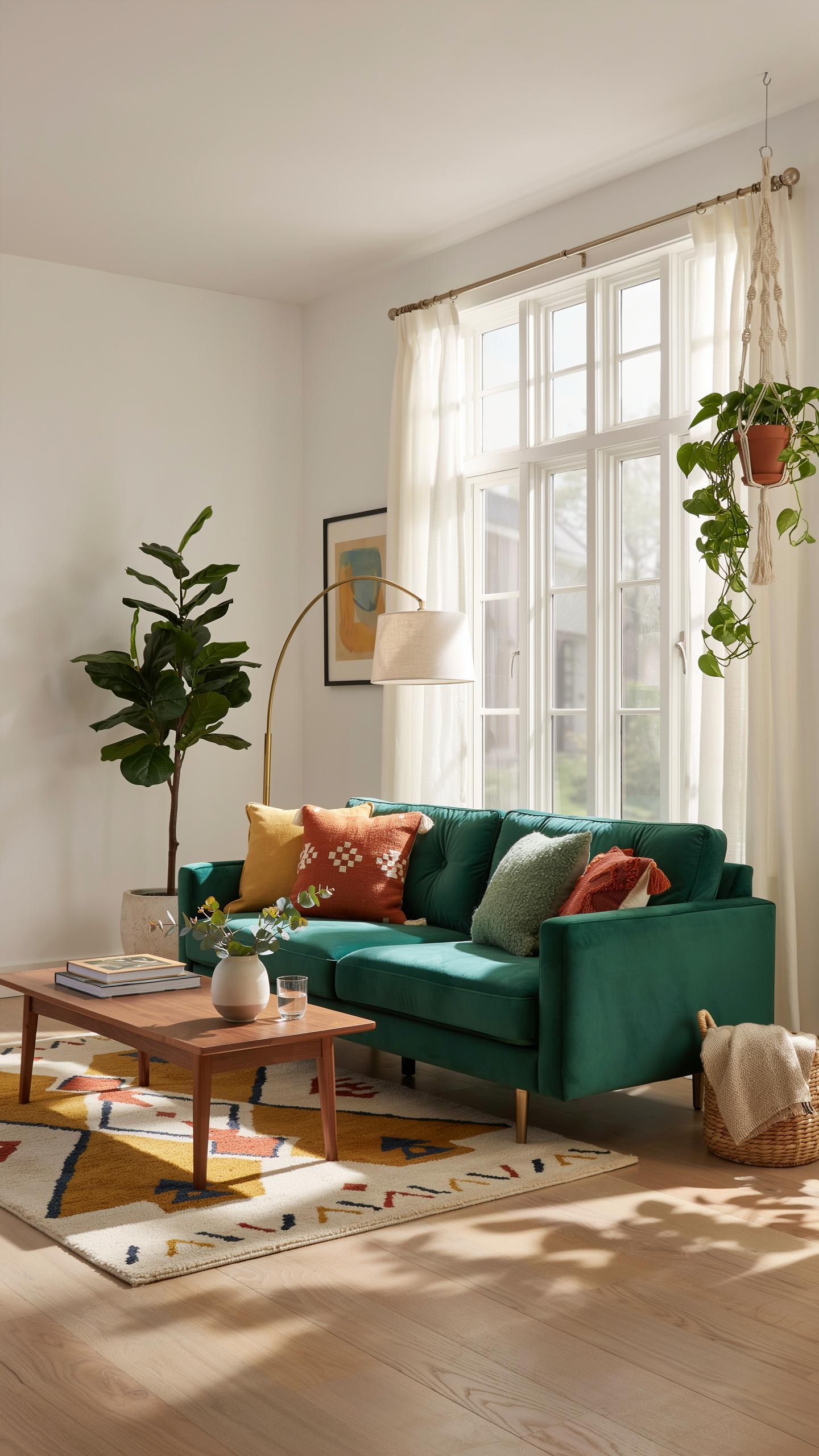
Pairing Olive Green With Warm Wood And Brass Accents
Olive green functions as a neutral in tiny homes because it recedes visually without demanding attention. This quality makes it ideal for small spaces where you need breathing room. Pair olive green upholstery with warm wood tones like walnut or oak to create depth without clutter. Brass accents amplify the warmth because the metal reflects light and complements both the green and wood naturally.
The combination works because these materials share undertones. Olive contains yellow and brown notes that sync with warm wood grain. Brass hardware on side tables, lamps, or picture frames ties the palette together without adding bulk. This approach keeps tiny living rooms functional while maintaining visual cohesion across limited square footage.
Color is a creative element that can make even the smallest space feel expansive and soulful. A thoughtful palette turns a tiny house into a cherished sanctuary that tells your unique story.
Recommended Accessories To Complement Your Statement Sofa
A statement sofa anchors your room, so accessories must work with its presence rather than against it. Select pieces that echo the green or warm wood tones to maintain unity. Avoid competing colors that fragment the small space further.
- Throw Pillows: Choose cream, taupe, or muted gold covers to soften the olive without introducing new colors. Linen and cotton materials age well in high-traffic tiny homes.
- Area Rug: Select a neutral base with subtle geometric patterns in cream or light gray. This grounds the sofa and defines the seating zone without visual noise.
- Side Table: Opt for wood construction with brass legs or hardware to echo both materials in your palette. Keep surfaces minimal to avoid clutter accumulation.
- Floor Lamp: Choose a brass or wood base with a neutral shade to provide layered lighting. Avoid busy patterns that compete with the sofa’s visual weight.
- Wall Art: Hang pieces that feature greens, warm neutrals, or metallic accents to reinforce your palette. Keep frames simple and consistent throughout the space.

These accessories work because they reinforce your existing palette rather than fighting against it. Cohesive styling makes tiny rooms feel intentional and larger. Every piece should justify its presence by contributing to the overall design system.
Creative Green Couch Room Ideas For Tiny Homes
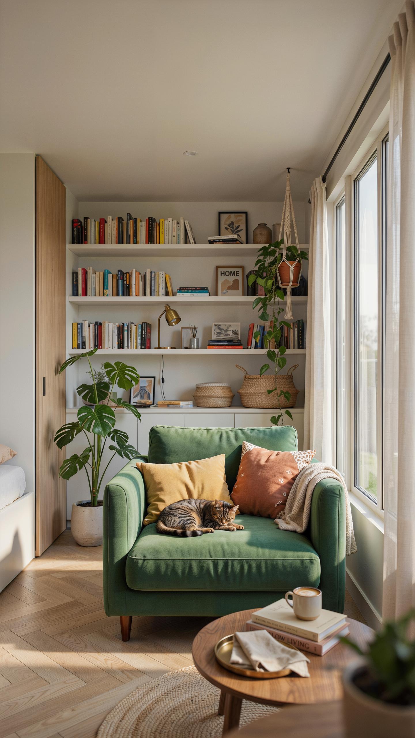
Utilizing Vertical Space And Lighting Around Your Green Seating
A green couch in a tiny home demands strategic lighting placement to prevent the space from feeling dark or cramped. Position lights above or behind the couch to bounce illumination across walls without consuming floor space. Wall sconces flanking the couch work better than floor lamps in tight quarters. Layer ambient and task lighting to control how the green absorbs or reflects light throughout the day.
Vertical storage surrounding your green seating maximizes function without expanding the footprint. Mount shelving above the couch to store books, plants, or decor items. Use the wall space behind the couch for floating cabinets or hanging organizers. This approach keeps the room functional while the vertical elements draw eyes upward, making ceilings feel higher and the space feel less confined.
Blending Emerald Green With Botanical Elements And Textures
Emerald green couches pair effectively with natural materials that add texture without clutter. Incorporate woven baskets, linen throw pillows, or wooden side tables to complement the green without competing for visual attention. Textured elements break up solid color fields and create depth on limited wall space. Choose materials that serve dual purposes, like ottomans with storage or tables that double as plant stands.

Live plants amplify the botanical connection a green couch already establishes in the room. Small potted plants on shelves or hanging from walls reinforce the natural palette without consuming floor space. The green of foliage echoes the couch while adding organic variation in tone and texture. This layering creates visual interest and makes the color scheme feel intentional rather than monotone.
Wall Color Ideas Aesthetic For Making Small Rooms Feel Spacious
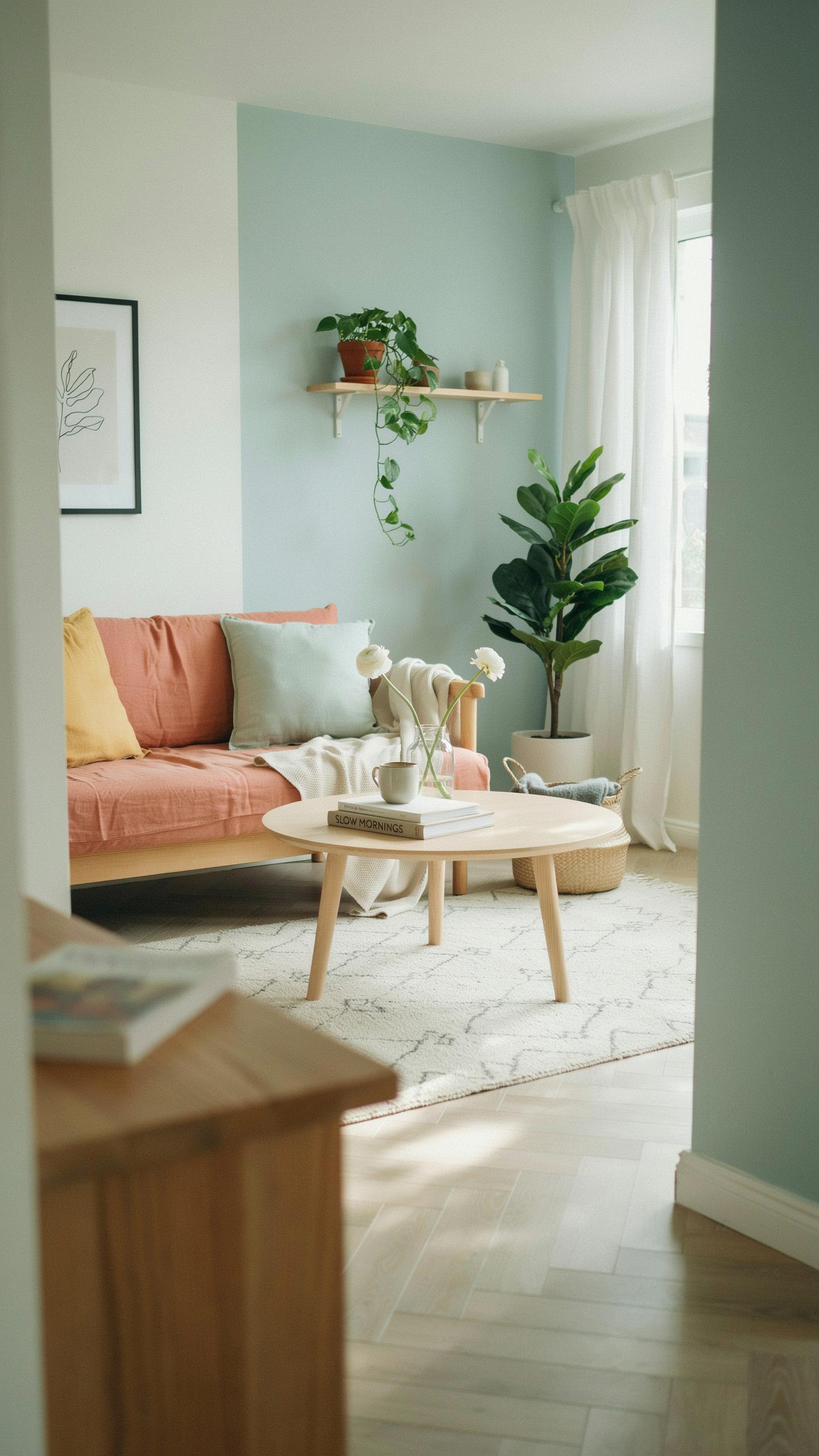
Sophisticated Soft Greys And Off Whites For High Light Reflectance
Soft greys and off-whites dominate tiny home design because they reflect light efficiently. Light reflection directly expands perceived space without structural changes. These neutral tones absorb less light than darker colors, making rooms appear larger than their actual dimensions. The science is straightforward: lighter surfaces bounce available light around the room, multiplying brightness and airiness in confined spaces.
Off-whites perform better than pure white in small rooms because pure white creates harsh glare and visual fatigue. Greige, warm grey, and cream variants maintain brightness while reducing eye strain. These colors work on every wall surface—ceilings, walls, and trim. Consistency across surfaces eliminates visual breaks that segment space. Small rooms need unified color fields to feel expansive, not chopped up by contrasting trim or accent walls.
Using Blush Pinks And Cool Blues For A Stylish And Modern Aesthetic
Blush pinks expand spatial perception when applied with intention in tiny homes. The color reflects light similarly to off-whites but introduces personality without overwhelming compact areas. Blush tones work on accent walls or full room applications. Pair them with white trim and natural wood to prevent the space from feeling too soft or juvenile. Modern tiny home dwellers use blush as a statement rather than background.

Cool blues achieve spatial expansion through psychological association with sky and water, which read as expansive environments. Pale blue variants like dusty blue or slate blue maintain light reflection while establishing mood. These colors pair effectively with grey undertones and natural materials. Apply cool blues to single walls or full rooms depending on natural light availability. Rooms with southern exposure handle darker blues better than north facing spaces that need maximum light reflection.
Cohesive Interior Paint Color Combinations That Elevate Tiny Spaces
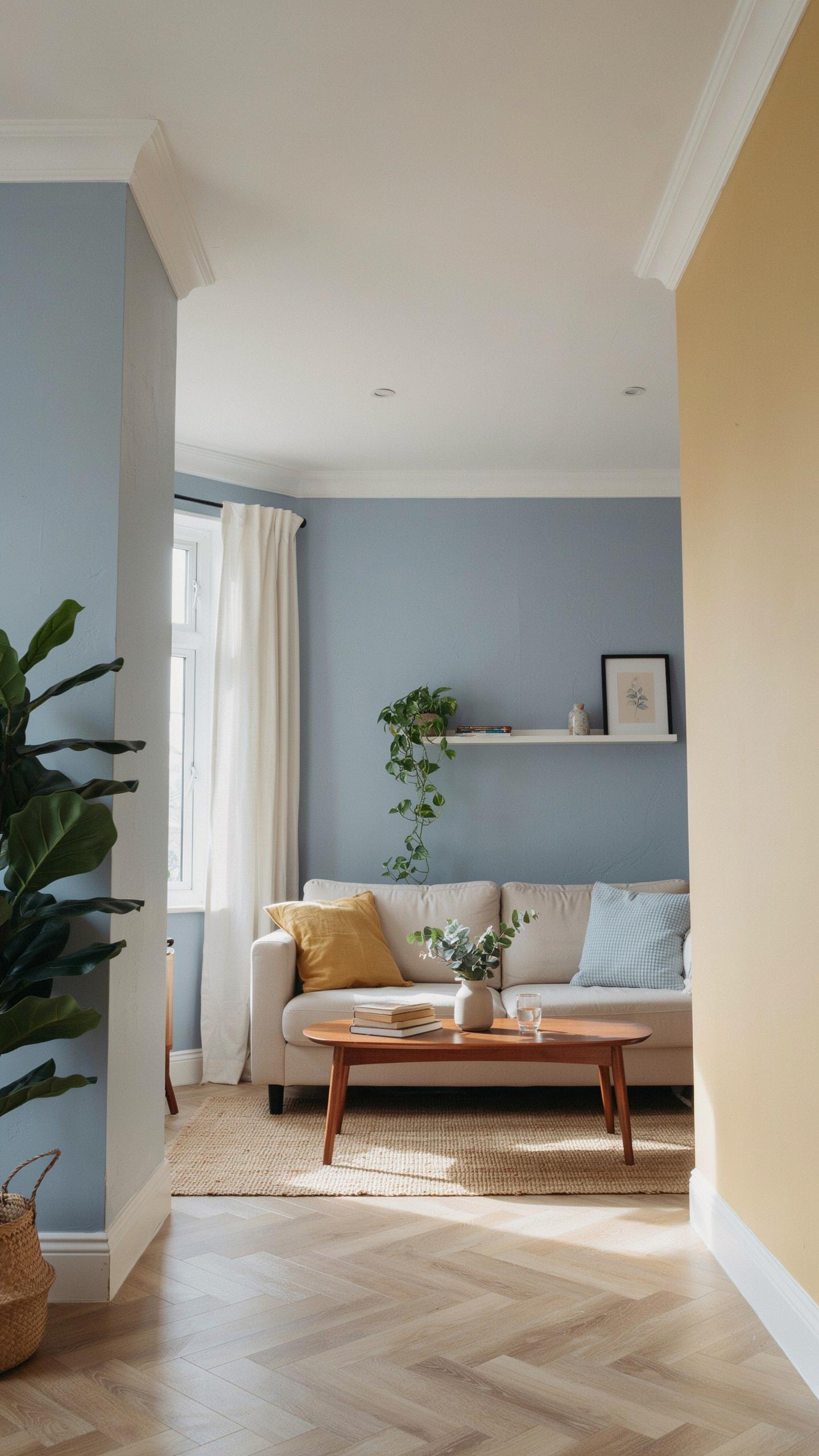
Combining Cool Tones With Warm Accents For Balance
Cool tones like blues, greens, and grays recede visually, making small rooms feel larger. Warm accents in terracotta, ochre, or warm neutrals prevent cool palettes from feeling cold or clinical. This combination works because contrast engages the eye without overwhelming confined square footage. Apply cool tones to walls and warm accents through furniture, trim, or artwork.
The strategy here is straightforward: cool dominant colors expand perceived space while warm details create visual interest and prevent monotony. A pale blue-gray wall paired with warm wood tones and cream-colored trim delivers depth without cramping the room. This approach solves the common problem of tiny homes feeling sterile or impersonal when using only one temperature of color throughout.
High Contrast Combinations To Define Functional Zones
High-contrast color blocking divides tiny homes into distinct functional areas without building walls. Dark paint on one wall paired with light paint on adjoining walls creates visual boundaries. This technique signals transitions between sleeping, living, and working zones. Contrast makes separate functions feel intentional rather than cramped together.
Matte and semi-gloss finishes amplify the contrast effect by creating subtle light absorption differences. A charcoal accent wall behind a bed paired with cream walls in the same room defines the sleeping zone clearly. High contrast also improves wayfinding in open-concept layouts, helping occupants mentally organize the space. This tactical use of contrast delivers functional clarity without structural changes.
Choosing The Perfect House Interior Colour For Cozy Vibes
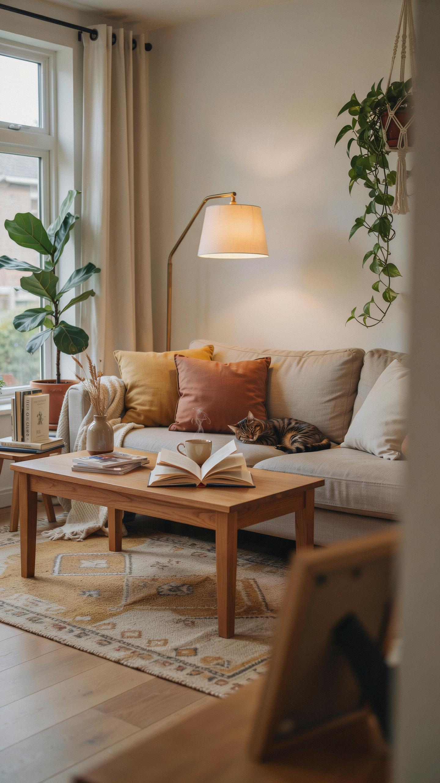
The Warmth Of Terracotta And Cream In Tight Spaces
Terracotta and cream combinations work in tiny homes because they reflect light differently. Terracotta absorbs warm wavelengths while cream reflects them back into the room. This interplay makes 200-square-foot spaces feel larger without adding actual square footage. The color pairing also reduces visual clutter by creating a unified, continuous surface effect throughout open floor plans.
Terracotta comes from iron oxide pigments found in clay. It ranges from burnt orange to rust tones depending on iron concentration. Cream reflects up to 90 percent of available light, making it ideal for windowless corners. Together, these colors create thermal comfort perception, which matters in confined spaces where temperature control is critical for livability.
Deep Navy And Charcoal For Cozy Intimate Nooks
Dark colors in tiny homes require strategic placement to avoid cramping the space. Navy and charcoal work best on single accent walls or built-in features like shelving units. These colors absorb light rather than reflect it, which makes them powerful for defining specific zones within open-concept layouts. Applied correctly, they create psychological boundaries that make 300-square-foot apartments feel intentionally designed rather than cramped.
Navy contains blue undertones that recede visually, pushing walls back in perception. Charcoal offers neutral stability without the coldness of pure black. Both colors pair with metallic fixtures to bounce light back into the room strategically. In bedrooms and bathrooms, these darker tones reduce eye stimulation, supporting better sleep and relaxation in shared living quarters where separation matters functionally.
Crafting A Simple House Design Interior With Minimalist Hues
Streamlining Your Colors To Reduce Visual Clutter
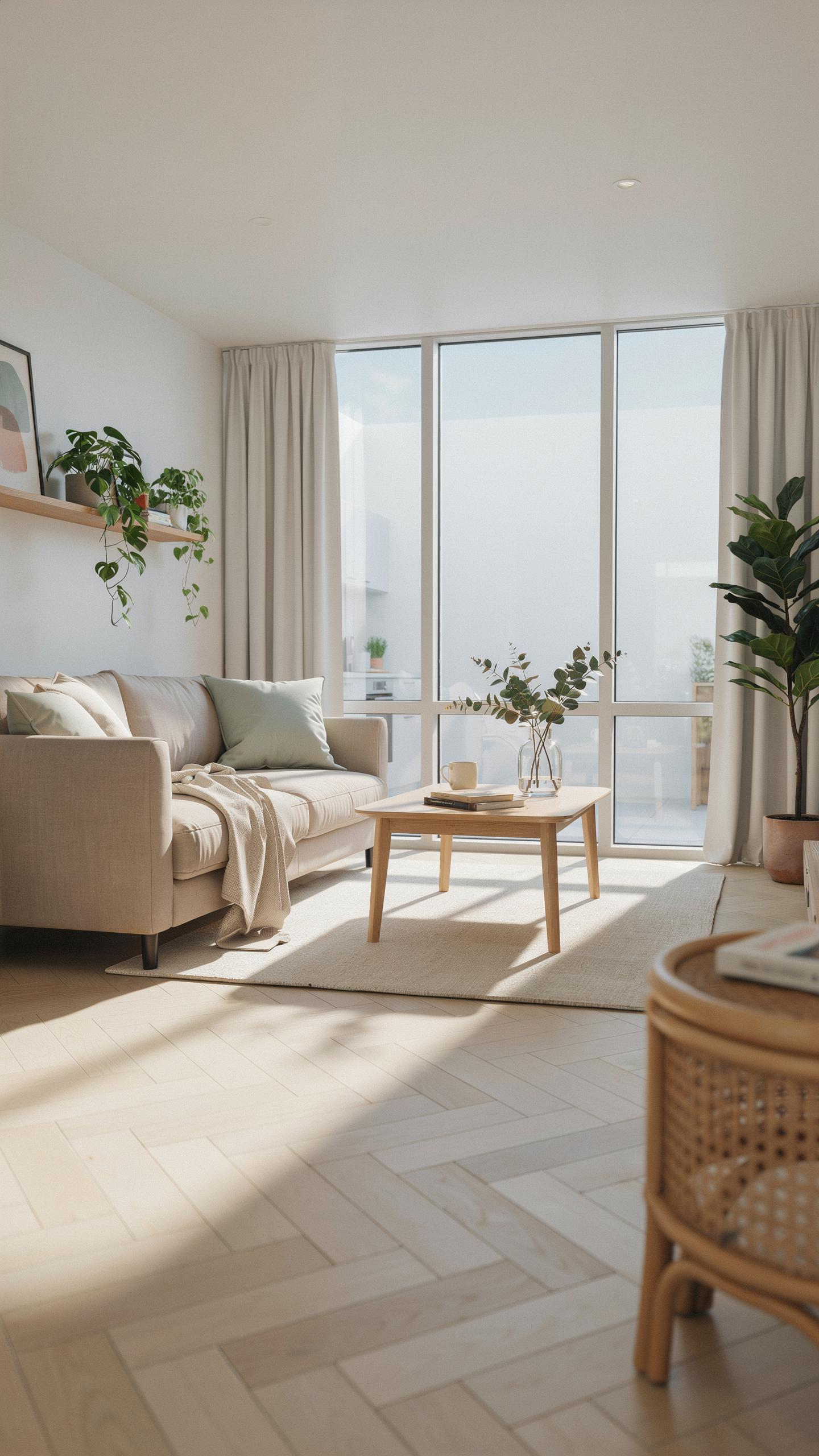
Minimalist color palettes work in tiny homes because they expand perceived space. Use two to three base colors maximum. Limit accent colors to one. This constraint forces intentional design choices. You eliminate decision fatigue and visual noise. The eye moves through the space without stopping at competing colors. Neutral walls anchor the room. Strategic color placement directs attention where you want it.
Reducing colors cuts maintenance and replacement costs. When you paint less, you buy less paint. Fewer colors mean fewer coordinating elements needed for furniture and decor. Small spaces demand efficiency in every decision. Color simplicity supports this principle directly. Your tiny home functions better with restrained palettes because you focus resources on quality rather than quantity.
Key Minimalist Paint Brands And Hues For Tiny Homes
Benjamin Moore, Sherwin Williams, and Behr produce reliable neutral bases for tiny homes. These brands offer consistent color accuracy across batches. Their formulations perform well in compact spaces where paint quality directly impacts the overall aesthetic. Trusted brands eliminate guesswork when selecting your primary palette.
- Benjamin Moore Swiss Coffee: Off white with subtle warmth. Works as a primary wall color without feeling sterile or cold in confined areas.
- Sherwin Williams Urbane Bronze: Sophisticated gray-brown that grounds tiny spaces. Creates depth without overwhelming limited square footage.
- Behr Ultra Pure White: Clean baseline for minimalist design. Reflects light effectively in compact rooms with limited natural light exposure.
- Benjamin Moore Hale Navy: Deep neutral that adds visual weight when used strategically. Accents work better than full room coverage in tiny homes.
- Sherwin Williams Accessible Beige: Warm neutral that adapts across different lighting conditions. Functions as both primary and transitional color effectively.
Apply these hues strategically rather than uniformly. Paint accent walls in deeper tones to anchor the space. Keep ceiling and trim colors light to maintain height perception. Test paint samples in your specific lighting before committing. Tiny homes amplify color mistakes due to concentrated viewing distance.
Frequently Asked Questions

Why is choosing the right color scheme so important for a small living space?
Selecting a thoughtful tiny home interior design color palette is crucial because color directly influences how we perceive physical boundaries. In limited square footage, dark or high-contrast shades can make walls feel like they are closing in. Conversely, lighter tones reflect natural light, creating an airy atmosphere that makes the home feel significantly larger and more inviting, effectively transforming a cramped area into a breathtaking, open sanctuary.
How can I use color to create separate zones within a single open-plan room?
To define different functional areas without using bulky walls, try the “tonal layering” technique within your tiny home interior design color palette. Use a consistent neutral base throughout the entire house, but introduce subtle shifts in hue or texture for specific spots. For example, a soft sage green nook can distinguish the workspace from a creamy white living area, providing visual organization while maintaining a cohesive, harmonious flow.
Should I use the same color palette throughout every room in a tiny home?
Largely yes. Carrying one cohesive tiny home interior design color palette from room to room removes the visual breaks that make small spaces feel chopped up and smaller than they are. That doesn’t mean every room has to be identical, small shifts in accent color or texture can still distinguish spaces, but keeping the base tones consistent creates a sense of continuous, flowing square footage rather than a series of disconnected boxes.