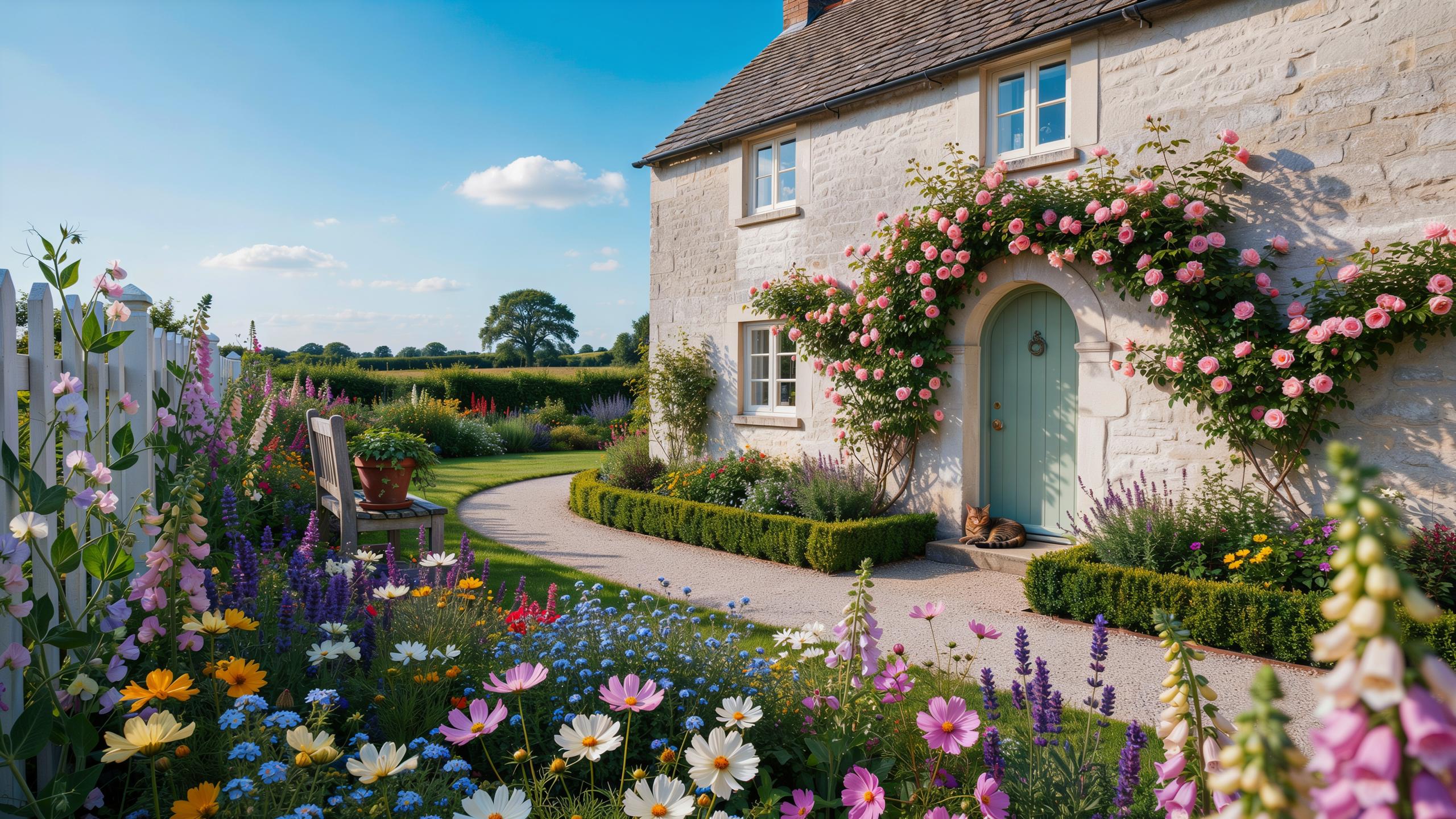
Embracing The Charm Of A Cottage Garden Color Scheme
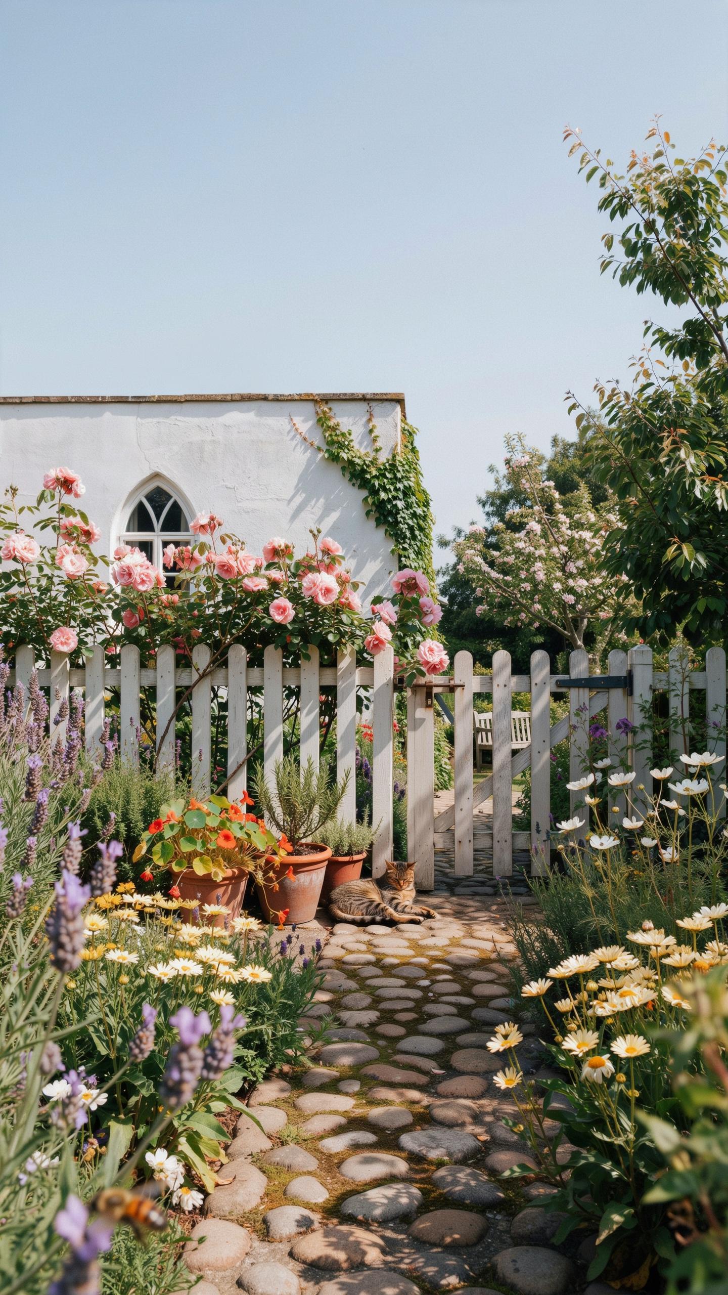
Defining The Palette
A cottage garden color scheme relies on soft pastels and muted tones rather than bold, saturated colors. Historically rooted in English garden traditions from the 1800s, these palettes emphasize dusty roses, lavenders, soft blues, cream, and pale yellows. The restraint comes from practical origins: gardeners grew what bloomed naturally, then arranged them without rigid color theory. This approach produces visual harmony because the colors share similar saturation levels and don’t compete for attention.
The core strategy behind cottage palette selection involves choosing colors that feel weathered and lived-in rather than new and vibrant. Paired neutrals like cream, taupe, and soft gray serve as anchors that prevent the composition from feeling chaotic. Many successful cottage schemes use three to four main colors maximum, allowing individual plants to stand out without overwhelming the overall design. This restraint directly contradicts modern landscape trends favoring high-contrast combinations and demands precision in plant selection.
Impact On Curb Appeal
A unified cottage garden color scheme signals intentionality and care to viewers, which directly influences perceived property value. Homes with cohesive landscaping schemes show higher curb appeal scores in real estate assessments because the design appears deliberate rather than random. The soft, harmonious palette appeals to broader buyer demographics than extreme color choices, reducing risk in the resale market. Consistency across your garden beds, borders, and focal points creates visual continuity that makes properties appear larger and more organized.
The practical advantage of a cottage color palette lies in its forgiving nature and low maintenance visual impact. Pastel schemes age gracefully as plants mature and colors fade, whereas bold combinations deteriorate quickly and look neglected. Properties with established cottage gardens maintain their appeal longer between seasonal updates because the base palette remains stable. This stability reduces the pressure to constantly refresh plantings, lowering both time and financial investment while preserving strong curb presence.
Core Directives For An Authentic Cottage Garden Design
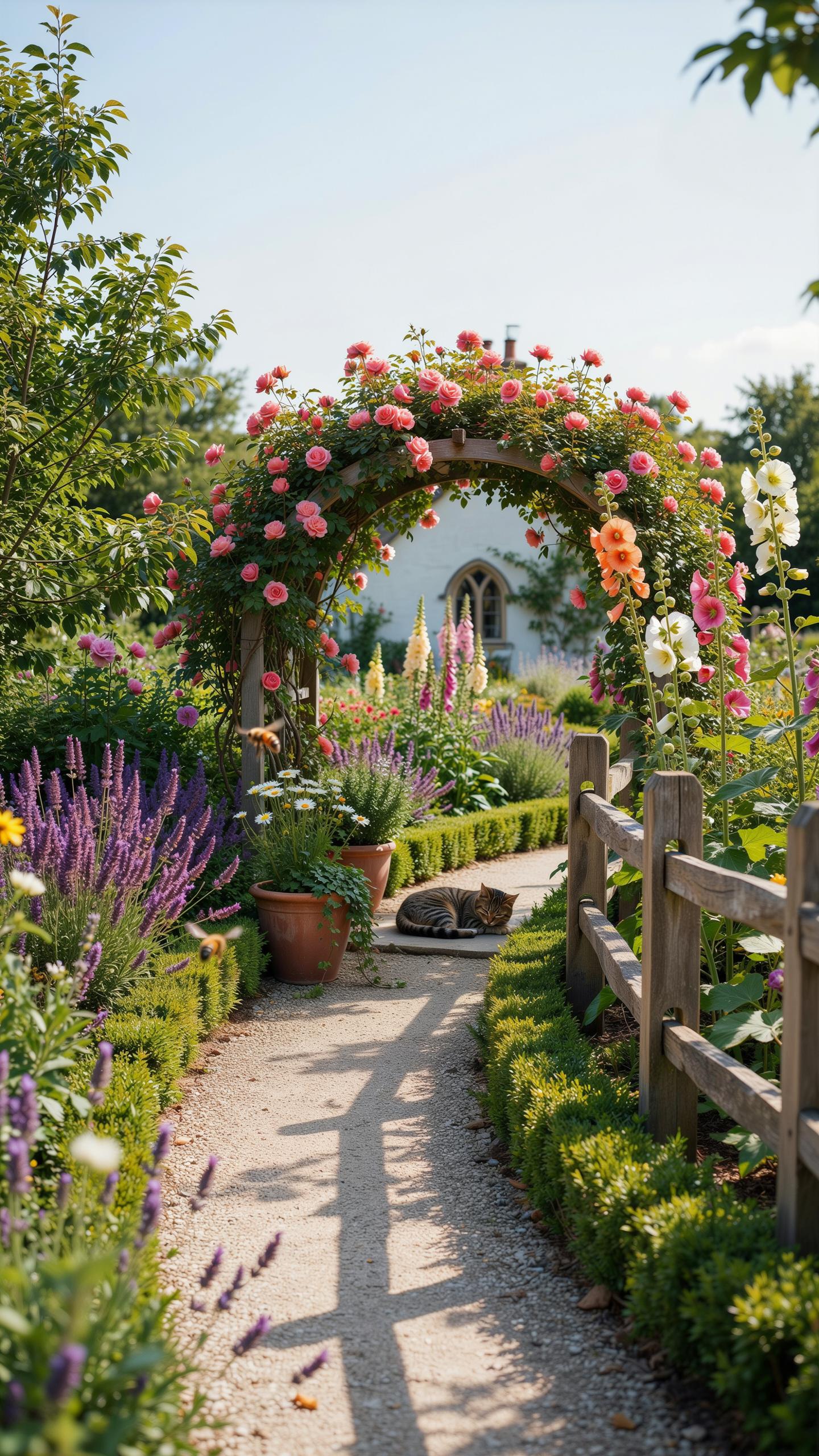
Informal Structures
Cottage gardens succeed by mixing planted beds with practical hardscaping. Gravel pathways, stone edging, and weathered fencing provide structure without rigid geometry. These elements ground the design and create circulation patterns that feel natural rather than imposed. The key is balance: enough structure to function, enough softness to let plants dominate visually.
Materials matter for authenticity and longevity. Natural stone, reclaimed brick, and untreated wood align with cottage garden origins. Metal gates and arbors add utility and vertical interest. Avoid polished finishes and uniform materials. Weathered surfaces reinforce the aesthetic and age gracefully in actual gardens rather than appearing staged.
Essential Cottage Plants
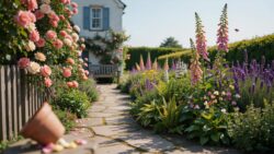
Cottage garden color schemes depend on traditional flowering plants that perform reliably in temperate climates. These species evolved within cottage gardens across England and Europe for generations. They tolerate variable conditions, self-seed readily, and provide continuous blooms across seasons. Plant selection drives the entire visual outcome.
- Roses (heirloom varieties): Damasks, Gallicas, and Albas deliver fragrance and repeat blooms. These cultivars predate modern hybrids and establish the cottage garden foundation.
- Delphiniums: Tall spikes in blue and purple create vertical rhythm. They anchor rear garden borders and naturalize over time with minimal intervention.
- Foxgloves: Biennial plants offering dramatic height and bell-shaped flowers. They self-seed prolifically and thrive in partial shade conditions.
- Lavender: Essential for fragrance, texture, and pollinator activity. Both English and French varieties suit cottage schemes with minimal maintenance demands.
- Hollyhocks: Tall bloomers producing stacked flowers from summer through fall. They naturalize freely and tolerate poor soil conditions effectively.
These plants perform across hardiness zones four through nine without requiring specialized care. Choose species over novelty hybrids for reliability and color consistency across seasons and years.
Selecting Your Perfect Cottage Garden Color Palette
Cool Vs Warm
Cool pastels draw from blue, purple, and green undertones. Think lavender, pale blue delphiniums, and soft gray-green foliage. These colors recede visually, making small spaces feel larger. Cool palettes work well in shaded areas where warm tones look muddy. They pair naturally with silver-leafed plants like artemisia and dusty miller, creating cohesion without effort.
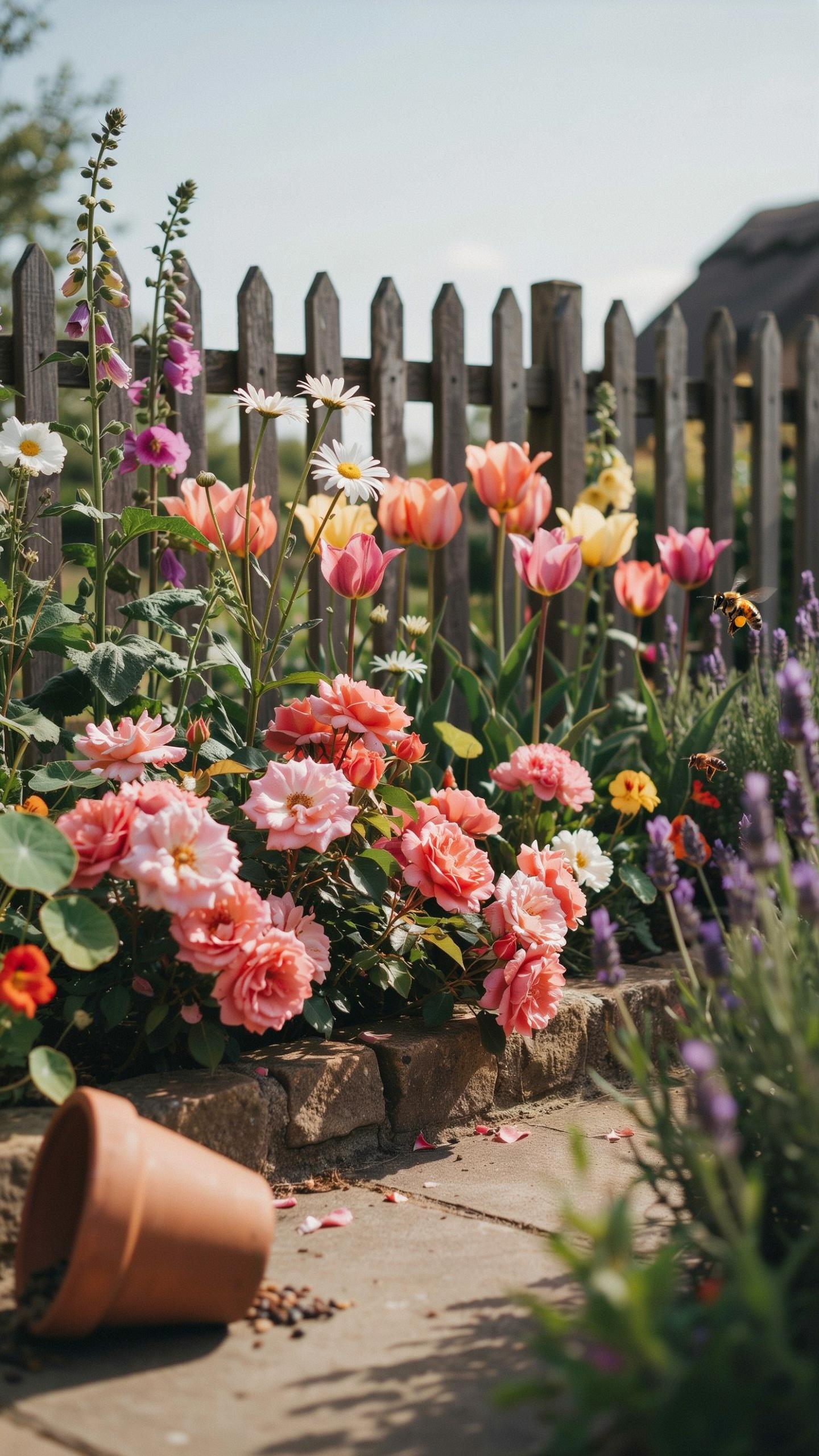
Warm tones include cream, soft yellow, peach, and coral. These advance toward the viewer and draw attention to focal points. Sun-washed warm colors perform best in full-light areas where they won’t fade. Warm palettes pair effectively with bronze fennel, golden marjoram, and rust-toned foliage plants. Choose warm or cool based on your site’s light conditions and desired spatial effect, not personal preference alone.
Seasonal Flow Palette
Spring requires early bloomers in pale yellows, whites, and soft pinks to transition from winter dormancy. Hellebores, primroses, and early bulbs establish the season’s foundational tones. These colors must coordinate with existing evergreen structure to avoid visual chaos during establishment. Plan spring color to complement the greens already present in your garden beds.

Summer and autumn demand deeper saturation and broader color variety to sustain visual interest. Layer coral dahlias, deep purple salvias, and golden rudbeckias across these months. Autumn foliage shifts burgundy and bronze naturally, so select perennials that bridge spring’s pastels to fall’s deeper hues. Continuous bloom requires staggered plantings of complementary colors, not reliance on single specimens.
Designing With A Pastel Cottagecore Color Palette
Dreamy Lavender Pinks
Soft lavender, powder pink, and creamy white form a functional color trio for cottage gardens. These hues reflect light efficiently, reducing glare in bright conditions. They pair well with green foliage because they sit opposite green on the color wheel, creating natural contrast. This palette traces back to Victorian-era garden design, where soft colors masked soil and created visual softness around working garden spaces.
Plant selection determines how effectively this palette functions. Lavender varieties like Hidcote and Munstead produce naturally soft purple flowers. Roses in blush and mauve tones anchor the scheme. Combine these with white flowering plants such as feverfew or white cosmos to balance the composition. The cream-colored backdrop of a cottage or fence amplifies the overall effect without competing for visual attention.
Shady Pastel Solutions
Shade reduces plant blooming capacity, making light pastels strategically valuable in wooded garden corners. Pale pink and lavender flowers emit more visual presence in low light than deeper tones do. White and cream flowers act as light reflectors, brightening shadowed areas naturally. This solves the practical problem of dim corners without requiring artificial intervention or removing established trees.

Shade-tolerant plants in pastel colors perform the work here. Hydrangea varieties produce pink and blue flowers in partial shade. Astilbe flowers in pale pink spread easily in shaded zones and handle moisture well. Hellebores bloom in soft tones during winter when shade is deepest. These plants generate the color scheme while adapting to difficult growing conditions where sun-loving flowers cannot survive.
Injecting Vibrant Garden Colors For Visual Depth
Accent Color Theory
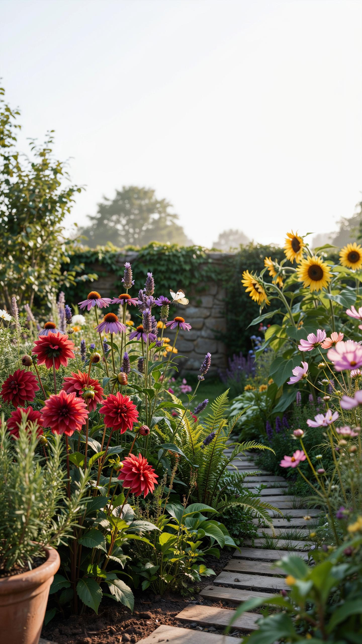
Bold purples, deep magentas, and bright yellows serve specific functions in cottage gardens. These colors command attention and draw the eye to focal points. Place them strategically rather than scattered throughout. A concentrated mass of one accent color creates impact. This approach prevents the garden from feeling chaotic or overwhelming to visitors moving through the space.
Accent colors work best when they appear in clusters of three to five plants. Repeat the same accent color in different areas to create intentional rhythm. Purple delphiniums paired with magenta cosmos create a cohesive visual story. Bright yellows like rudbeckia anchor corners or entry points. The key is restraint. Overusing accent colors dilutes their effectiveness and turns a garden into visual noise.
Balancing Greens
Green foliage serves as the foundational structure in any cottage garden color scheme. Varied textures in greens prevent monotony and add depth to planting beds. Combine fine-textured plants like fennel with broad-leafed options like hosta. Different green undertones matter too. Some plants display blue-green tones while others show yellow-green hues. This variation makes accent colors pop without adding more flowers.

Greens occupy roughly 50 to 70 percent of a well-designed cottage garden. They provide visual rest between colorful plantings and prevent eye fatigue. Dense green backgrounds make nearby purples and yellows appear more vibrant through contrast. Use evergreen shrubs like boxwood to maintain structure year-round. Strategic green placement transforms accent colors from random spots into intentional design elements with real visual power.
Inspirational Cottagecore Color Schemes For Every Season
Spring Renewal Palette
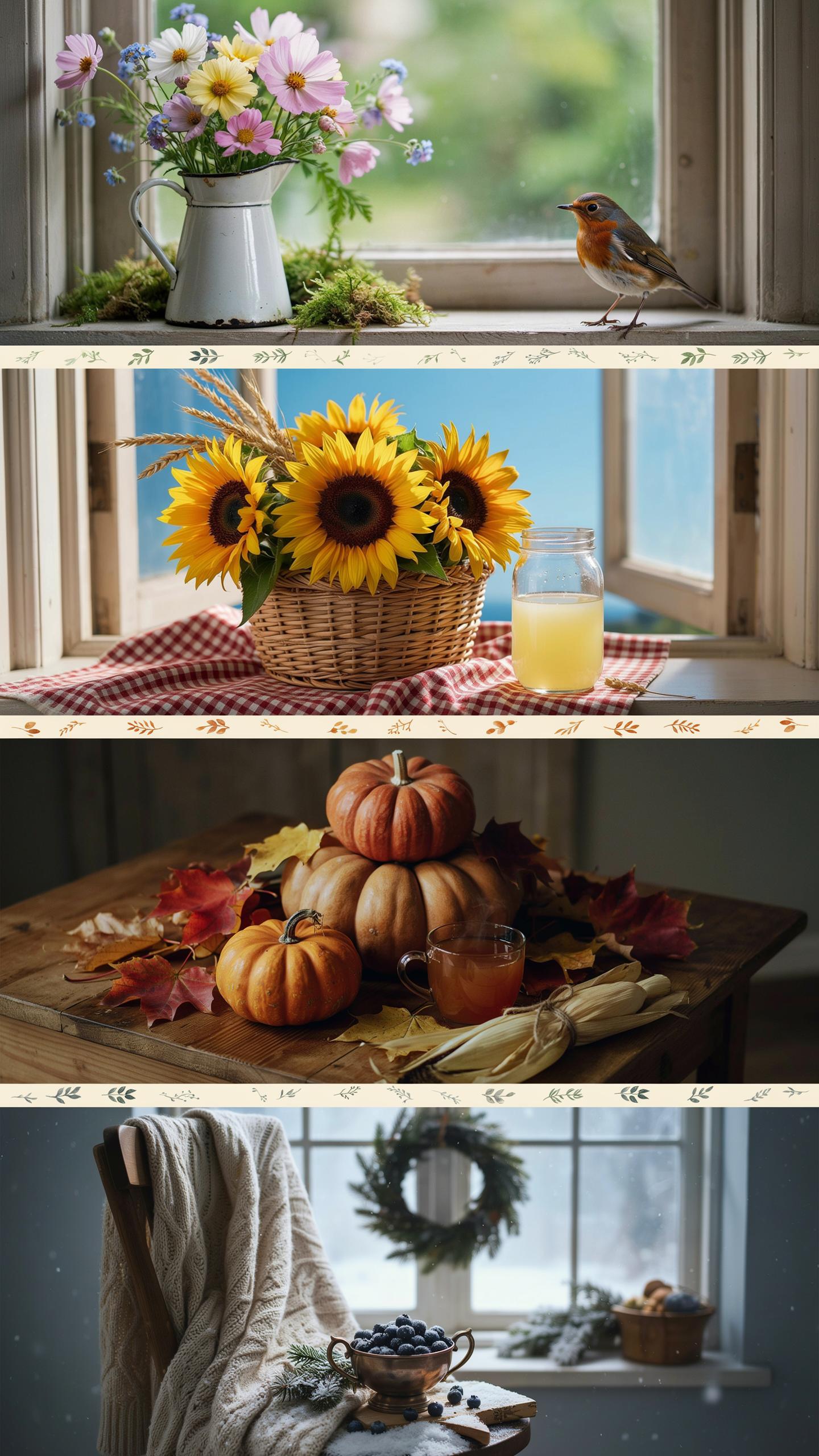
Spring cottage gardens rely on soft yellows and pale tones to signal renewal after winter dormancy. Daffodils produce consistent yellow blooms in early spring, while primroses offer pale yellows and creams. These colors work because they reflect natural light levels during longer spring days. Plant them in clusters near garden edges or borders for maximum visual impact and easy maintenance access.
Soft yellows pair effectively with white flowering plants like hellebores and snowdrops. This combination creates visual depth without overwhelming small spaces typical of cottage gardens. The pale tones recede into backgrounds, allowing viewers to focus on garden structure and pathways. Deploy this palette in foundation plantings where you need to brighten transitional areas between seasons.
Summer Abundance Palette
Deep crimson roses dominate traditional cottage garden summer displays because they flower reliably from June through September. Blue delphiniums planted behind crimson roses create strong vertical contrast and visual structure. This color pairing draws from Victorian-era cottage garden design, where bold color combinations defined planting schemes. The contrast between warm crimsons and cool blues prevents monotony in midsummer plantings.
Crimson and blue combinations work tactically because they’re visible from distance and photograph clearly for property documentation. Plant delphiniums at garden backs to provide height while crimson roses occupy middle layers. This layered approach maximizes bloom visibility and reduces maintenance zones. Water delphiniums consistently since they prefer moist soil, while roses tolerate drier conditions once established.
Weaving Your Cottage Core Color Palette Into Hardscapes
Painted Fences Structures
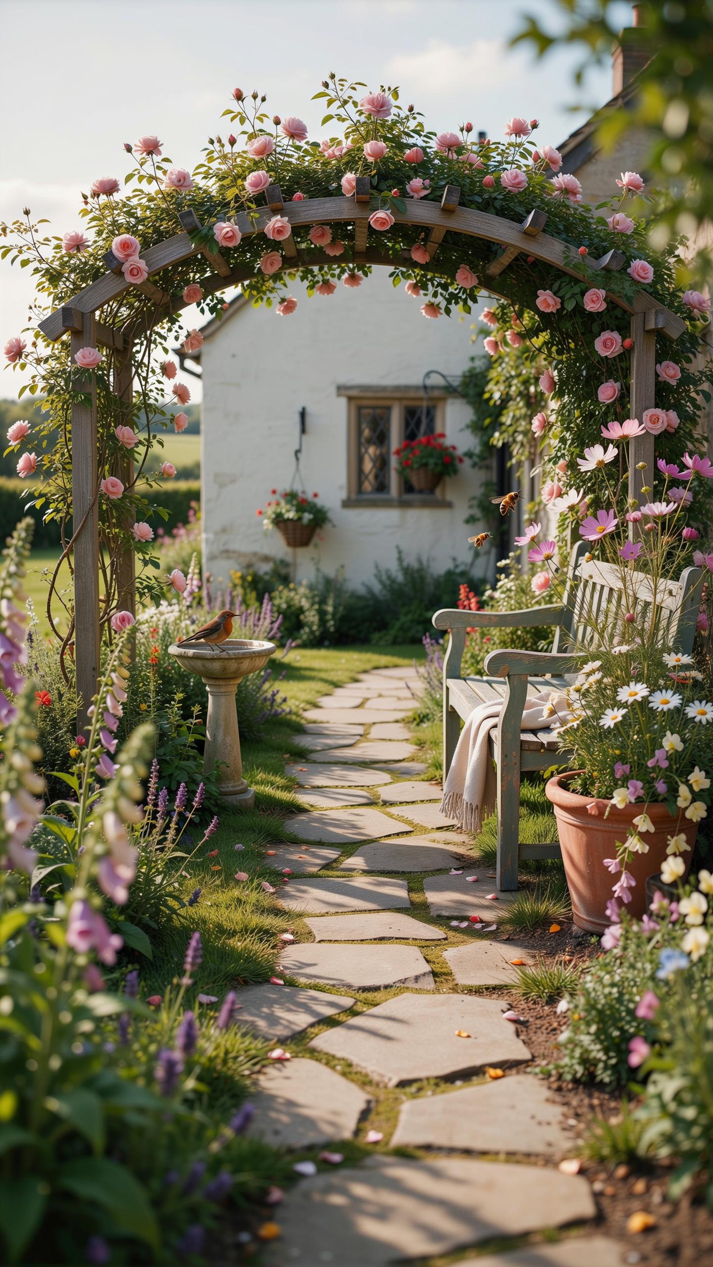
Paint selection for hardscapes serves a functional purpose. It protects wood from weather damage while establishing visual continuity with your planting scheme. Hardscapes anchor the garden’s color foundation. They provide the stage on which plants perform their seasonal color shifts.
Choose paint colors that either complement or recede into the background. White fencing works universally because it reflects light and creates contrast with foliage. Soft greens and grays blend hardscapes into the landscape, allowing plant colors to dominate. Consider the sunlight your garden receives daily, as paint color appearance shifts dramatically between morning and afternoon light conditions.
The flower borders of a cottage garden should be a tapestry of soft, intermingling hues that welcome the soul home. To paint your landscape with color is to elevate the very spirit of the earth you tend.
Practical Tips For Implementing Garden Color Schemes
Drifts Vs Solitaries
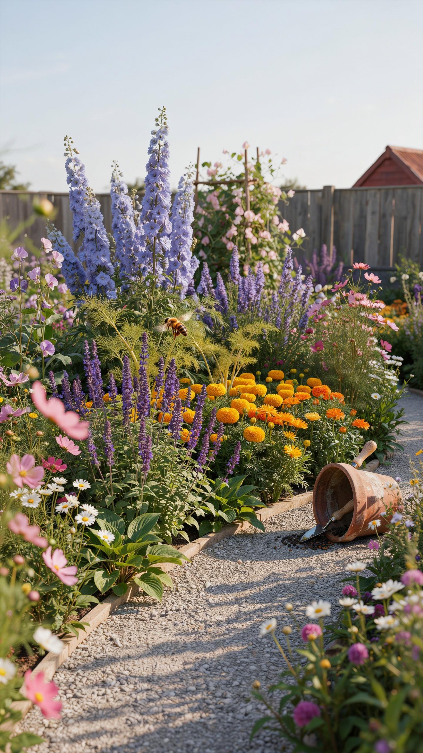
Planting in drifts means grouping three to five plants of the same variety together rather than scattering single specimens. This approach creates visual weight and makes colors read from a distance. Drifts mimic how plants naturally colonize in wild settings. A single plant disappears in a garden; a drift of lavender commands attention and anchors your color scheme.
Solitaries work only for specimen plants that demand focus, like a columnar conifer or tree. Most cottage gardens fail when they rely on scattered individual plants because the eye cannot connect the color story. Drifts of repeating colors create rhythm and coherence across beds. Space drifts strategically to guide viewers through the garden’s color progression.
Low Maintenance Color Tips
Select perennials suited to your climate zone to reduce replanting and watering demands. Native and naturalized plants require less intervention once established. Group plants by water and soil needs so maintenance becomes uniform across color blocks. This reduces the time spent adjusting care for individual specimens and keeps colors consistent year to year.
- Deadhead spent blooms weekly: Remove faded flowers to trigger continuous blooming. This extends your color display and prevents self-seeding chaos that disrupts your intended palette throughout the season.
- Apply mulch annually: A two to three inch layer suppresses weeds that compete for nutrients and water. Weeds fade color impact by stealing resources from flowering plants and creating visual clutter.
- Water early morning: Deliver water at the soil level before heat rises. Morning watering reduces disease pressure and ensures plants stay hydrated through peak sun without stress that dulls flower color.
- Divide perennials every three years: Overcrowded plants produce fewer blooms and weaker colors. Division renews vigor, increases plant count for drifts, and maintains the density needed for strong color impact in beds.
- Feed with balanced fertilizer in spring: Apply a slow release formula as growth begins. This supports consistent blooming without encouraging excessive foliage that shades flowers and weakens your color scheme.

Once systems are in place, cottage gardens demand less ongoing work than ornamental beds with trending annuals. The payoff is four to five months of reliable color without constant replanting cycles.
Frequently Asked Questions

What is the best way for a beginner to choose a cottage garden color scheme?
For beginners, the easiest way to start is by selecting a harmonious cottage garden color scheme using analogous colors, which are next to each other on the color wheel. For example, a romantic blend of pinks, purples, and soft blues creates a cohesive look without being overwhelming. To keep it grounded, always include plenty of green foliage and white “filler” flowers like Alyssum to provide visual rest between the vibrant blooms.
How do I arrange flowers to ensure my color palette looks professional?
To master your cottage garden color scheme, use the “drift” method rather than planting in straight rows. Plant your chosen colors in organic, kidney-shaped groups of three or five to create a natural flow. Place darker, more intense shades like deep burgundy or violet in the foreground to add depth, while keeping airy, pale pastels toward the back. This layering technique mimics a wildflower meadow while maintaining a curated, intentional aesthetic.
Can I create a beautiful cottage garden aesthetic on a limited budget?
Absolutely. Achieving a charming look doesn’t require expensive mature plants. You can establish a stunning palette by purchasing seeds for easy-to-grow annuals like cosmos, zinnias, and sweet peas. Another budget-friendly tip is to trade perennial divisions with neighbors or shop end-of-season sales. Within a year or two, these affordable options will spread and fill your beds, providing that lush, overflowing character that makes this gardening style so beloved and timeless.