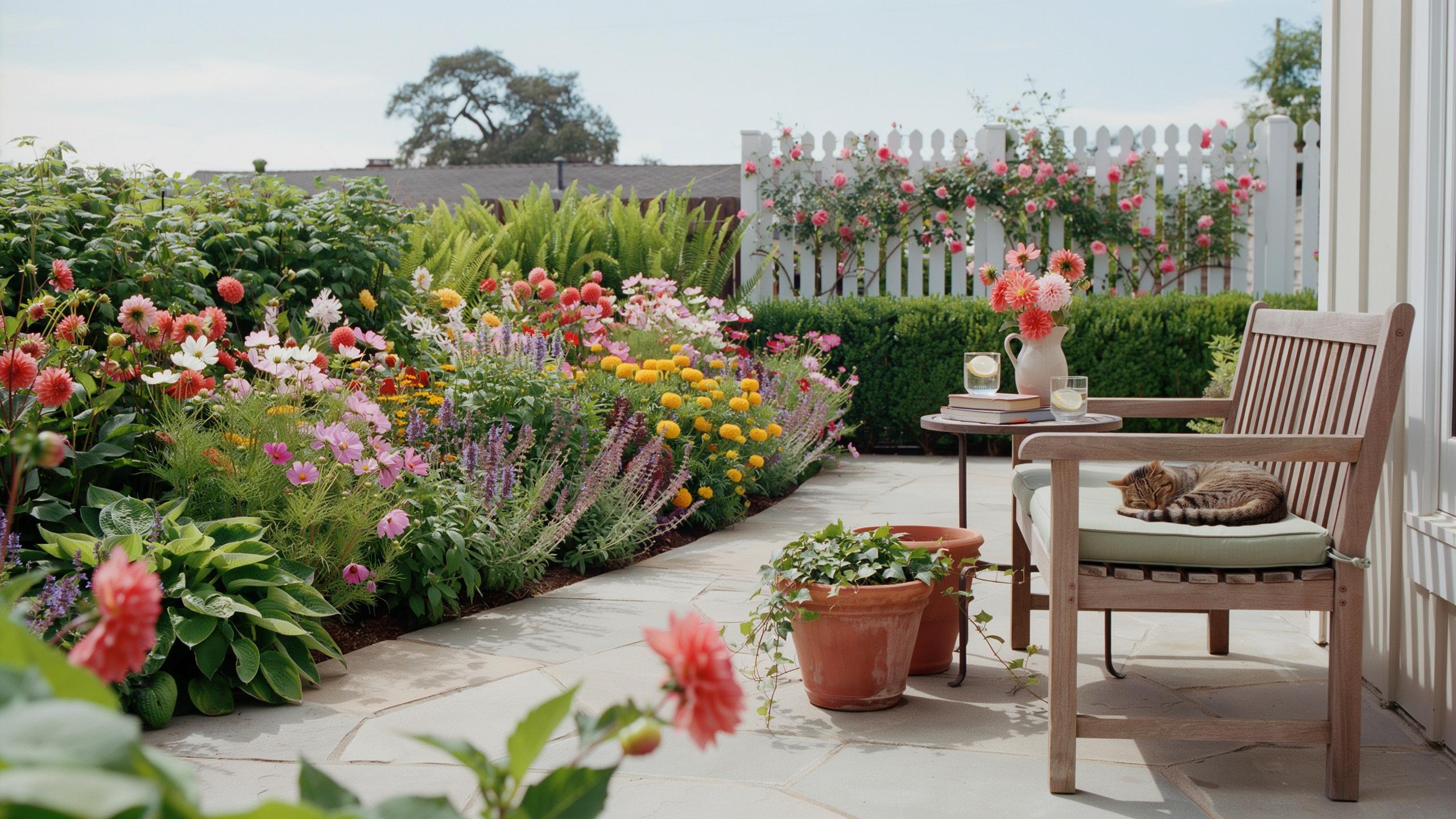
Understanding The Basics Of A Garden Color Scheme
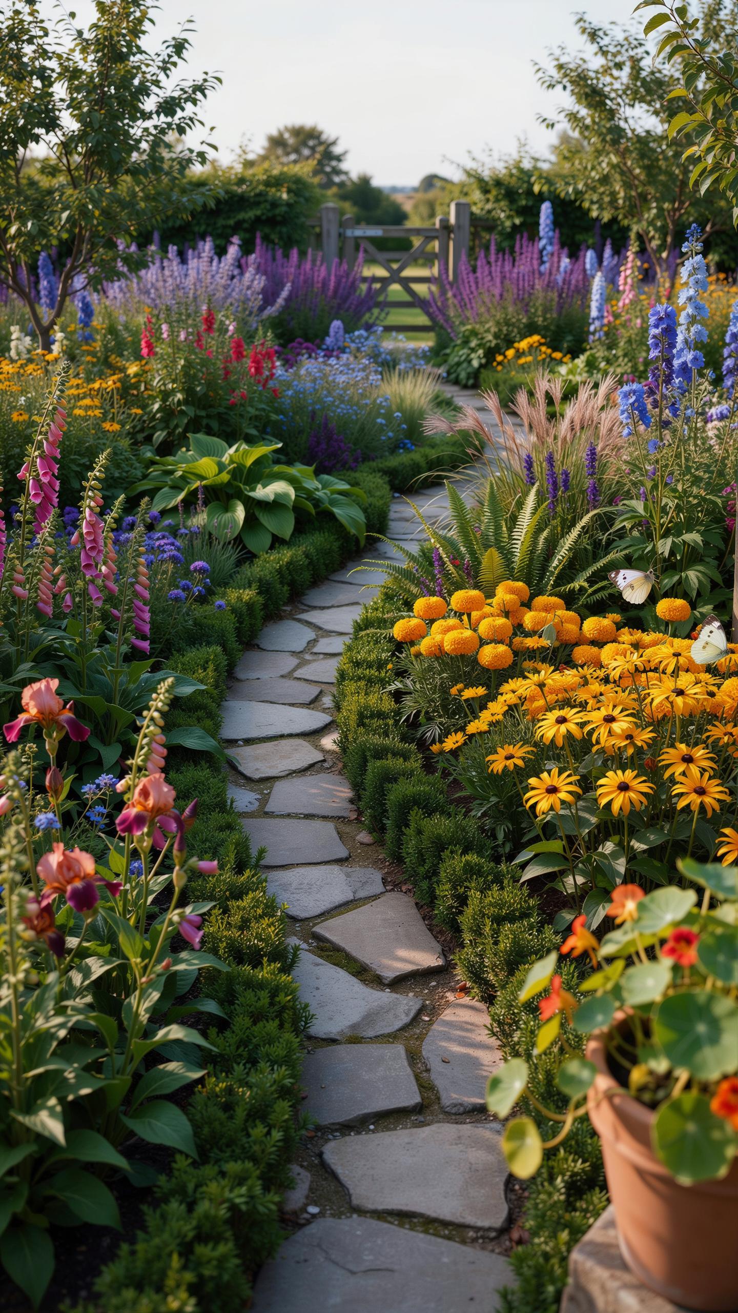
How Color Theory Applies To Garden Design
Color theory dictates how human eyes perceive a garden design color palette across large distances. Proper application controls the visual pace of an outdoor space. Fast colors like red and yellow draw the eye immediately and make objects appear closer. Slow colors like blue and violet recede and create a sense of depth. You must manage these hues to manipulate the perceived size of the garden.
Effective practitioners use the psychological weight of color to set a specific mood. Deep greens and cool blues lower the heart rate and suggest rest. Bright oranges and reds stimulate energy and encourage movement through a space. You choose colors based on the intended function of each garden zone. This strategy ensures the landscape serves its purpose through direct visual influence on the viewer.
The Role Of The Color Wheel In Choosing Complementary Plant Pairings
The color wheel is a technical tool that identifies mathematical relationships between plant hues. Complementary pairings sit directly across from each other on the wheel. Examples include purple and yellow or blue and orange. These high-contrast combinations create immediate visual impact and high energy. Use this tactic when you want to highlight a specific focal point or entry gate in the landscape.
Professional designers also use the wheel to find analogous colors located side by side. This technique uses three related hues like blue, blue-violet, and violet. It creates a harmonious and stable appearance that avoids visual clutter. You apply this method to large borders to create a cohesive look. Understanding these fixed positions allows you to predict how different plants will look when placed together.

How To Build A Color Palette Garden From Scratch
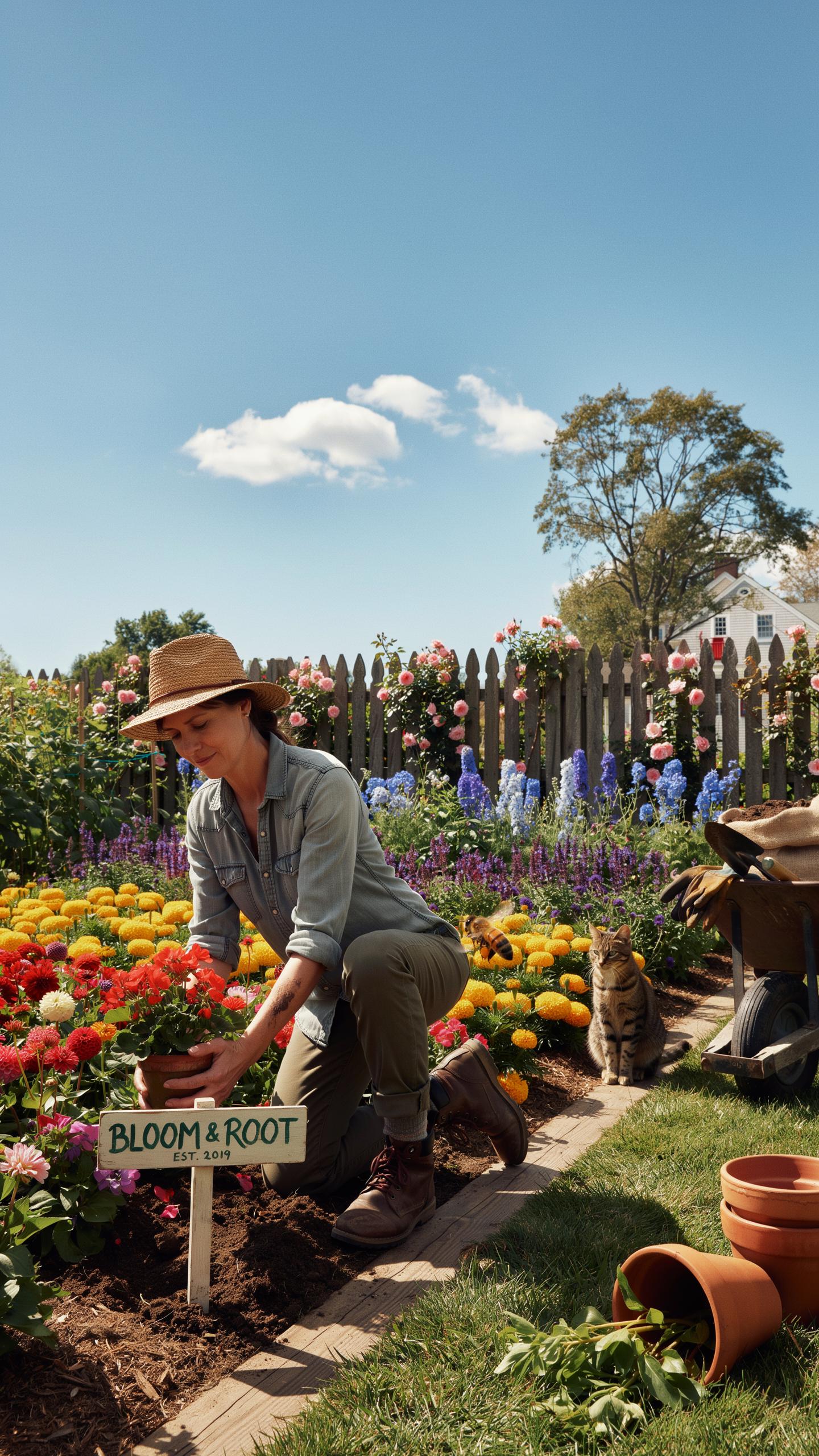
Assessing Your Garden Space Before Choosing Colors
Light exposure dictates how colors appear to the human eye. Direct southern sunlight intensifies warm reds and oranges but washes out pale pastels. Shady areas benefit from white or light yellow blooms that reflect limited light. Observe your garden at different times of the day. Note where the sun hits and where shadows linger. This data prevents you from selecting colors that disappear in the glare.
Evaluate the existing permanent structures in your landscape. Identify the material of your home, fences, and paved paths. A brick house has warm undertones that clash with cool pinks. Natural stone provides a neutral backdrop for almost any scheme. You must treat these fixed elements as the base layer of your palette. Align your plant choices with these materials to ensure a cohesive visual result.
Balancing Foliage Tones With Flowering Plant Colors
Foliage provides the structure of your garden for twelve months of the year. Flowers are temporary and often last only a few weeks. You must select leaf colors that support your palette when blooms are absent. Use dark maroon or deep purple leaves to create contrast against bright greens. Silver and blue-grey foliage can bridge the gap between clashing flower colors. Treat the leaves as your primary design tool.
Evergreens offer a permanent green anchor for your color scheme. Use these plants to prevent the garden from looking empty during winter months. Variegated leaves with white or gold edges add light to dark corners without relying on flowers. Match the intensity of your foliage to the intensity of your blossoms. Strong leaf textures provide a backdrop that makes delicate flower colors stand out more effectively.
Top Plant Picks For A Truly Colorful Garden
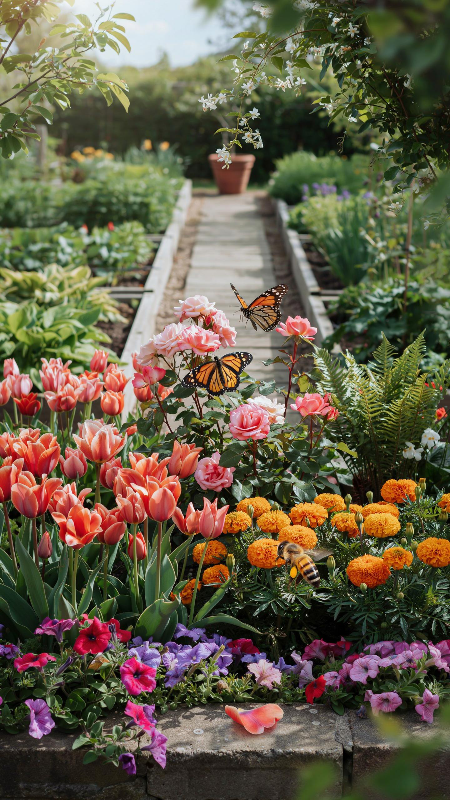
Bold And Vibrant Flowering Plants That Make A Statement
Statement plants act as visual anchors in a garden design color palette. You must select species with high pigment saturation to create clear focal points. Use red Hot Poker or purple Salvia to draw the eye immediately. These plants break visual monotony and define the spatial hierarchy. Bold colors work best when placed near high-traffic areas or at the end of sightlines.
Positioning matters more than quantity when using vibrant tones. Grouping these plants creates a massive block of color that commands attention. Avoid scattering single bright plants randomly across the space as this creates visual noise. Stick to a limited range of bold hues to maintain a professional look. Contrast these intense colors against dark green foliage to increase the perceived brilliance of the blooms.
Best Plant Varieties To Layer Color Throughout The Growing Season
Layering ensures your garden design color palette remains active from spring through autumn. You must select plants with staggered bloom times to prevent brown spots. Successional planting requires a mix of bulbs, perennials, and shrubs. This strategy maintains visual interest as the sun angle changes and different species take the lead. A well-planned sequence provides a constant supply of color for the viewer.
- Early Spring Bulbs: Species like Crocus and Narcissus provide the first wave of color. These plants emerge when most other vegetation is dormant. They offer immediate impact after winter and set the tone for the coming season.
- Mid-Season Perennials: Echinacea and Rudbeckia offer reliable blooms during the peak summer months. These varieties are hardy and maintain their color intensity under direct sunlight. They bridge the gap between early spring growth and late autumn transitions.
- Late Season Grasses: Ornamental grasses like Pennisetum add golden and bronze tones in late autumn. Their structural form remains intact even after the first frost. These plants extend the color palette into the colder months of the year.
- Deciduous Shrubs: Varieties like Cornus or Viburnum provide seasonal shifts in leaf color. They transition from green to deep reds or yellows as temperatures drop. Shrubs offer a large surface area of color that anchors the entire landscape.
- Evergreen Foundation: Plants like Buxus or Taxus provide a consistent green backdrop. This permanent layer ensures the garden never looks empty during the winter. A solid green base makes seasonal flower colors appear more vivid and defined.
Effective layering requires coordinating the decline of one species with the rise of another. Place later-blooming plants in front of earlier species to hide fading foliage. This tactical placement keeps the garden looking clean and intentional. Use structural plants to hold the design together while the color palette shifts. Proper layering maximizes the return on your horticultural investment throughout the entire year.
Exploring Garden Color Scheme Colour Palettes For Every Style
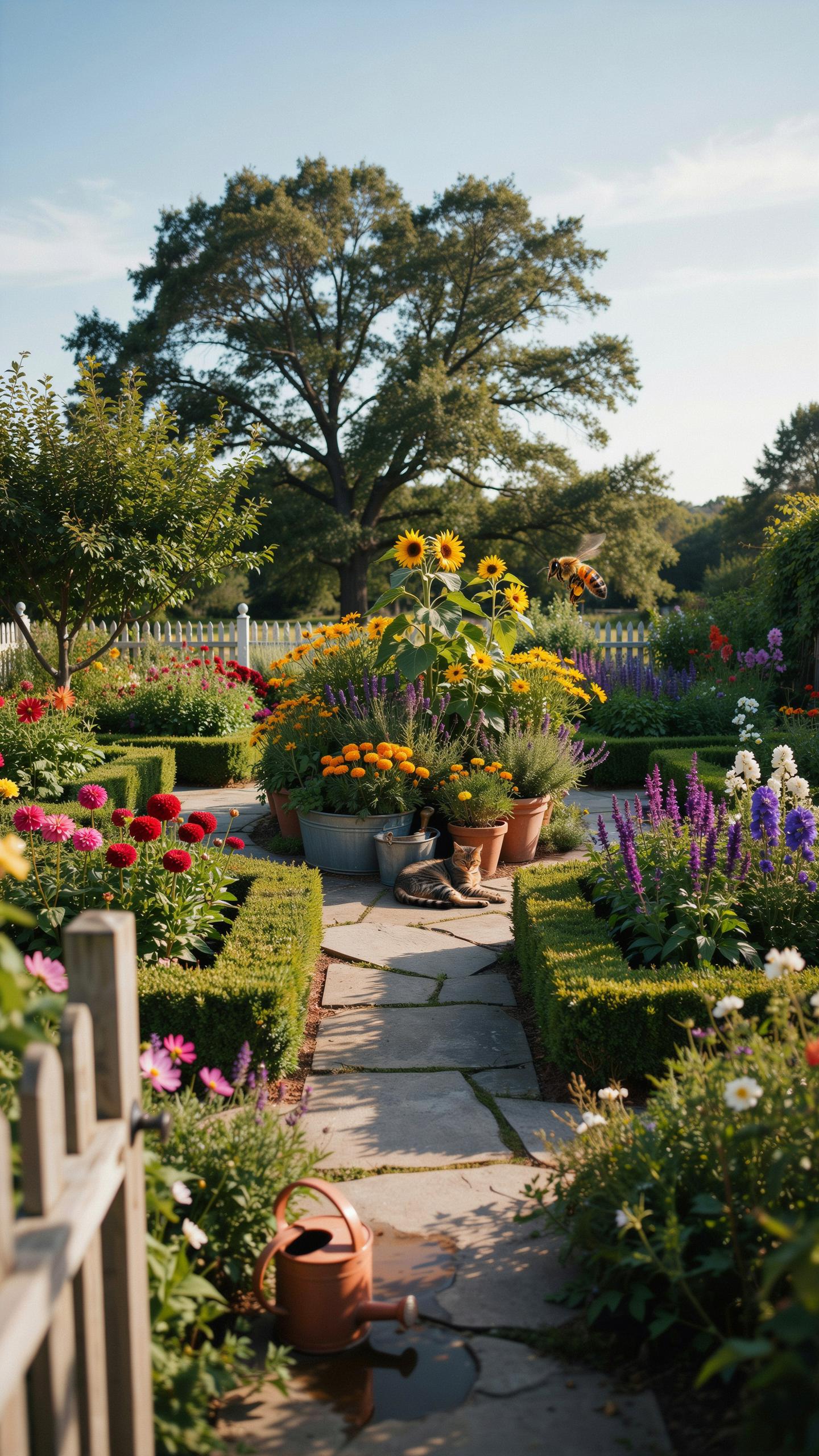
Monochromatic Garden Schemes: Elegant Simplicity In One Hue
Monochromatic palettes use a single color in varying shades and textures. Historically, Vita Sackville West popularized this at Sissinghurst with her White Garden. This approach creates a clean visual field that reduces mental clutter. It relies on foliage shape and petal form to create interest rather than color shifts. Designers use this strategy to make small spaces feel larger and more cohesive.
Success in a single hue garden requires hardware and foliage to do the heavy lifting. You must mix matte leaves with glossy ones to catch light differently. In a white scheme, silver foliage adds depth without breaking the color rule. Use hardscaping like grey stone or dark wood to provide a neutral base. This technique ensures the garden looks structured even when plants are not blooming.
A garden should be a serene wash of harmonious hues, calling you home to the quiet beauty of a simpler time.
Analogous And Complementary Schemes For Dynamic Visual Impact
Analogous schemes use three colors located next to each other on the color wheel. Examples include mixing yellow, orange, and red for high energy. This movement mimics natural transitions found in forest edges and meadows. Using these related tones creates a sense of harmony that feels effortless. It works best in large borders where colors can bleed into one another to guide the eye.

Complementary schemes use colors from opposite sides of the wheel like purple and yellow. This creates maximum contrast and makes individual plants pop. The high tension between colors grabs attention quickly and defines specific garden zones. High contrast layouts require careful balancing to avoid visual chaos. Professional designers often use a ratio of seventy percent primary color to thirty percent accent color to maintain control.
Designing A Cottage Garden Color Palette With Timeless Charm
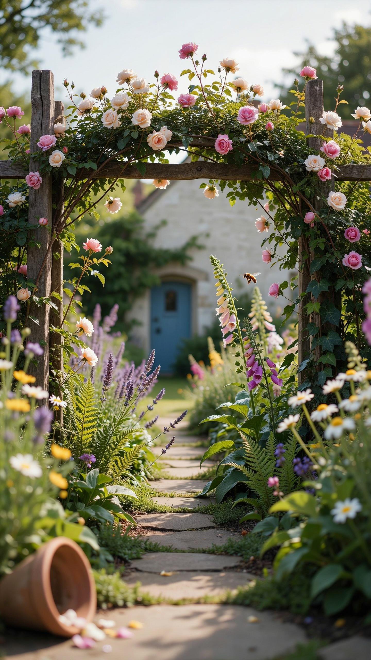
Traditional Cottage Garden Flowers And Their Natural Color Harmony
The traditional cottage garden relies on a dense planting style. It uses flowers like lavender, foxgloves, and hollyhocks to create vertical layers. These plants provide a base of soft greens and purples. This mix works because the colors appear together in nature. The goal is a look that seems organic rather than forced. You must choose plants that bloom at similar times to maintain this visual balance.
Cottage gardens prioritize functional beauty. Historically, these spaces mixed vegetables with ornamental flowers. This created a tapestry of diverse textures and shades. You should use cool tones like blue delphiniums to make small spaces feel larger. Warm white roses help bridge the gap between different hues. This strategy prevents the garden from looking messy. It ensures the garden design color palette remains cohesive and professional.
Mixing Soft Pastels And Rich Jewel Tones In A Cottage Setting
Mixing pastels with jewel tones adds depth to your outdoor space. Soft pinks and pale yellows act as a neutral background. Darker shades like deep burgundy or royal purple provide necessary contrast. This contrast draws the eye to specific focal points. Without these darker anchors, the garden looks washed out. You should place jewel tones near the center of your flower beds for maximum impact.
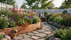
Balance is the key to this color strategy. Use a ratio of three parts pastel to one part jewel tone. This prevents the darker colors from dominating the space. Deep red peonies or dark purple salvias work well against light foliage. This combination creates a sense of luxury within a rustic framework. High contrast increases the visual energy of the garden. It keeps the viewer engaged across the entire landscape.
Seasonal Planning With A Garden Colour Palette In Mind
Mapping Spring And Summer Color Transitions In Your Garden
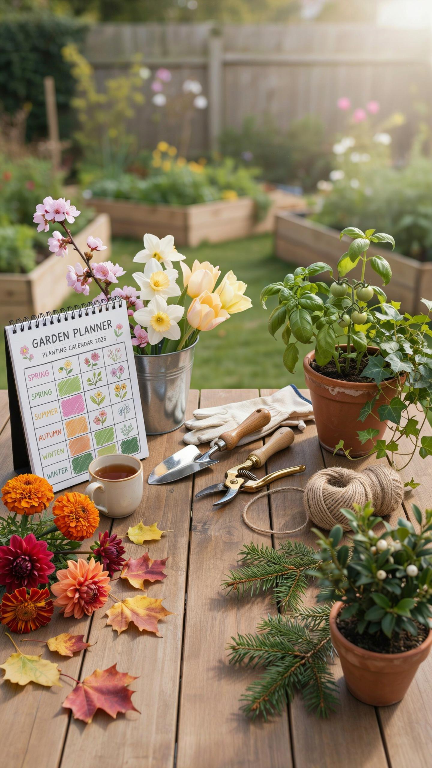
Spring transitions require a strategic shift from soft pastels to high-saturation pigments. Early spring palettes rely on bulbs like blue muscari and yellow daffodils to break winter dormancy. These cool tones establish a baseline before the heat increases. Designers must time plantings so that fading spring foliage is hidden by emerging summer perennials. This prevents gaps in your garden design color palette during critical growth phases.
Summer demand shifts toward high-contrast schemes to handle intense midday sun. Strong sunlight washes out pale pinks and light blues. Use bold reds, deep purples, and vibrant oranges to maintain visual impact. Integrate silver-leaved plants like Stachys byzantina to reflect light and provide a neutral bridge between clashing hues. This tactical layering ensures the garden remains structurally sound and visually assertive as temperatures rise throughout the peak season.
Extending Visual Interest With Autumn And Winter Tones
Autumn marks a pivot from floral dominance to foliage and fruit. Your garden design color palette must incorporate deciduous shrubs that undergo chemical changes to produce crimson and gold leaves. Use plants like Cornus or Liquidambar for reliable shifts in pigment. These structural elements provide bulk and color after herbaceous perennials die back. You must plan for these deep tones to maintain the garden’s perceived value in late October.
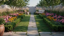
Winter palettes focus on stems, bark, and evergreen density. Stripped of leaves, the garden relies on the physical texture of plants like Betula utilis for white bark or Cornus sanguinea for red stems. These colors provide a skeletal framework against grey skies. Evergreen shrubs provide the necessary green backdrop to prevent a barren appearance. Select plants with persistent berries to add small pops of red or orange during the coldest months.
Using Hardscaping And Accessories To Enhance Your Garden Colors Palette
Choosing Paving, Gravel, And Wall Colors That Complement Your Plants
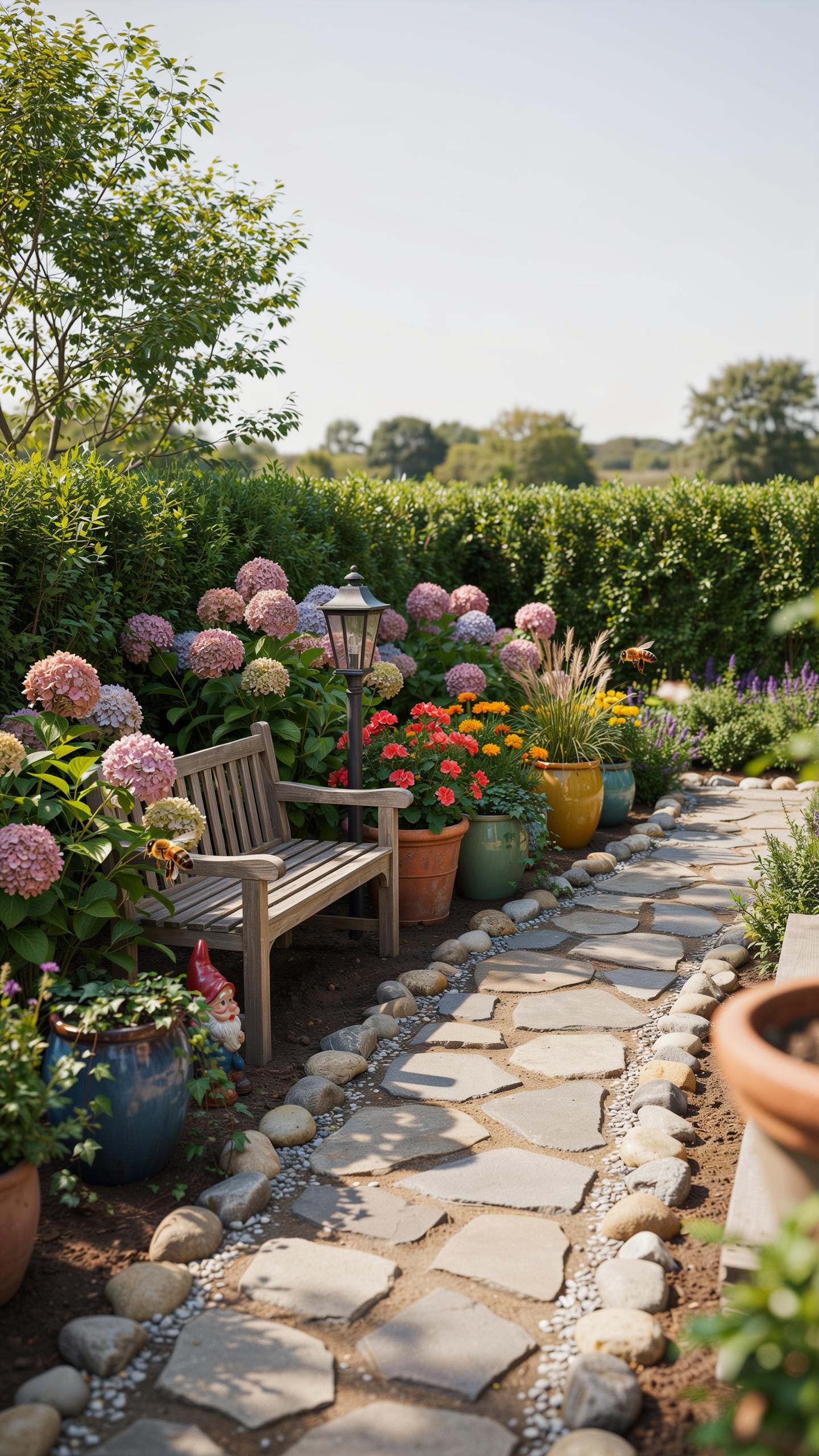
Hardscaping provides the permanent background for your garden design color palette. Natural stone materials like cooling grey slate or blue limestone stabilize vibrant flower colors. Warm sandstone or clay bricks provide a grounded base for green foliage and white blooms. You must select materials that match the light conditions of your site. Darker stones absorb heat while lighter gravel reflects sun onto your plants.
Walls and fences act as a vertical canvas for your layout. Dark charcoal or deep brown fences make green leaves appear more vivid and textured. Light colored walls brighten shaded corners and help pastel flowers stand out. Choose your structural colors first because they are expensive to change. Match the undertones of your paving to the dominant temperature of your chosen plant palette for visual cohesion.
How Garden Furniture And Decorative Pots Reinforce Your Color Theme
Furniture and pots act as strategic focal points within the landscape. These elements bridge the gap between fixed architecture and seasonal softscaping. Use bold colors on mobile items to direct the eye toward specific garden zones. Strategic placement of colored containers can heighten the drama of specific blooms or provide contrast during winter months when most deciduous plants are dormant.
- Terra Cotta Pots: Real clay pots provide a neutral orange-red tone that complements blue and purple flowers. This classic material suits Mediterranean and cottage styles because the earthy hue anchors bright floral displays against green leaves.
- Metal Furniture: Black or dark green iron pieces disappear into shadows to highlight delicate plant stems. Powder-coated modern sets allow you to introduce specific accent colors that may not be available in your local plant hardiness zone.
- Wooden Elements: Cedar and redwood offer natural warmth that evolves as the wood weathers to silver grey. Unstained wood supports a relaxed palette while painted timber allows for high-contrast schemes that define the boundaries of outdoor living rooms.
- Glazed Ceramics: High-shine pots reflect light and introduce intense pigments like cobalt or turquoise. These vessels work best as standalone features in minimalist designs where you need a single punch of color to break up monochromatic greenery.
- Textile Accents: Outdoor rugs and cushions provide the fastest way to test a new color palette. Use these soft goods to mirror the seasonal tones of your flower beds or to provide a neutral resting spot for the eyes.
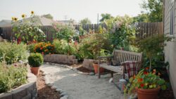
Balance your accessory choices to avoid visual clutter. Too many competing colors on pots and chairs will distract from the natural beauty of the plants. Select one primary accent color for your accessories that repeats throughout the space. This repetition creates a sense of rhythm and professional polish. Ensure your furniture material choice respects the historical context and architecture of your home.
Practical Tips For Maintaining Your Garden Color Palette Year Round
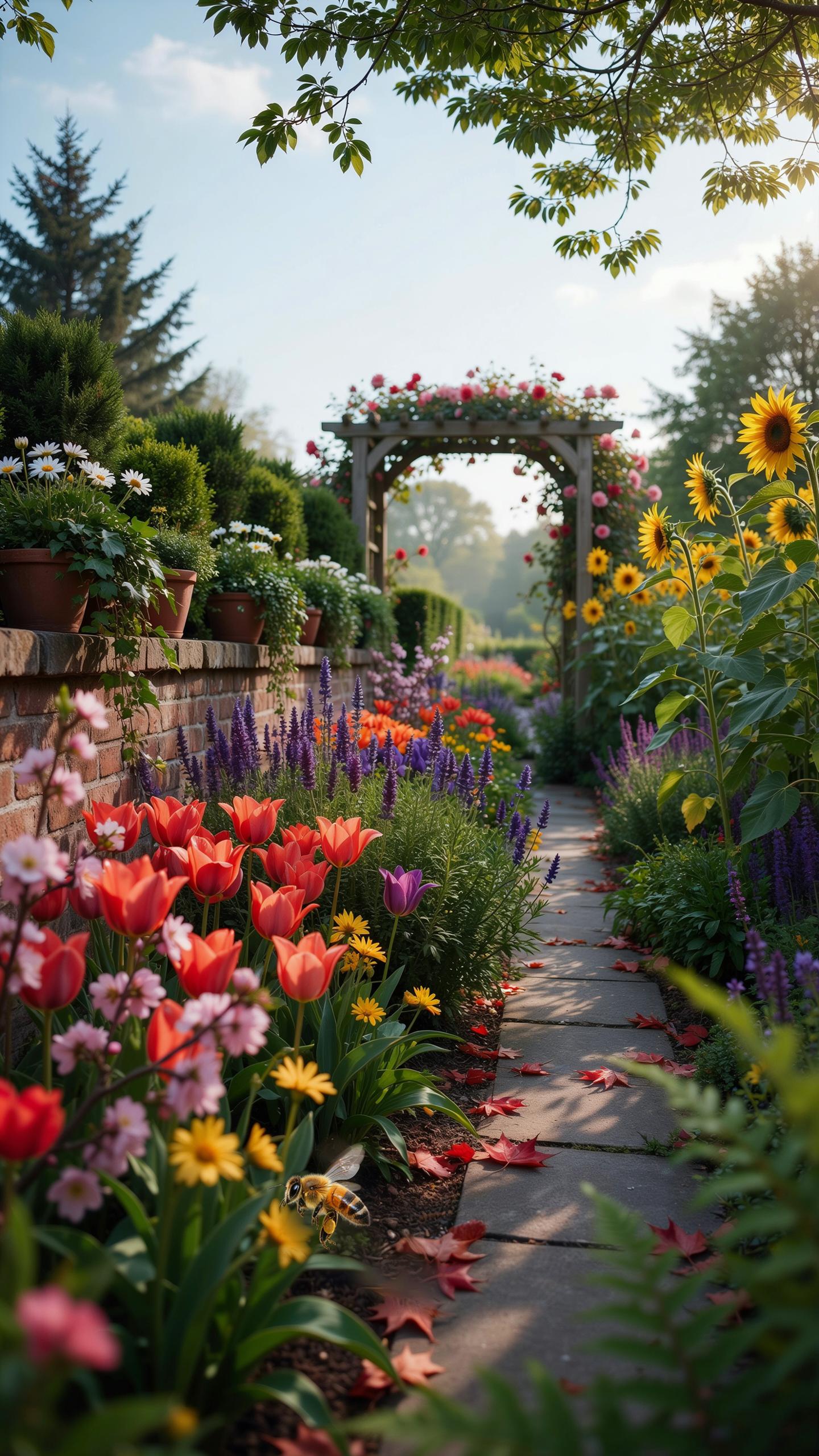
Pruning And Deadheading To Keep Colors Looking Fresh And Intentional
Deadheading removes spent flowers before they produce seeds. This practice diverts energy back into the root system and foliage. For many perennials, it triggers a second flush of blooms. This keeps your primary colors active deeper into the season. Removing brown or decaying petals prevents visual clutter. It ensures your garden design color palette remains sharp and focused rather than muddy or muted.
Strategic pruning maintains the structure of your color blocks. Fast-growing shrubs can quickly overshadow smaller accent plants if left unchecked. Use clean shears to thin out dense growth and improve sunlight penetration. This prevents the interior of the plant from turning yellow or brown. Regular maintenance ensures that every plant in your scheme holds its intended shape. It creates clean lines and distinct color transitions.
Replacing And Refreshing Plants To Sustain Your Chosen Garden Palette
Seasonal gaps are inevitable in any landscape. Early spring bulbs fade while summer perennials are still dormant. You must replace exhausted annuals or dying specimens immediately to preserve the visual impact. Use temporary container plants to fill holes in your borders. Select species that strictly match your existing color palette. This keeps the design looks intentional and prevents your outdoor space from appearing neglected.
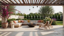
Succession planting is a core tactical requirement for long-term design. Research the bloom times of every species in your plan. Ensure that as one group of flowers ends, another group begins. This creates a rotating cycle of color that supports your overall theme. Replace woody plants if they become too leggy or stop flowering effectively. Consistent updates maintain the density and vibrancy required for a professional look.
Inspiring Garden Color Palette Ideas For Small And Large Outdoor Spaces
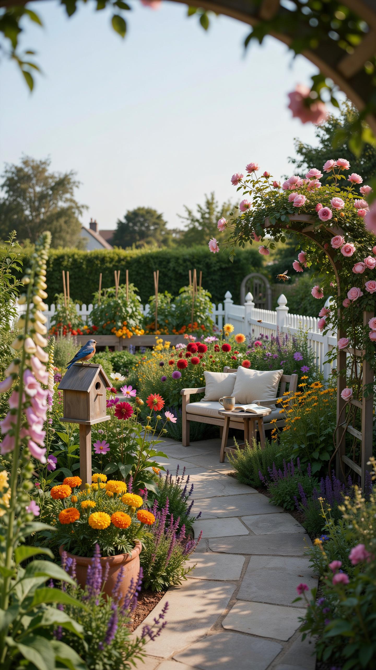
Compact Garden Color Strategies For Balconies, Patios, And Small Yards
Small spaces require a restricted garden design color palette to avoid visual clutter. Use cool colors like blue, violet, and soft gray to make boundaries recede. These tones trick the eye into perceiving more distance. Stick to two or three hues at most. Neutral hardscaping like light pavers or white pots reflects light. This brightness makes a cramped balcony feel open and airy.
Monochromatic schemes work best in tight quarters. Use different shades of a single color to create interest without chaos. Foliage texture becomes your primary tool when the color range is narrow. Mix glossy green leaves with matte silver plants. Use vertical structures to display your palette upward. This saves floor space while adding layers of color. Professional designers use this tactic to maximize every square inch.
Creating Depth And Drama With Color In Larger Garden Landscapes
Large landscapes demand high contrast to define specific zones. Use warm colors like red, orange, and yellow in the foreground. These colors advance toward the viewer and create an immediate focal point. They pull the eye to a specific seating area or entrance. Use bold mass plantings to ensure the color carries across long distances. Tiny patches of color disappear in a vast field.
Implement the law of perspective by placing darker, cooler tones at the far edge of the property. Deep purples and forest greens create a sense of infinite depth. This technique mimics atmospheric perspective found in classical landscape paintings. Use large drifts of repeating colors to provide a sense of rhythm and unity. This connects different areas of the yard. Consistent repetition prevents the landscape from looking disjointed or unfinished.
Frequently Asked Questions

How do I choose a garden design color palette if I am a complete beginner?
The easiest way to start is by selecting a primary anchor color that you love, such as a calming lavender or a vibrant red. Once you have your main hue, use a color wheel to find complementary shades or stick to an analogous scheme by picking colors next to each other. Keeping your garden design color palette limited to three main tones ensures a cohesive, professional look without feeling overwhelming.
How can I create a sense of flow using different colors in my backyard?
To achieve a seamless transition, repeat specific colors throughout different zones of your landscape. Use “repeater plants” or matching decorative containers to lead the eye through the space. By strategically placing pops of high-contrast shades against a consistent garden design color palette of greenery, you create visual rhythm. This technique makes your outdoor area feel like a single, unified room rather than a disconnected collection of various plants and flowers.
Is it possible to create a high-end color scheme on a tight budget?
Absolutely! You can achieve a sophisticated look by focusing on foliage rather than expensive seasonal blooms. Many affordable shrubs and grasses offer stunning silvery, chartreuse, or deep burgundy leaves that provide year-round structure. Additionally, painting old planters or garden furniture in a uniform shade is a cost-effective way to reinforce your chosen theme. Consistency is the secret to making an inexpensive outdoor space look intentionally designed and luxurious.