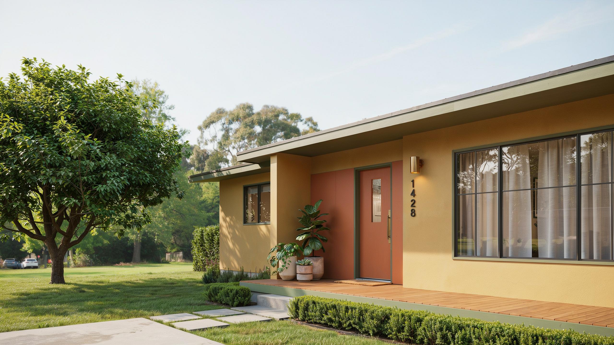
Understanding Mid Century Home Exterior Paint Colors And Their Natural Appeal
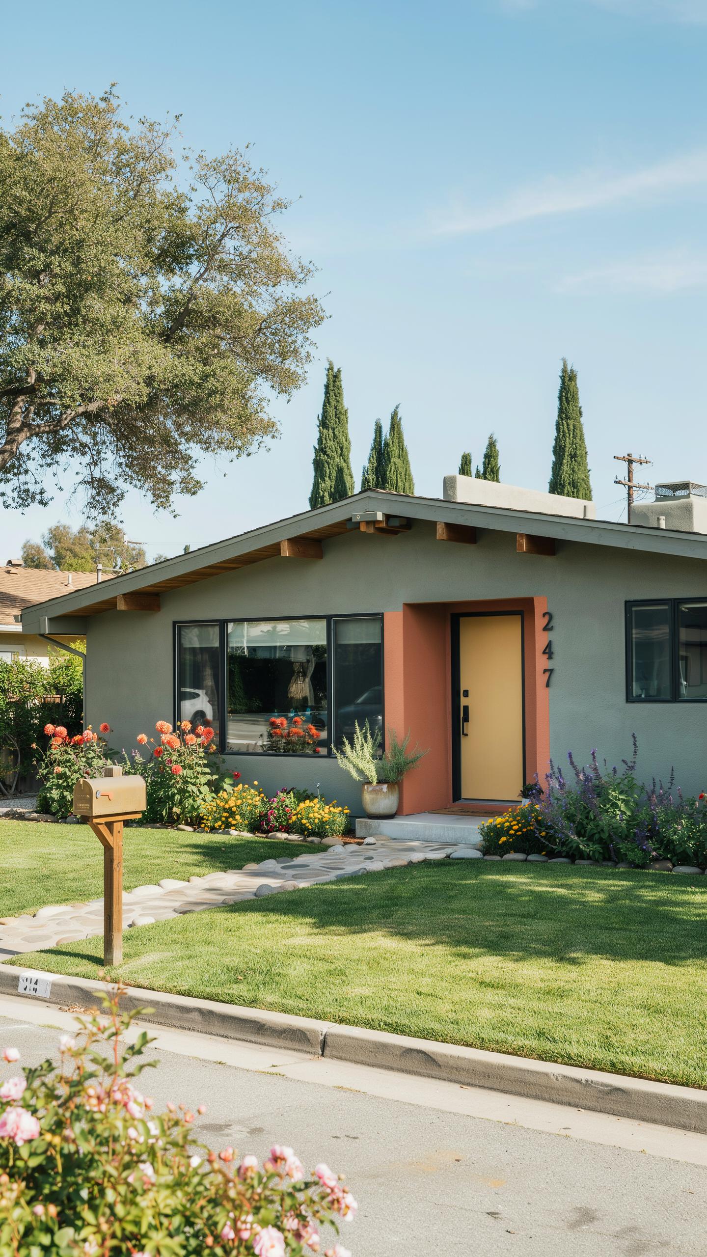
The Historical Connection To Nature And Organic Elements
Mid-century architects and homeowners deliberately pulled color palettes from their immediate environments. Earth tones, warm grays, and muted ochres dominated exterior choices because they reduced visual conflict between the built structure and natural surroundings. This approach reflected the design philosophy of blending indoor and outdoor living spaces rather than creating sharp visual boundaries.
Regional geography directly influenced color selection during this period. Homes in desert regions favored warm sand tones and terracotta influences. Coastal properties leaned toward cooler grays and soft greens that echoed local vegetation. Mountain communities adopted deeper earth tones that anchored structures within forested landscapes. Homeowners understood that exterior color either harmonized with or disrupted the relationship between house and land.
How Light And Architecture Shape Your Exterior Color Choices
Mid-century designs featured expansive glass walls, clean flat rooflines, and geometric forms that cast strong shadows throughout the day. These architectural elements responded intensely to natural light, meaning paint color appeared different at dawn than at noon or dusk. A color that reads muted in morning shade can appear bright and washed out under full afternoon sun exposure.
Structural geometry created predictable shadow patterns that directly affected how paint colors performed. Overhanging eaves cast permanent shadow zones on upper walls, while flat planes received unfiltered direct sun. You must test paint samples at multiple times of day on your specific home’s orientation. The color you select must work across these shifting lighting conditions without appearing either too dark or too washed out at any point during daylight hours.
Earthy And Warm Classic Mid Century House Paint Colors
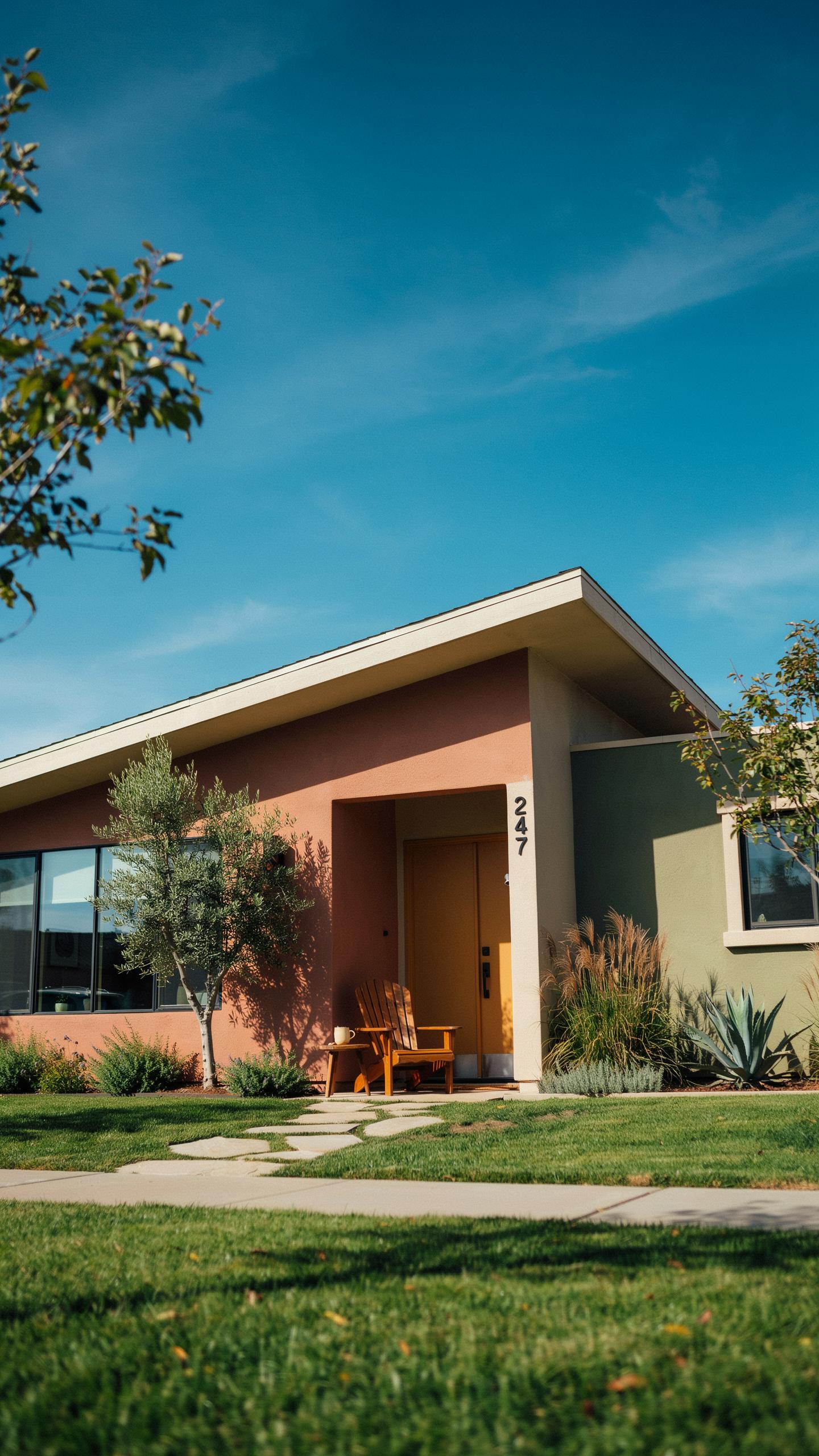
Warm Terracotta And Clay For A Desert Sunset Feel
Terracotta and clay colors emerged as practical choices for mid century homes in arid regions. These earth tones mask dust and weathering while reflecting heat, reducing cooling costs. Wood panel siding and stucco absorbed these warm hues effectively. The palette drew from regional geology and construction materials already present in desert communities like Palm Springs and Arizona.
Warm sand and clay tones paired well with the modernist design principles of the era. Flat rooflines and clean geometric forms created visual contrast against warm-colored walls. These shades worked with natural stone foundations and timber accents without competing for attention. The combination created cohesive exteriors that felt grounded in their environment rather than imposed upon it.
The Timeless Allure Of Olive Sage And Forest Greens
Deep greens anchored mid century homes into their surrounding landscapes by design intent. Muted sage and forest tones receded visually, making structures blend rather than dominate. These colors worked across different regions and climate zones. Homeowners chose green specifically to create continuity between built structures and natural vegetation.
Muted green tones paired directly with warm cedar trim and natural stone features common in mid century construction. The color combination reduced visual jarring between exterior materials. Green provided enough depth to showcase architectural detail without overwhelming clean modernist lines. Cedar accents warmed cool green bases and prevented exteriors from reading as cold or institutional.
Cool And Sophisticated Mid Century Modern House Exterior Paint Colors
Chic Charcoal And Sleek Slate Grays For Modern Depth
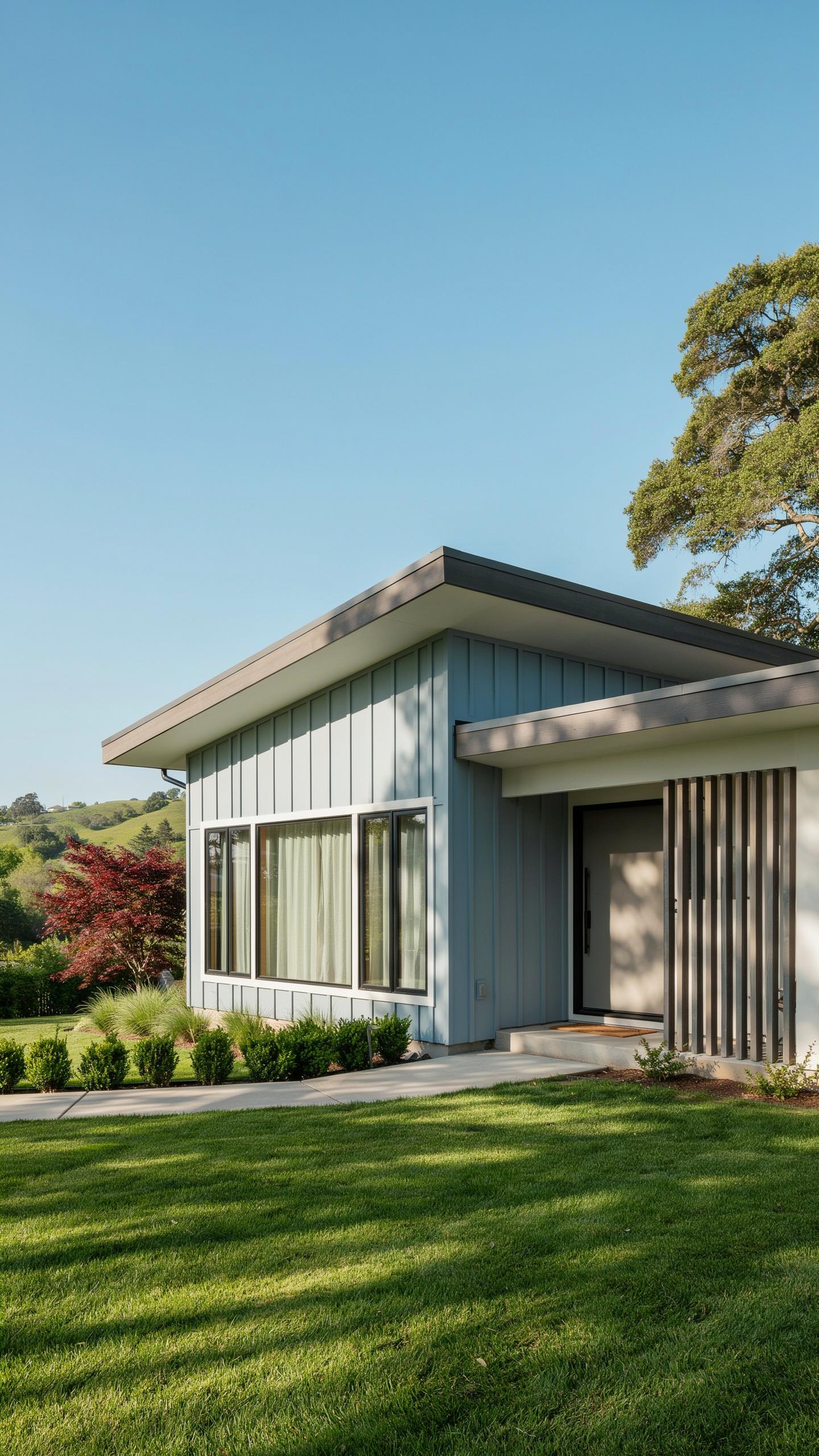
Deep charcoal gray delivers visual weight without heaviness. The color emphasizes horizontal lines and geometric forms that define mid-century architecture. Charcoal reads as intentional and grounded. Paired with white trim, it creates stark contrast that sharpens a home’s angular features and clean edges.
Slate gray functions as a neutral backdrop for natural materials. Wood siding, stone accents, and metal fixtures pop against this dark foundation. The color resists showing dirt and maintains its appearance over time. This practical advantage made slate gray a preferred choice among mid-century homeowners seeking low-maintenance exteriors.
Cool Steel Blues And Coastline Inspired Hues
Muted blues dominated mid-century coastal and suburban developments. These cool tones reflect sky and water, creating visual continuity with the environment. Steel blue and dusty blue shades avoid the brightness of pure primary blue. The restraint keeps the home grounded while maintaining the calming effect these cool tones provide.
Blue-gray hybrids bridge cool and neutral territory. These shades work across multiple architectural styles and landscapes. They complement both modern materials like aluminum and classic materials like brick. Cool blues maintain their sophistication without demanding bold landscaping or accent colors to balance the exterior.
Creating Contrast With Mid Century Modern Exterior Paint Palettes
Selecting High Contrast Trim To Frame Architectural Lines
Crisp white or obsidian black trim defines your home’s structural geometry. Mid century modern design emphasizes clean lines and horizontal planes. Strategic trim placement outlines your roofline and underscores the asymmetrical forms that define the movement. This contrast sharpens the visual impact of your primary wall color and draws the eye along architectural edges.
The contrast method works because it separates planes visually. White trim against warm earth tones creates depth. Dark trim against lighter walls emphasizes form. Your trim becomes a design tool that amplifies what makes mid century architecture distinctive. Choose trim colors that oppose your wall color on the value scale for maximum effect.
Color is a creative element, not a decorative one, and the right hue can wrap a home in a timeless embrace.
Blending Paint With Rich Redwood And Warm Cedar Accents
Natural timber integrates with exterior paint colors to humanize modern forms. Redwood and cedar slats soften the hard edges of concrete, steel, and stucco common to mid century homes. Stained wood introduces warmth that cooler paint palettes need. Strategic placement of timber elements prevents your exterior from feeling sterile or cold.
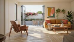
Timber accents solve a functional problem in mid century design. Modern forms can read as austere without material variety. Cedar and redwood weaken the austerity by introducing organic texture and warmth. These materials age visibly over time, adding character that paint alone cannot provide. Natural wood works best on soffits, fascia, privacy screens, and accent walls.
Bold Accent Choices For Midcentury Home Exterior Paint Colors
Iconic Door Colors Of The Mid Century Era
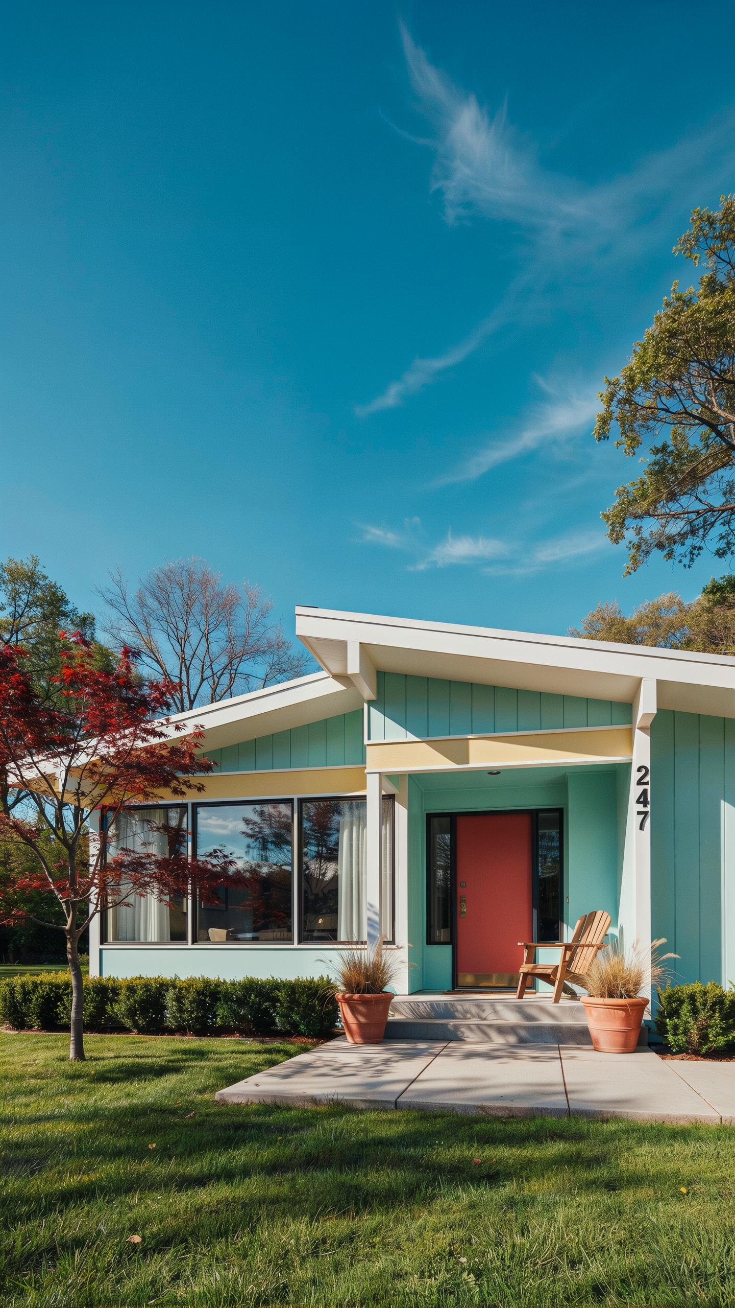
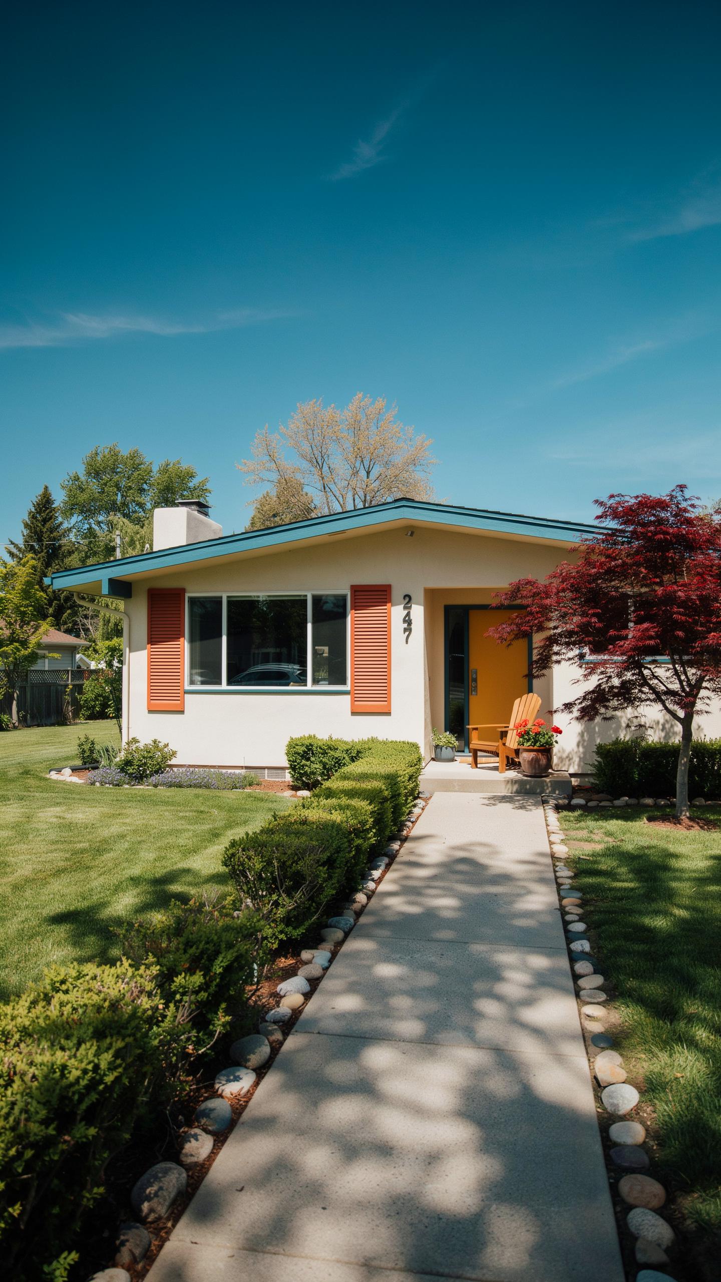
Your front door serves as the primary focal point for color expression on a midcentury home. The mid-century period, spanning roughly the 1940s through 1960s, embraced bold color choices that departed from traditional neutral aesthetics. Doors provided homeowners with a controlled way to introduce vibrant hues without overwhelming the entire facade.
- Mustard Yellow: A warm, earthy yellow that appeared frequently on 1950s residential doors, offering visibility and welcoming appeal without aggressive intensity.
- Chartreuse: A yellow-green hybrid popular in the 1960s, representing the era’s embrace of experimental color combinations and modern sensibilities.
- Atomic Orange: A bright orange tone reflecting the space-age optimism of the 1950s and 1960s, commonly paired with minimalist door hardware.
- Electric Turquoise: A blue-green shade that captured the period’s fascination with cool, modern tones and contemporary color theory.
- Coral Red: A softer alternative to pure red, this shade appeared on midcentury homes seeking warmth without the formality of traditional burgundy.
Door color selection communicated both style and intent to visitors. Midcentury homeowners selected these shades deliberately to signal modernity and confidence in their design choices. These colors remain functionally sound choices today because they reference genuine historical practice rather than invented trends.
Using Accent Walls To Highlight Structural Supports And Beams
Carport beams, exposed posts, and fascia boards represent often overlooked opportunities for secondary color application. Midcentury architects frequently exposed structural elements as design features rather than concealing them. These components offer natural canvases for contrasting paint that emphasizes the home’s geometric framework and construction logic.
Painting structural supports in a contrasting tone creates visual hierarchy without altering the primary facade color. A home with cream siding and dark brown beams emphasizes the architectural skeleton and draws attention to the design’s underlying structure. This strategy works because it echoes the period’s interest in honest material expression and visible construction methods. Strategic accent placement on support elements requires less paint than full walls while delivering significant visual impact through careful color relationships.
Cooperating With Nature Mid Century Home Exterior Colors And Landscaping
Choosing Hues That Complement Xeric Landscapes And Succulents
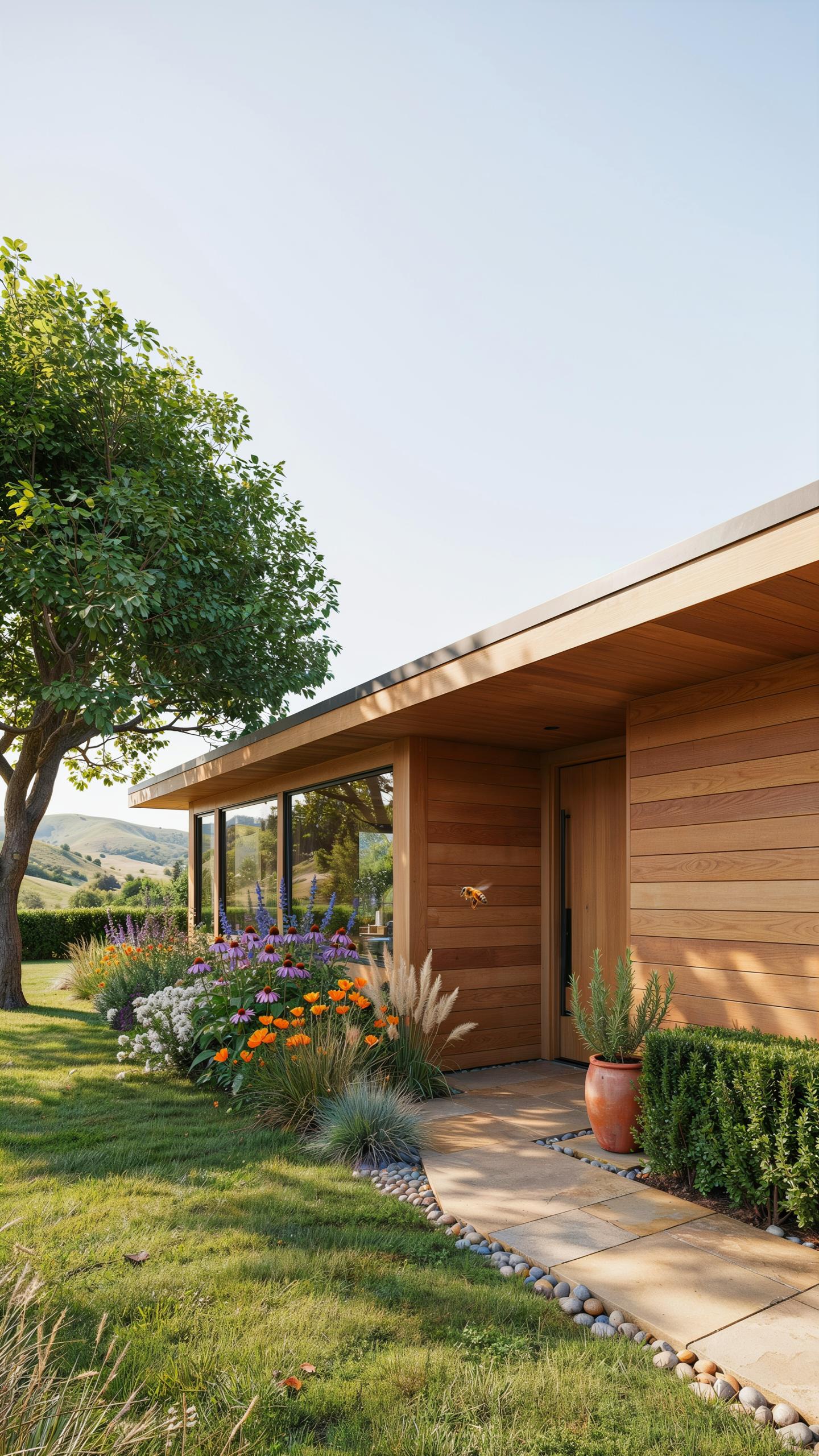
Arid climates demand exterior colors that work with, not against, the natural environment. Light sand tones, off-whites, and warm grays reflect heat and blend with desert soil. Sage green and muted taupe siding coordinate with native plantings and gravel surfaces. These palettes reduce visual conflict between structure and landscape, creating cohesion without maintenance-heavy color schemes.
Mid century architects understood that xeriscaping required strategic color choices. Pale exteriors prevent the home from appearing as an isolated object in sparse terrain. Soft neutral bases allow sculptural elements like cacti and ornamental grasses to command visual attention. This approach maximizes curb appeal while supporting drought-resistant landscaping goals.
Integrating Native Shrubbery And Forest Canopies
Homes positioned under tree cover face natural shading that washes out lighter colors. Mid century builders in forested regions chose deeper siding values to maintain visual weight and definition. Charcoal, forest green, and warm gray tones prevent the structure from fading into shadows. This strategy keeps architectural details visible despite reduced sunlight exposure.
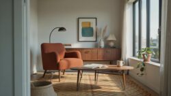
Coordinate your base color to the canopy density on your property. Dense overhead shade demands richer, more saturated exterior colors than open lots. Test paint samples at different times of day to see how shifting light affects appearance. Strategic color selection ensures your home reads as intentional and grounded, not diminished by landscape context.
Selecting Exterior House Paint Color Combinations Modern Mid Century Designers Love
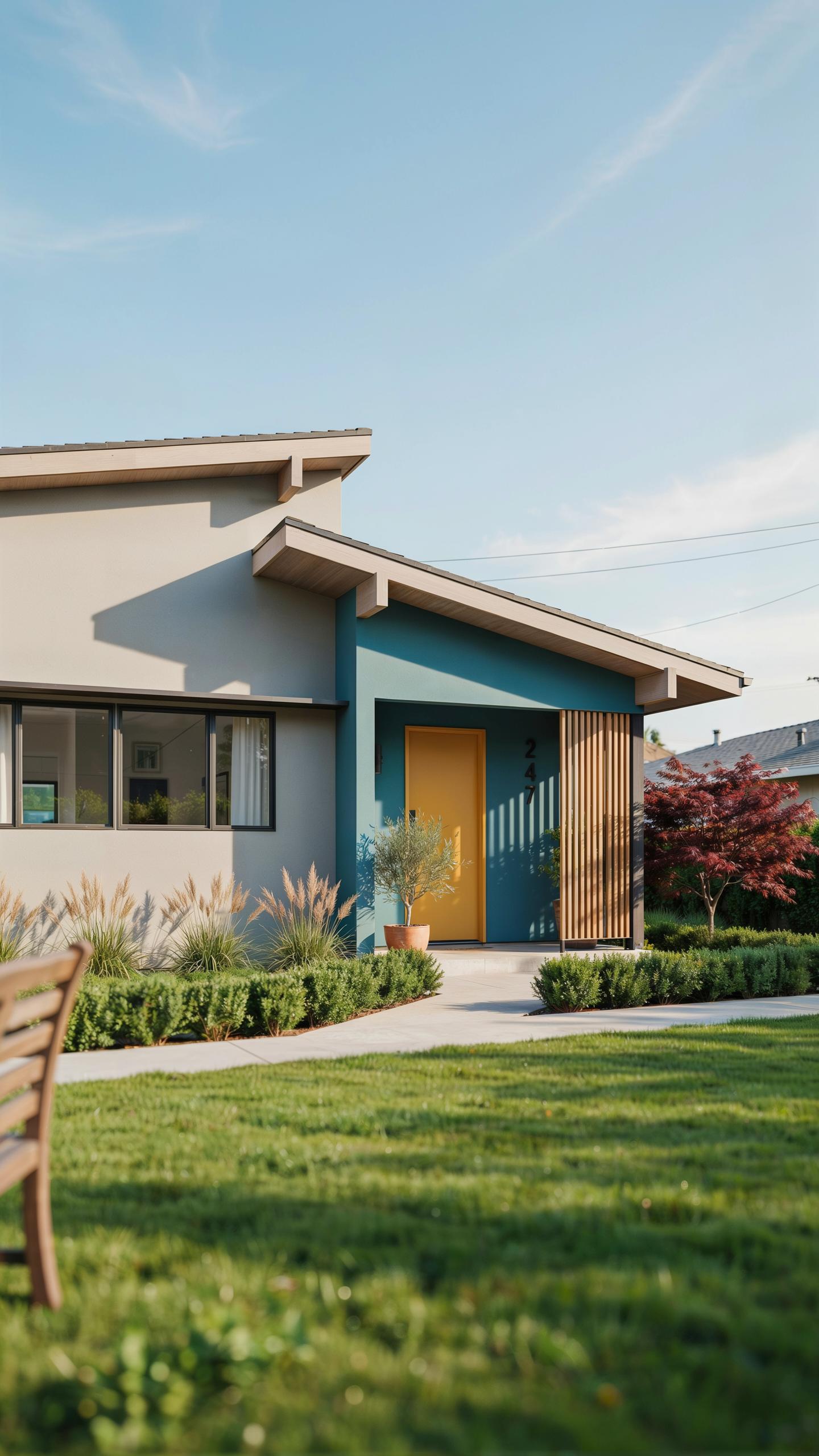
A Curated List Of Historic Triple Tone Color Palettes
Mid century homes thrive on structured color logic. The three-part system works because it organizes visual hierarchy. Your dominant body color covers the largest surface area. The trim color defines edges and architectural lines. The accent shade highlights doors, shutters, or soffits. This framework prevents color chaos while maintaining period authenticity.
- Charcoal Body with Cream Trim and Teal Accent: Deep charcoal grounds the home while warm cream trim prevents harshness. Teal accents on doors echo mid century modernism and add intentional visual interest without overwhelming the facade.
- Soft Gray Body with White Trim and Burnt Orange Accent: Light gray provides neutral sophistication. Crisp white trim clarifies architectural details. Burnt orange on entry doors or window frames channels 1950s ranch authenticity.
- Warm Tan Body with Ivory Trim and Slate Blue Accent: Tan creates welcoming warmth. Ivory trim offers contrast without jarring severity. Slate blue accents on shutters or garage doors ground the palette in period design.
- Sage Green Body with Linen Trim and Charcoal Accent: Sage connects to mid century organic design trends. Linen trim softens the look. Charcoal accents strengthen definition and add contemporary edge.
- Brick Red Body with Cream Trim and Olive Green Accent: Brick red references authentic period masonry. Cream trim brightens the elevation. Olive green accents complement warm undertones throughout.
Triple tone palettes solve the coordination problem outright. Designers use this method to achieve cohesion without overthinking. Each color serves a specific function on the home’s exterior. The system scales to different architectural styles within the mid century era. Implementation becomes straightforward once you lock in your three colors.
Balancing Dark Bases With Soft Creamy Undertones
Dark navy or charcoal body colors demand careful trim selection. Pure white creates visual shock and strips warmth from mid century homes. Creamy off whites, warm alabaster, and light grays soften the contrast instead. This approach maintains definition while keeping the palette inviting. The trim becomes a bridge between dark and light rather than a harsh dividing line.
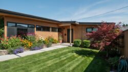
Undertone matching determines success or failure in this strategy. Warm alabaster works better than cool whites when your base is warm charcoal. Light grays with yellow or beige undertones complement navy bodies effectively. Test paint samples on your actual exterior in different lighting conditions. Morning sun and afternoon shadows reveal how colors interact with your specific home. The goal is contrast that feels intentional, not clinical or uninviting.
Practical Restoration Tips For Mid Century Modern Home Exterior Paint Colors
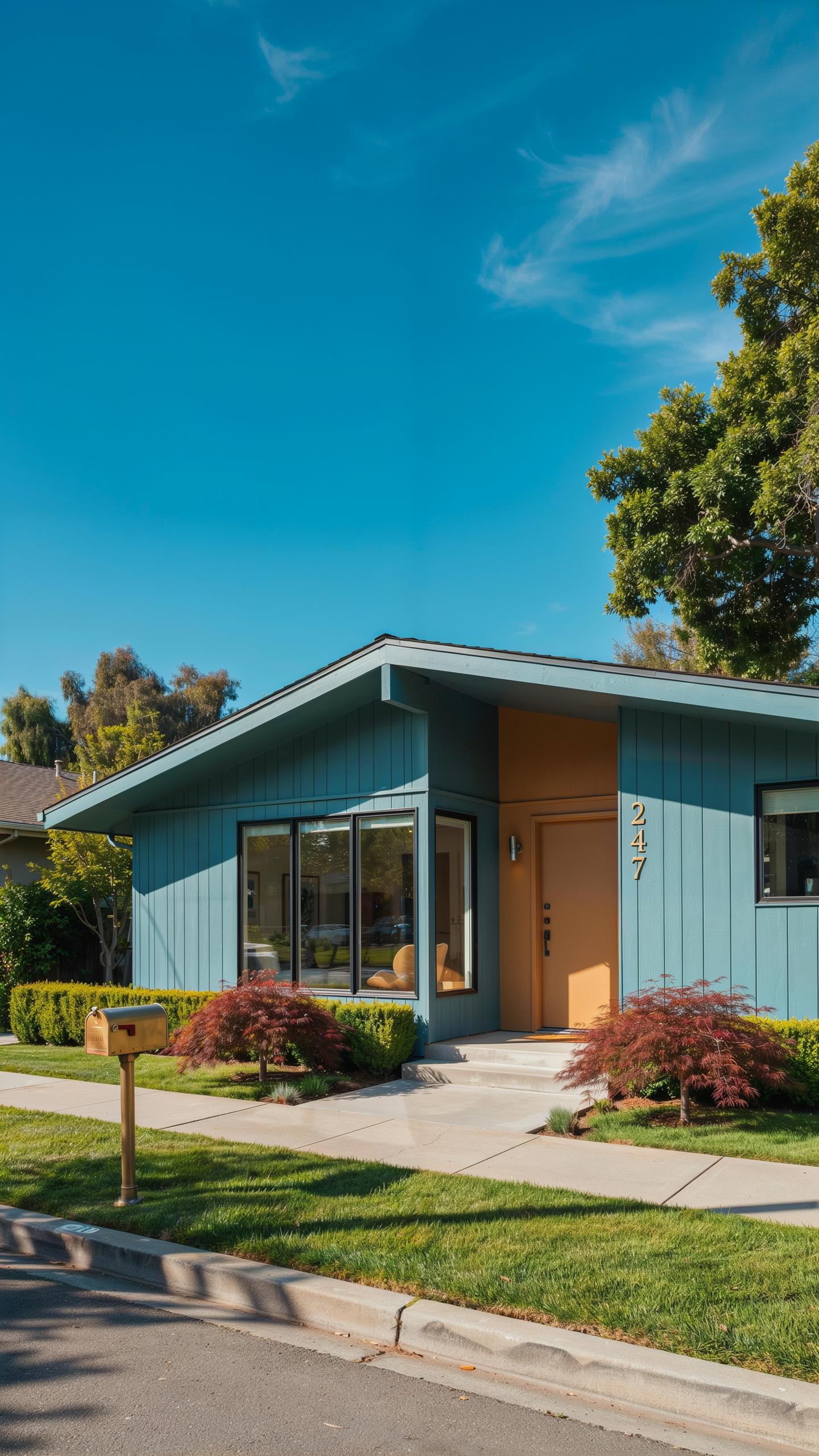
Sourcing Authentic Historic Swatches And Modern Match Equivalents
Original paint manufacturers from the 1950s and 1960s documented their color formulations. Research these through the Smithsonian, architectural archives, and period-specific design books. Benjamin Moore, Sherwin-Williams, and Behr now offer dedicated mid-century collections that replicate these historical hues with modern paint chemistry for better durability and coverage.
Modern paint technology allows accurate color matching without sacrificing authenticity. Digital spectrophotometry can analyze original paint chips from your home’s previous layers. Work with a paint specialist who understands mid-century palettes to ensure your chosen color reflects the actual design intent of that era rather than contemporary interpretations.
Preparing Stucco, Siding, And Brick For Long Lasting Durability
Inspect all exterior surfaces for cracks, water damage, and material deterioration before any paint application. Board and batten siding requires caulking at joints to prevent moisture infiltration. Stucco needs patching of any holes or spalling areas. Brick should be cleaned and assessed for repointing needs. These repairs form the foundation of a durable finish that lasts decades.
Apply a high-quality primer rated for your specific substrate after repairs cure fully. Use flat finishes on stucco to maintain authentic mid-century appearance while satin finishes work well on siding and brick for added protection. Primer blocks stains and ensures even color coverage. Quality primers prevent future paint failure and shield against UV damage and moisture, protecting your investment over time.
Frequently Asked Questions

What are the most popular mid century home exterior paint colors for a welcoming look?
To achieve a cozy vibe, homeowners often lean toward earthy palettes. Warm grays, muted olives, and deep teals are classic choices that ground the architecture. Using these mid century home exterior paint colors helps blend the structure with surrounding nature, while a pop of mustard yellow or burnt orange on the front door adds that iconic retro charm. These combinations offer a sophisticated yet inviting street presence for any vintage-inspired residence.
How do I choose the right accent colors for my mid-century modern home?
Start by identifying the natural materials of your home, such as stone or wood siding. Use your primary mid century home exterior paint colors on large surfaces like stucco, then select a contrasting shade for the trim and eaves. A three-color rule works best: a neutral base, a darker trim, and a vibrant “look-at-me” hue for the entryway. This balanced approach highlights the clean, geometric lines synonymous with mid-century design.
Is it possible to update my home’s exterior on a limited budget?
Absolutely! You can transform your facade without a full renovation by focusing on high-impact areas. Refreshing just the trim and the front door with authentic period shades can make an incredible difference. Investing in a gallon of high-quality paint to update shutters or window frames allows you to embrace mid-century aesthetics affordably. Small, strategic color changes create a modern, cozy atmosphere while significantly boosting your property’s overall curb appeal and value.