Unveiling The Legacy Of Vintage Mid Century Modern Art Outdoors
Architectural Context
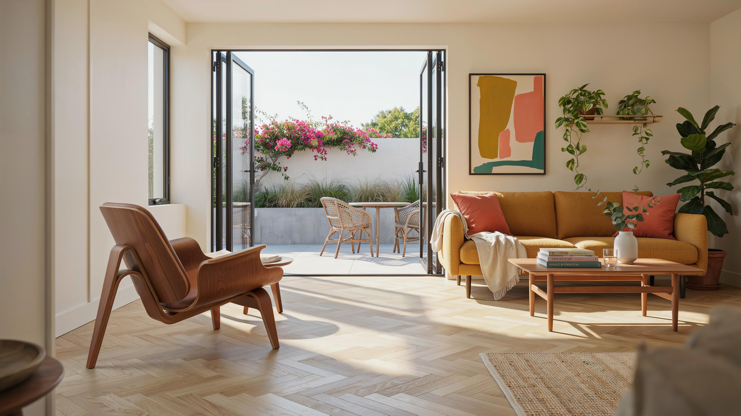
Post-war residential architecture fundamentally shifted how designers approached the boundary between interior and exterior space. Joseph Eichler pioneered this approach through his tract homes built between the 1950s and 1960s. He integrated large glass walls, open floor plans, and direct sightlines to gardens and patios. This design philosophy treated the outdoor space as an extension of the living area rather than a separate zone.
The programmatic framework Eichler established created a practical demand for outdoor art that could hold its own visually against interior pieces. Expansive glass walls meant outdoor sculptures and installations became focal points from inside the home. This integration required selecting art that worked in both natural light and as part of the larger spatial composition. The transparency of these homes made outdoor art selection a critical design decision for mid century interiors.
Sculptural Presence
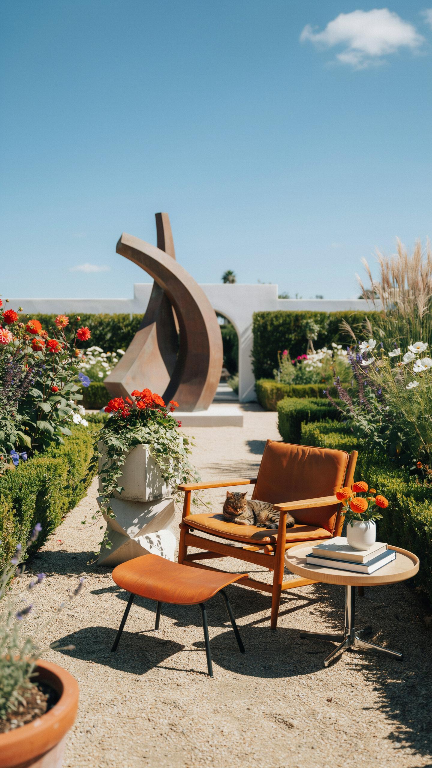
Weather-resistant outdoor sculptures grounded mid century patios with visual weight and artistic credibility. Henry Moore and Barbara Hepworth created abstract organic forms that aligned with mid century design principles. Moore’s bronze reclining figures and Hepworth’s pierced abstract forms suggested movement and natural shapes without literal representation. These sculptural approaches translated well to outdoor settings where scale, shadow, and landscape context enhanced their impact.
Selecting weather-resistant materials allowed designers to place substantive art outdoors without compromise. Cast bronze, stainless steel, and resin compositions resisted oxidation and sun exposure while maintaining aesthetic integrity. Placing a single significant sculpture on a patio created a visual anchor visible through expansive glass walls. This strategy elevated outdoor spaces from functional areas to galleries that informed the entire home’s design narrative.
Embracing The Bold Vibrancy Of Mid Century Modern Colorful Palettes
Palette Selection
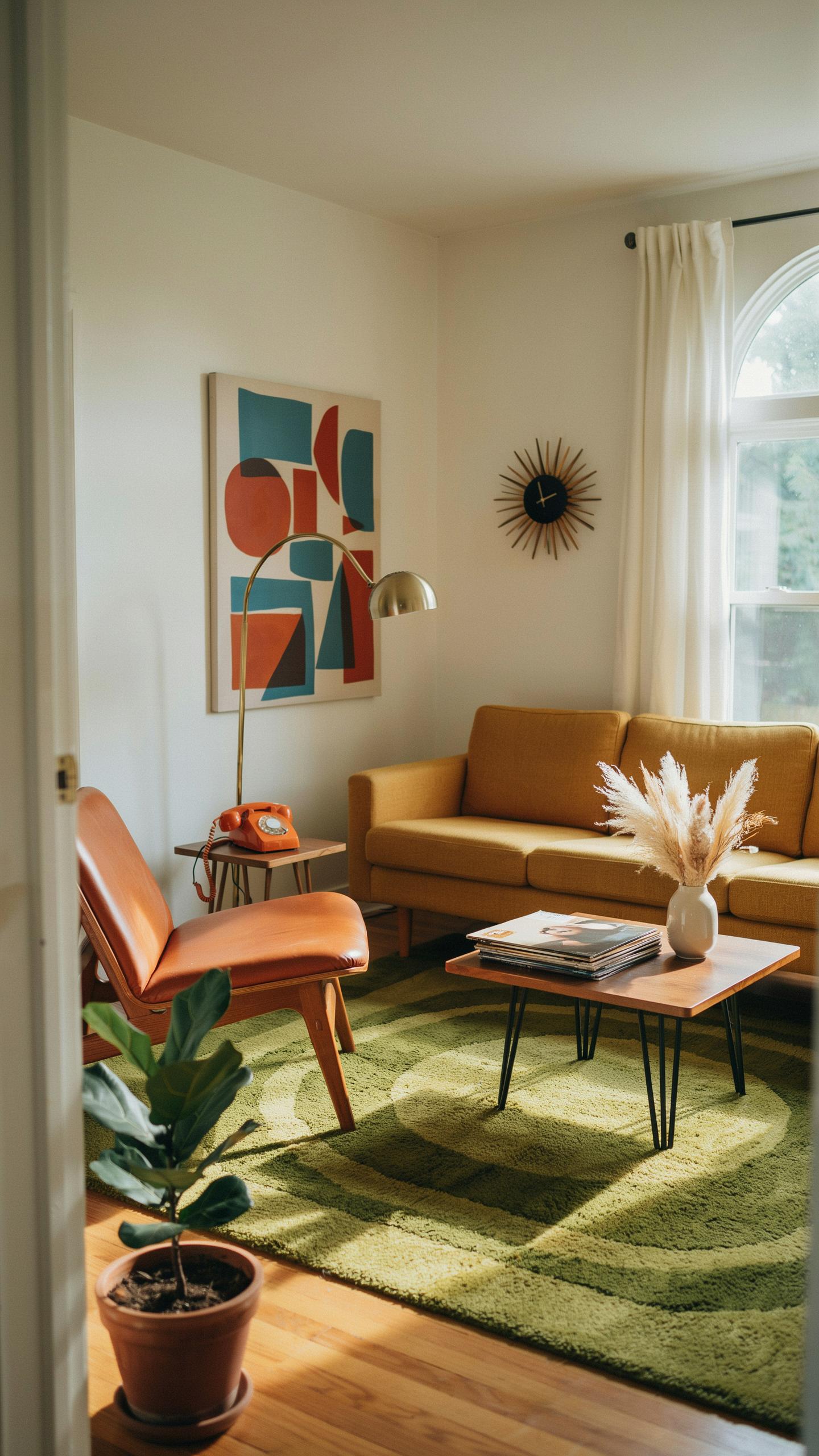
Mid century designers pulled color directly from post-war optimism and industrial manufacturing capabilities. Mustard yellow, turquoise, and tangerine dominated residential spaces from the 1950s through early 1960s. These shades reflected the era’s confidence in progress and technological advancement. Applying these colors to exterior wall art grounds your space in authentic design history while creating visual impact against architectural elements.
The color palette worked because it contrasted sharply with mid century minimalist forms. Outdoor art installations benefit from this same principle: bold, saturated hues demand attention on large surfaces. Your exterior walls become functional design statements rather than passive backgrounds. Choose colors that withstand weather exposure while maintaining their intensity over time.
Contrast Techniques
Juxtaposing geometric painted forms against natural landscape elements creates visual tension that mid century designers deliberately pursued. Green foliage serves as a neutral backdrop that amplifies the impact of bright geometric shapes. This contrast strategy originated in mid century landscape architecture, where designers used plants to frame and enhance built structures. Apply geometric patterns and vibrant shapes to your outdoor walls to replicate this calculated visual strategy.

The technique works because the human eye naturally seeks contrast and clarity. Bright geometric forms pull focus away from visual clutter in mixed outdoor environments. Paint your designs with sharp edges and defined boundaries rather than soft transitions. This directness aligns with mid century design philosophy that rejected ornamentation in favor of purposeful visual hierarchy.
Developing A Cohesive Mid Century Material Board For Exterior Spaces
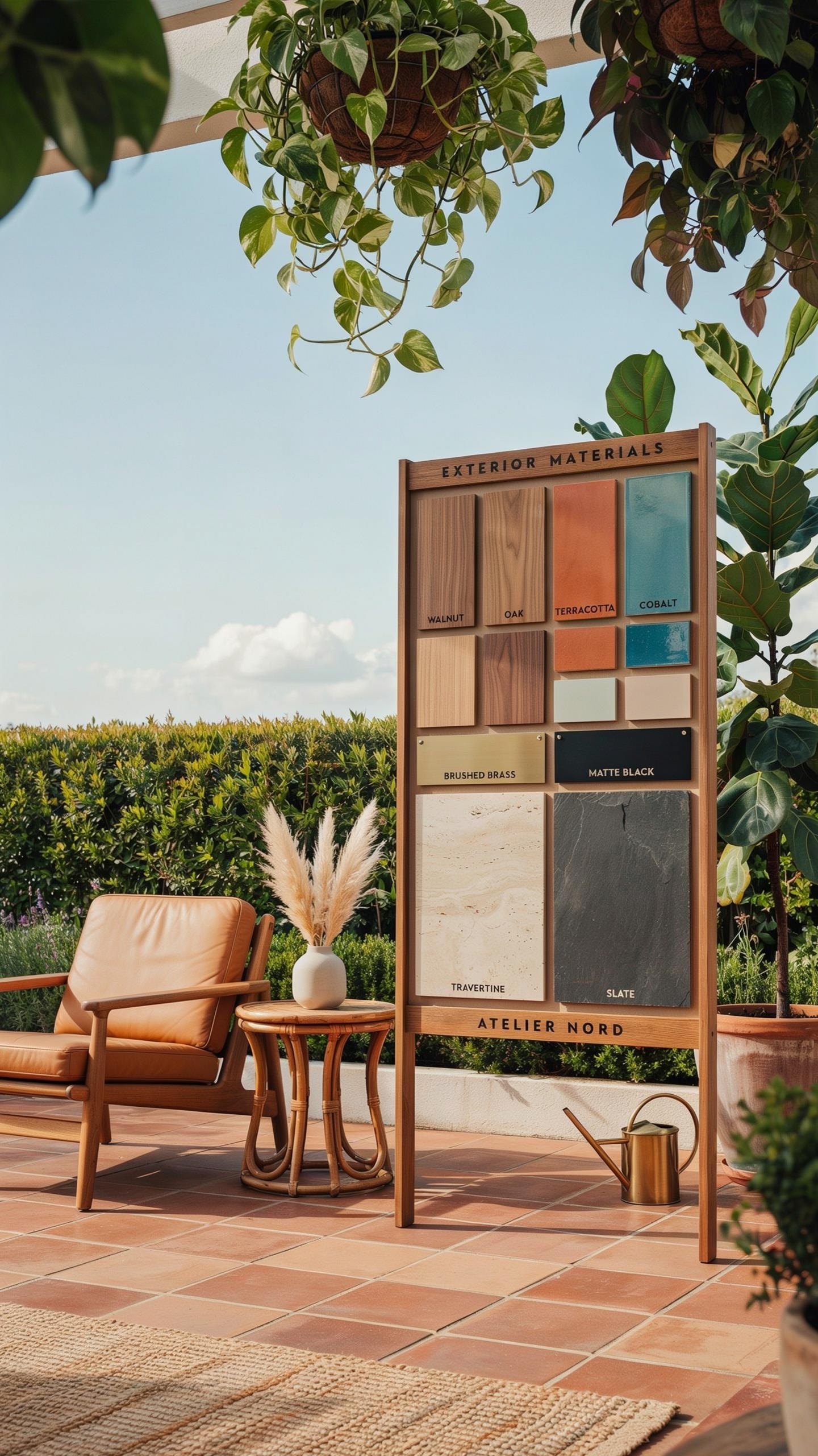
Tactile Elements List
Mid century designers understood that outdoor art demands materials that perform under exposure. The aesthetic movement prioritized honest material use, meaning you select pieces that age visibly and maintain function. Exterior installations require materials that resist moisture, UV damage, and temperature fluctuation while preserving design intent.
- Weathered Teak Wood: Naturally resists rot and weathers to silver-gray patina. Teak contains oils that provide inherent weather resistance without chemical treatment. Used extensively in mid century outdoor furniture and sculptural frames.
- Anodized Aluminum: Lightweight metal with oxidized surface that prevents corrosion. Mid century architects favored aluminum for clean lines and minimal maintenance. Available in matte finishes that align with period design language.
- Copper And Brass: Develops protective patina over time. Both metals withstand outdoor elements while creating warm color transitions. Common in mid century kinetic sculptures and wall-mounted installations.
- Terrazzo Aggregate Panels: Composite material combining marble chips with concrete binder. Resists freeze-thaw cycles and maintains polished appearance outdoors. Mid century designers used terrazzo for both functional and sculptural applications.
- Powder Coated Steel: Factory-applied finish creates durable, UV-resistant coating. Maintains color and prevents rust on exterior frames and sculpture bases. Allows matte black and neutral tones essential to mid century aesthetic.
Material selection determines longevity and visual consistency across exterior art installations. Test finishes in your specific climate zone before committing to large-scale pieces. Honest material degradation aligns with mid century design philosophy, but controlled weathering requires planning.
Industrial Materials
Wrought iron and matte black steel dominated mid century exterior design because they perform under environmental stress. These materials age predictably, developing consistent patinas that enhance rather than diminish aesthetic value. Cast concrete panels offer sculptural possibilities while maintaining structural integrity through seasonal cycles. Steel resists moisture when properly finished, and concrete’s thermal mass provides design flexibility for art installations.

Industrial materials require maintenance protocols specific to your climate. Matte black finishes need periodic sealing to prevent rust bloom in high-humidity zones. Cast concrete benefits from water-resistant sealers that preserve color without creating glossy surfaces. Wrought iron installations demand annual inspection for rust development, particularly at welded joints. This maintenance reality drove mid century designers toward materials that age gracefully rather than require constant restoration work.
Navigating The Mid Century Modern Revival In Contemporary Yards
Historical Influence
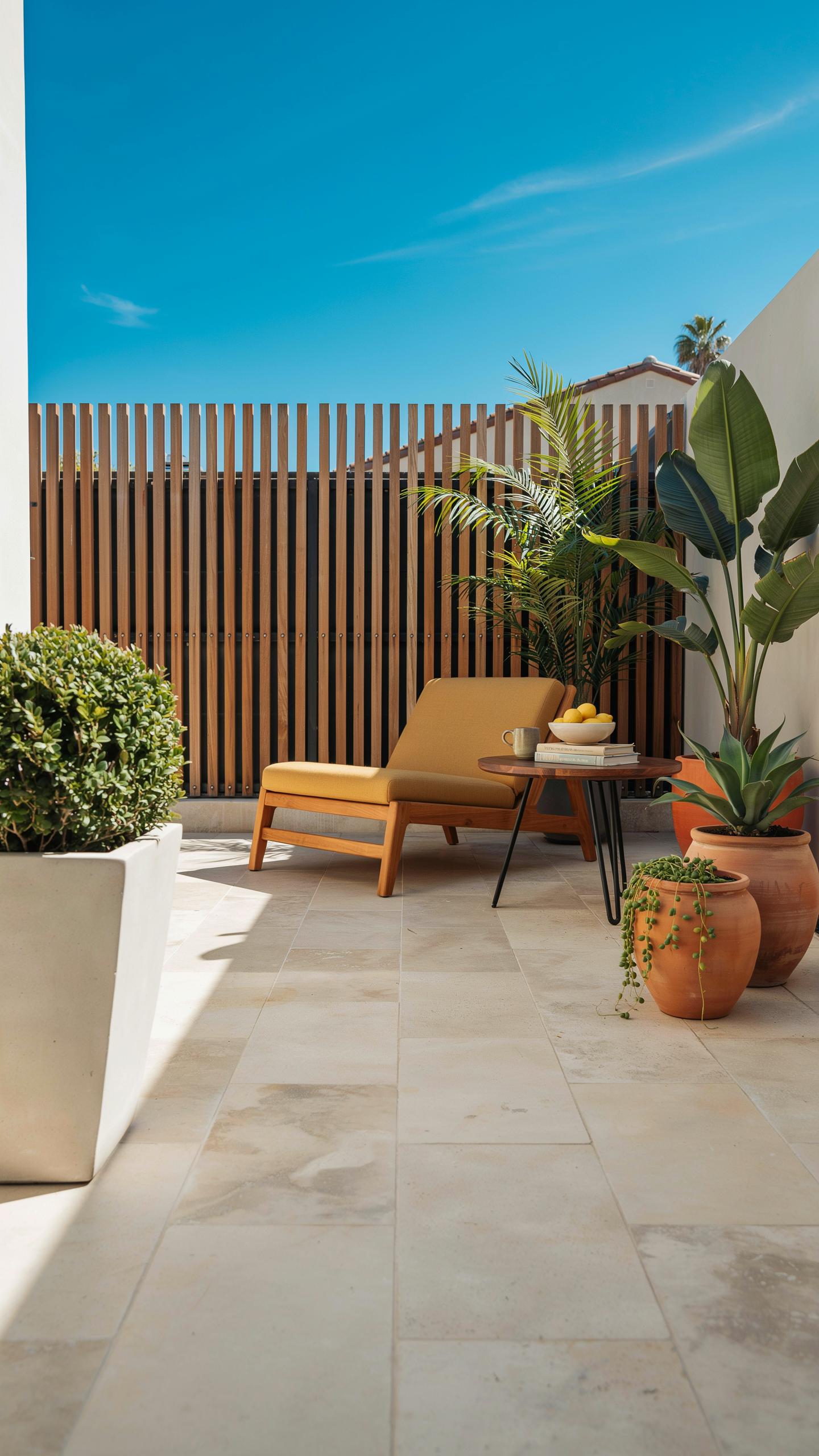
The mid-century modern movement emerged from 1945 to 1969, driven by post-war optimism and manufacturing innovation. Designers prioritized function over decoration, favoring clean lines and geometric forms. This era produced iconic art styles featuring abstract patterns, bold typography, and limited color palettes. Today’s manufacturers reverse-engineer these original works to create accurate reproductions using modern weather-resistant inks and canvas treatments. The demand for authentic mid-century aesthetics in outdoor spaces drives production of fade-resistant prints that maintain color integrity under UV exposure for years.
Original mid-century prints utilized lithography and silkscreen techniques that defined the era’s visual language. Modern reproduction technology now captures these methods’ essence while adding protective sealants unknown in the 1950s and 1960s. Manufacturers study museum archives and private collections to ensure geometric accuracy and color fidelity. This research-backed approach means contemporary outdoor art selections deliver genuine mid-century character without sacrificing durability. Homeowners gain access to period-accurate aesthetics previously impossible to maintain in outdoor environments.
Blending Eras
Authentic vintage mid-century silhouettes feature specific design markers: tapered furniture legs, sunburst motifs, and abstract geometric compositions. Pairing these forms with contemporary moisture-resistant fabrication creates functional outdoor installations. Modern canvas treatments include acrylic-latex bases and UV-protective topcoats that preserve image quality. This combination honors original design intent while solving practical outdoor challenges. The result is outdoor art that reads as genuinely mid-century while performing reliably in harsh weather conditions.
Contemporary fabrication methods allow designers to scale vintage silhouettes to fit modern terrace dimensions without distorting proportions. Weather-sealed substrates replace paper and canvas, maintaining color saturation through seasonal exposure cycles. Hardware selections now use stainless steel and powder-coated aluminum instead of traditional materials. This technical advancement enables mid-century aesthetics to dominate outdoor spaces as primary design elements rather than supplementary accents. Homeowners construct cohesive mid-century outdoor environments that integrate art, furniture, and architectural details seamlessly.
Practical Mid Century Modern Ideas For Patio Art Walls
Focal Points
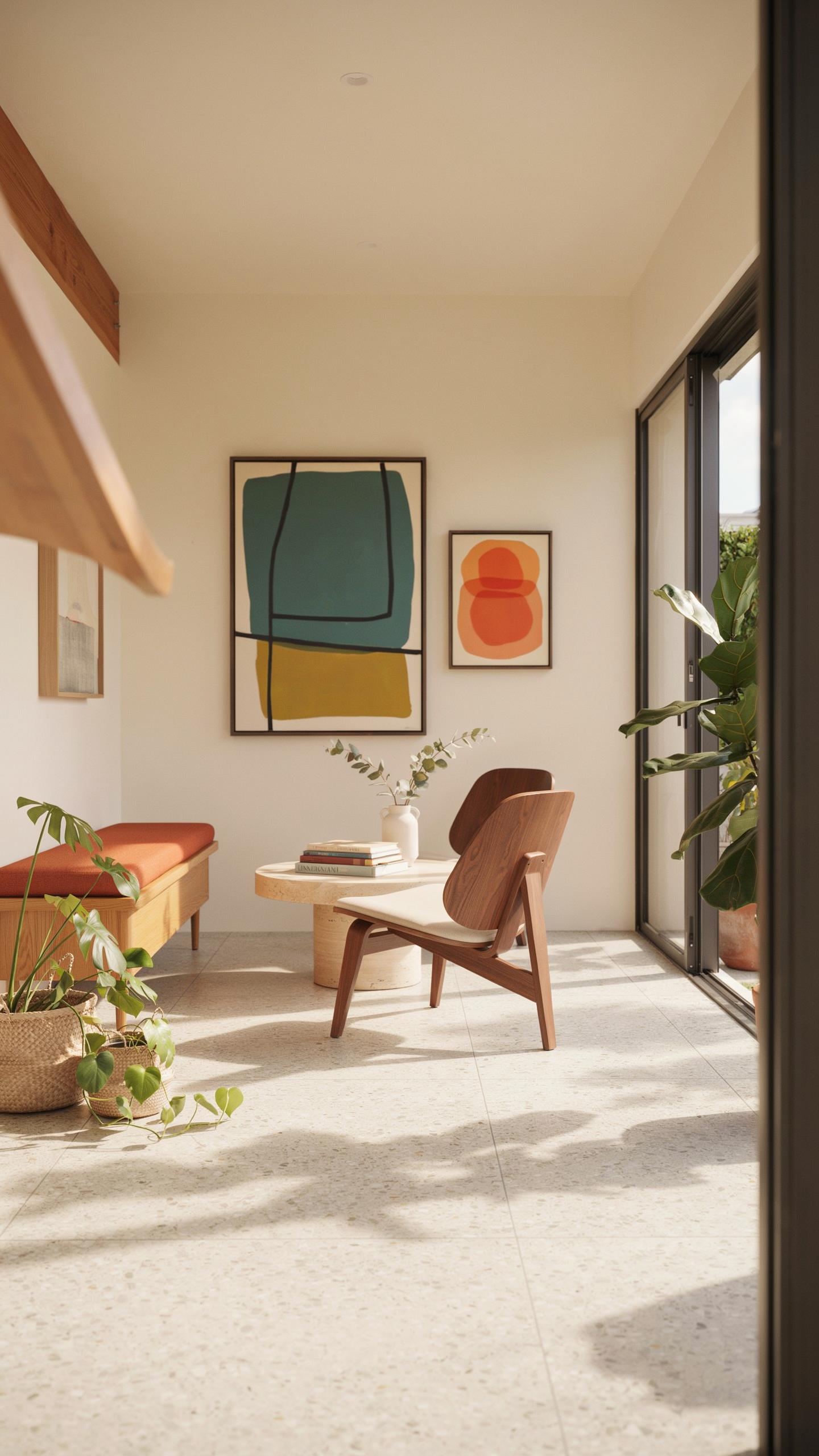
Select one exterior wall as your primary display surface. This wall becomes the anchor for large-scale canvas reproductions featuring abstract compositions. Rothko’s color field paintings translate effectively to outdoor settings because the work relies on color relationships rather than representational imagery. The scale matters—aim for pieces between four and six feet in width to command visual attention from seating areas.
Use marine-grade or outdoor-rated canvas materials to withstand weather exposure. Standard canvas degrades quickly outdoors. Reproductions printed on acrylic or polyester substrates rated for exterior use maintain color saturation and resist UV fading far longer than traditional canvas. Mount the work twelve to eighteen inches from the wall surface to allow air circulation behind the piece and reduce moisture accumulation.
Interior design should not stop at the back door, for the transition between the house and the garden should be invisible.
Lighting Integration
Plan low-voltage LED systems into your patio layout before finalizing furniture placement. Position uplighting fixtures two to three feet from the wall base, angled upward at forty-five degrees. This replicates gallery lighting techniques that emphasize texture and color without creating harsh shadows. LED systems run on twelve-volt transformers, reducing electrical complexity and cost compared to standard line voltage.

Integrate lighting controls into existing outdoor systems or install a dedicated circuit with a dimmer switch. Dimming capability matters because it shifts the visual impact of abstract work throughout evening hours. Lower light levels create intimacy while higher settings emphasize compositional details. Install fixtures on separate switches so you can light the art independently from general patio illumination.
Selecting Weatherproof Mid Century Home Decor Prints And Panels
Substrate Material
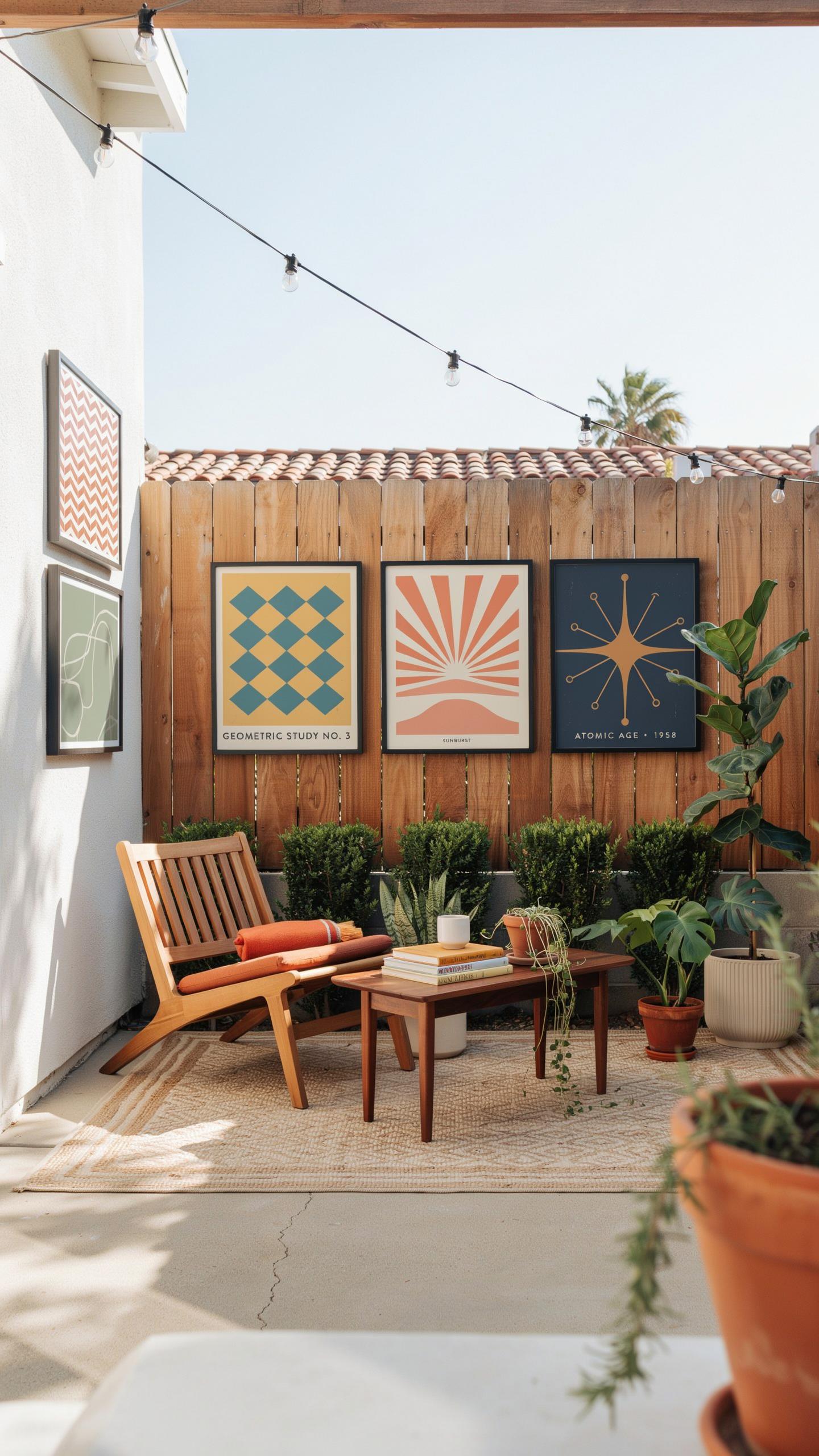
Aluminum composite panels and high-pressure laminates serve as the foundation for outdoor mid century art displays. These materials resist UV degradation, moisture absorption, and thermal expansion that destroys paper-based prints. Aluminum composite construction creates a stable base that prevents warping and color shift under direct sunlight exposure.
The laminate layer bonds to the aluminum core, creating a unified structure that handles temperature fluctuations without separation or buckling. High-pressure laminates offer superior scratch resistance compared to standard printed surfaces. This combination extends print longevity from months to years in outdoor environments where traditional framing fails.
Framing Solutions
Open-frame formats eliminate moisture traps that compromise mid century artwork in humid outdoor settings. Marine-grade stainless steel borders provide structural support while resisting rust and corrosion from rain and salt exposure. This framing approach keeps prints visible without the glass reflections that obscure artwork and create glare in daylight.

Stainless steel hardware and fasteners maintain integrity in wet climates where standard steel corrodes within months. The open design allows air circulation behind panels, preventing condensation buildup that leads to mold and image degradation. Mount panels flush against walls or use spacers to create intentional gaps for weathering and drainage.
Curating Kinetic Sculptures And Mid Century Ideas For Movement
Calder Influence
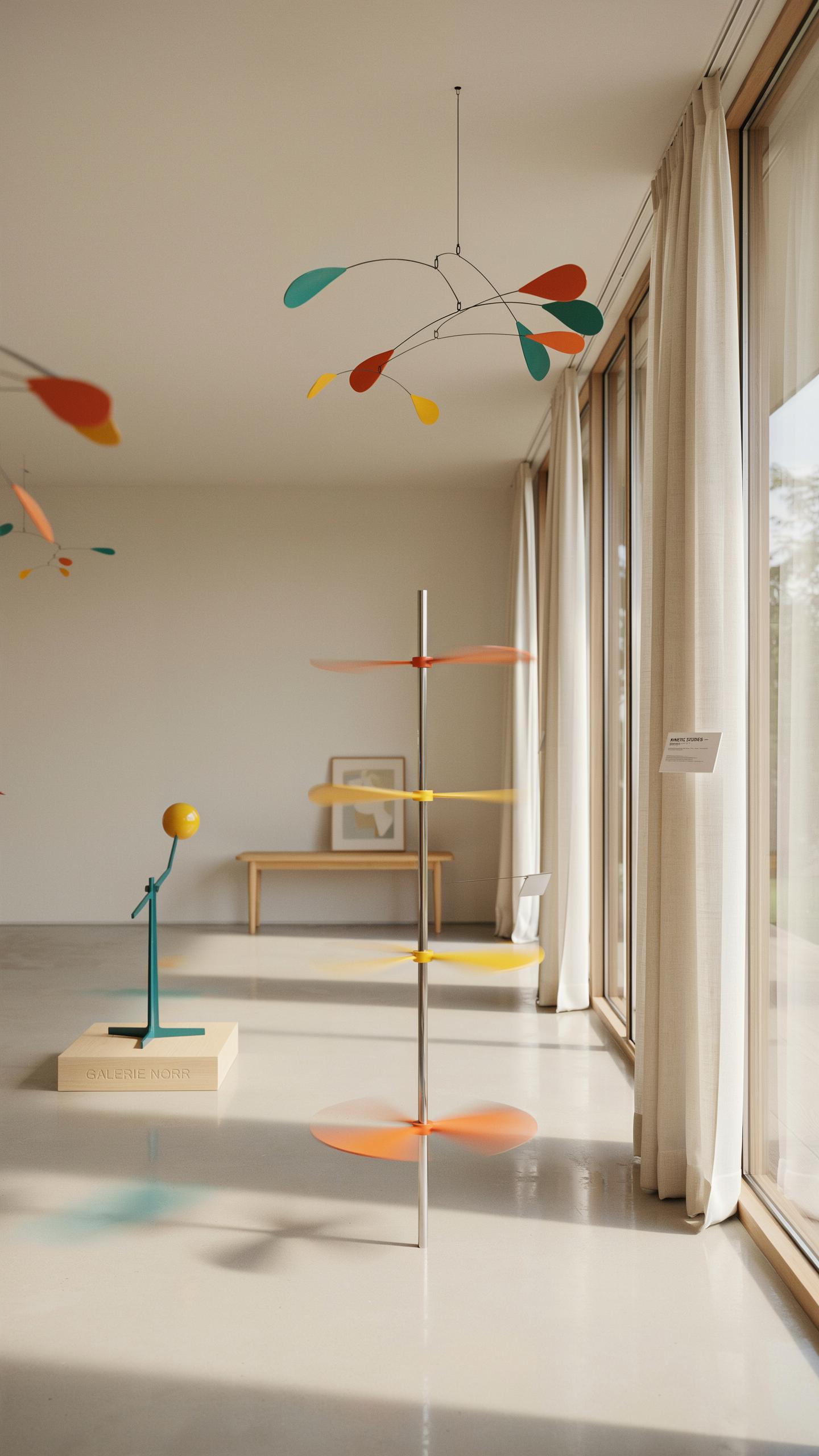
Alexander Calder pioneered mobile sculptures in the 1930s, combining abstract forms with movement principles. His work merged art with physics, creating pieces that respond to air currents and hand manipulation. Sheet metal construction became his signature technique. Outdoor versions translate this concept to deck spaces where natural wind drives constant visual change without mechanical intervention.
Calder’s mobiles work tactically in outdoor settings because they demand zero maintenance while delivering continuous visual interest. Position them where afternoon light creates moving shadows across deck surfaces and seating areas. The interplay between sculpture, shadow, and changing light angles creates depth without cluttering sightlines. This approach maintains the clean aesthetic central to mid century design philosophy while introducing the movement principle that defined Calder’s contribution to modern art.
Structural Balance
Steel balance sculptures operate through counterweight positioning, a principle mid century designers borrowed from engineering and mathematics. Place these pieces near water features where reflections multiply their visual presence and shifting light patterns amplify their impact. Breeze patterns interact with these structures differently than mobiles, creating subtle tilts and minute adjustments rather than sweeping rotations. The result reads as controlled rather than chaotic.

Water proximity serves multiple tactical functions in outdoor mid century design. Reflective surfaces double the sculpture’s visual footprint while creating layered depth perception. Balanced sculptures near water catch and redirect natural light patterns throughout the day. This positioning creates focal points that draw the eye without overwhelming the deck space, maintaining the purposeful restraint that defines authentic mid century aesthetic principles.
Harmonizing Mid Century Interior Colors With The Natural Landscape
Color Palette List
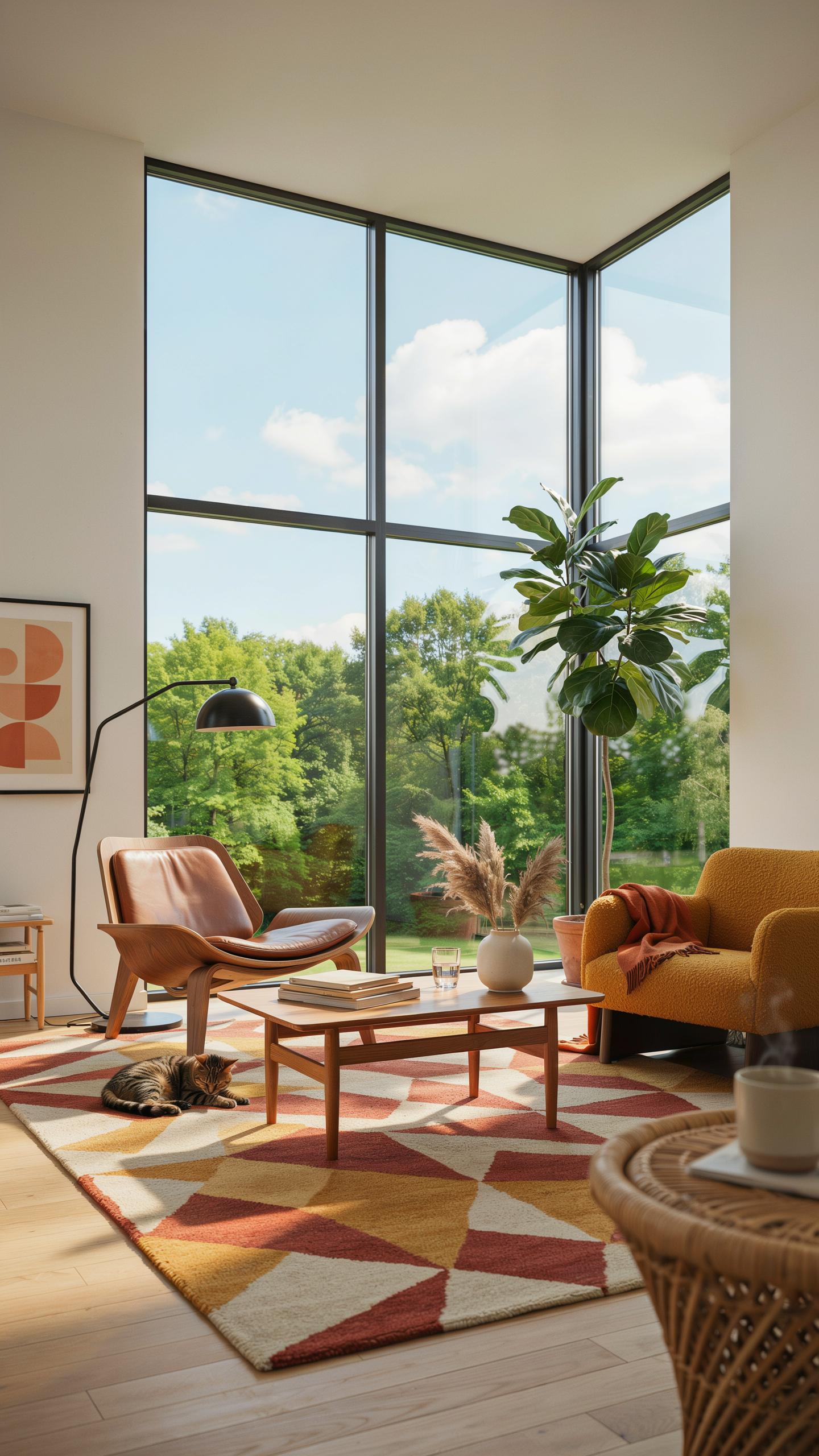
Mid century design used specific color families that connect indoor and outdoor spaces through intentional repetition. Designers of the 1950s and 1960s understood that visual continuity reduces friction between rooms and yards. The palette you select indoors should anchor to natural materials visible through windows and doors.
- Warm Grays with Charcoal Accents: Ground your interior with soft gray walls that echo concrete patios and stone pathways. This neutral base holds mid century furniture without competing for attention.
- Burnt Orange and Rust Tones: Pull these earth hues from exterior brick and clay elements. Use them as accent colors on upholstery or artwork to bridge the interior-exterior boundary.
- Teal and Deep Blue: Reference water features and sky views. Mid century designers paired these colors with natural wood to create visual rest points from busy outdoor landscapes.
- Mustard and Ochre Yellow: Connect to autumn foliage and dried grasses in your yard. These warm tones appear in mid century textiles and pair cleanly with walnut or teak furnishings.
- Deep Forest Green: Match interior accent walls to evergreen plantings or hedges. This color stabilizes a room while maintaining sight lines to the garden beyond.
Your color selections must function in both daylight and artificial lighting. Test paint samples at different times to ensure they read the same indoors and through windows to the exterior.
Complementary Tones
Wood tones define mid century interiors and determine how effectively your space connects to the landscape. Walnut and teak were dominant choices during the 1950s and 1960s because they reflected the period’s embrace of natural materials. These warm browns work specifically well against exterior brick and copper elements.
Match your interior wood furniture directly to visible outdoor materials through intentional sight lines. If your patio features terracotta pavers or rust colored brick, select art and accent pieces that echo these hues on the interior. This creates visual continuity without requiring matching materials. The eye traces from your sofa through the window frame to the garden with no jarring color shifts.
Choosing Mid Century Modern Wood Colors For Structural Art Frames
Wood Species Selection
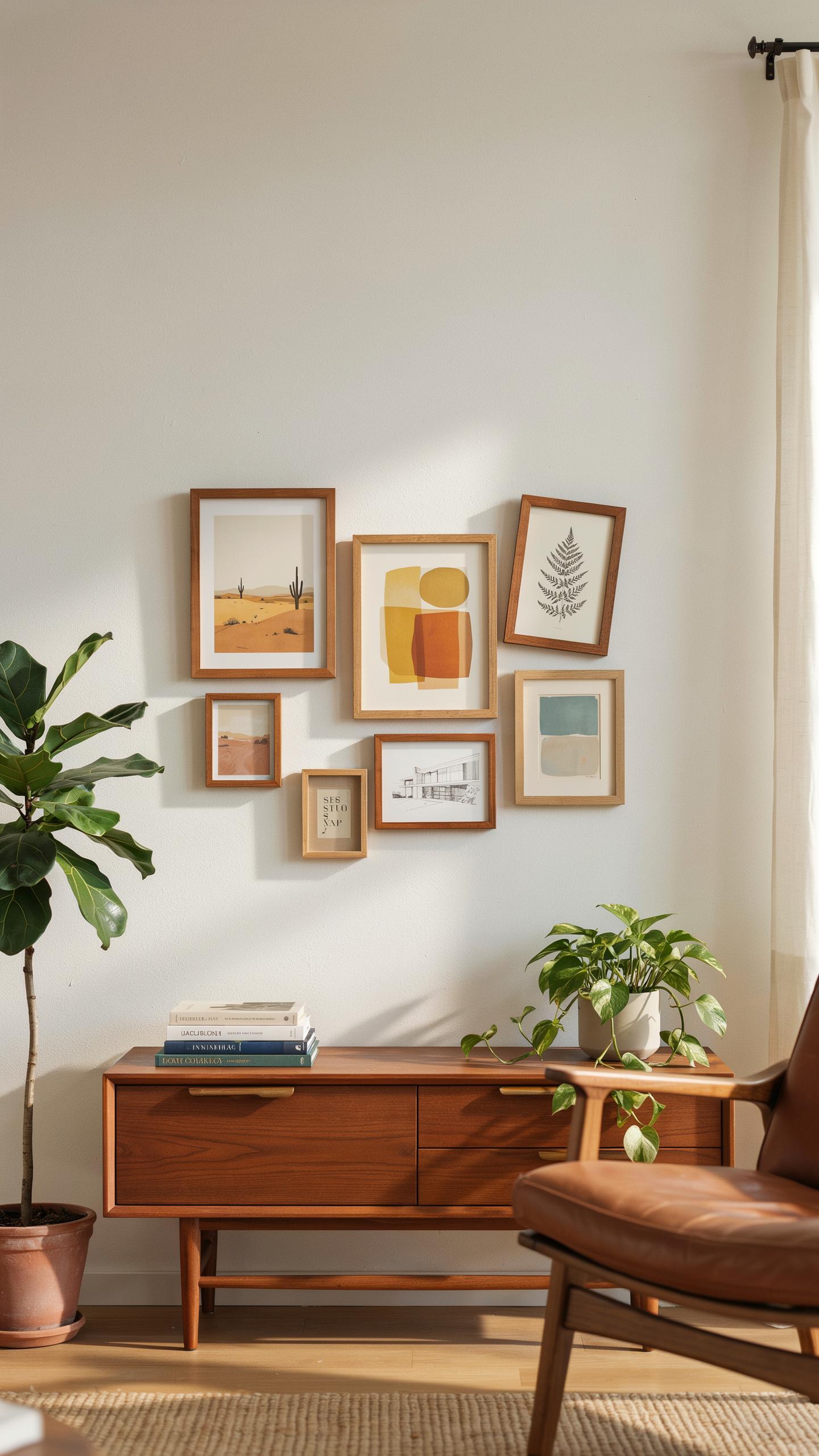
Teak, redwood, and modified eucalyptus deliver the warm tones mid century design demands while resisting outdoor decay. These woods replicate the rich walnut aesthetic of 1950s and 1960s interiors without failing to rot. Their natural density and oil content provide inherent weather resistance. Select teak for superior longevity and color stability over decades of exposure.
Redwood offers a cost-effective alternative with decent durability in dry climates. Modified eucalyptus, treated through thermal or chemical processes, improves rot resistance beyond untreated stock. Match grain patterns and color depth across multiple frames for visual cohesion. Wood selection directly impacts maintenance frequency and frame lifespan in outdoor applications.
Sealant Techniques
Marine-grade varnishes with UV inhibitors are non-negotiable for external wooden art installations. These formulations block ultraviolet rays that cause graying and accelerate wood breakdown. Standard interior varnishes fail rapidly outdoors due to moisture penetration and thermal cycling. Apply sealant in thin, even coats following manufacturer specifications for cure times and recoat intervals.
UV inhibitor technology prevents chromatic shift in wood tones over months of sun exposure. Reapply sealant every two to three years depending on climate intensity and direct sun hours. Inspect frames annually for varnish failure, checking for peeling, cracking, or water staining. Early resealing prevents costly structural damage and maintains the frame’s mid century aesthetic integrity.
Strategic Layouts For A Mid Century Interior Design Art Selection Patio
Grid Alignments
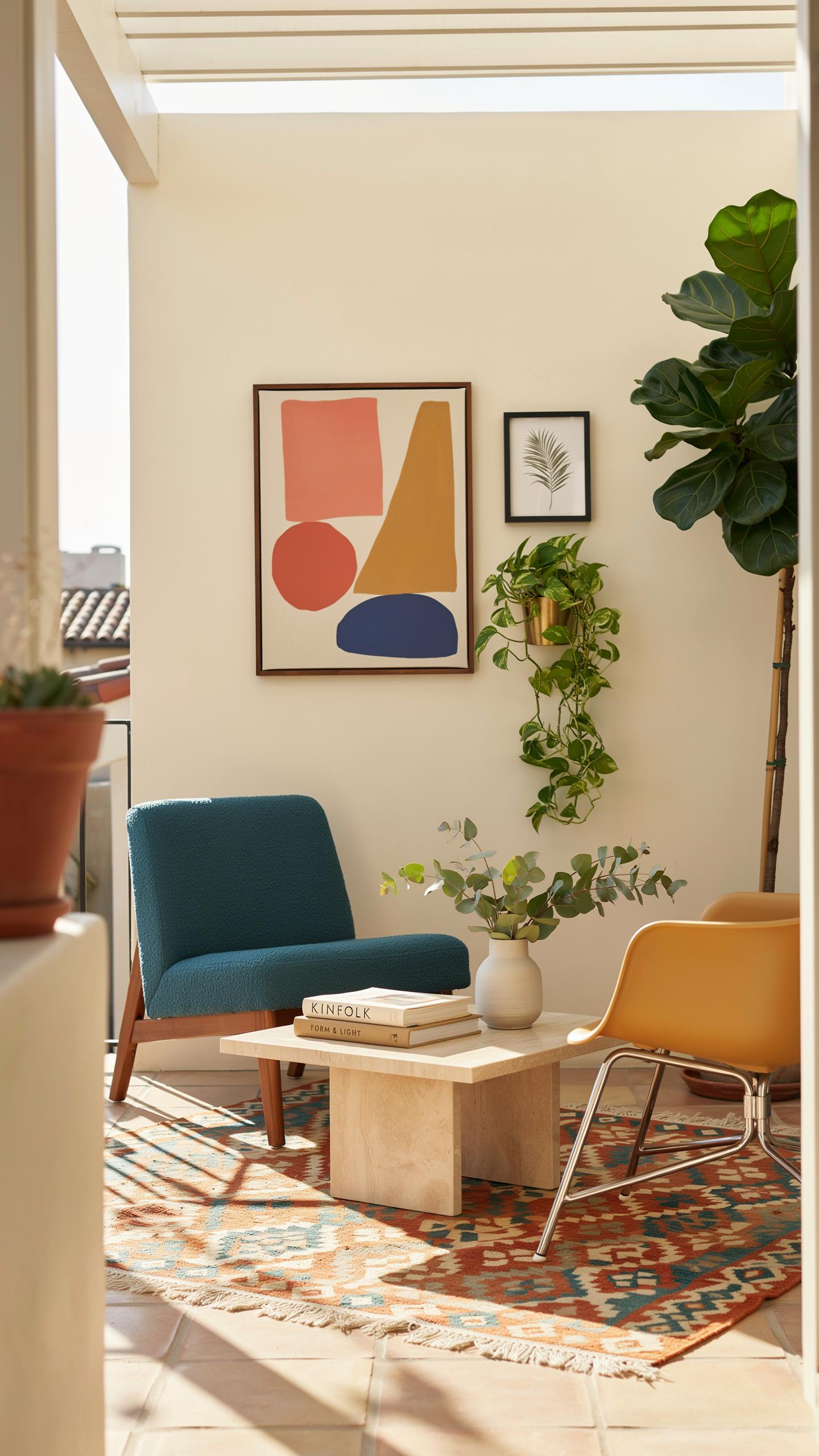
Mid-century design relied on modular systems and geometric order. Apply this principle to outdoor art by arranging pieces in clean grids rather than scattered placement. Symmetrical layouts reinforce the structured aesthetic that defined the era. This approach works for multiple panels, sculptures, or mixed media installations. Grid arrangement prevents visual chaos and makes small patios feel intentional.
The grid system also improves functionality. Uniform spacing between pieces creates clear sight lines and easier movement through the space. This layout principle comes directly from mid-century architecture, which prioritized clean lines and rational organization. Outdoor environments benefit from this discipline because weather exposure and spatial constraints demand clarity. A well-executed grid transforms a patio into a cohesive gallery experience.
Spatial Harmony
Negative space is not wasted space in mid-century design. It is a working element that gives art room to breathe and anchors the composition. Too many pieces clustered together contradicts the minimalist philosophy the era valued. Each artwork needs breathing room to make its individual impact. Strategic placement of empty space actually amplifies the strength of what you display.
Calculate negative space around each piece using the rule of proportional distance. If a patio spans 20 feet, leave at least 4-6 feet between major art installations. This prevents visual overwhelm and maintains the uncluttered environment mid-century designers prioritized. Outdoor patios naturally compete for attention with sky, plants, and hardscape. Restraint in art placement keeps focus sharp and the space functional.
Frequently Asked Questions

What defines the best art styles for a mid-century modern outdoor space?
When focusing on mid century interior design art selection for your patio or deck, look for geometric abstractions, organic shapes, and bold pops of color. The goal is to mirror the “form follows function” philosophy by selecting pieces that feel architectural yet integrated with nature. Opt for weather-resistant metal wall reliefs or framed prints featuring sunburst motifs and minimalist lines to maintain that iconic retro-futuristic aesthetic outdoors.
How do I choose durable outdoor art that reflects a mid-century aesthetic?
Selecting durable pieces requires balancing style with resilience. For an authentic mid century interior design art selection, prioritize materials like powder-coated aluminum, treated teak wood, or ceramic mosaics. These materials withstand the elements while offering the matte finishes and structured forms typical of the 1950s. Ensure any canvas reproductions use UV-resistant inks to prevent the vibrant teals, oranges, and mustard yellows from fading under the direct summer sun.
Can I achieve a high-end mid-century outdoor look on a limited budget?
Absolutely! You don’t need original vintage gallery pieces to elevate your porch. Many affordable retailers offer resin-based sculptures and geometric metal screens that mimic expensive designer collections. Another budget-friendly tip is to upcycle thrifted wooden frames with a coat of weatherproofing sealant and insert high-quality digital prints of abstract patterns. This allows you to curate a sophisticated atmosphere without overspending on your seasonal decor upgrades.