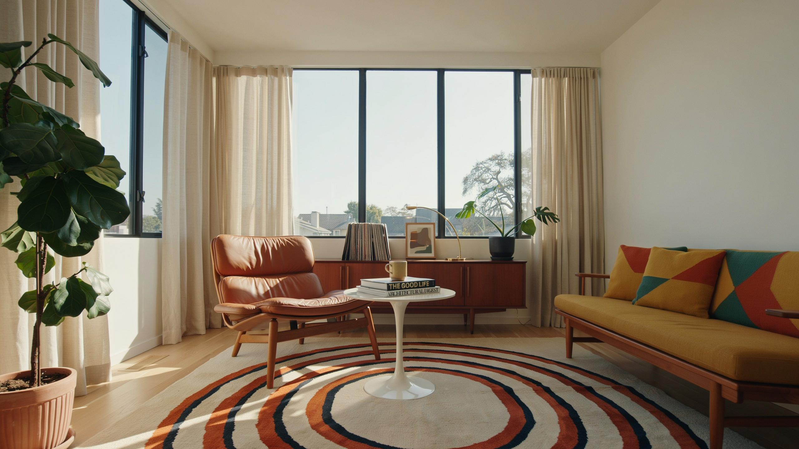
Understanding The Classic Mid Century Interior Design Color Scheme
Defining The Era’S Color Philosophy
Post-war economic growth in the 1950s and 1960s created demand for optimistic, forward-thinking design. Manufacturers developed new synthetic pigments and paints. Designers paired earthy tones like ochre, sage, and warm grays with bold saturated colors. This contrast reflected the era’s dual focus: grounding tradition with technological progress and modernity.
The mid century color palette operates on calculated tension. Neutral wood and muted base colors provide visual stability. Bright accent shades like mustard yellow, teal, coral, and burnt orange add energy without overwhelming spaces. This strategy prevents rooms from feeling chaotic while maintaining the era’s characteristic vitality and visual interest.
The Role Of Natural Wood Tones
Teak, walnut, and rosewood dominated mid century furniture because these woods offered rich warm grain patterns and superior durability. Their natural color ranges from honey to deep brown, providing sophisticated backdrops for bolder design elements. These woods became synonymous with quality construction and became status markers in residential design during this period.
Wood tones function as anchors in mid century schemes. Furniture and cabinetry in these materials establish visual weight and warmth that prevent bright accent colors from appearing jarring. Designers intentionally paired saturated accent walls or upholstery against wood frames and floors. This layering technique creates depth and prevents color schemes from feeling flat or two-dimensional.

Establishing A Base With A Mid Century Color Palette
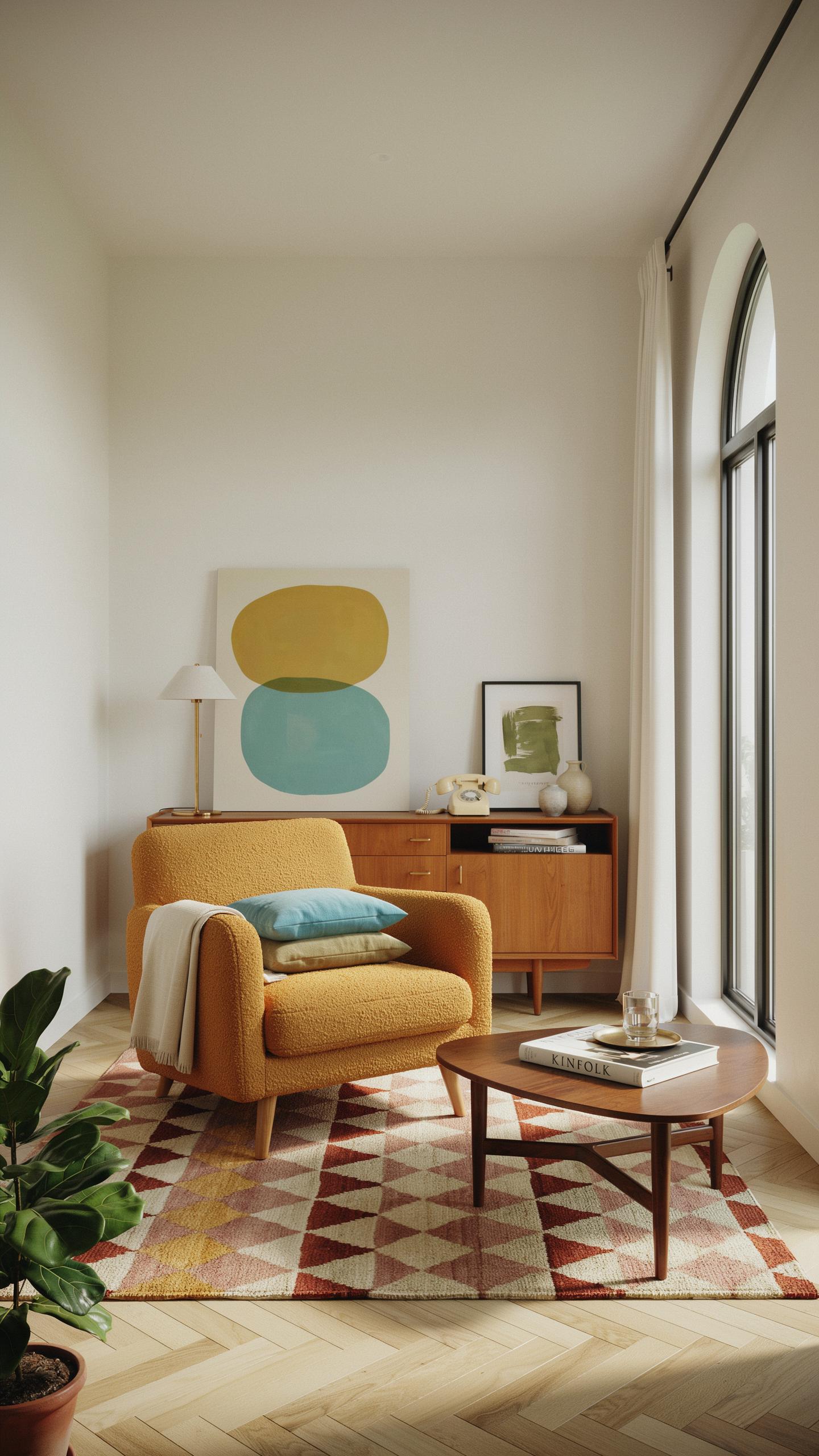
Selecting Your Foundation Neutrals
Mid century design relies on neutral backgrounds to function properly. Warm whites, muted grays, and soft beiges create clean backdrops that let furniture and accent colors command attention. These foundation shades handle the heavy lifting in your rooms, reducing visual noise and establishing order. Skip stark white or pure black. Instead, choose neutrals with subtle warmth or gray undertones that feel intentional rather than accidental.
Your neutral selection determines how well your entire scheme performs. Walls painted in these foundation colors provide stability for bold accent pieces like mustard yellow sofas or teal accent chairs. The right neutral recedes visually, making expensive mid century furniture the focal point. Neutrals also simplify future changes to your scheme without requiring full repaints. They work across open floor plans by maintaining visual continuity between connected spaces.
Balancing Warm And Cool Undertones
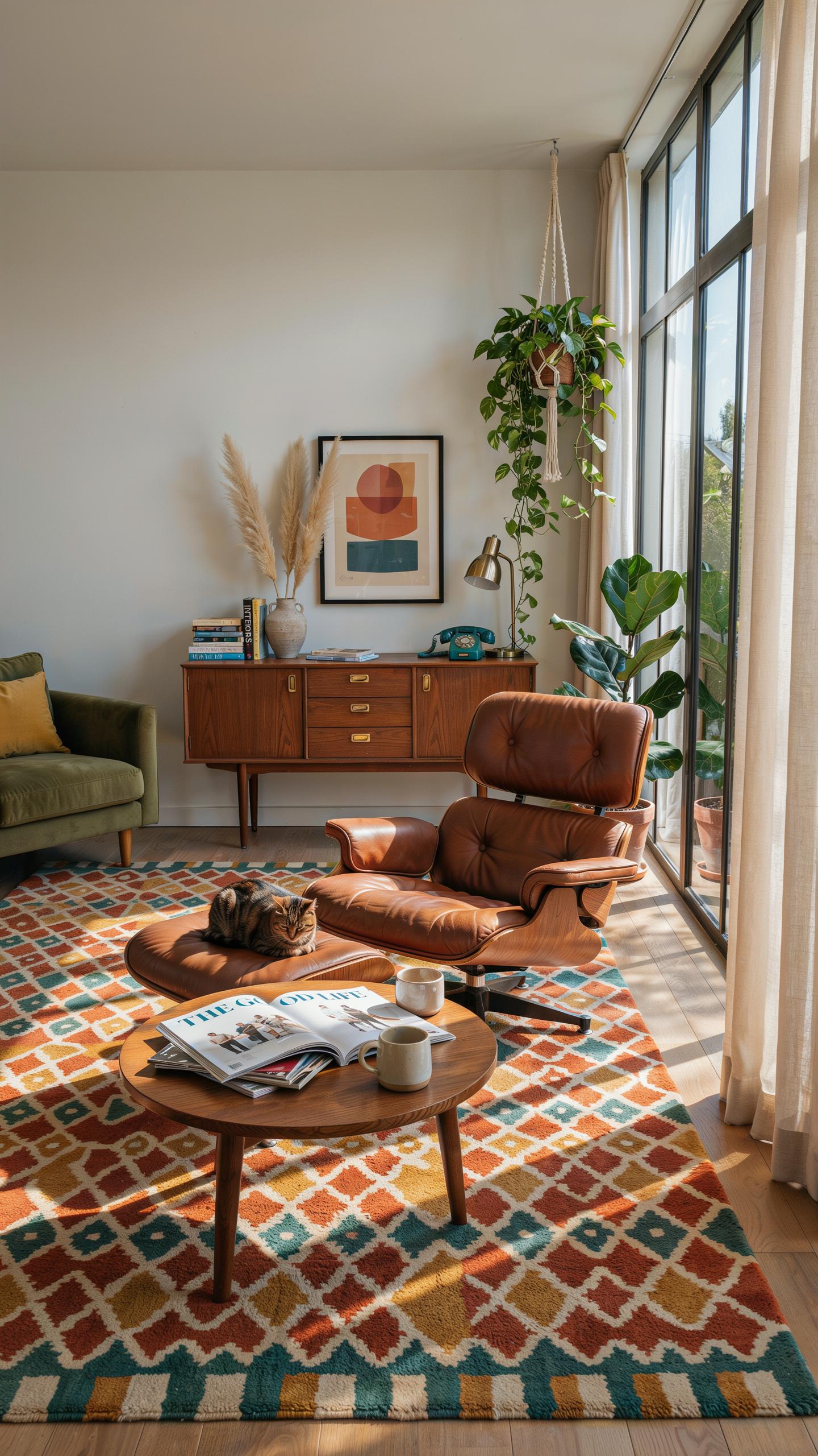
Mixing warm and cool tones prevents rooms from feeling flat or dated. Warm neutrals like cream and taupe pair with cool elements such as chrome fixtures and cool gray upholstery. This contrast creates depth and sophistication. Many mid century spaces use warm beige walls with cool-toned wood or steel furniture to achieve visual interest. The balance prevents any single temperature from dominating and making spaces feel one-dimensional.
Open floor plans demand undertone consistency to function visually. When warm and cool elements clash without purpose, rooms feel disconnected. Strategic pairing means a warm neutral wall works with cool metal accents and cool gray textiles in the same area. This approach maintains sophistication while preventing sterile or overly dated feelings. Test paint samples under your existing lighting before committing, as undertones shift dramatically based on light sources.
Exploring Earthy Tones In A Mid Century Palette
Integrating Avocado Green And Harvest Gold
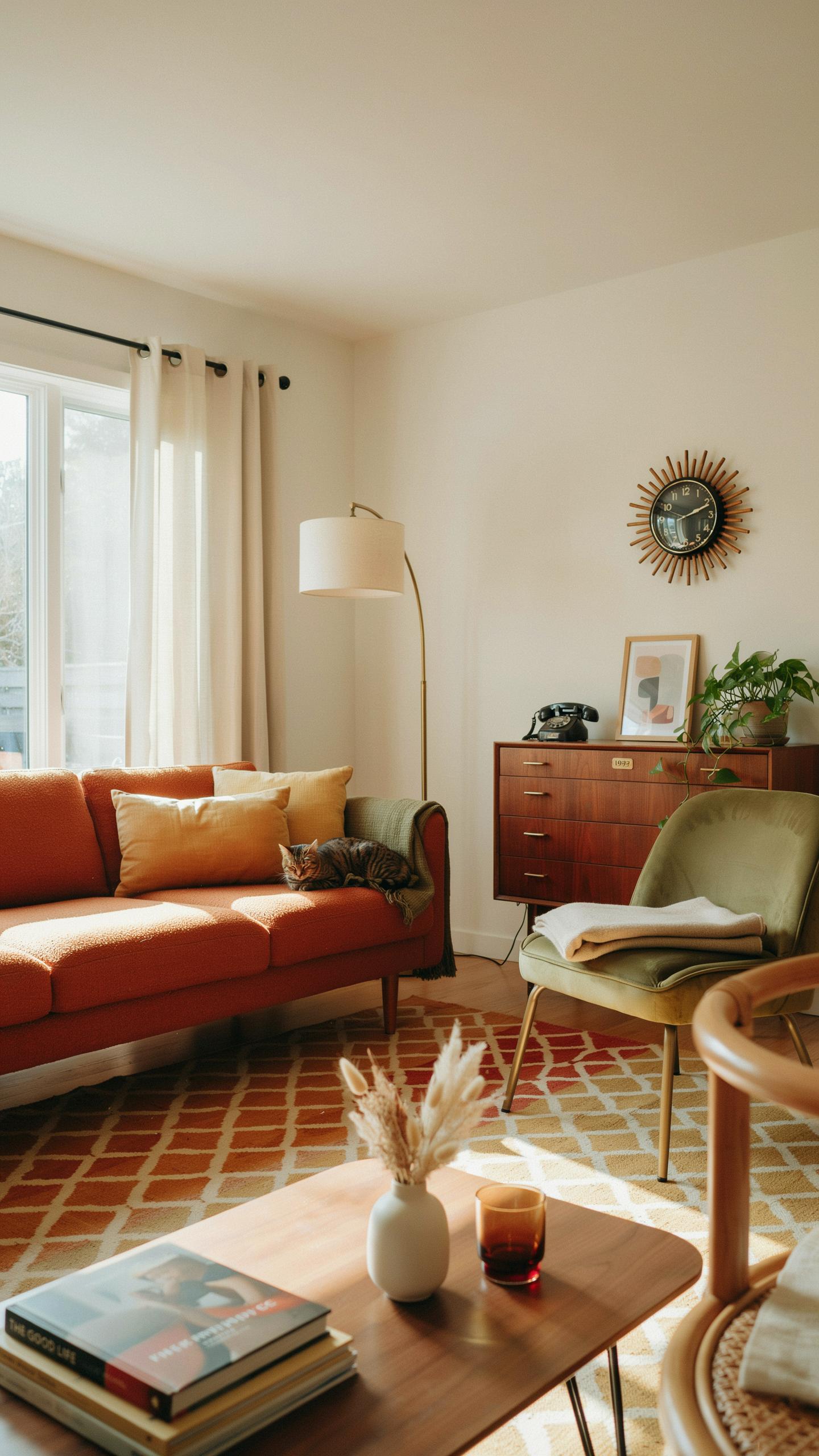
Avocado green and harvest gold dominated mid century interiors from the 1960s through 1970s. These colors came from the era’s connection to natural materials and organic forms. Designers paired them with clean lines and minimal ornamentation. The shades work because they reference earth and agriculture without feeling dated when used strategically.
Modernize these tones by applying them to single accent walls or furniture pieces rather than entire rooms. Pair avocado with walnut wood and brushed metal for authentic mid century impact. Harvest gold works well on kitchen cabinetry or as upholstery on tapered-leg chairs. Both colors ground a space without demanding attention, allowing geometric patterns and sculptural shapes to take focus.
Embracing Terracotta And Warm Ochre
Terracotta and warm ochre appeared in mid century design through pottery, ceramics, and tile work. These clay tones create visual warmth and connect interiors to craft traditions and natural earth pigments. They pair naturally with wood, leather, and woven textiles common in the period. The colors feel approachable and inviting without appearing trendy or artificial.
Deploy terracotta on accent walls behind sofas or in dining areas for maximum impact. Warm ochre works better on smaller surfaces like ceramic side tables, pottery displays, or upholstered ottomans. Use these tones sparingly to avoid overwhelming rooms with competing warm hues. Combine them with neutral whites, grays, or soft blacks to maintain visual balance and mid century clarity.
Adding Drama With Vibrant Mid Century Modern Colors
The Impact Of Mustard Yellow And Tangerine
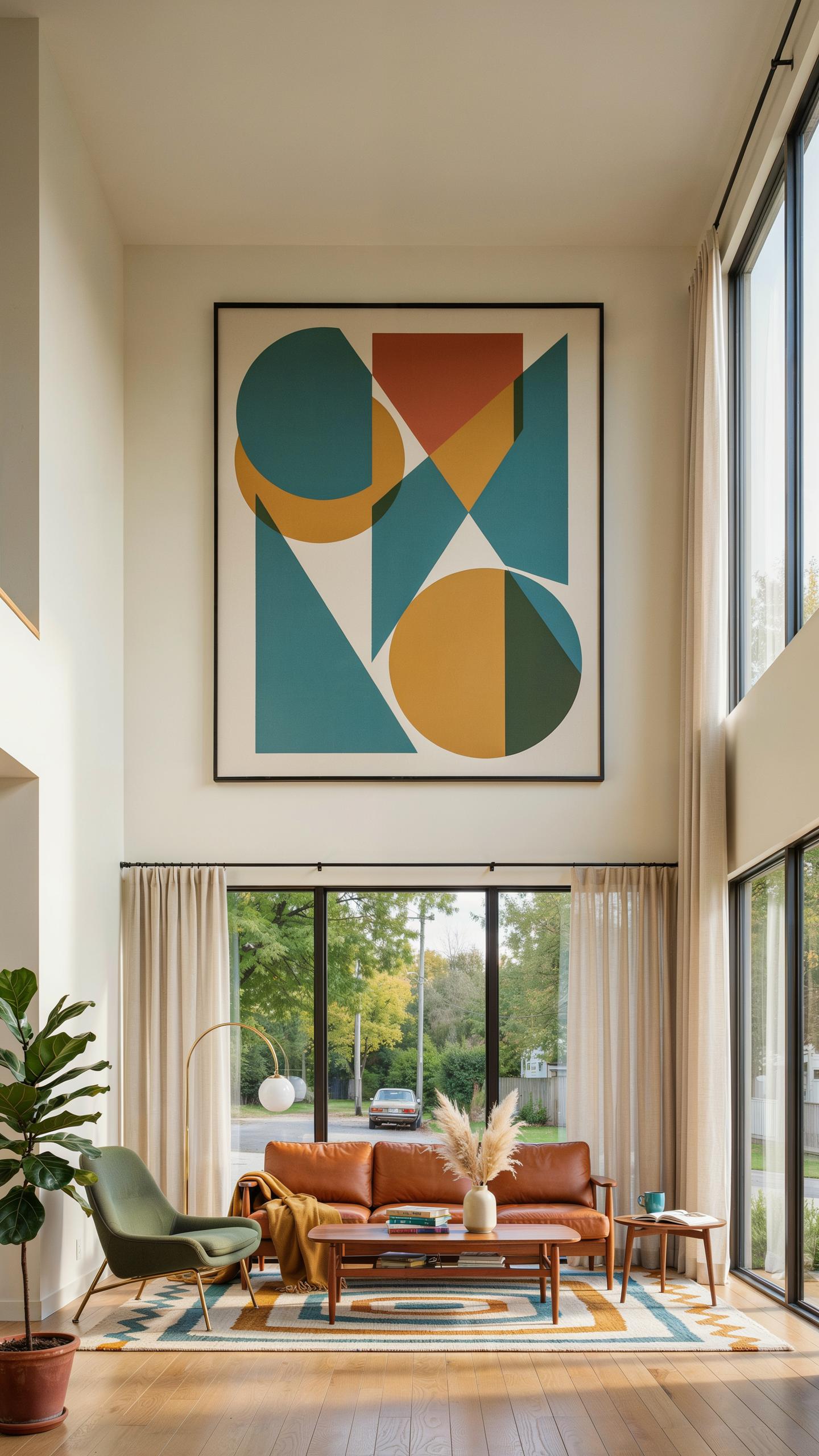
Mustard yellow and tangerine entered mid-century design during the 1950s and 1960s when manufacturers embraced bold color production. These warm saturated tones work in dining rooms and kitchens to stimulate appetite and conversation. Apply mustard as a feature wall or through upholstered furniture pieces. Tangerine performs better as accent color through smaller elements like throw pillows or artwork to avoid overwhelming space.
The saturation level matters more than the hue itself. High-chroma yellows and oranges demand balance from neutral backgrounds like white, gray, or natural wood tones. Pair mustard with mid-century staples like walnut or teak furniture to ground the energy. These colors modernize retro spaces faster than any other tactic because they signal intentional design choice rather than dated remnants.
Using Electric Teal And Turquoise Accents
Teal and turquoise emerged as preferred mid-century accent colors because they provided visual contrast against warm wood furniture prevalent in the era. These cool gemstone tones evoke poolside culture and resort aesthetics that defined 1950s aspirational living. Use teal on statement furniture pieces or paint a single accent wall. Turquoise works better as smaller accents through ceramics, textiles, or artwork to maintain balance.
Brass hardware and metal accents amplify teal’s impact by creating color temperature contrast. The cool blue-green tones sit opposite warm brass on the color wheel, generating visual tension that reads as intentional rather than accidental. Limit teal to one primary surface, then repeat through smaller decorative objects. This approach prevents the space from feeling themed or costume-like while maintaining authentic mid-century character.
Designing Authentic Mid Century Modern Interiors
Essential Color Rules For Authentic Styling
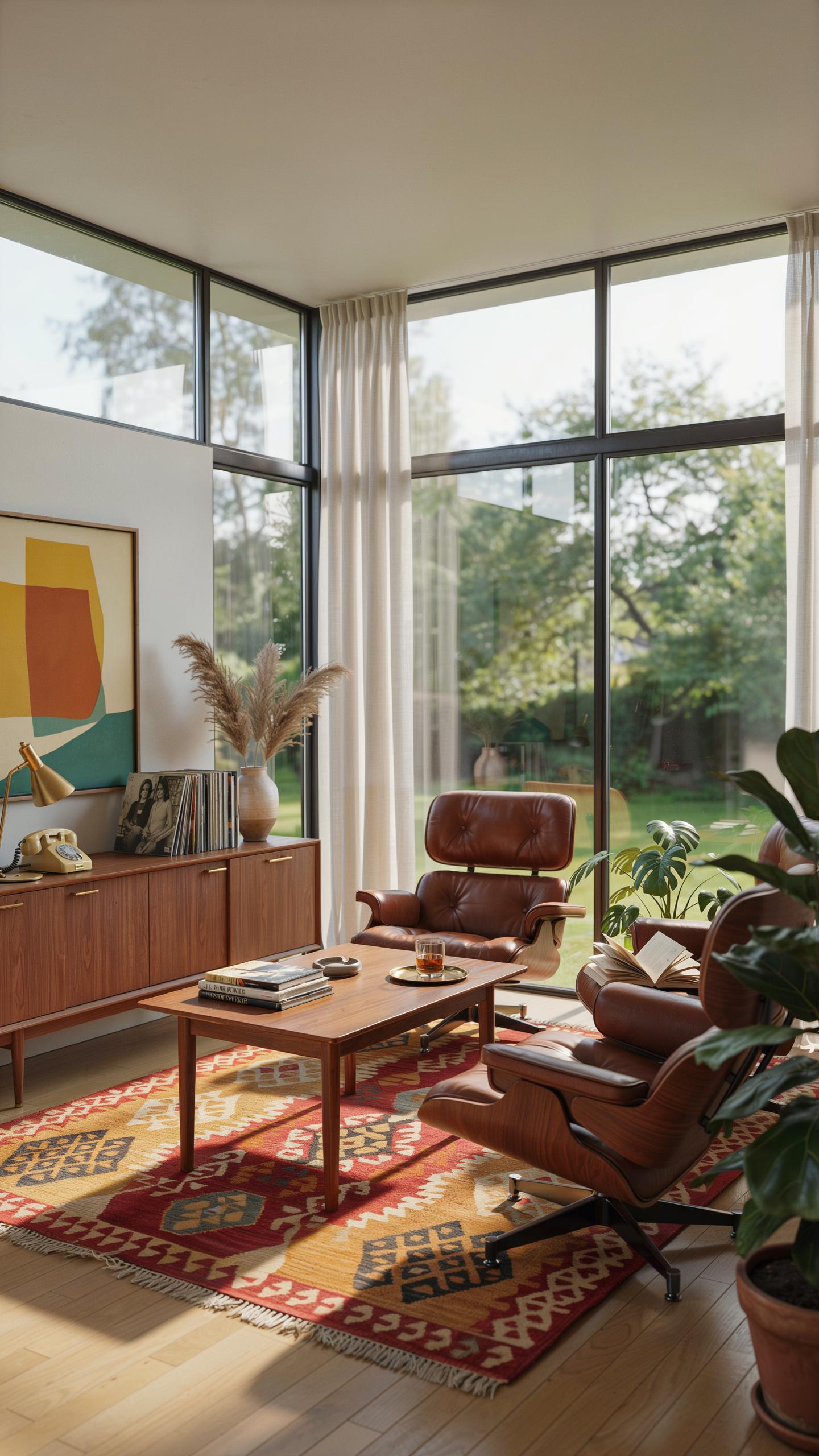
Mid century modern design relies on restraint. The era, spanning roughly 1945 to 1969, rejected ornamental excess in favor of functional simplicity. Limit your palette to three to four main colors maximum. This constraint forces intentional decisions and prevents visual chaos that contradicts the movement’s core philosophy.
- Neutral Base Colors: Use whites, grays, blacks, or warm beiges as your foundation. These colors anchor the space and let statement furniture command attention without competing patterns or tones.
- One Accent Wall: Apply a bold color like mustard yellow, teal, or burnt orange to a single wall. This strategy adds visual interest while maintaining the balanced aesthetic mid century design demands.
- Limit Warm And Cool Tones: Choose either warm-leaning palettes (yellows, oranges, warm grays) or cool-leaning palettes (blues, greens, cool grays). Mixing both creates visual tension that undermines cohesion.
- Repeat Colors In Furnishings: Echo your wall colors in upholstery, art, or accessories. This repetition creates rhythm and reinforces that your color choices are deliberate, not accidental.
- Preserve Breathing Room: Leave 40 to 50 percent of visible surfaces neutral. Mid century spaces feel open because they avoid color saturation. Restraint defines the aesthetic.
Apply these rules consistently across your entire space. Success depends on discipline, not experimentation. Each color choice must justify its presence by supporting the overall layout and design intent.
Color is a tool that can completely transform the energy and soul of a home. Use it to create a space that feels as timeless and vibrant as your favorite memories.
Harmonizing Paint With Statement Furniture
Eames lounge chairs typically feature leather in black, brown, or cognac tones. Paint your walls in soft grays or warm whites to let the chair’s form and material dominate. Avoid competing colors that fragment attention or reduce the furniture’s visual impact and sculptural quality.
Saarinen tulip tables come in white or black bases with marble or laminate tops in neutral shades. Pair these with pale gray or soft beige walls. Bold accent walls work only if positioned away from the table. The table’s iconic pedestal base deserves uncluttered surroundings that emphasize its innovative design and proportions.
Selecting The Perfect Paint For Your Mid Century Interior
Navigating Between Matte And Eggshell Finishes
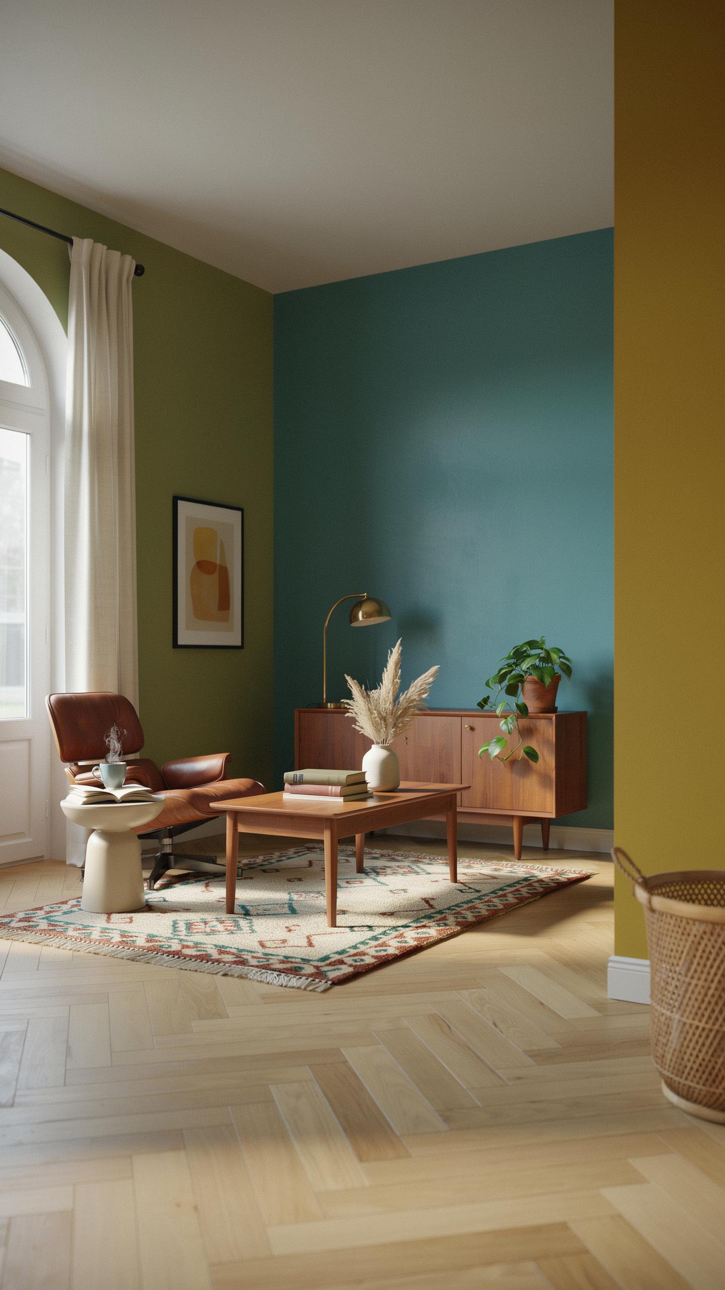
Mid century interiors used matte and low-luster finishes on walls to downplay surface imperfections and create calm, understated rooms. High-gloss finishes were rare in residential spaces during this period. Matte paint absorbs light evenly, which complements wood paneling and geometric wallpaper by allowing these elements to dominate visually without competing reflections from shiny surfaces.
Eggshell finishes offer subtle sheen while maintaining the muted appearance mid century design requires. This finish wipes clean more easily than matte, making it practical for kitchens and bathrooms where you need durability. In living areas with wood paneling, stick with matte to preserve the authentic flat plane that defines the era’s aesthetic.
Testing Color Swatches Under Variable Lighting
Paint colors shift dramatically between daylight and incandescent bulbs used in mid century homes. Natural light exposes true color, while warm incandescent bulbs push colors toward orange and yellow tones. Test your chosen colors on walls at different times of day and under evening lighting to spot muddy undertones that emerge in shaded corners or north-facing rooms.
Shadows change how colors read on walls throughout the day. A color that looks balanced in morning light might appear dull or greenish by evening. Paint sample swatches directly on your walls in multiple locations, then observe them for several days before committing to a full room paint job.
Incorporating A Color Palette Mid Century Modern Into Textiles
Choosing Iconic Patterns And Textures
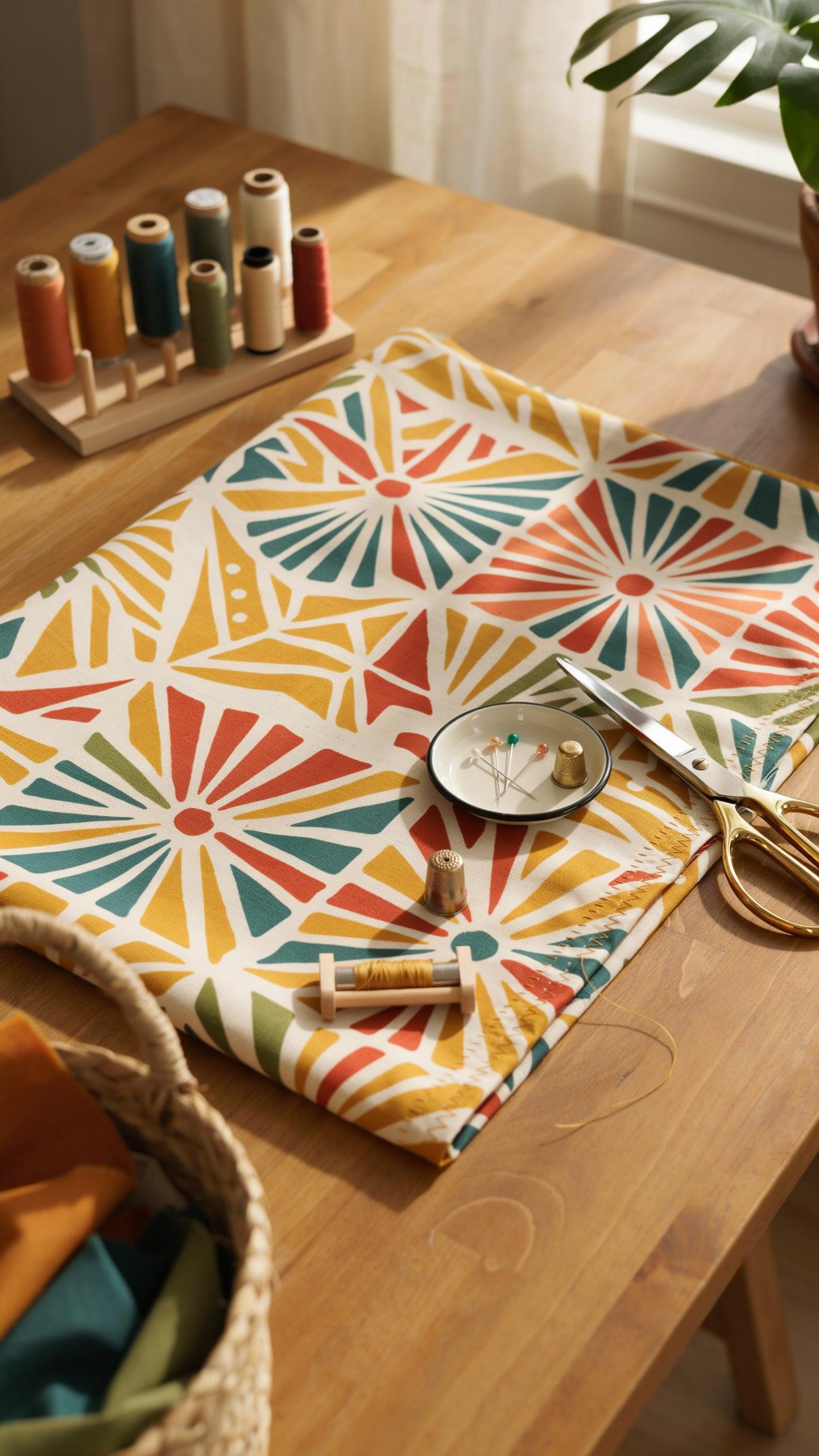
Mid century textiles rely on geometric and organic patterns that emerged from design movements between the 1930s and 1960s. You need textiles that reflect your color palette through both visual impact and tactile quality. Select materials that served functional purposes while maintaining aesthetic value during this period.
- Geometric prints: Angular shapes like triangles, hexagons, and sunburst patterns dominated mid century fabric design. These patterns work with your color scheme to create visual rhythm across sofas, chairs, and accent pillows.
- Boomerang and atomic motifs: Curved lines and starburst designs characterized 1950s optimism. Use these patterns on upholstered furniture to anchor your room’s mid century identity.
- Solid weave textures: Linen, wool, and cotton blends provided durability and clean lines. Choose solid colors from your palette to balance patterned pieces and prevent visual chaos.
- Abstract designs: Non-representational patterns offered flexibility within strict color schemes. Select these for throw pillows and accent textiles to add sophistication without clashing with existing elements.
- Woven tonal variations: Textiles with threads in slightly different shades created depth without pattern. These work well for upholstery when you need cohesion across multiple seating pieces.
Textile selection directly impacts how your color scheme reads in three dimensions. The interplay between pattern scale and your chosen colors determines whether a room feels cohesive or fragmented. Choose textiles that complement rather than compete with your walls and flooring.
Selecting Rugs And Drapery To Frame The Room
Area rugs with abstract patterns serve as room anchors and connect your color palette across floor space. Select rugs with designs that echo your walls or accent colors without duplicating them exactly. Position rugs to define seating zones and create visual boundaries in open floor plans.

Drapery choices directly impact how light interacts with your color scheme throughout the day. Heavy linen drapes in solid colors from your palette frame windows while maintaining the clean lines mid century design requires. Sheer curtains underneath filter light and add layering without sacrificing the architectural simplicity the era demands. Your drapery choices influence perceived room height and wall color intensity based on how they hang and move.
Practical Styling Tips For Your Mid Century Colour Palette
The 60 30 10 Distribution Principle
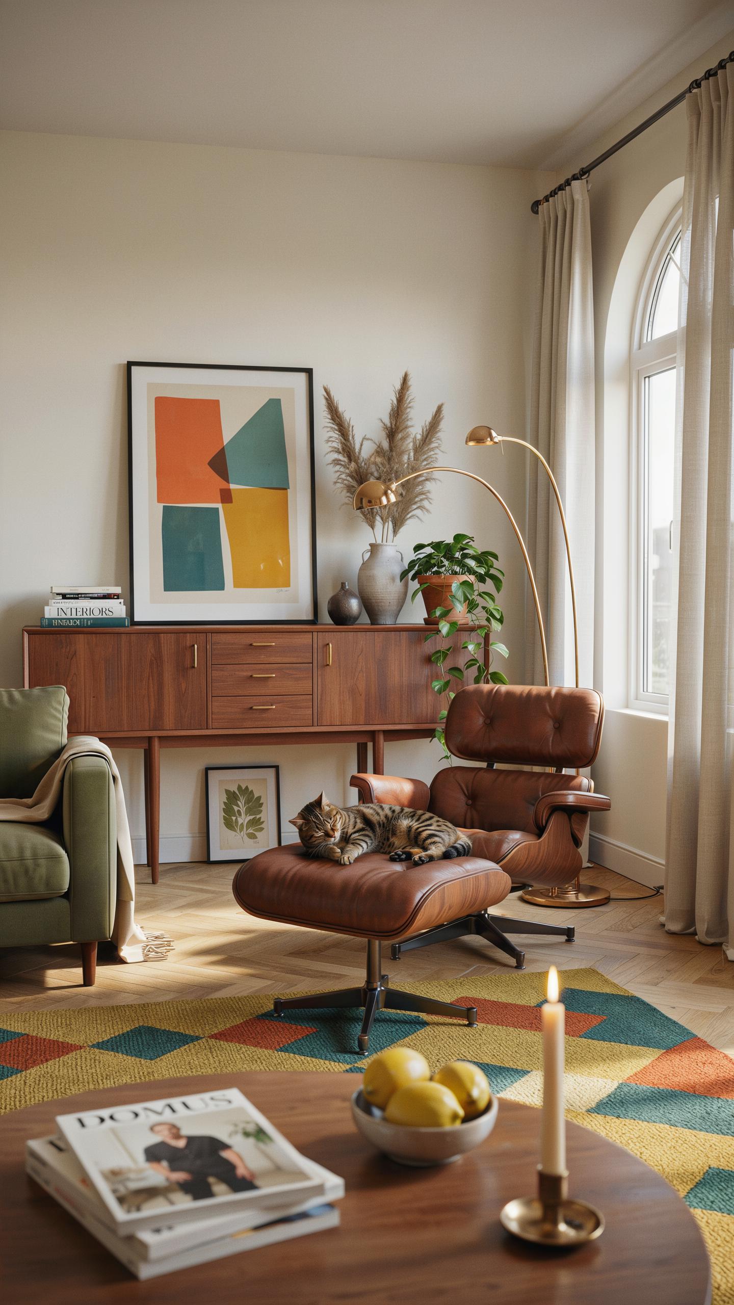
The 60-30-10 formula solves color imbalance in mid century rooms. Assign 60 percent to a neutral base like warm gray, beige, or soft white. This dominant color anchors your walls, larger furniture pieces, and flooring. It prevents visual chaos and creates breathing room for accent colors to land effectively.
The remaining 40 percent splits into two layers. Your secondary color takes 30 percent through medium-scale furnishings, curtains, or area rugs. Think warm wood tones, muted greens, or dusty blues popular during the 1950s and 1960s. The final 10 percent goes to bold accent pieces like throw pillows, artwork, or a single statement chair that draws the eye without overwhelming.
Mixing Vintage And Contemporary Accent Pieces
Authentic mid century finds prevent sterile interiors that feel like design showrooms. Pair a genuine Eames lounge chair with a modern side table or current-era artwork. This blend signals intentional curation rather than wholesale reproduction. Real vintage pieces carry patina and construction details that new items cannot replicate, grounding your space in genuine design history.
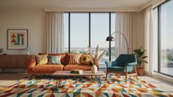
Balance matters when combining eras. Too many period-correct pieces read as museum installation. Too many contemporary elements dilute mid century impact. Layer one or two authentic focal pieces per room, then fill remaining needs with modern items that respect the color palette. This approach keeps your home functional while honoring the original design era’s principles without appearing dated or overly themed.
Adapting Mid Century Colors For Different Rooms
Creating Cozy Retro Bedrooms And Studies
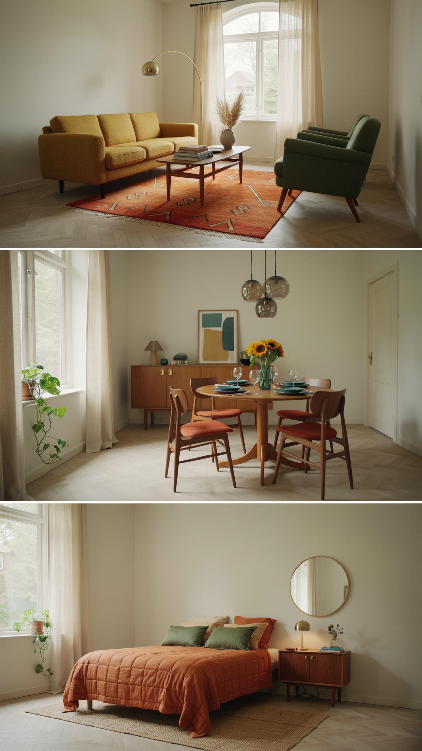
Deep moss greens work in bedrooms because they reduce visual stimulation without feeling cold. Smoky blues create distance from the wall, making smaller rooms feel larger. Warm walnut tones ground a space and tie in period-appropriate wood furniture. These colors lower cortisol levels naturally, supporting sleep and focus. Apply them as primary wall colors or through large furniture pieces.
Layering these colors matters more than picking one. Use moss green on walls, add walnut through a headboard or desk, then introduce smoky blue through textiles. This combination prevents monotony while keeping the room calm. Avoid bright whites or high-contrast patterns in sleeping areas. The goal is visual rest, not visual interest.
Designing Bright And Airy Open Concept Spaces
Yellow and white combinations reflect light in kitchens and dining areas, expanding the perceived space. Yellow stimulates appetite and conversation, making it tactically useful for eating zones. White surfaces bounce natural light deeper into open floor plans. This pairing maintains the mid century aesthetic while solving practical lighting challenges. The contrast stays energetic without overwhelming.
Deploy yellow on a single accent wall or through cabinetry rather than all walls. Pair it with crisp white ceilings and trim to amplify brightness. Use warm yellows, not acidic tones, to stay period-accurate to mid century preferences. White appliances and countertops anchor the scheme. This approach maximizes light flow while keeping the space functional for both daily living and entertaining.
Frequently Asked Questions

What are the fundamental colors used in a classic mid century modern palette?
A classic mid century interior design color scheme typically balances warm neutrals with bold, saturated accents. You will often see earthy base tones like mushroom or warm gray paired with iconic “pop” colors. These include mustard yellow, avocado green, burnt orange, and robin’s egg blue. The goal is to create a sophisticated yet playful atmosphere that highlights the organic shapes and natural wood grains typical of this vintage-inspired era.
How can I successfully mix bold accent colors without overwhelming my living space?
The secret to a balanced mid century interior design color scheme is following the 60-30-10 rule. Dedicate 60% of your room to a neutral foundation, 30% to a secondary wood tone or muted color, and only 10% to those vibrant retro hues. By applying bold shades like teal or terracotta through small items like throw pillows, rugs, or lamps, you maintain visual harmony while still embracing the era’s signature personality.
Is it possible to achieve a mid century look on a budget without repainting every room?
Absolutely! You can introduce a mid century interior design color scheme through affordable accessories and textiles rather than permanent changes. Look for secondhand gallery wall frames, geometric patterned curtains, or colorful ceramic vases in period-accurate shades. Focus on high-impact areas like the entryway or sofa. By layering these specific hues over your existing white or beige walls, you capture the retro aesthetic without the high cost of a full renovation.