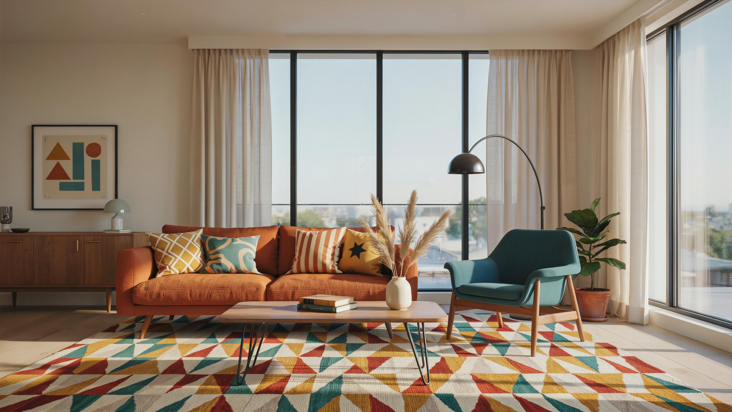
Understanding Mid Century Interior Design Textiles And Fabric Ecology
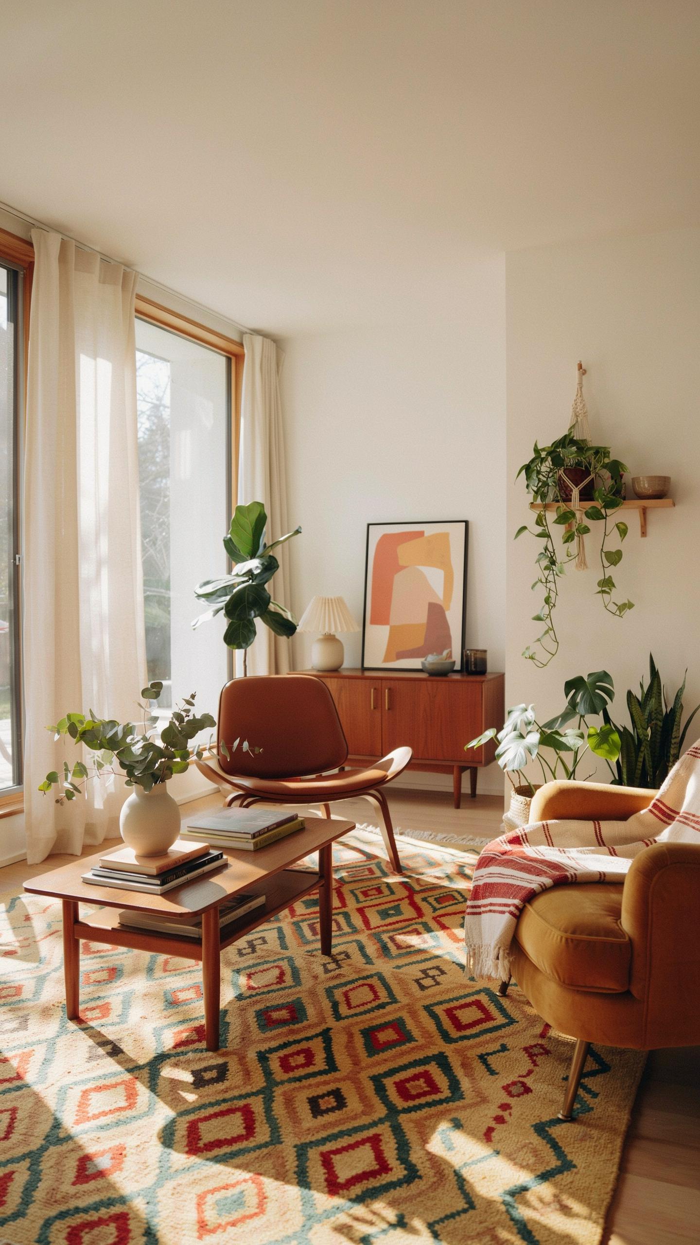
Historical Fabric Overview
The post-World War II era fundamentally shifted textile production. Manufacturers blended synthetic fibers like nylon and acrylic with natural materials to create fabrics that resisted wear and required minimal maintenance. This practical approach aligned with mid-century design’s emphasis on function. Bouclé, tweed, and nubby weaves became staples because they masked dirt and hid wear patterns better than smooth fabrics.
Designers of the 1950s and 1960s leveraged texture to solve real household problems. Rough weaves prevented slipping on furniture while adding visual interest to interiors. Synthetic blends dried faster and resisted mildew compared to pure natural fibers. This wasn’t aesthetic experimentation. It was engineering applied to everyday living spaces where families needed durable, washable surfaces.
Selecting Durable Materials
Choose blend ratios based on your traffic patterns and maintenance capacity. A 60 percent natural fiber and 40 percent synthetic split provides durability without sacrificing breathability. Pure wool performs well in light-use spaces but shows wear quickly under heavy sitting. Acrylic blends outperform in high-traffic zones because synthetic fibers resist pilling and retain their structure through repeated cleaning cycles.
Test fabrics before committing to large pieces. Rub samples with your hand to gauge how they recover from crushing. Check colorfastness by exposing swatches to sunlight for two weeks. Examine the weave structure directly. Tight, dense weaves trap less dirt and release stains more easily than loose constructions. Fiber strength matters more than appearance when you’re buying for actual use, not showroom viewing.

Designing A Living Room With Character Using Bold Graphic Prints
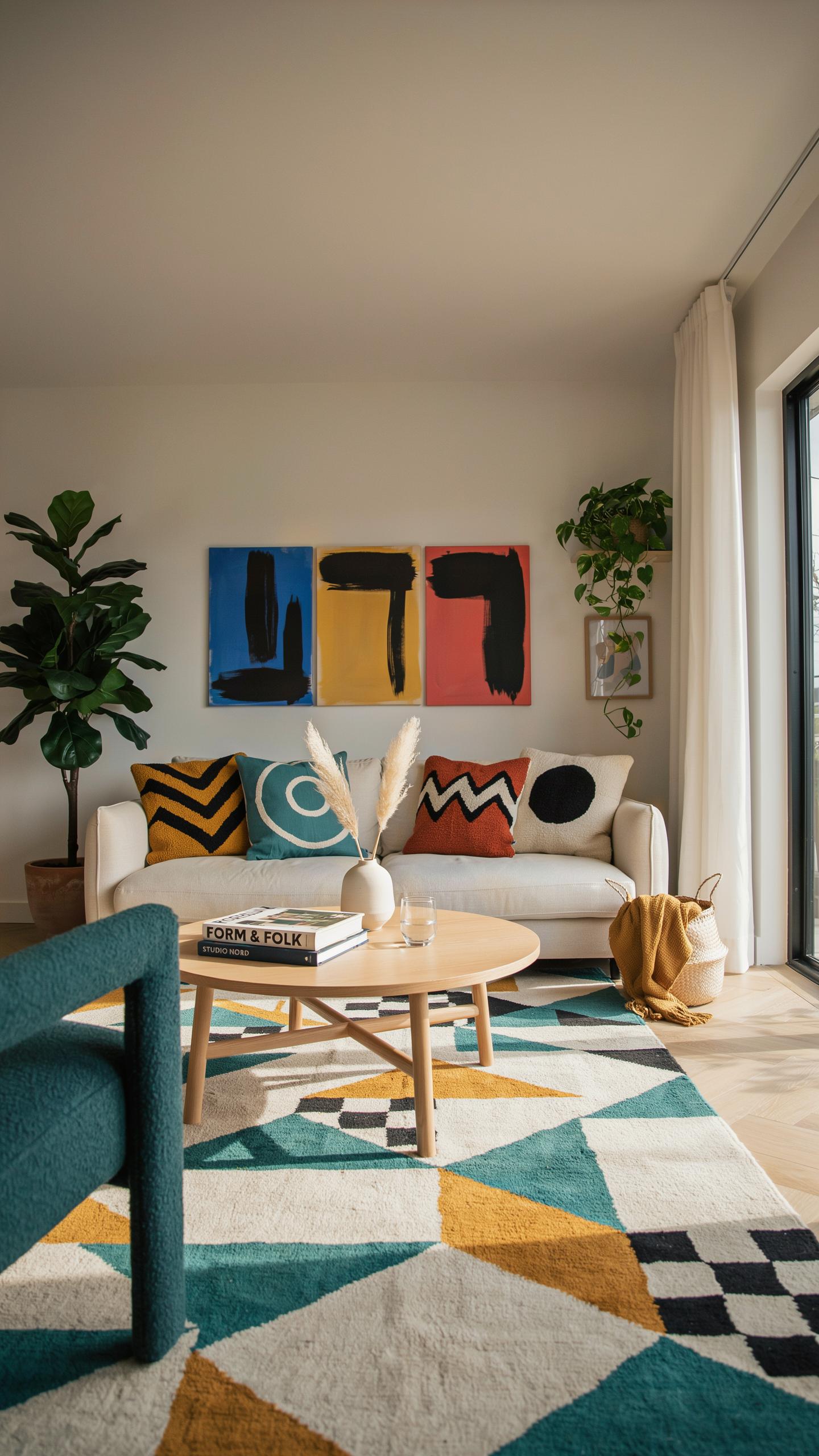
Defining The Main Focal Point
Large-scale geometric prints work as focal points because they command visual attention without requiring additional decoration. A single statement piece like a patterned drapery panel or upholstered chair with bold graphics establishes the room’s design direction. Mid-century designers used geometric motifs derived from modernist art movements and industrial design. Scale matters significantly. Oversized patterns read as intentional design choices. Small, repetitive patterns create visual noise and clutter the space.
Place your graphic textile on a wall-facing element like drapes or a prominent seating piece. This positioning ensures the pattern functions as the first visual anchor when entering the room. The key is restraint. One graphic statement per room prevents competing visual hierarchies. Pair it with plain walls and minimal accessories. The pattern itself becomes the room’s character without needing additional ornamentation or supporting prints elsewhere.
True modernism is about finding beauty in the useful, where hardy wovens and honest textures turn a house into a soulful home. Good design is a bridge between the elegance of the past and the demands of daily life.
Balancing Solid Elements With Motifs
Neutral sofas in solid fabrics ground a room when bold geometric prints occupy other areas. Choose sofa upholstery in white, gray, or tan to absorb the visual weight of patterned textiles. Wood furniture with clean lines and natural finishes from the mid-century era complements graphic textiles effectively. The solid elements provide visual rest spaces that prevent the eye from becoming fatigued. This contrast makes both the graphics and solids more visually effective.
Distribution of color and pattern requires deliberate placement. If your patterned drapes use bold black and white geometrics, keep furniture finishes understated. Natural wood tones or simple upholstery in complementary neutrals maintain balance. Introduce color through the graphic textile itself, not through additional competing pieces. This approach ensures your design reads as cohesive and intentional rather than accidental. The graphic textile enhances the space instead of overwhelming it.
Mid Century Modern Living Room Eclectic Combining Patterns With Purpose
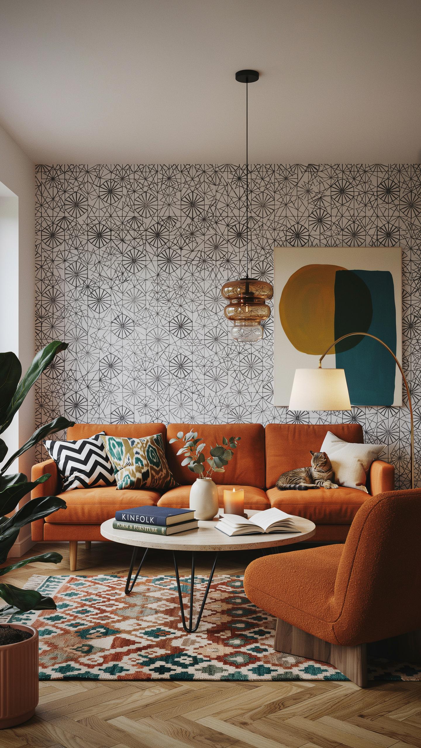
Mixing Diverse Scales And Colors
Mid century designers balanced organic and geometric patterns by anchoring rooms with a dominant color palette, then introducing secondary patterns within that framework. Atomic starbursts and amoeba shapes paired well with grid lattices because they occupied different visual weights. The key was selecting two to three colors that appeared across all textiles, creating visual continuity despite pattern variation.
Scale contrast prevented pattern chaos in mid century interiors. Large-scale geometric prints on upholstery paired with smaller-scale abstract designs on accent pillows created rhythm without overwhelming the space. Designers often reserved solid colors for 40 to 50 percent of visible textile surfaces, allowing patterned pieces to command attention without competing for dominance.
Steps For Layering Textiles Effortlessly
Start by choosing your base textile, typically the largest piece like a sofa throw or area rug. This anchor establishes your primary color and sets the pattern intensity level for the room. From there, select secondary textiles that share at least one color with the base but introduce a different scale or pattern direction.
- Anchor with solids first: Use solid-colored throws or rugs as your foundation layer to establish color story and provide visual rest between patterned elements.
- Alternate pattern scales: Pair large geometric prints with small-scale abstract or organic patterns to create visual interest without overwhelming the space.
- Repeat colors strategically: Ensure each new textile shares a minimum of one color with existing pieces to maintain cohesion across layers.
- Balance pattern density: Limit patterned textiles to 50 percent of visible surfaces in your living room to avoid visual fatigue and maintain mid century clarity.
- Consider texture variety: Mix smooth linen with chunky wool weaves or nubby cotton to add dimension beyond color and pattern alone.
The final layer consists of accent pillows and smaller textiles that tie everything together. These pieces should reinforce your color story while adding subtle pattern or texture variation. Test your combinations by photographing them together before committing to purchases, ensuring patterns read cohesively rather than chaotically.
Essential Fabrics For A Curated Vintage Modern Apartment
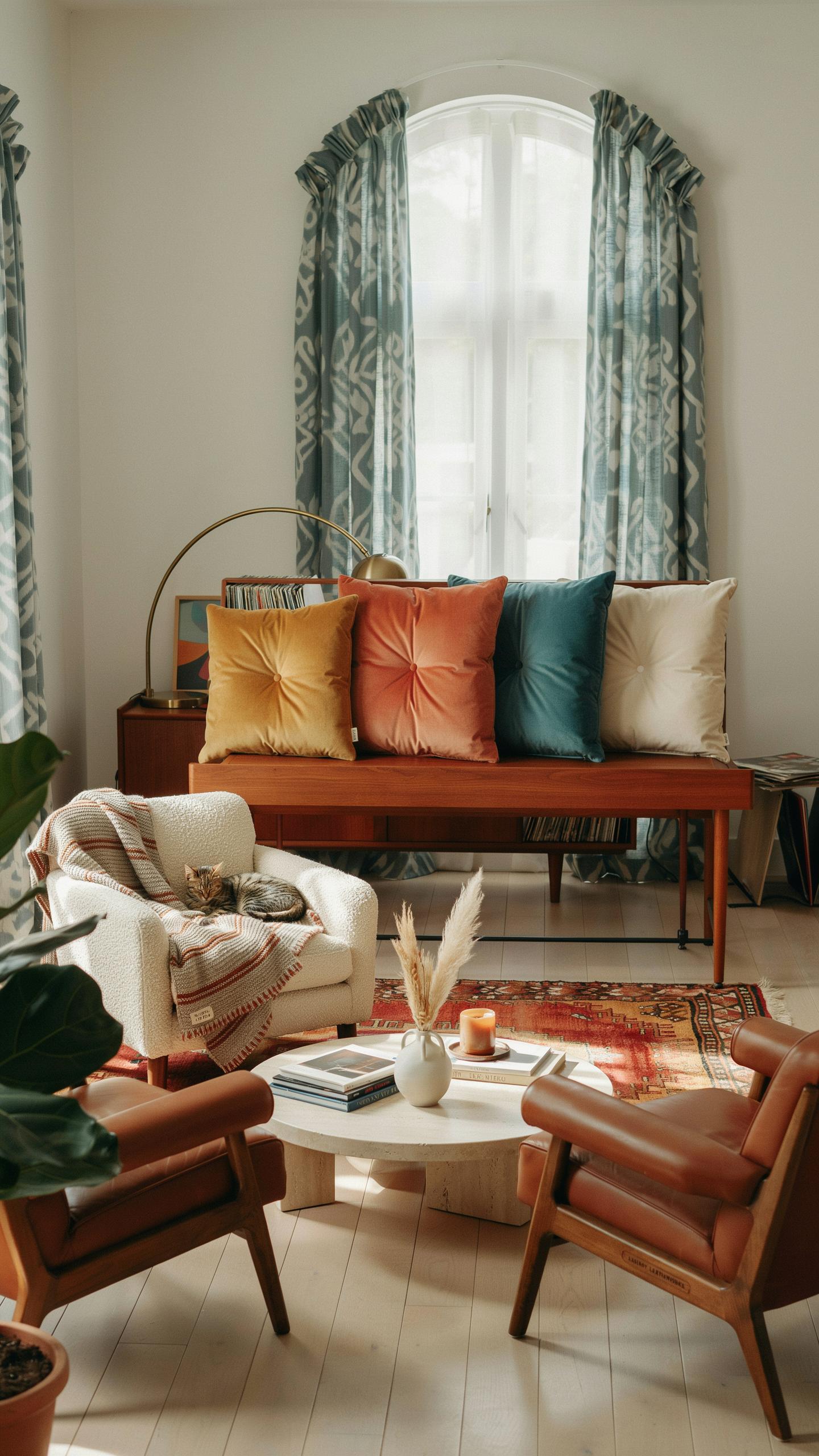
Maximizing Small Spaces With Smart Drapery
Lightweight linen curtains solve the core problem in compact apartments: they filter light without blocking it. Linen was a staple during the mid century period because it hung cleanly and resisted wrinkles from the window’s natural movement. The fabric’s open weave structure maintains visibility to the outside while diffusing harsh sunlight. This preserves floor space by eliminating the visual weight that heavier drapes create.
Fiberglass alternatives emerged in the 1950s and 1960s as practical textured options that replicated linen’s appearance at lower cost. These synthetic fabrics resist fading and require minimal maintenance, which matters in urban rentals where durability outweighs authenticity concerns. The slight texture catches light similarly to natural fibers, adding period-appropriate visual depth without sacrificing the transparency needed to keep rooms feeling open.
Multi Functional Textile Furniture Covers
Heavy cotton duck protects mid century furniture frames while maintaining clean silhouettes in tight quarters. Cotton duck’s tight weave resists wear from daily use and withstands repeated washing. Slipcovers in this material adapt vintage pieces to modern living by protecting against stains and damage. The fabric drapes well across classic mid century forms, preserving the furniture’s original lines without permanent alteration.

Wool blends add durability where pure cotton falls short, particularly on high traffic futons and sofas. Wool’s natural resilience prevents sagging and extends furniture lifespan in small spaces where pieces work harder. These covers slip on and off for cleaning, solving the practical problem of maintaining vintage finds in active urban apartments. The neutral tones standard to mid century design keep rooms uncluttered and functional.
Mid Century Modern Deco Elevating Spaces With Textured Weaves
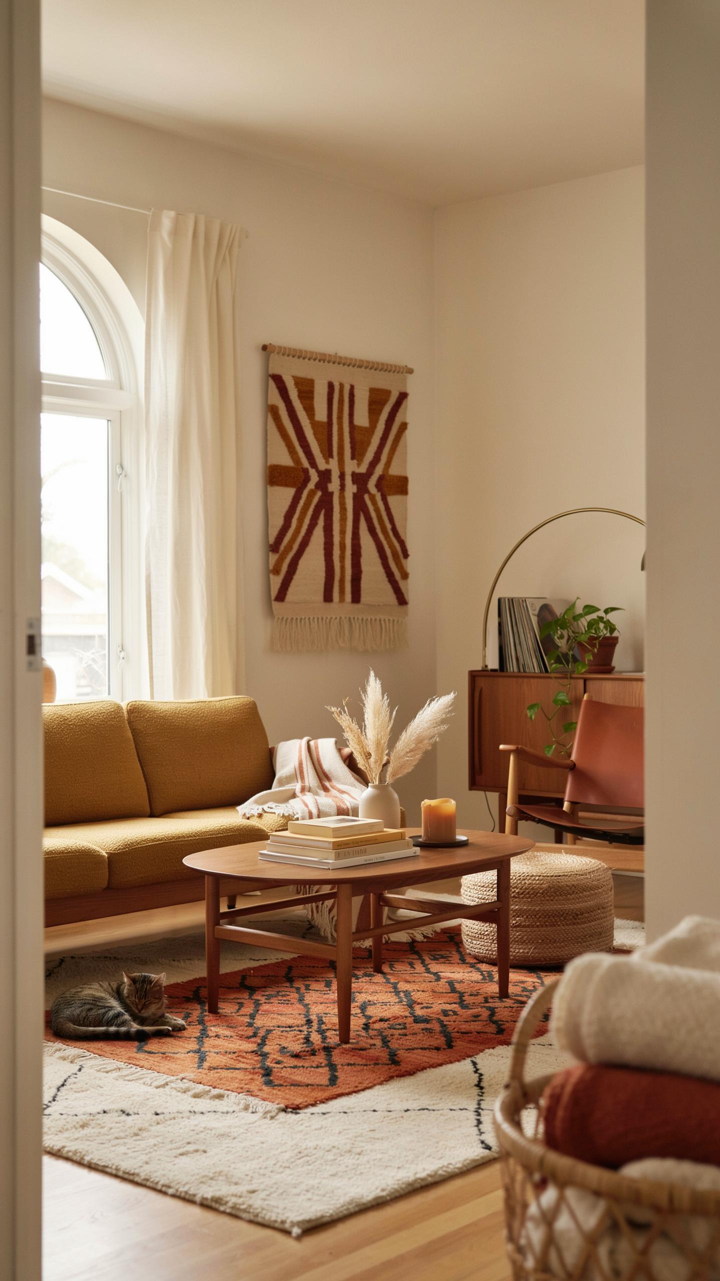
The Revival Of Bouclé And Nobby Chenille
Bouclé and chenille weaves deliver visual and tactile complexity that complements the clean lines of mid century furniture. These loop pile constructions catch light unevenly, creating depth on otherwise flat surfaces. When paired with minimalist lounge chairs or sculptural sofas, textured weaves break up visual monotony without introducing pattern or competing elements that clash with modernist design principles.
Bouclé gained prominence in the 1950s and remained relevant through the 1960s for upholstery work. The fiber loops trap air, providing natural insulation and a three dimensional appearance. Nobby chenille offers similar visual payoff with slightly tighter construction. Both materials demand proper cleaning protocols to maintain fiber integrity. Deploy these weaves strategically on statement seating pieces where tactile quality enhances rather than overwhelms the design framework.
Integrating Flat Weaves And Slub Linens
Flat weaves and slub linen create contrast through texture variation without pile construction. Raw silk and slub linen accent pillows introduce crispness against heavy wool upholstery. This juxtaposition establishes visual hierarchy and prevents spaces from feeling monotonous or overly precious. The approach works particularly well in art deco influenced mid century interiors that blend geometric precision with material authenticity.
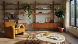
Slub construction introduces deliberate yarn irregularities that catch light differently across the textile surface. Pair heavy wool base upholstery with accent pieces in slub linen or raw silk to signal intentional material selection. This strategy prevents the space from reading as either overly casual or hermetically sealed. The combination acknowledges mid century designers’ interest in honest material expression alongside streamlined form.
Home Decor Vintage Modern Authenticity Meets Modern Functionality
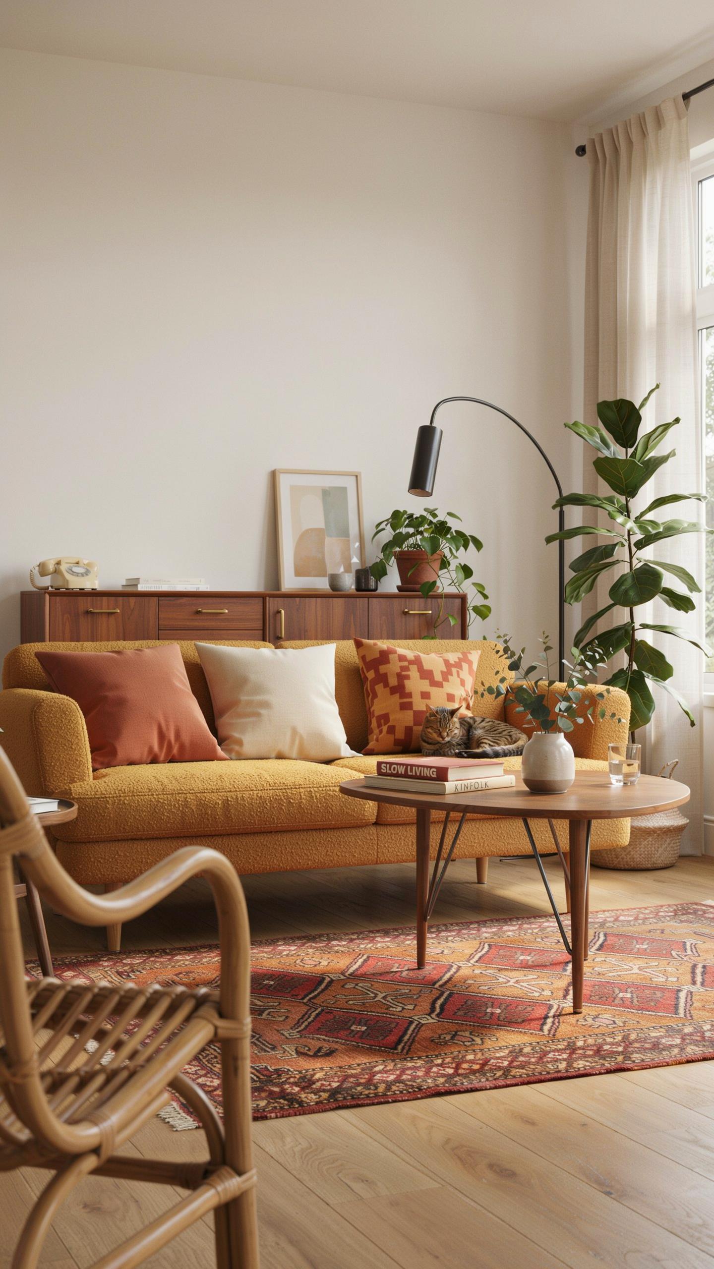
Sourcing Reputable Reproduction Fabrics
Modern manufacturers produce mid-century patterns with technical accuracy because they access original design archives and work from primary source materials. Companies like Maharam and Knoll Textiles hold legitimate licenses to Alexander Girard’s geometric and botanical patterns. These producers use contemporary manufacturing methods to replicate weave structures and colorways from the original designs. The advantage is consistency and durability without hunting for increasingly fragile original stock.
Reproduction fabrics solve a practical problem: authentic vintage pieces wear out quickly under daily use. Original mid-century textiles used natural fibers like cotton and linen in construction methods suited to 1950s household expectations. Modern reproductions maintain pattern fidelity while incorporating synthetic blends or performance treatments that extend fabric lifespan. This allows you to use mid-century aesthetics functionally in high-traffic areas where original pieces would deteriorate.
Updating Authentic Discoveries Safely
Clean vintage fabric before any restoration work to remove accumulated dust and surface debris that accelerates fiber breakdown. Use cool distilled water and mild pH-neutral detergent designed for delicate textiles. Air dry completely in a flat position away from direct heat or sunlight. Test any cleaning solution on hidden corners first to check for color bleeding or fiber damage.
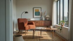
Stabilize weak areas by backing fragile sections with archival-quality muslin or linen using needle and thread instead of adhesives. Lining vintage upholstery or wall hangings distributes weight evenly across compromised fibers and prevents further tearing. Have professional conservators handle valuable pieces or textiles with complex fiber compositions. Proper stabilization extends usable life by years while preserving the original fabric structure underneath.
Mid Century Decoration Styling Rugs And Window Treatments
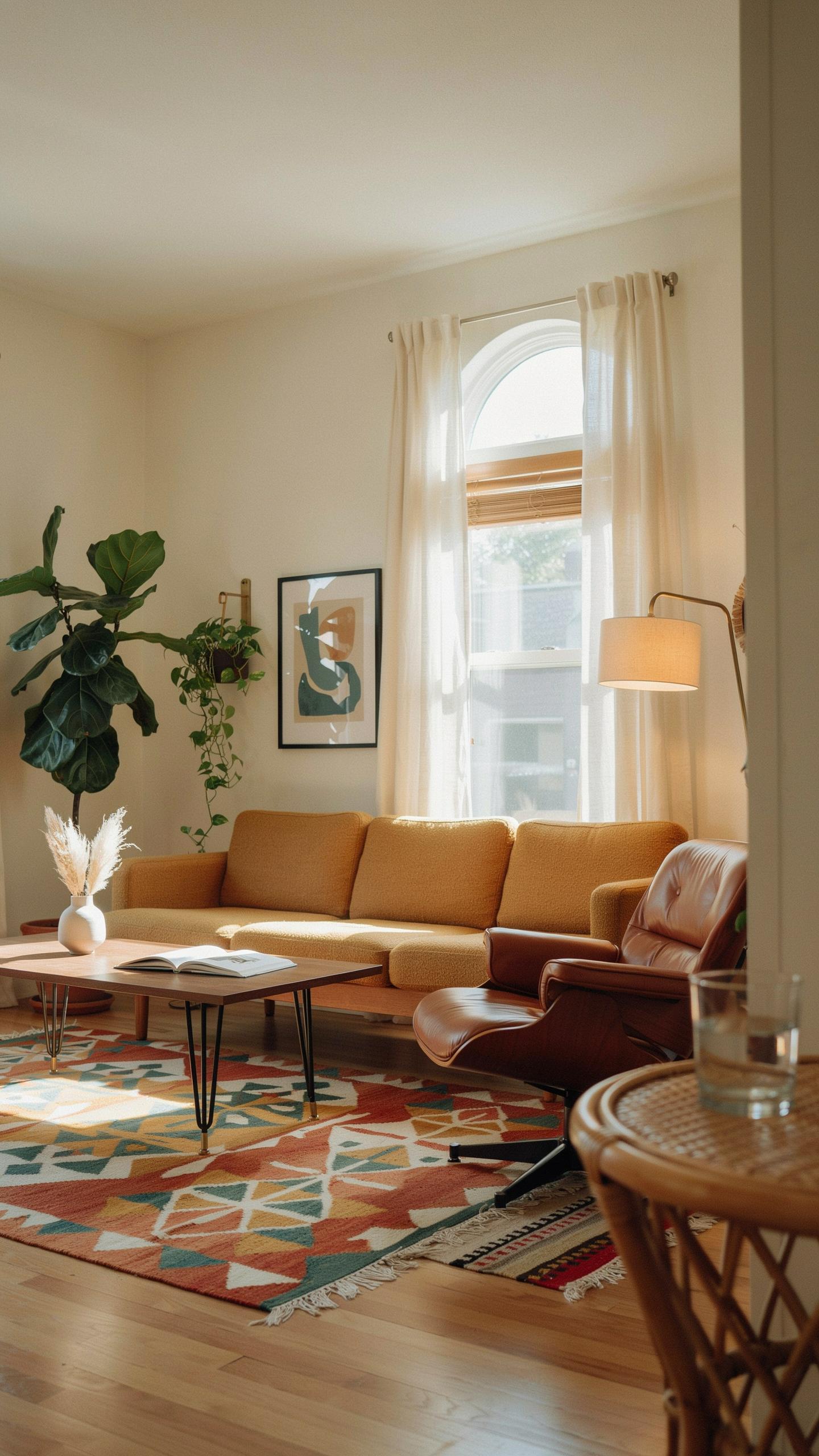
Selecting Scale Appropriate Floor Coverings
Mid-century furniture features distinct geometric profiles and elevated legs that demand flooring solutions with visual clarity. High-pile shag carpets anchor low-slung seating by creating textural contrast without competing for visual attention. Geometric flat-weaves in wool align with the era’s design logic, offering durability while maintaining the clean lines furniture makers intended.
Scandinavian wool rugs deliver performance without compromise. These flat-weave pieces resist matting under furniture legs and handle foot traffic in active living spaces. Natural wool fiber resists staining better than synthetic alternatives, making maintenance straightforward. Choose rugs with minimal pattern or solid tones to support, not distract from, your furniture’s structural design.
Top Vintage Inspired Window Treatment Ideas
Authentic mid-century windows balance function with form through hardware that exposes structural elements rather than concealing them. Metal rods and brackets in brass, chrome, or brushed aluminum define the period’s approach. This strategy frames drapery panels as intentional design components rather than functional necessities masking poor window proportions.
- Linen panel pairs: Natural linen hangs straight without manipulation, showcasing solid colors or subtle weaves. The material’s weight provides clean drape while diffusing harsh afternoon light effectively in residential settings.
- Geometric print cotton blends: Printed cottons featuring abstract or atomic patterns align with 1950s and 1960s textile design. These materials withstand repeated opening and closing while delivering period-accurate visual impact.
- Floor to ceiling floor treatments: Mounting hardware at ceiling height elongates wall planes and maximizes light control. This approach works in both compact apartments and larger period homes.
- Sheer and opaque combinations: Pairing lightweight sheers under heavier panels delivers flexibility for light management without sacrificing style. Layers also add textural depth that strengthens mid-century interiors.
- Metal tension rods: Slim rods in aluminum or steel provide minimal visual weight while supporting fabric reliably. This hardware choice maintains sight lines and emphasizes window proportions over treatments.

Period window treatments prioritize exposure of structural hardware over elaborate valances or swags. Keep fabric choices to solid tones or restrained geometric patterns that read cleanly from across the room. This disciplined approach respects the era’s rejection of ornamental excess and reinforces the functional design philosophy that defines mid-century work.
Embracing A Funky Sophisticated Interior Velvets And Metallic Accents
Rich Velvet Upholstery Choices
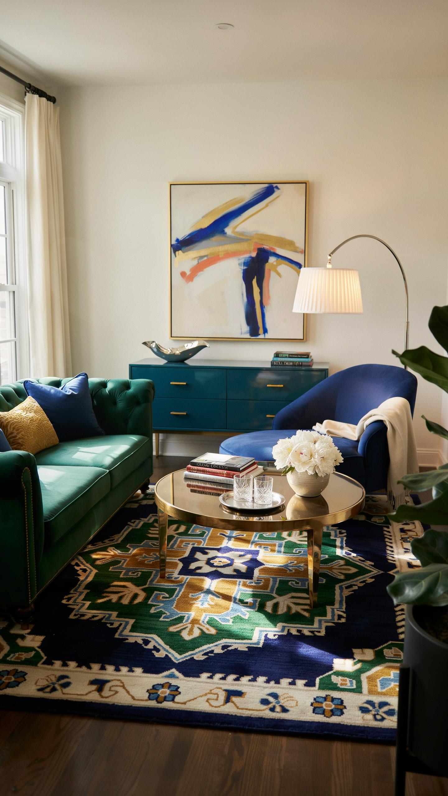
Velvet became a standard upholstery material in mid century design because it offered durability and visual depth that other fabrics could not match. Mohair velvet, made from angora goat fiber, dominated high end furniture of the 1950s and 1960s. Synthetic alternatives like viscose velvet and acetate velvet emerged later and performed well for residential use. Choose jewel tones and warm earth tones to anchor a room. Mustard yellow, avocado green, and rust read as period accurate while maintaining visual impact in contemporary spaces.
Velvet absorbs light rather than reflects it, creating contrast against glossy surfaces common in mid century design. This material works best on seating furniture where tactile quality matters. Pair velvet upholstery with wooden frames in walnut or teak for authentic proportions. The fabric naturally resists pilling when constructed with high quality fiber. Budget accordingly since quality velvet upholstery costs more than standard fabric options but lasts decades with basic care.
Subtle Metallic Threading In Upholstery
Lurex thread, invented in the 1940s, became prevalent in mid century textiles during the late 1950s through 1970s. Manufacturers wove this aluminum core yarn into upholstery and drapery fabrics to add shimmer without overwhelming the design. Silver and gold metallic threading reads as playful rather than formal when used sparingly. Select pieces where metallic accents thread through solid colored base fabrics or geometric patterns. This approach avoids the appearance of costume or theatrical design in residential settings.

Metallic threading performs best on upholstery that catches ambient light, such as lounge chairs positioned near windows. The reflective quality enhances the dimensional feel of mid century furniture without requiring solid metallic fabrics. Mix metallicized textiles with matte velvet or linen to create visual contrast and prevent visual fatigue. Real Lurex holds up better than cheaper metallic substitutes that dull or tarnish. This technique works particularly well on accent chairs rather than large sectionals where restraint strengthens the overall composition.
Timeless Principles Of Mid Century Design Interior Coordination
Color Palette Harmonization Techniques
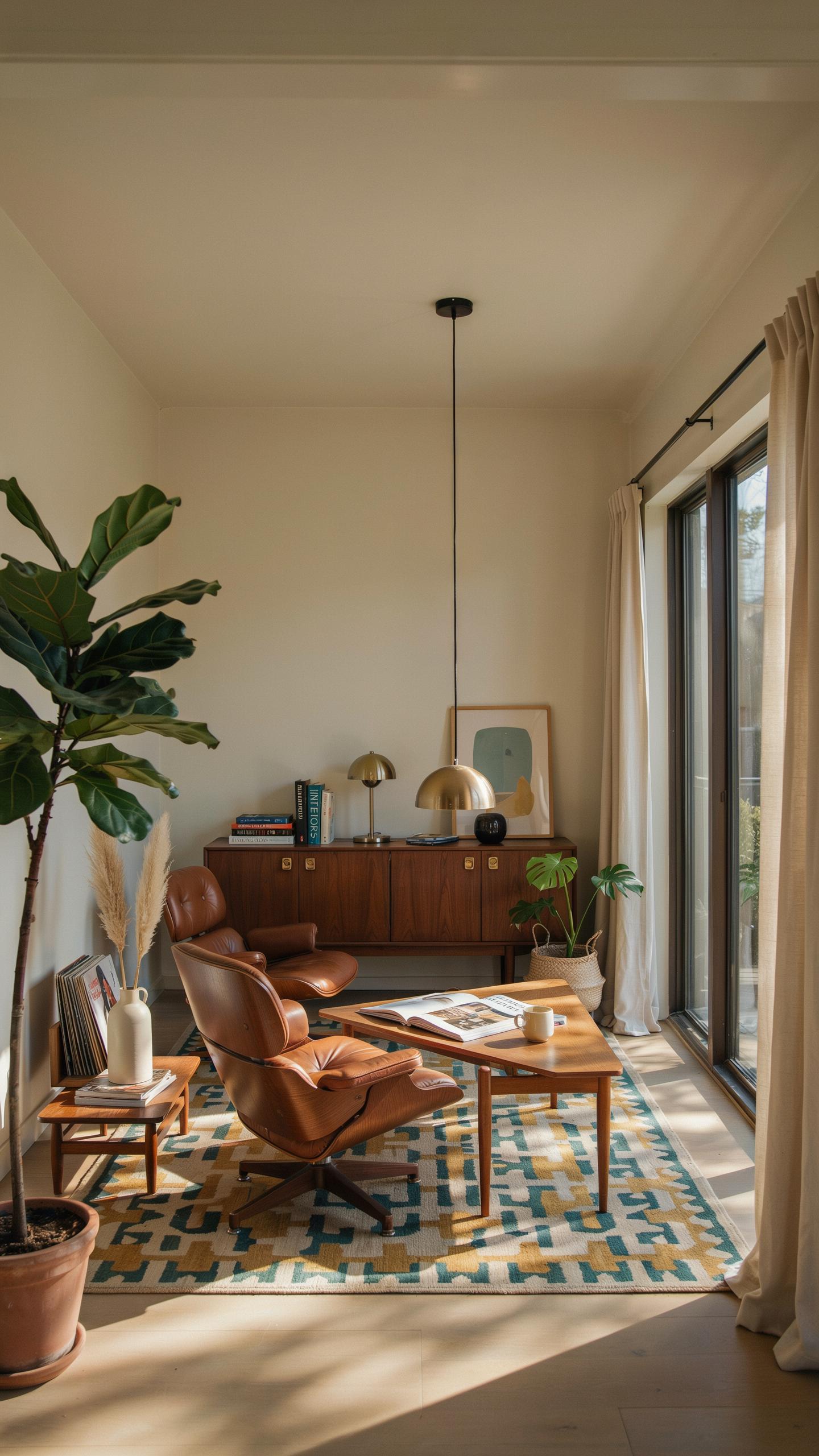
The 60-30-10 color rule applies directly to mid century textiles. Your dominant color occupies 60 percent of the room, typically a neutral like beige, gray, or off white. This anchors the space and prevents visual chaos. Secondary colors fill 30 percent, drawing from earth tones like rust, ochre, or muted green. Vibrant accent colors claim the final 10 percent through pillows, throws, or small upholstered pieces.
Implement this rule by selecting your neutral base fabric first, whether linen or wool blend upholstery. Then layer secondary earth tone textiles across seating and window treatments. Use accent colors sparingly in geometric patterned fabrics or solid jewel tones that mid century designers favored. This approach maintains the clean lines mid century interiors demand while preventing the space from feeling sterile or dated.
Upholding The Principle Of Form And Function
Mid century design rejected decoration without purpose. Every textile must perform a function while supporting the overall aesthetic. Upholstery fabrics need durability and comfort, not just visual appeal. A sofa with beautiful fabric that collapses after two years defeats the principle entirely. Select textiles with proven performance records: tight weaves, quality construction, and fabrics rated for residential use.
Comfort drives long term success in mid century interiors. Choose cushioning density and fabric hand that invite use rather than display. Window treatments should operate smoothly and filter light effectively. Throw pillows must have proper fill and maintain their shape through regular use. This balance between visual design and practical performance separates authentic mid century interiors from museums that discourage living.
Frequently Asked Questions

What are the most common types of mid century interior design textiles?
When starting with this style, look for natural materials with heavy textures. Key mid century interior design textiles include chunky wool bouclé, heavy linens, and flat-weave cottons. These fabrics often feature bold geometric patterns or abstract “atomic” motifs. The goal is to balance organic warmth with structured, clean lines, ensuring your sofa or drapes feel authentic to the era while remaining durable enough for everyday modern living.
How can I mix different mid century patterns without overwhelming my room?
To successfully coordinate mid century interior design textiles, follow the rule of three: choose one large geometric print, one smaller textured solid, and one organic shape. Stick to a consistent color palette, such as olive green, mustard yellow, and burnt orange. By varying the scale of the patterns while keeping the hues harmonious, you create a cohesive visual flow that feels intentional and stylish rather than cluttered or distracting.
Is it possible to find affordable mid century style fabrics on a budget?
Absolutely! You don’t need designer vintage fabrics to achieve the look. Many modern retailers offer accessible options like polyester-blend tweeds and faux-velvets that mimic the high-end aesthetic of the 1950s. Shop for “slubby” textures or waffle weaves at standard home goods stores. Focus on finding the right color story and tactile weight, which allows you to capture that iconic retro vibe without a custom-made price tag.