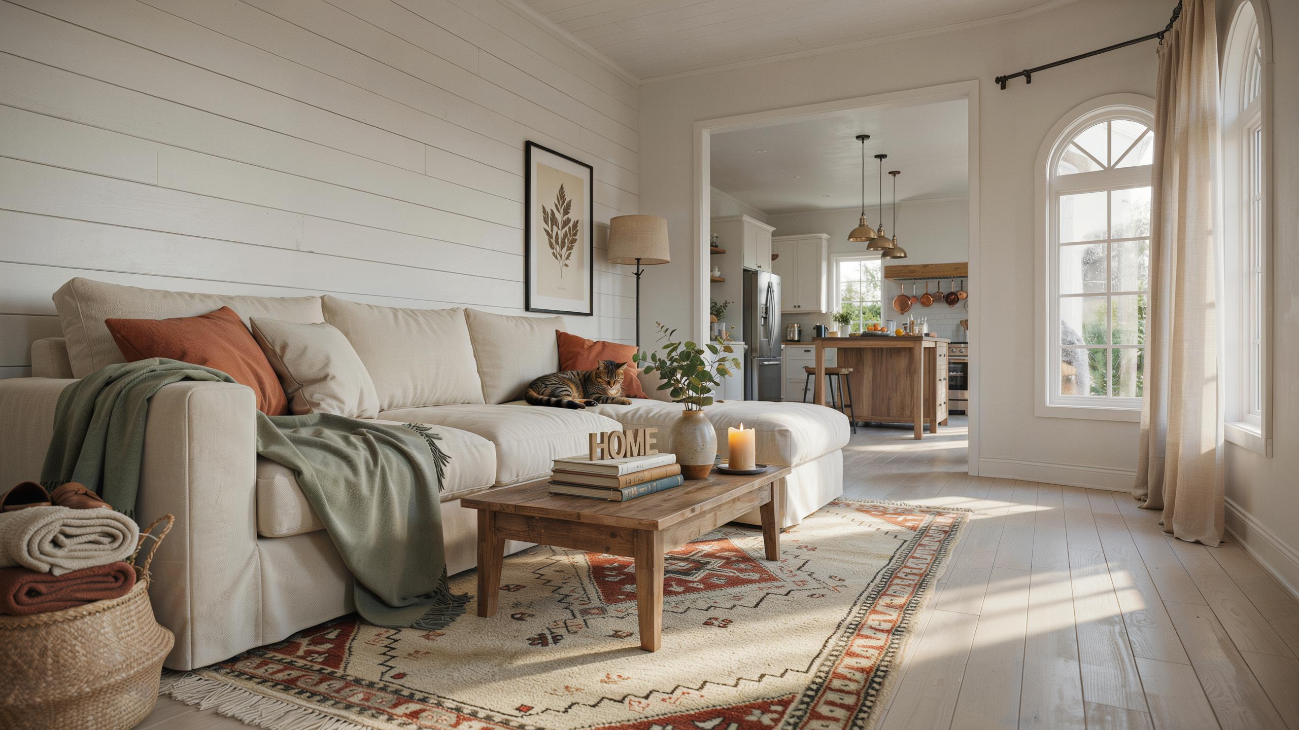
Understanding The Modern Farmhouse Color Palette And Aesthetic
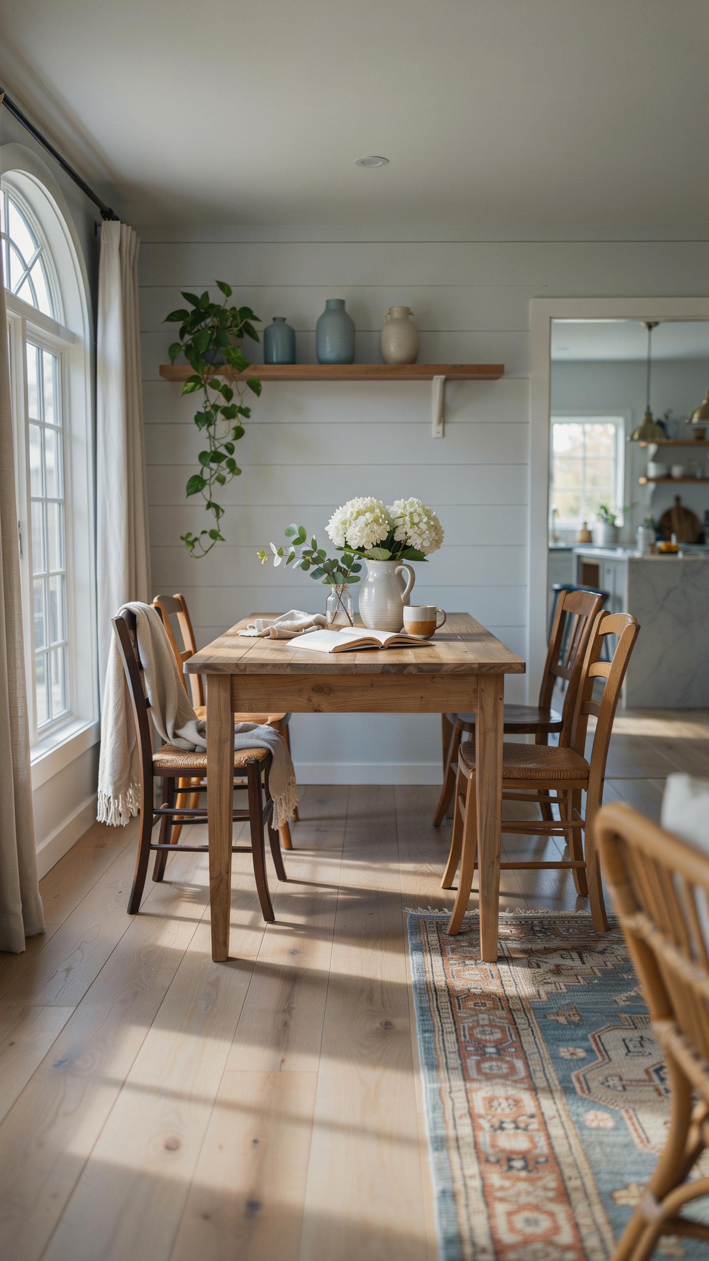
Defining The Style
Modern farmhouse style combines two design movements: rural American farmhouse traditions and contemporary minimalism. The style emerged in the early 2000s as designers sought to blend vintage farmstead aesthetics with clean lines and modern efficiency. Natural materials like reclaimed wood, wrought iron, and stone anchor the space. Sleek finishes, neutral tones, and uncluttered layouts prevent the design from feeling dated or overly rustic.
This approach rejects ornate Victorian elements and instead pulls from functional farm architecture. Exposed beams, shiplap walls, and weathered textures provide authenticity. Yet the overall composition stays organized and refined. Every decorative choice serves a purpose rather than existing purely for visual abundance. The result is livable, practical design that feels both grounded in history and relevant today.
The Role Of Color
Color in modern farmhouse design functions as a unifying force across diverse textures and materials. A cohesive palette ensures reclaimed wood, metal fixtures, stone, and textiles work together rather than competing. Neutral base colors create visual calm while allowing architectural details and natural materials to stand out. This strategic approach prevents spaces from feeling chaotic when combining rustic and contemporary elements.
The right color selections amplify the style’s core advantage: timelessness. By anchoring interiors in grounded neutrals and soft naturals, the design resists trend cycles. Color choices directly impact how effectively textures read and how different zones flow together. A weak palette fragments the space visually. A strong palette makes disparate elements cohere into a unified, intentional aesthetic that functions both practically and aesthetically.
Essential Modern Farmhouse Paint Colors For A Welcoming Entryway
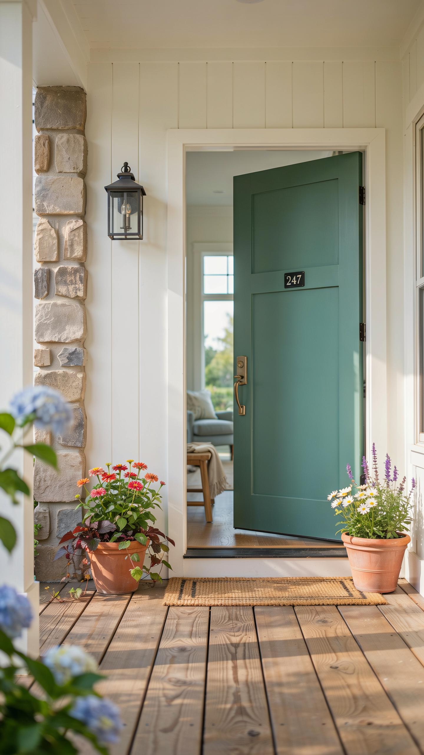
Inspirational Foyer Hues
Off-whites, soft grays, and warm grige tones form the foundation of modern farmhouse entryways. These colors work because they reflect light, make spaces feel larger, and create a neutral backdrop for wood accents and metal fixtures. Off-whites lean warmer than pure white, preventing clinical sterility. Soft grays add sophistication without heaviness. Grige, a gray-beige blend, bridges both warmth and coolness effectively.
These neutral tones allow architectural details to take center stage. Shiplap walls, exposed beams, and vintage hardware become focal points when paint stays understated. The strategy removes visual clutter immediately upon entry. Guests experience calm rather than overstimulation. This approach aligns with farmhouse design roots, which prioritized function over decoration.
Entryway Paint Recommendations
Sherwin-Williams Alabaster, Benjamin Moore Swiss Coffee, and Repose Gray represent industry standards for modern farmhouse foyers. These products perform consistently across varied lighting conditions and surface preparations. They mix easily with trim and accent colors. Professional painters rely on these options because they deliver predictable results on both new construction and renovation projects.
- Sherwin-Williams Alabaster (SW 7008): A warm off-white that reads neutral in most lighting. Provides flexibility for wood tones and metal finishes without color conflict.
- Benjamin Moore Swiss Coffee (OC-45): A soft greige-beige hybrid that leans slightly warm. Works well in entryways with natural light and complements farmhouse hardware finishes.
- Sherwin-Williams Repose Gray (SW 7015): A true soft gray without blue or green undertones. Maintains modern appeal while staying true to farmhouse color restraint.
- Benjamin Moore Accessible Beige (OC-161): A warm neutral that bridges gray and beige families. Suitable for entryways transitioning to warmer adjacent rooms.
- Sherwin-Williams Tricorn Black (SW 6258): Used for accent doors or trim in modern farmhouse entries. Contrasts effectively against light walls to define architectural features.

Test these colors in your entryway under actual lighting conditions before committing to full application. Paint samples on large poster board and observe at different times of day. Lighting changes how undertones read on walls. Making this observation prevents costly repaints and ensures the selected color performs as intended in your specific space.
Designing A Cozy Living Area With A Modern Farmhouse Interior Color Palette
Layering Warm Neutrals
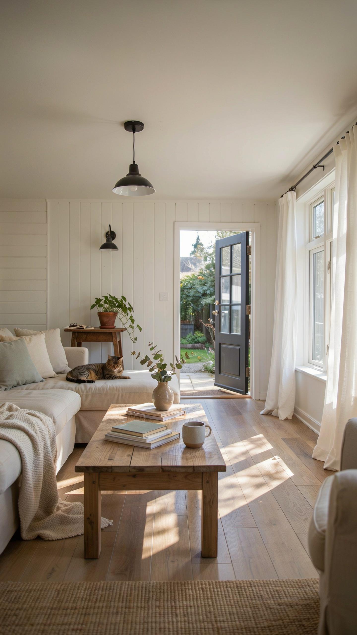
The foundation of modern farmhouse design relies on layering multiple neutral tones rather than using a single flat color. Warm whites, creams, beiges, and soft grays create visual interest while maintaining cohesion. Each neutral carries different undertones: some lean warm with yellow or red bases, others lean cool with gray undertones. This variation prevents monotony and allows rooms to feel dimensional without introducing bold colors.
Select neutrals strategically for different surfaces to maximize depth. Use warm white on walls as your base, then layer creams or soft beige on larger furniture pieces like sofas or area rugs. Apply cooler grays to accent walls or secondary pieces to create subtle contrast. This approach maintains the relaxed farmhouse aesthetic while building a sophisticated visual hierarchy that guides the eye naturally through the space.
Adding Earthy Accent Tones
Earthy accents work best when applied in moderation throughout modern farmhouse interiors. Muted olive greens, terracotta, and soft clay tones complement warm neutrals without disrupting the calm environment. These colors reference natural materials like aged wood, clay pottery, and vegetation found in rural settings. They add authenticity to the design without overwhelming the neutral foundation you established.
Introduce earthy accents through textiles, accessories, and smaller furniture pieces rather than large structural elements. A terracotta throw pillow, olive green curtains, or soft clay-toned pottery on shelves provides visual interest while maintaining flexibility. This method allows you to adjust accent intensity seasonally or during redesigns without costly renovations. Keep earthy tones muted and desaturated to prevent them from dominating the sophisticated, understated character of modern farmhouse spaces.
Selecting The Perfect Kitchen And Dining Room Farmhouse Paint Colors
Cabinetry Paint Selections
Kitchen cabinets anchor the modern farmhouse aesthetic and demand strategic color choices. Bright whites like Sherwin Williams SW 7005 Pure White or Benjamin Moore OC 17 White Dove work as baseline options because they reflect light and create visual space. Deep charcoals such as SW 7062 Cavern Clay provide contrast while maintaining the farmhouse sensibility without reading as trendy or temporary design choices.
Cabinet color selection must coordinate with countertop materials to function properly. Butcher block countertops pair cleanly with white cabinets for traditional farmhouse contrast or charcoal cabinets for modern depth. Quartz countertops in gray or cream tones work with both white and charcoal cabinets because their neutral bases bridge multiple color schemes without visual conflict or distraction.
Dining Room Mood Setter
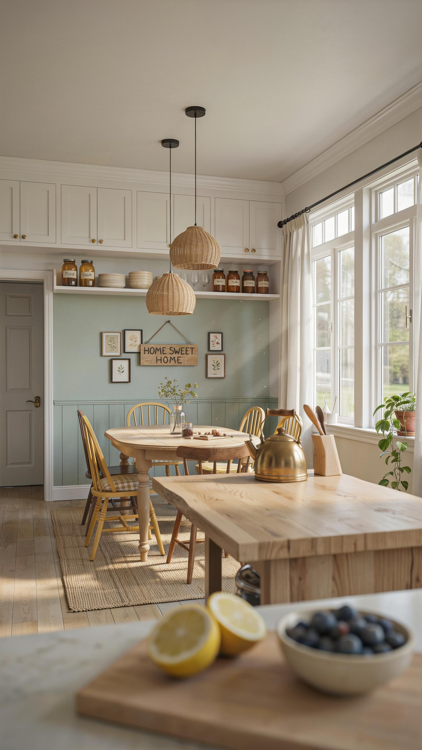
Dining room walls require colors that support natural wood tables and woven pendant lighting without competing for visual attention. Soft neutrals like SW 7015 Repose Gray or Benjamin Moore HC 172 Healing Aloe create balanced backdrops that let wood grain and lighting fixtures function as design anchors. These colors maintain the farmhouse lineage while providing modern restraint that prevents spaces from feeling dated.
Board and batten wall paneling demands careful color coordination to maximize its architectural impact. Paint paneling in whites or soft grays while choosing a slightly deeper or warmer tone for remaining walls, or reverse this approach for visual interest. This layering strategy uses color contrast to emphasize the paneling geometry while keeping the overall palette cohesive and intentional rather than accidental or poorly considered.
Creating A Serene Bedroom Oasis With Farm House Colors
Calming Wall Colors
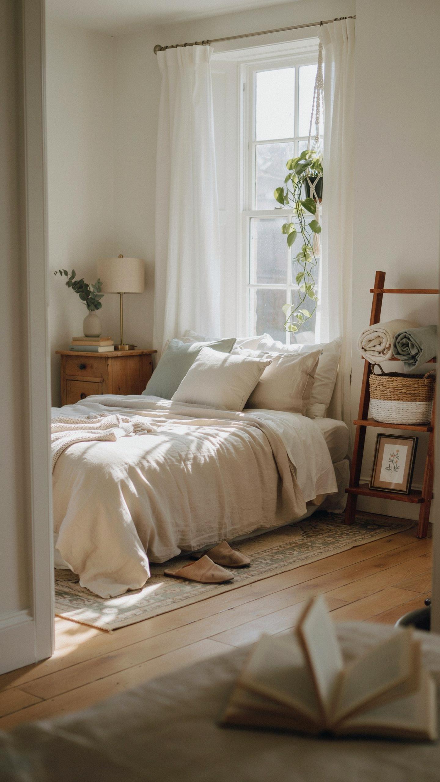
Cool undertones work better than warm ones for bedroom walls because they lower visual stimulation. Muted blues reduce cortisol levels and signal the nervous system to relax. Soft sage greens connect to nature and create psychological distance from daily stress. These colors reflect light softly without creating glare that disrupts sleep cycles. Skip bright whites and warm beiges. Pick colors with gray or green undertones instead.
Paint samples on bedroom walls and observe them at different times of day. Morning light and evening light change how colors appear. Live with samples for three days before committing to a gallon. North facing rooms need warmer undertones within the cool palette. South facing rooms tolerate cooler, more saturated versions of these shades. Test your selection before painting entire walls.
Textiles And Paint Harmony
Linen bedding pairs with muted blue walls because both materials share natural fiber origins and matte finishes. Chunky knit blankets add texture contrast without competing for visual attention. Distressed wood furniture in whitewashed or gray tones complements cool wall colors by echoing undertones. The combination creates cohesion through repetition of neutral values. Avoid mixing multiple fabric textures that clash or create visual chaos.
Layer your textiles strategically to enhance the color scheme. Place lighter linens as base layers and darker knits on top to add depth. Distressed wood nightstands and bed frames should match the undertone family of your walls. This approach ties the room together without requiring expensive statement pieces. Consistency in undertones across materials matters more than matching exact shades.
Bathrooms And Laundry Rooms Styling With Farmhouse Paint
Crisp White And Soft Gray Schemes
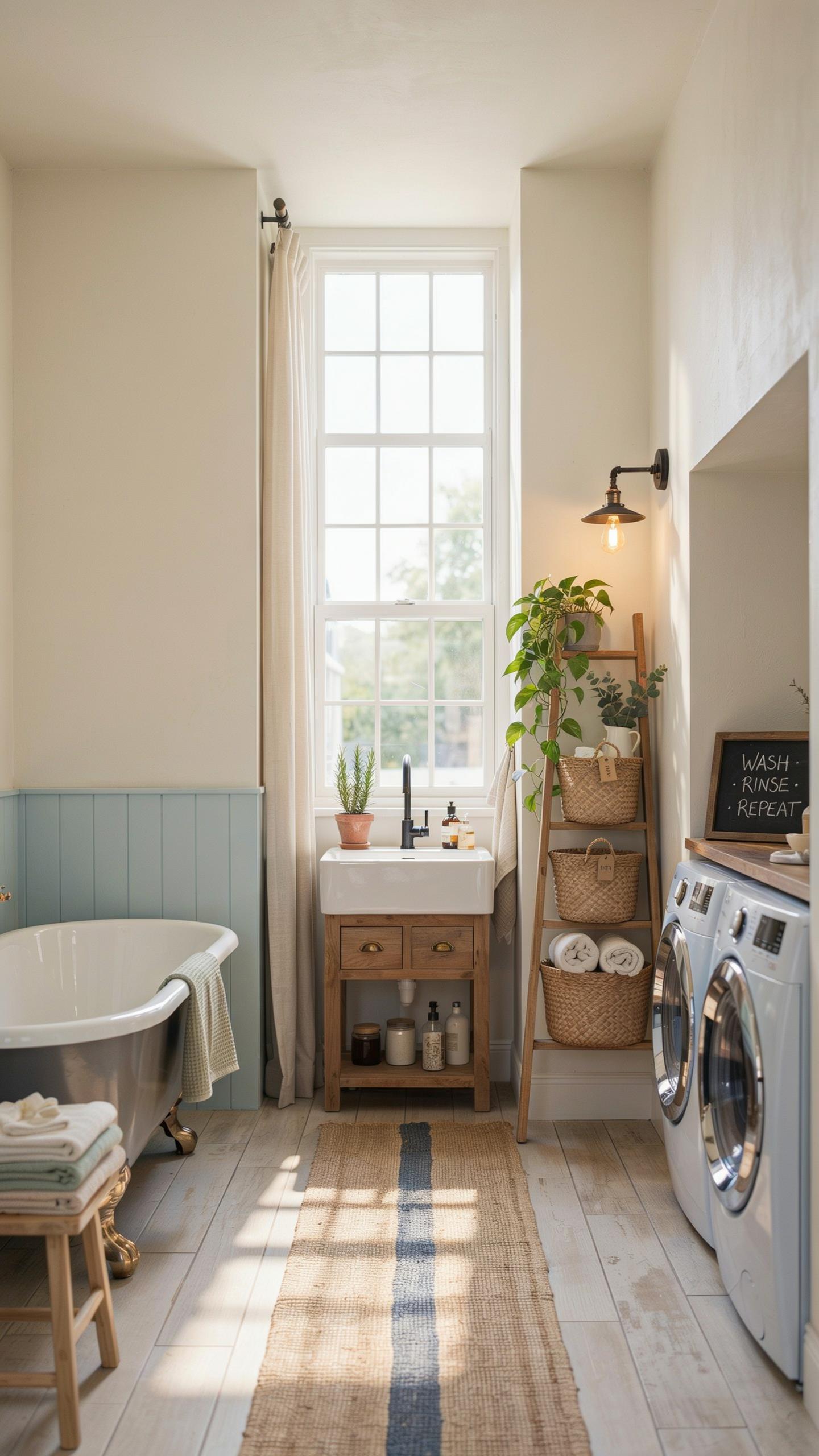
Crisp white and soft gray dominate modern farmhouse bathrooms and laundry rooms because they solve real problems. These colors reflect light in small spaces, making them feel larger. High-moisture areas need paint that resists mildew and moisture damage. White and gray hide water stains better than darker tones. They also provide a neutral backdrop for fixtures and accessories you’ll replace over time.
Soft grays work better than pure white when you want warmth without yellow undertones. Look for grays with minimal LRV (light reflectance value) differences from white to maintain brightness. Benjamin Moore’s Chantilly Lace and Sherwin Williams’ Alabaster are industry standards for bathrooms. Apply quality bathroom-grade paint with mildew-resistant additives in these spaces. Primer matters here. Use a bonding primer on glossy surfaces like tile surrounds to ensure paint adheres properly.
The best colors for a home are those that whisper of the earth and the sky, grounding us in timeless comfort while embracing the clean lines of today. A thoughtful palette doesn’t just decorate a room, it creates a sanctuary where heritage and modern life live in perfect harmony.
Contrast With Dark Hardware
Dark matte black hardware creates visual separation against light walls and cuts through the minimalism that can make small spaces feel sterile. Matte black resists fingerprints better than polished finishes in high-traffic laundry rooms. This contrast strategy comes from industrial design principles, not farmhouse tradition, but it works within modern farmhouse aesthetics. The combination reads clean and intentional rather than dated.

Patterned cement floor tiles ground the space and add texture without overwhelming walls. Matte black fixtures like faucets, towel bars, and light fixtures tie together visually while maintaining that industrial farmhouse edge. Keep wall color consistent while varying materials on floors and hardware. This approach prevents visual chaos in compact bathrooms and laundry zones where every element competes for attention.
Executing A Seamless Renovation Color Palette Throughout Your Home
Maintaining Visual Flow
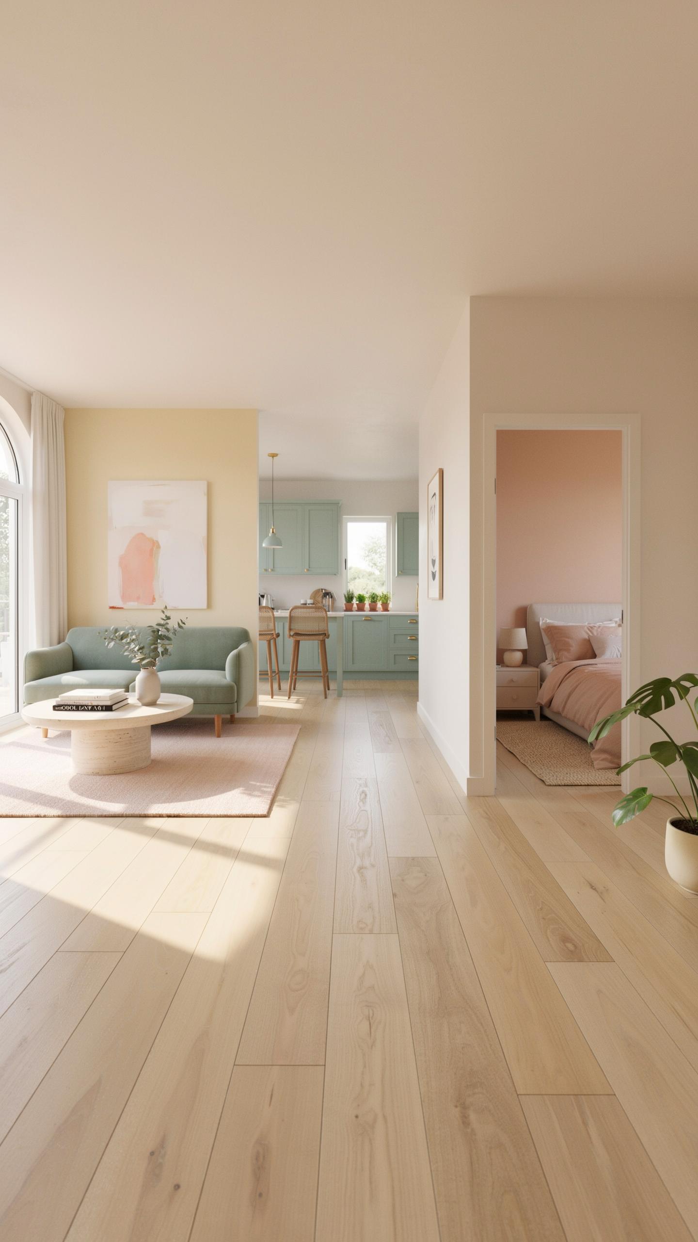
Modern farmhouse design relies on consistent undertones to prevent jarring shifts between rooms. Choose a neutral base, cream, greige, or soft white, and apply it across all main living spaces. This anchors your palette and makes adjoining rooms feel intentional rather than disconnected. Undertones matter here. Warm undertones in one room clash with cool undertones in the next.
Secondary colors should echo across spaces through strategic placement. If you use a muted sage in the kitchen, repeat it as trim or cabinetry accent in an adjacent room. This repetition signals intentional design, not random color choices. Your eye moves smoothly through the home instead of stopping at each doorway.
Transition And Accent Tips
Open floor plans demand deliberate color placement to avoid visual chaos. Accent colors work best when confined to specific zones rather than spread throughout. Use these proven methods to introduce accent colors without breaking your cohesive palette.
- Rugs as transition tools: Layer a patterned or solid accent rug in one zone to define the space and introduce secondary colors while keeping the overall palette unified.
- Built-in shelving backgrounds: Paint the back panel of built-ins in a muted accent color like dusty blue or warm taupe to anchor the color without overwhelming adjacent areas.
- Architectural trim accents: Use trim work in a slightly deeper shade than your base color to create subtle definition between spaces without hard color breaks.
- Cabinet and hardware contrast: Select cabinet interiors or hardware finishes in bronze or black to introduce accent tones within functional elements rather than on walls.
- Door frames and archways: Frame doorways with a coordinating accent color to signal transitions while maintaining visual continuity across the floor plan.

Strategic accent placement prevents color overload in open spaces. One or two accent zones per room keeps the modern farmhouse palette readable. Your eyes rest on neutral bases, then land deliberately on chosen accent points. This creates intentional visual movement instead of competing focal points.
Tips For Testing Your Selected Modern Farmhouse Paint Colors
Observing Light Transformations
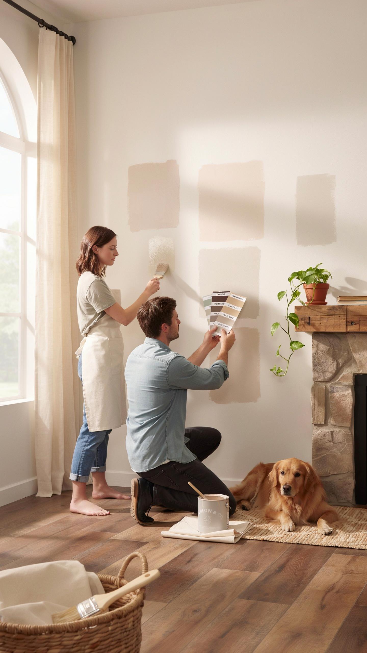
Paint colors shift under different lighting conditions. Natural sunlight changes throughout the day, moving from cool morning light to warm afternoon rays to dim evening tones. Your modern farmhouse palette needs to perform across all these scenarios. Test your colors at multiple times of day before committing to full application.
Artificial lighting creates additional variables. Incandescent bulbs emit warm tones and intensify warm undertones in paint. LED and fluorescent lights run cooler and can make warm colors appear flat or dull. Modern farmhouse interiors typically use mixed lighting sources. Observe how your selected colors respond to your actual lighting setup at different hours.
The Power Of Large Swatches
Small paint sample cards deceive. They don’t show how a color fills a wall or reacts to room proportions and lighting angles. Purchase large peel and stick paint samples or paint cardboard sheets in your candidate colors. Position these samples on multiple walls, including areas that receive direct sunlight and shadowed zones.
Leave swatches up for several days minimum. You need time to observe them under morning light, afternoon light, and artificial evening lighting. Notice how the color appears next to your flooring, trim, and existing furniture. This real world testing prevents expensive mistakes. Only order full gallons after you confirm the color performs as intended in your actual space.
Frequently Asked Questions

What are the core colors used in a basic modern farmhouse look?
A classic modern farmhouse style color palette begins with a foundation of warm, crisp whites and soft, airy greys. Unlike traditional rustic styles that rely heavily on dark browns, this contemporary approach uses light neutrals to create a bright and welcoming atmosphere. You can then layer in contrasting accents like matte black hardware or deep navy textiles to add depth and visual interest without overwhelming the serene, clean aesthetic of your living space.
How do I choose the right accent colors for my farmhouse palette?
To successfully implement a modern farmhouse style color palette, stick to the 60-30-10 rule. Use a neutral white for sixty percent of the room, a secondary soft beige or grey for thirty percent, and save bold tones for the final ten percent. Earthy greens, muted blues, or charcoal tones work beautifully for cabinetry, front doors, or throw pillows, providing a sophisticated pop of color that maintains a cohesive and grounded feel throughout your home.
Can I achieve a modern farmhouse look on a budget without repainting everything?
Absolutely! You can refresh your home’s aesthetic by focusing on affordable accessories like cream-colored linens, galvanized metal trays, and light wood frames. Swapping out old cabinet knobs for matte black hardware instantly provides that high-end feel. By introducing these small elements, you can mimic a professional color scheme through textures and accents alone, proving that you don’t need a massive renovation budget to capture the essence of this popular design trend.