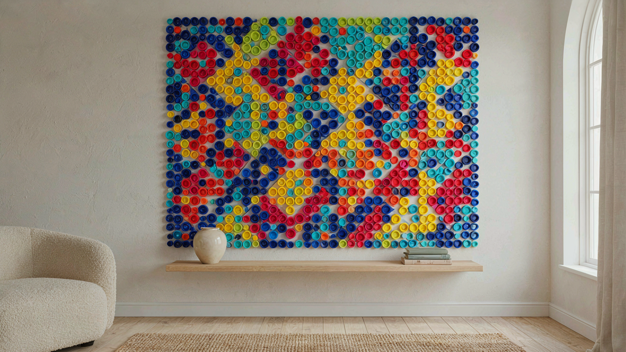
The “Scarcity Advantage” Bottle Cap Art Protocol

Minimalist Material Sourcing For Bottle Cap Crafts
You want permission to start without having everything figured out first. That’s the real fear here. The mechanism is simple: constraint forces decisions. You don’t need a massive stockpile of bottle caps to begin. Most people wait for the perfect collection before they design anything, which means they never start.
Collect strategically instead of hoarding randomly. Gather caps from beverages you actually consume over two to three weeks. This gives you a working inventory of 30 to 50 caps in limited color ranges. The limitation is the feature, not the problem. You’ll see patterns emerge faster with fewer options than you would drowning in thousands of identical plastic pieces.
Pre Computation: Design Before Collecting Plastic Bottle Caps
The conventional advice here is backwards. People source materials first, then figure out what to build. You should reverse this. Sketch or mock up your design on paper using basic shapes and limited colors before collecting a single cap.
This step filters out weak ideas before you waste time hunting materials. Draw your wall piece at actual scale. Identify exactly how many caps you need and in what color palette. Then source only what the design requires. This prevents the pile of leftover caps that ends up in a drawer. You work backward from vision to material, not forward from material to random inspiration.
Beyond Randomness: The Pattern Generation Method For Bottle Cap Art
When Grids Stop Looking Like Accidents
You want permission to call your bottle cap arrangement “intentional design” instead of just gluing things down. That fear drives most people toward grid systems. Geometry offers a real mechanism: tessellation, borrowed from architecture and tiling design, creates visual closure where the eye stops searching for order because order is undeniable. A grid doesn’t hide mistakes. It exposes them. That’s why it works.

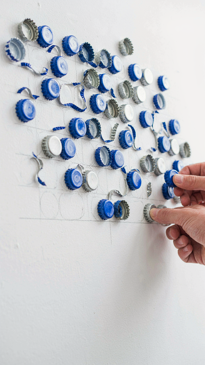
Start with axis-aligned grids (straight rows and columns) or offset grids (brick pattern). Both create instant visual authority because they refuse ambiguity. The caps align on invisible lines. Your wall reads as controlled, not scattered. Plot your bottle caps on graph paper first. Mark the exact position of each cap’s center point. Transfer those marks to your wall using a level and pencil. The grid itself stays invisible. Only the pattern remains.
Negative Space Shapes Your Composition
The real work in organic bottle cap arrangements isn’t placing caps where they go. It’s controlling the empty space between them to create intentional voids. Most people ignore negative space entirely and wonder why their compositions feel chaotic. The empty areas between clusters function like visual anchors. They give the eye permission to rest. Without them, all you have is noise.
Create organic flow by grouping caps into tight clusters, then spacing those clusters apart with deliberate gaps. The gaps should feel like part of the design, not mistakes. Map your composition on paper using circles to represent cap clusters and blank zones to represent negative space. This forces you to see absence as an active design choice. Transfer the pattern to your wall and build outward from the cluster centers. Irregular spacing creates rhythm. Predictable spacing creates monotony.
The Visual Economy Of Plastic Bottle Cap Crafts

How To Dominate With Three Colors
You want this to look intentional, not like you grabbed whatever caps were lying around. That’s the real fear underneath the question. Color theory from graphic design applies directly here: you’re managing contrast and harmony with severe constraints. A three-color palette forces decisions. You eliminate noise. Caps in navy, white, and rust create tension without chaos. Caps in cream, sage, and charcoal feel cohesive. The mechanism is constraint itself. Limited options force you to repeat patterns, and repetition reads as control.

Most people dump forty different colored caps into one piece and wonder why it looks scattered. Wrong move. You pick your three caps, count them, and build around ratios. Navy caps occupy sixty percent of the surface. White caps twenty percent. Rust caps twenty percent. This distribution creates visual weight that holds together. When you assign a color a structural role instead of scattering it randomly, the piece stops looking like accident and starts looking like decision.
Stacking Depth Without Expensive Materials
Dimension comes from layering, and layering comes from understanding that bottle caps have physical thickness you can exploit. This isn’t about buying special materials. It’s about recognizing that caps themselves are already three-dimensional objects. You glue one cap slightly forward of another, creating shadow. You stack caps in columns on your wall surface. You nest smaller caps inside larger ones. The depth builds through repetition of simple positioning, not through expensive techniques.
The common advice says to add other materials like paint, glitter, or resin. That’s solving the wrong problem. The real leverage point is shadow and overlap. A cap glued flat reads as flat. A cap glued on top of another cap reads as dimensional. Stack five caps vertically and you get pronounced shadow lines. Position them at angles instead of straight and shadow becomes irregular, which reads as more sophisticated. The protocol is simple: decide your depth first, then build the layers to hit that depth target.
Engineered Adhesion: Ensuring Longevity In Bottle Caps Art

The Clean Surface Rule
You want your bottle cap art to stay on the wall without falling apart in six months. That fear drives most people to skip prep work entirely. The mechanism is simple: adhesive bonds to surface texture, not to the cap itself. Oil, dust, and oxidation sit between the adhesive and the substrate, creating a weak interface that fails under gravity and temperature fluctuation.

Clean the back of each cap with rubbing alcohol and let it dry completely. For wall surfaces, wash with a damp cloth and allow to dry. Rough surfaces bond stronger than smooth ones, so lightly sand glossy paint or sealed walls with fine-grit sandpaper before mounting. This is not optional if you want the piece to last.
Matching Adhesive To Cap Material
Most bottle cap art fails because people use the wrong adhesive for the material. Metal caps, plastic caps, and cork-lined caps demand different chemistry. Contact cement works on metal but fails on certain plastics. Epoxy grips everything but yellows over time and cures slowly.
Two-part epoxy ranks highest for mixed-material pieces because it creates a mechanical lock rather than relying on surface chemistry alone. Apply a thin, even layer to the cap back, press for thirty seconds, then cure per instructions. For plastic-only caps, use a flexible polyurethane construction adhesive instead of rigid epoxy. For cork or felt-lined caps, roughen the surface first, then use epoxy to ensure the adhesive penetrates the porous material rather than sitting on top of it.
The “Assembly Line” Approach To Bottle Cap Mural Creation
Breaking Down The Design Grid First
You want to believe you can just glue caps randomly and call it art. That’s fear of commitment talking, wrapped in false creativity. Borrowed from manufacturing, modularity means breaking your mural into identical repeating units, and bottle cap art benefits from treating each section like an independent tile. This removes decision paralysis and scales the work without mental burnout.

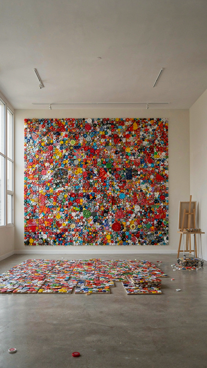
Start by sketching your full mural at actual size or grid it out on paper. Divide it into square or rectangular blocks, each containing four to sixteen caps depending on your pattern complexity. Design one module completely, then repeat it across your layout. This eliminates the trap of making inconsistent choices mid-project, which wastes caps and creates visual noise nobody can articulate but everyone sees.
Map It Out Before You Glue Anything
Common advice says “just start arranging.” That’s incomplete. You need a binding sequence that moves methodically across your surface, not jumping around like you’re playing checkers. The real mechanism here is reducing cognitive load and preventing rework. Lay out all your caps on the mural surface before applying adhesive. Mark their positions with pencil or photograph the arrangement so you can replicate it exactly when you glue.
Work in one direction: left to right, top to bottom, one row at a time. This prevents you from turning a cap you already glued because you suddenly noticed it doesn’t fit the color progression three rows up. Adhesive sets fast, and repositioning costs time and caps. Build your mural like you’re reading a page. Follow that sequence without deviation.
Cognitive Load Optimization For Pop Bottle Crafts
Material Flow Architecture
You’re worried you’ll start a project and abandon it halfway through because you’ll get lost in decisions. That’s the real problem here. Steal from military logistics: the concept of supply line optimization applies directly to bottle cap arrangement. Before you touch a single cap, map your material flow like a commander maps troop movement.
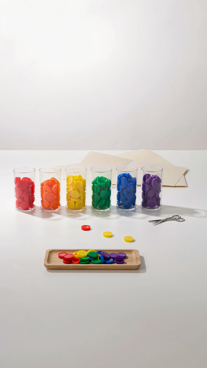
- Sorting Station First: Separate caps by color, size, and condition before design work begins. This removes real-time sorting friction and lets you see your actual inventory constraints upfront.
- Staging Area: Group pre-sorted caps into project-sized batches. A batch is enough material for one completed wall piece, not a vague pile.
- Adhesive Strategy: Choose one adhesive type per project, not multiple options. Switch costs kill momentum. Hot glue, epoxy, or contact cement—pick one and commit.
- Substrate Prep: Mount your backing board, prime it if needed, and mark your layout grid before opening a single cap container. The substrate becomes your supply hub.
- Discard Protocol: Define which caps are unusable before you start building. Cracked, faded, or dented caps leave the system immediately—no second-guessing mid-project.

The amateur approach is grabbing caps as you go, making decisions in real time, and burning mental energy on choices that should’ve been made at the start. Professionals pre-stage everything. You work in assembly mode, not problem-solving mode. Your hands move; your mind stays clear.
Priority Filtering Under Uncertainty
Paralysis happens when you see unlimited design options and no clear ranking system. The fix isn’t more inspiration—it’s a decision hierarchy that eliminates 90 percent of choices before you ever start. Build three filters and apply them in order: does this design fit your wall space, do you have the caps it requires, and does the aesthetic match your existing decor?
Most people skip straight to aesthetics because it feels like the “real” decision. That’s backwards. Constraints come first. Space limits your scale. Inventory limits your color palette and pattern complexity. Context limits your style. Run these three filters and you’ve already eliminated most options without debate. The remaining choices are actually meaningful.
From Waste To Wealth: The Inherent Value Of Bottle Cap Art
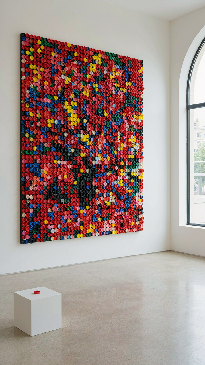
Plastic Caps Get A Second Life
You want permission to feel good about turning trash into decoration. The real mechanism is material substitution. Economics calls it this: when a producer extracts value from a waste stream, they reduce extraction costs elsewhere. Bottle caps are already manufactured, already distributed, already discarded. You’re not creating new demand for plastic production. You’re redirecting existing material that has nowhere else to go. That’s the actual environmental win, not the feel-good narrative.

The plastic bottle cap industry generates millions of units annually as byproduct waste. Most never enter recycling systems because they’re too small for standard machinery to process. When you source caps for art, you pull from that stranded inventory. You’re not competing with recycled plastic markets. You’re using material that landfills and incinerators would claim otherwise. The carbon footprint of your art project is essentially the transportation cost to move caps from collection point to your workspace.
What Makes Bottle Cap Art Actually Sellable
Common advice treats bottle cap art as quaint craft. That misses the mechanism. Bottle cap art works as a commercial product because it operates in a specific market gap: handmade wall decor that doesn’t require fine art training to produce or appreciate. Design movements like maximalism and tactile brutalism have already primed buyers to value dimensional, textured wall pieces over flat prints. Bottle caps deliver that visual demand at a price point below gallery art.
The unique selling proposition isn’t the material. It’s the constraint. Uniform circular shapes force compositional discipline. You can’t hide behind detail or complexity. Each piece reveals your pattern logic immediately. Collectors and interior designers recognize this constraint as honest work. You price based on time investment and composition sophistication, not material cost. A well-executed bottle cap installation sells because the limitation itself demonstrates intentionality.
Monetizing Your Mastery: Beyond Hobby Bottle Cap Art Ideas

Finding Your Actual Market
You want to know if people will pay for this. That’s not artistic curiosity—it’s fear of wasting time on something nobody values. The real mechanism is scarcity matching demand. Bottle cap art occupies a narrow lane: functional decor that reads as craft, not mass production. Most creators miss this and compete on volume instead of positioning.

The markets that actually exist aren’t what you think. People don’t buy bottle cap art because it’s made from recycled materials. They buy it because it solves a specific problem: they need wall decor that signals personality without the pretension of fine art or the blandness of IKEA. Your job is to identify which version of that problem your audience has.
- Bar and brewery owners: Seek authentic local decor that matches their brand identity. Bottle cap mosaics with bar logos or regional themes convert fast. Direct B2B pitch, not retail.
- Craft beverage collectors: Want display pieces that honor their specific bottles or breweries. They’ve already spent money on the hobby. Monetize existing passion, not create it.
- Corporate offices and hospitality: Need conversation pieces that feel handmade without looking chaotic. Geometric or branded bottle cap installations for lobbies and conference rooms work at scale.
- Etsy and online craft markets: Customers seeking personalized gifts. Custom pieces with initials, anniversary dates, or specific bottle types command premium pricing versus generic designs.
- Workshop facilitators and team-building companies: Buy bottle cap art kits and pre-made pieces as finished products for events. This is bulk recurring revenue, not one-off sales.
The mechanism isn’t “make art and hope.” It’s identifying who already has the problem, already has budget allocated, and already knows they need what you’re selling. Most bottle cap artists default to selling on Etsy or Instagram, which means competing with 50,000 other people on price and algorithmic luck. That’s the wrong game.
The Story That Justifies The Price
Everyone says “tell your story.” That’s useless advice because stories aren’t free passes to charge more. The real function of storytelling in craft sales is reducing buyer friction by pre-answering objections. A customer looking at your bottle cap art is asking one implicit question: why is this worth money instead of a DIY kit?
Your story must address the exact objection blocking the sale. If you’re selling to brewery owners, the story isn’t about your artistic journey. It’s about how your installation process is faster than competing options, how the piece integrates with their existing aesthetic, and why it stays together. If you’re selling personalized pieces on Etsy, the story is about the time investment, the precision required, and why machine-made alternatives don’t hold up. The story is the permission structure that justifies premium pricing over commodity alternatives. Without it, you’re just another craft seller competing on cost. Document your process, show the specific bottles you use, name the design logic behind each piece. Make the invisible work visible, then charge for it.
The Real Obstacle: Your Unwillingness To Embrace Productive Constraints. Discipline, Not Inspiration, Forges Impact


You don’t need more bottle cap ideas. You need to pick one and finish it. The friction you feel isn’t a sign to research more. It’s a sign to start. Grab ten caps today, commit to one design, and ship it. Every artist who matters stopped waiting for the perfect idea and started executing with garbage materials instead. Constraints don’t limit creativity. They ignite it. Your first piece won’t be your best. It’ll just be the one that lets you make the second.