The “Expensive Look” Deception: Why Basic Thrifted Vase Makeover Fails
What Everyone Gets Wrong About Makeovers
You want the transformation to signal that you have taste and money without spending either. That’s the real reason you’re here. The problem: most thrifted vase makeover advice stops at surface treatment. Paint it, add flowers, call it done. This fails because it ignores the core principle that separates amateur from intentional. Expensive objects signal restraint, not effort. A thrifted vase painted with gloss finish and hot glue details screams “I tried hard” instead of “I know what I’m doing.”
Generic guidance treats vase makeovers like crafts instead of design. You’ll see tutorials recommending spray paint, metallic accents, and stencil patterns as if decoration equals elevation. The mechanism at work here is borrowed from architecture: signal-to-noise ratio. High-end interiors minimize visual noise while maximizing material integrity. A $300 ceramic vase doesn’t work because of what’s added to it. It works because of what’s present and nothing more.
Material Presence Over Surface Addition
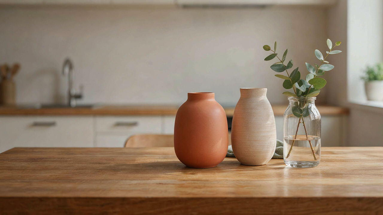
Expensive vases sit heavy in your hand. They have weight distribution that feels deliberate. Most thrifted vase makeovers fail because they treat the vessel as a canvas rather than a form. You can’t paint your way to density. The real upgrade happens through material substitution or strategic removal, not layering novelty on top of existing geometry.
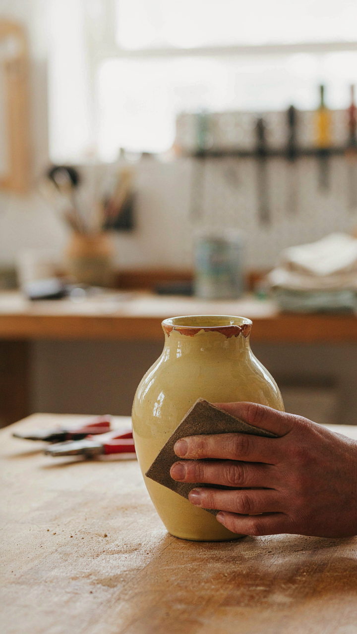
The difference between $30 and $300 isn’t the decoration. It’s the material density and how light behaves across the surface. Matte ceramic reads as intentional. Glossy painted surfaces read as corrective. If your thrifted vase has a basic glaze, consider whether matting the finish through light sanding and matte topcoat creates depth without adding visual noise. The expensive look requires subtraction of shine, not addition of ornament.
The Material Alchemy Protocol: Painting Glass To Look Like Pottery

Prep The Glass Like You’re Building Foundation
You want people to assume it cost more than it did. That’s the motive. Here’s the mechanism: paint doesn’t bond to glass without friction. Glass is nonporous. Your paint will chip in weeks without proper preparation. Start by cleaning the vase thoroughly with white vinegar and let it dry completely. Sand the entire exterior surface with 120-grit sandpaper using circular motions. This creates micro-scratches that give paint something to grip. Wipe away all dust with a tack cloth before priming.

Prime with a bonding primer designed for glossy surfaces. Shellac-based primers work best for glass because they’re aggressive enough to anchor paint molecules. Apply two thin coats rather than one thick coat. Thick applications peel. Thin coats cure properly and last. Let primer dry per manufacturer specs, usually 24 hours. Skip this step and your expensive-looking finish becomes cheap-looking wreckage within months.
Build Texture That Reads As Craft
Ceramic surfaces have porous texture. Paint alone won’t create that illusion. Borrowing from materials science, you’re engineering a surface finish that mimics capillary action—the way pottery clay absorbs and reflects light differently than glass. Apply your base coat with a foam roller in thin, uneven passes to avoid the uniform sheen that screams “plastic paint job.” Layer a second, slightly darker shade using a dry brush technique, hitting only the raised areas your base coat created.
The ceramic illusion happens through strategic opacity variation. Mix your paint with a texture additive or sand into the topcoat to create actual surface variation. Dab, don’t brush, your final layer with a sea sponge. This creates the depth that separates professional-looking vases from flat, painted ones. The texture traps shadow. Shadow creates dimension. Dimension creates perceived value.
The Art Of Imperfection: How To Paint A Ceramic Vase Authentically
Embracing Natural Variations And Flaws
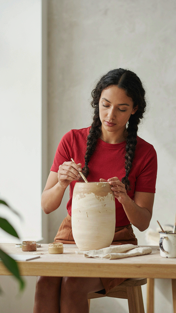
You want the vase to look intentional, not like you’re hiding a mistake. That’s the real mechanism here. Paint isn’t a filter that erases what’s underneath. Ceramic absorbs moisture unevenly. Old glazes have micro-crazing. The vase itself dictates where paint will pool and where it won’t. Working against this creates obvious artificiality. Working with it makes the piece read as curated.

Start by accepting the vase’s surface topology instead of sanding it smooth. Brush strokes should follow the clay’s natural texture and any existing glaze imperfections. Uneven paint coverage isn’t a failure. It’s evidence that a real surface exists beneath the finish. This is what separates thrifted vases that look expensive from ones that look like a craft project gone wrong.
Brushwork And Patinas For Aged Aesthetics
The common advice says dry brush technique. That’s incomplete. Dry brushing alone reads as texture, not age. Real aged finishes have directional wear, concentrated where hands touched or light hit the piece over decades. You’re not creating random variation. You’re creating a wear map that tells a story of use.
Use a 60/40 paint-to-solvent ratio on your final layer. Apply heavier concentrations at the base and lip. Thin the edges where you’d expect gravity and friction to actually wear paint away. Let the base ceramic show through deliberately in these zones. This isn’t decoration. It’s archaeological accuracy translated into a $12 vase from a thrift store.
Upcycle Glass Vases: From Disposable To Desirable Object
When Function Stops Mattering
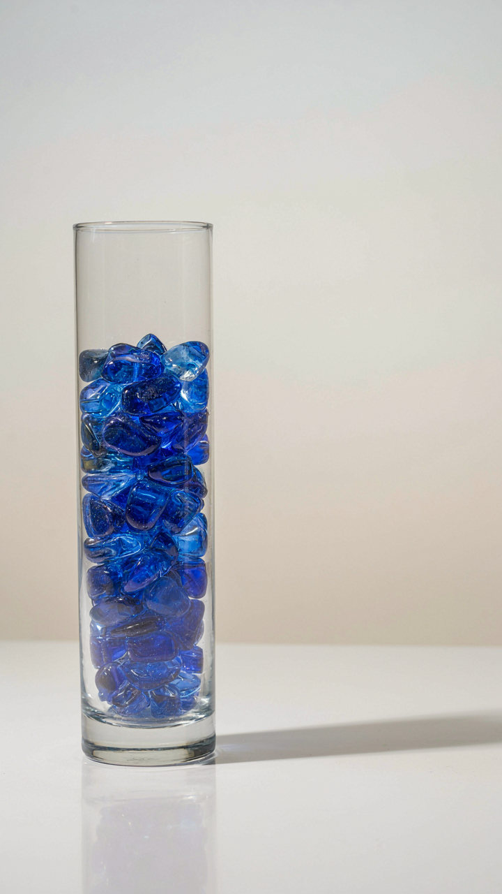
You want this vase to signal taste, not effort. That’s the real stake. The mechanism is simple: most thrifted glass vases fail because they chase decoration instead of reconsidering what a vase actually does. Borrowed from industrial design, form follows function means the shape serves a purpose first. Here, the purpose isn’t just holding flowers. It’s existing as an object worth looking at when empty. Strip that vase of assumptions about what it should be, and you unlock its actual value.

Common advice says to paint, embellish, or disguise the glass. Wrong. The expensive move is removing visual noise until the vase’s core geometry speaks for itself. A clear glass vessel with clean lines doesn’t need florals or colored resin. It needs intentional restraint. This is where most makeovers fail: they add instead of subtract. Evaluate the vase’s proportions, transparency, and silhouette. If those three elements work, stop there. If they don’t, you’re fixing the wrong problem.
Mass Distribution Creates Perceived Value
Weight is currency in design. A light vase feels temporary and cheap. A heavier one feels chosen and permanent. Bringing in physics terminology, mass distribution determines stability and visual weight. A vase bottom-heavy by design communicates craftsmanship, even if it’s thrifted. Top-heavy vases, common in cheap production glass, read as unstable and forgettable.
Test this: fill the vase with water and hold it. Where does the weight settle? If it concentrates at the bottom through glass thickness alone, you’re starting from strength. If weight needs the water to feel substantial, the base is weak. To correct this, add materials to the bottom chamber only. Recycled glass pebbles, sand, or even food-grade epoxy weighted at the base transform the vase’s tactile presence. Place it on a surface and observe the shadow it casts. Deeper shadow means more perceived solidity. That’s your signal the makeover worked.
Beyond Paint: The Subtlety Of Texture In Vase Makeover Diy

Plaster And Grit Build Real Depth
You want people to think you paid more than you did. That’s the real reason texture matters. The mechanism is simple: expensive ceramics and art objects use surface variation to catch light differently across the piece. Borrowed from material science, this is called light diffusion. A flat painted vase diffuses nothing. Texture does the work.
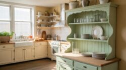
Plaster and grit create depth because they sit on top of the base layer instead of flattening into it. Mix unsanded grout or joint compound with water to a thick paste, apply it unevenly across the vase with a putty knife or old credit card, then press fine sand or pumice grit into the wet surface. Let it cure fully before sealing. The result catches side light and shadows that signal handcrafted quality to anyone looking at it.
When Texture Reads As Cheap Instead
Most people slap on texture and call it done. That’s the mistake. Uniform texture, applied evenly, looks like a bad spray-on coating or craft store filler. Expensive pieces use texture strategically, not everywhere. The gaps matter more than the coverage.
Apply texture only to sections where you want visual weight: the base, along the rim, in a band around the middle. Leave smooth areas to breathe. Seal everything with a matte clear coat, not a glossy one. Gloss reads cheap on textured surfaces because it amplifies the artificiality. Matte finish lets the texture recede into sophistication instead of screaming applied decoration.
The Curatorial Eye: Selecting The Right Thrifted Vases Diy Base

Shape Proportion And Underlying Structure
You’re browsing thrift stores hoping to find a vase that looks like it cost money, which means you’re really hunting for permission to believe you have taste. Stop. The actual mechanism is structural geometry. A vase’s visual weight comes from how its mass distributes vertically and horizontally, not from material or age. Proportion is the skeleton everything else hangs on.
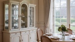
The common mistake is choosing vases based on surface appeal. You see a color you like or a pattern that catches your eye, so you grab it. Wrong angle. Start by analyzing the silhouette. A vase with a wide shoulder that tapers to a narrow neck reads as intentional and controlled. A squat cylinder with straight sides looks industrial and current. A bulbous body with a long thin neck reads expensive because it demands confidence in its own strangeness. Flip the vase upside down. If the base looks carelessly made or too heavy, the entire piece collapses visually, even after you refinish it.
Avoiding The Craft Fair Aesthetic Trap
The craft fair trap is assuming that handmade or heavily decorated equals valuable. It doesn’t. Most thrifted vases fail because they’re overcomplicated, which reads as uncertain, not refined. Complexity without purpose screams amateur hour.
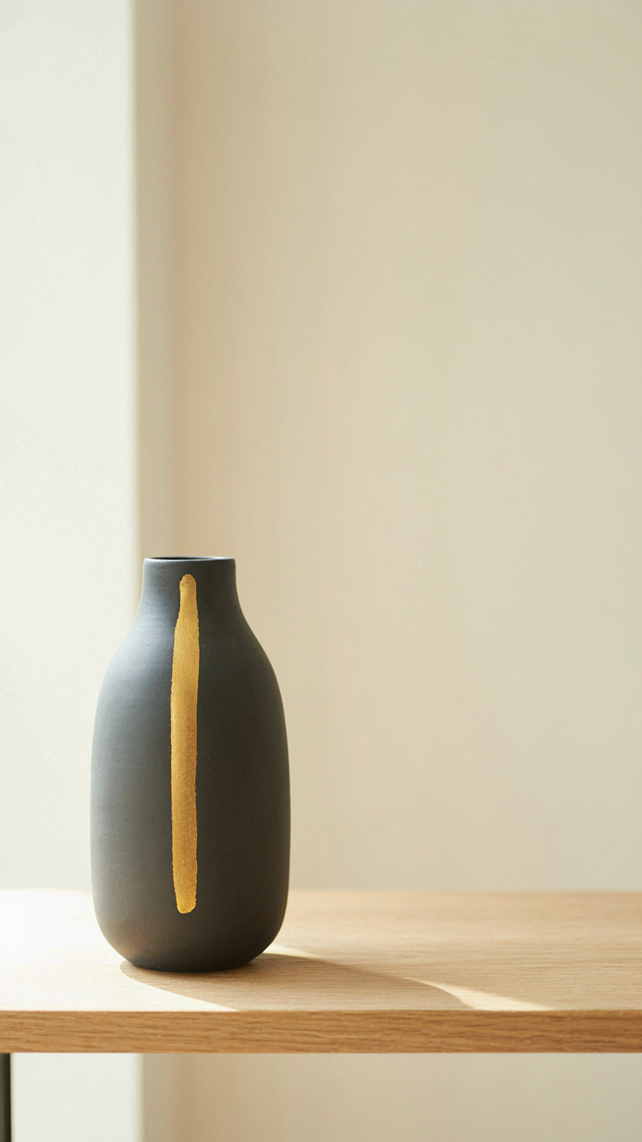
Look for vases with negative space. The best vintage pieces know when to stop. A vase painted with one bold stripe holds more visual authority than one covered in floral decals. If a vase has multiple competing colors, patterns, or textures fighting for attention, walk past it. The makeover will amplify that noise, not fix it. Choose a clean structural base because refinishing magnifies restraint or chaos equally.
Advanced DIY Vase Techniques: Patinas And Chemical Washes
Simulating Verdigris Or Aged Metal
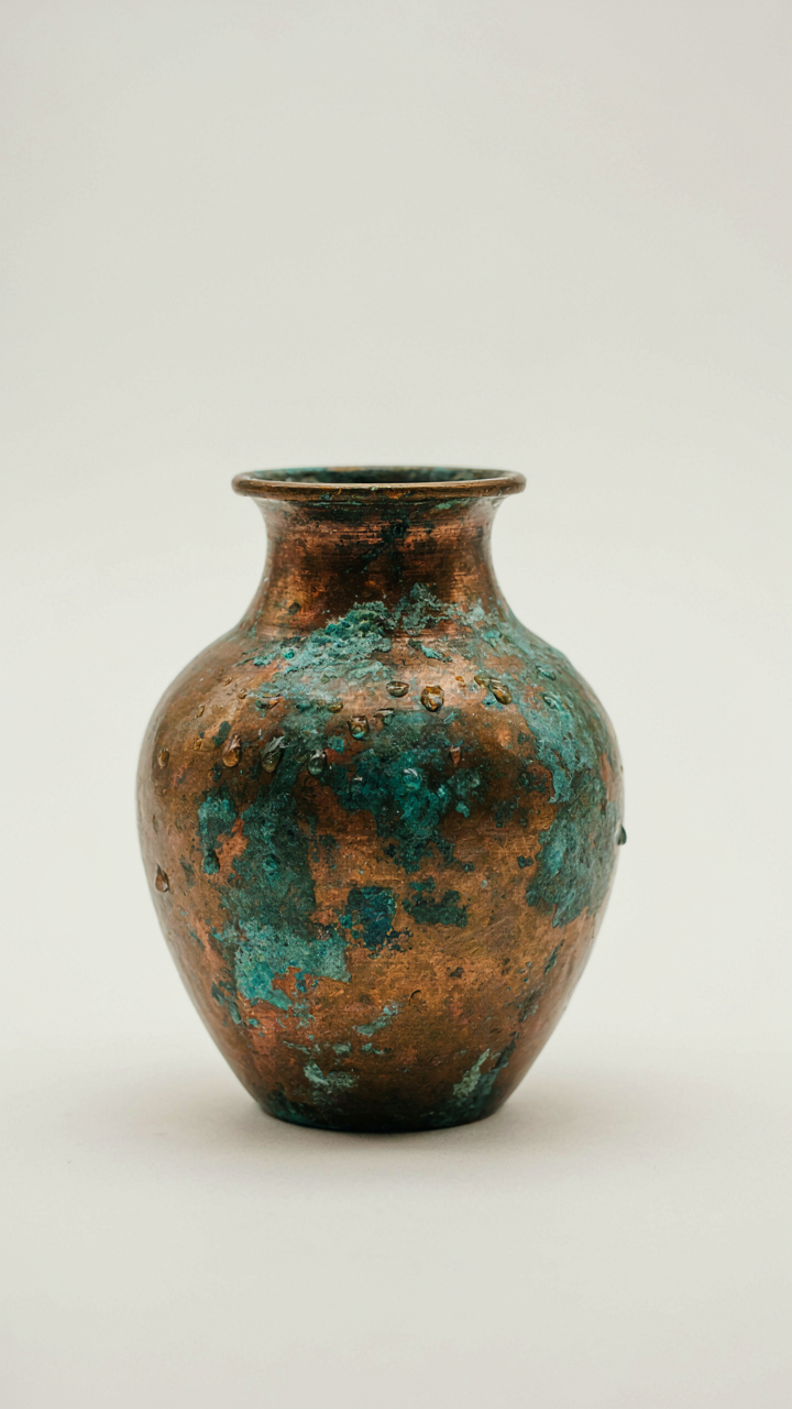
You want the vase to look like it survived decades untouched, not like you made it last Tuesday. The mechanism is this: verdigris forms when copper oxidizes through exposure to oxygen and moisture over time. You’re compressing that timeline chemically. A real patina has layers. A fake one looks flat because you’re applying color without understanding what color actually represents: the geological record of corrosion.

Start with a copper-toned base coat, then use hydrogen peroxide and salt to accelerate oxidation. The peroxide breaks down into water and oxygen, which reacts with the metal particles in your paint. Salt acts as a catalyst, speeding the reaction. Apply in thin, uneven layers. Verdigris doesn’t spread evenly across a surface, so neither should yours. Let each layer dry before adding the next. The depth comes from variation, not from a single wash.
Creating Natural Degradation Effects
The common advice here is wrong: most people think degradation means random scratches and dusty corners. That’s noise. Real degradation follows a pattern. Brass and copper corrode faster at stress points and where moisture pools. Iron rusts first at edges. Paint cracks where surfaces flex. You’re mapping environmental logic onto an object that never experienced that environment.
- High-traffic edges and rims: Use fine-grit sandpaper to thin paint at contact points where wear naturally occurs. Sand in one direction to mimic handling patterns, not chaotically.
- Pooling and runoff zones: Apply darker patina wash to the interior neck and base where liquid would sit and oxidize faster. Leave it heavier there.
- Hairline cracks in glazed finishes: Use a thin, dark wash in crevices before sealing. This suggests age without looking deliberately distressed.
- Uneven surface aging: Spray or brush darker tones onto one side heavier than the other, simulating sun exposure and weathering bias over time.
- Patina blooming: Apply a light, chalky layer of dry pigment or diluted paint over sealed sections to suggest surface oxidation without depth damage.
The sequence matters. You sand, then seal, then chemically age, then seal again. This order prevents your degradation effects from looking applied instead of lived. Start with the lightest effects and build opacity gradually. Stop before it looks intentional.
The Minimalist’s Manifesto: How To Upcycle Vases With Restraint
One Move Changes Everything
You want permission to do less because doing more feels safer. The mechanism here comes from constraint-based design: you isolate a single variable and maximize its impact rather than scatter effort across ten mediocre changes. A thrifted vase becomes expensive-looking when one element gets treated with intent, not when you layer techniques.
Most thrifted vases fail because people treat them like blank canvases. They add texture, paint multiple colors, glue on objects, then wonder why the result looks like a craft project. Pick one intervention: matte spray paint in a museum-quality shade, or a single band of high-end metallic leaf, or a deliberate chip left exposed. The restraint is what signals quality.
Know When To Walk Away
The difference between a makeover and a ruin is knowing the exact moment to stop. Professional restorers call this “reversibility,” but most DIY people never learn it because stopping feels incomplete. A vase with original patina and one strategic intervention reads as intentional. A vase that’s been sanded, painted, sealed, and embellished reads as desperate.
Test this: if you can describe the vase’s transformation in one sentence, you stopped at the right place. If you need three sentences, you overworked it. The expensive-looking thrifted vase sits still and lets its single intervention breathe. You finish when the vase speaks for itself, not when you’ve exhausted your tools.
The Real Obstacle Isn’t The Vase; It’s Your Fear Of Committing To A Distinct Aesthetic

Most people won’t commit to a vase makeover because committing means taking a stand. It means saying “this is my taste” instead of hiding behind “I’m still figuring it out.” Pick one aesthetic right now. Gold leafing, matte black, terrazzo texture—whatever. Buy the supplies today. The vase doesn’t care if you’re uncertain. Your guests will remember the one bold choice in your room before they forget a thousand safe ones.