The Illusion Of “Good Taste”: Why Your Thrift Store Candle Holders Look Basic
The Real Reason Your Makeover Fails
You want proof that you have taste. That’s the real fear driving this project. Most people apply the same three moves to every thrift candle holder—spray paint, add a candle, call it done—because they’re following a template, not making decisions. The mechanism is simple: when you copy what works for someone else, you erase the only variable that matters: constraint-based problem solving. Your holder isn’t the problem. Your approach is.
The consensus advice says “just paint it” or “add greenery.” This is incomplete. Those moves work when the holder’s form already has tension or visual weight. Most thrift holders are forgettable because they were mass-produced to offend no one. Makeover success requires you to identify what the holder actually is—its material, proportions, era—then escalate one specific property instead of decorating around weakness. You’re not adding style. You’re revealing structure.
Breaking Free From Filtered Aesthetics
Pinterest flattens all candle holder makeovers into one visual language: white, minimal, trending. This isn’t taste. It’s herd behavior masquerading as design. The mechanism here borrows from economics: when supply of “good taste” content explodes, demand for differentiation collapses. Everyone painting their thrift holder sage green or cream isn’t a coincidence. It’s saturation.
The solution isn’t to reject trends entirely. It’s to make one intentional choice that contradicts the current aesthetic, then commit to it fully. If the filtered look is matte and neutral, go glossy or introduce one unexpected color that relates to the holder’s original material or era. Contrast creates recognition. Your holder stops looking like content and starts looking like it belongs somewhere specific. The move: identify what category your holder sits in, then move against consensus within that category only.
Deconstructing The “Under Ten Dollars” Myth: Hidden Value, Not Just Cheapness

Quality Lives In The Material, Not The Price Tag
You want permission to feel smart about spending less. That’s the real reason this section matters. Here’s the mechanism: thrift stores price items based on surface condition and brand recognition, not material composition. A brass candle holder marked five dollars because of tarnish contains the same material as a polished version selling for thirty at a boutique. Brass, copper, and cast iron hold value independent of cosmetic damage. Most people conflate worn appearance with worthlessness. They’re wrong.

The thrift pricing system operates like a efficiency market that hasn’t priced in the variable you care about. Tarnish, dust, and minor dents get penalized heavily at checkout. Material quality gets ignored entirely. Walk past the ceramic holders marked two dollars. Find the metal ones with weight, patina, and real substance. Weigh the piece in your hand. If it feels substantial and the base sits flat, you’ve likely found something worth the renovation effort.
What The Surface Never Tells You
Everyone says look past the damage. That’s incomplete advice. You need to assess structural integrity versus cosmetic failure, a distinction from materials science that separates a salvageable piece from a waste of time. Cosmetic failure is tarnish, scratches, or paint chips. Structural failure is cracks, loose joints, or bent components that won’t hold a candle safely.
Run your finger along seams and joints. Check for hairline cracks in ceramic or glass. Test stability by pressing down on the rim. A wobbling base becomes a fire hazard, not a design feature. Inspect the interior cup where the candle sits. Look for damage that compromises function, not just appearance. Once you separate real problems from surface-level flaws, you know exactly what your ten dollars can fix and what it cannot.
The Alchemist’s Method: Transforming Thrift Store Candlestick Makeover Into Gold
When Chemistry Meets Intent
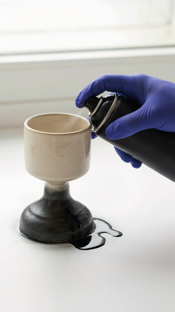
You want to feel like you created something instead of just bought it. Here’s what actually happens: paint and patina work through oxidation and layering, the same way rust forms on metal or leaves brown over time. When you apply primer to a thrifted candlestick, you’re creating a surface that accepts subsequent coats uniformly. Without it, paint beads and peels because the original finish repels rather than receives. The chemistry doesn’t care about your intentions, only about molecular adhesion.

Most people skip primer and wonder why their makeover fails. Primer bonds to whatever sits underneath—lacquer, varnish, dust, oxidation. Then the topcoat bonds to the primer, not directly to an unprepared surface. Acrylic latex paint dries through water evaporation and binds as the polymers interlock. Oil-based enamels cure through oxidation, creating a harder finish. For a candlestick under ten dollars including materials, acrylic primer plus two coats of acrylic enamel gives you durability without the fumes or curing time. Apply thin coats rather than one thick coat. The difference between a makeover that lasts and one that chips in three months is primer selection and application thickness.
Collision Of Materials Creates Perceived Value
Materials don’t have to match to work together, but they do need contrast to register as intentional. Pairing a ceramic candlestick base with a wooden dowel as the shaft, or a brass stem with a concrete-poured cup, signals design choice rather than accident. The mechanism is visual hierarchy through material discord. Your eye recognizes the boundary between substances and interprets it as deliberate.
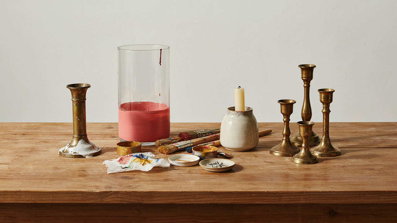
Thrifted candlesticks give you a head start because the original material is often already mixed. A brass base with a ceramic cup, or glass stem with metal fittings. Your job is amplifying that contrast, not hiding it. Spray paint the metal components matte black while leaving the ceramic natural, or vice versa. Wrap the wooden dowel in copper tape before inserting it into the base. Glue river rocks or concrete elements onto smooth surfaces. The material collision is what prevents the piece from looking factory-made. Test combinations by photographing them before committing adhesive.
The Scarcity Mindset Fallacy In Diy Candle Holder Transformation
When Constraints Force Better Decisions
You’re hoping a tight budget excuses you from making something worth keeping. It doesn’t. Constraints work like economic pressure in decision theory: they eliminate noise and force trade-offs that actually improve outcomes. When you have ten dollars, you stop buying materials you don’t need. You pick one material, one finish, one direction. The expensive designer with unlimited resources often fails because paralysis by option kills execution. You’re solving a harder problem because you have fewer choices, which sharpens your thinking.

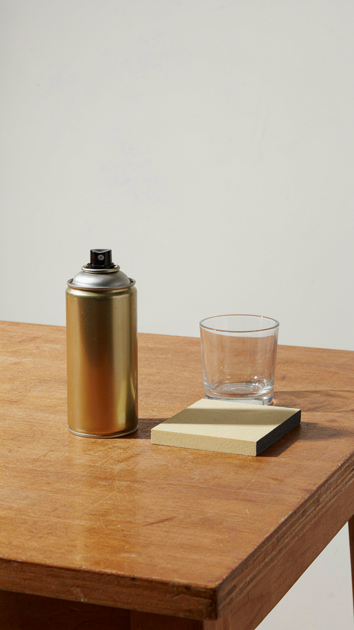
The mechanism is simple: scarcity removes the ability to hedge your bets. You can’t buy five different spray paints and see which one works best. You buy one, commit to it, and learn the material deeply instead of staying surface-level. This forces mastery of fundamentals. Brass polish application matters more when you only have one shot. Glass etching technique becomes precise when you can’t buy another candle holder to practice on. The ten-dollar limit isn’t a handicap. It’s a filter that separates people who plan from people who waste money discovering what they should have known before buying.
Resourcefulness Beats Unlimited Capital
The real advantage isn’t having less money. The real advantage is developing pattern recognition across materials that cost nothing. Thrift stores create a unique market dynamic: identical items sit side by side at different price points because the person pricing them doesn’t know what they are. A brass candle holder marked three dollars might be museum-quality mid-century design. A clear glass votive holder marked fifty cents could be older pressed glass with actual collector value. Resourcefulness means you learn to spot the signal others miss in the noise of ten thousand donated items.
When you work under constraint, you develop a system for evaluating materials before you buy. You ask: Can this be stripped? Can this accept paint? Can this be reassembled differently? Does the weight suggest quality underneath? You build a mental database of what responds to vinegar, what needs steel wool, what takes metallic spray coating without chipping. You stop treating materials as finished products and start seeing them as raw components. The person who spends a hundred dollars on premium supplies learns one way to work. The person who has ten dollars and sources materials from the thrift shelf learns to evaluate, test, and execute with whatever the store has today.
Repurpose Candle Holders: The “Assemblage Theory” Of Design

When Objects Gain Meaning Through Connection
You want permission to believe your thrift store find matters. Here’s the mechanism: objects don’t have fixed value. They gain it through the systems you place them in. Deleuze and Guattari called this assemblage theory in philosophy. In thrifted candle holder makeover work, it means a brass holder stops being “old junk” the moment you connect it to a new function or context. The holder itself unchanged, but its relationship to your space transforms it entirely.

This reframing eliminates the guilt of modification. You’re not fixing something broken. You’re activating potential that was dormant. A ceramic holder originally designed for tapers becomes a desk pencil cup. A brass candlestick becomes a plant stand base. The object flows into a new network of use and meaning. Cost stays under ten dollars because you’re leveraging existing form, not replacing it.
Stripping Away Context Creates Opportunity
Most people say “repurpose means finding a new use.” That’s incomplete. Repurposing actually means isolating an object from its original context first, then inserting it into a new one. The real work happens in that gap. A thrifted candle holder carries weight from its past life. It was likely purchased by someone else for a specific room, specific aesthetic, specific era. When you strip that context by buying it used and alone, you erase its former identity.
This erasure is where your budget advantage lives. You’re not paying for provenance, brand, or historical accuracy. You’re paying for material and form. Once context disappears, you see the holder for what it physically is: weight, height, surface texture, opening size. These properties cost nothing to activate differently. A glass holder becomes a terrarium. A metal one becomes a geometric wall bracket. The erasure step takes thirty seconds of deliberate perspective shift. Do it before you buy or immediately after, not weeks later.
The Anti Trends Protocol: Curating Truly Unique Candlestick Decor Ideas

Stop Chasing What Everyone Else Bought
You want your thrifted candle holder to look intentional, not like you followed a Pinterest board that five thousand other people saved. The real mechanism here is constraint. In economics, scarcity forces differentiation. Your thrifted holder already starts with constraint built in—it’s one specific object with real history, not mass produced. The mistake is treating that constraint as a limitation instead of leverage. Most people sand it, paint it white or millennial gray, and call it done. They’ve eliminated the constraint instead of weaponizing it.

Your distinct visual language emerges when you work against the current aesthetic, not with it. Pick a thrifted candle holder that contradicts the dominant style in your space. If minimalism dominates your room, choose something ornate or heavy. If your decor runs maximalist, find something restrained. This isn’t contrarianism for its own sake. It’s the only way to train your eye to see what you actually want instead of what algorithms recommend. The holder becomes memorable because it breaks the pattern you live in every day.
Define Your Visual Signature Through Restraint
The common advice here is backwards: people think unique means adding more. More colors, more techniques, more personality. Restraint is what actually signals taste. When you makeover a thrifted candle holder for under ten dollars, your constraint isn’t budget—it’s deciding what you will not do. Pick one material to focus on. One finish. One technique. One color family maximum. This discipline forces you to understand form instead of hiding behind decoration.
Study what you naturally gravitate toward across your entire environment: your clothes, the objects you keep, the spaces you linger in. You’ll notice patterns. Don’t fight them. Amplify one of them through your candle holder makeover. Use gold leaf on wood? Use it consistently. Prefer raw, unfinished surfaces? Leave the patina. Drawn to matte over glossy? Commit to that choice. The protocol is simple: identify your visual signature by auditing your existing selections, then apply one core element from that signature to your holder. The result won’t look trendy because it reflects your actual preferences, not current consensus.
DIY Candlestick Makeover: The “Less Is More” Deception
Know When To Stop Adding
You want permission to make something look expensive without spending money. That’s the real driver here. The mechanism is constraint. In design, constraint forces you to choose one change that matters instead of five that dilute each other. Most people treat thrifted candle holders like a blank canvas that demands filling. It doesn’t. A candlestick already has a job. Your edit should strengthen that job, not compete with it.

The impulse to over-decorate comes from insecurity about whether a single change looks “enough.” It isn’t. One strategic addition to a thrifted candlestick beats three mediocre ones. Test this: spray paint the base one metallic color, then stop. Notice how your eye lands there. That’s the mechanism working. A second addition now feels like noise.
One Material Shift Changes Everything
Paint alone doesn’t cut it because everyone does it. Real impact comes from texture replacement, not color swapping. Take a brass candlestick with a cheap plastic drip cup. Replace that cup with a real ceramic disc or wrap the base stem in twine. The material change signals quality because materials carry weight in how humans perceive value.
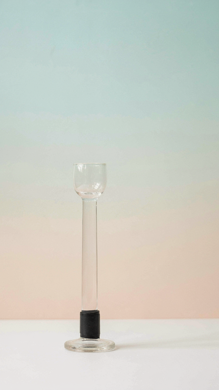
The constraint here is budget, so you’re not adding expensive materials. You’re swapping one cheap material for another cheap material that reads as intentional. A thrifted glass candlestick with a dull base becomes sharp when you wrap the bottom in matte black electrical tape or thin leather cord. The cost stays under two dollars. The perception shift is immediate because material texture communicates craft.
Beyond Paint: The Overlooked Power Of Texture In Diy Candlestick Transformation
What Texture Actually Does To A Candle Holder
You want texture on your thrifted candlestick because it solves a real problem paint can’t touch: visual weight without spending more money. Think of texture the way architects think about load-bearing walls. A smooth painted surface distributes visual attention evenly and flatly. Texture interrupts that flatness. It creates shadow, depth, and the illusion of craftsmanship. This is why a matte finish alone feels cheap and texture feels intentional.

Texture works because human eyes process depth through shadow and surface variation. When light hits a smooth surface, it reflects uniformly. When light hits texture, it breaks into micro-shadows that make the piece look more complex than it is. Under ten dollars, you’re not competing on materials. You’re competing on how much visual interest you generate per dollar spent. Texture is the mechanism that does this.
- Fabric wrapping: Wind burlap, linen, or rough cotton around the stem or base using hot glue. Creates organic variation and feels handmade for under two dollars.
- Sand adhesion: Mix fine sand or pebbles into matte paint before application. Creates gritty surface that catches light differently than smooth paint.
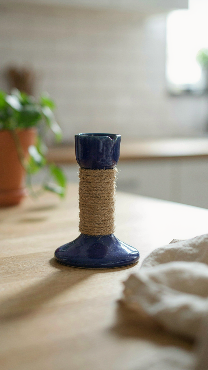
- Twine layering: Wrap thick jute or hemp twine tightly around the candlestick in bands. Adds sculptural dimension and costs less than a dollar per roll.
- Crackle medium: Apply crackle paint medium over base paint to create intentional surface breaks. Mimics aged finishes without refinishing furniture.
- Wax paper transfer: Press textured materials like lace or leaves into still-wet paint or adhesive. Leaves impression without permanent attachment.
Most people skip texture because they think paint does everything. It doesn’t. Paint covers. Texture transforms. The difference between a thrifted candlestick that looks like you tried and one that looks like you succeeded lives in how much visual information sits on that surface.
Stacking Contrasts Until It Reads As Intentional
Layering texture isn’t about piling effects randomly. It’s about creating contrast between distinct surfaces so each one amplifies the other. A smooth painted base becomes more striking next to a rough wrapped section. A matte finish reads as deliberate when it sits adjacent to glossy texture.
Start with one dominant texture that covers sixty percent of the piece. Add a secondary texture that covers thirty percent and contrasts with the first. Leave ten percent bare or minimal. This ratio creates visual hierarchy without chaos. The candlestick reads as designed, not decorated. The mechanism is simple: contrast needs order to register as intentional rather than accidental. Without that structure, layering just looks like you didn’t finish.
The Disruption Principle For Candlestick Makeover

When Ugliness Becomes The Point
You want permission to make something that doesn’t match the room. That’s the real reason you’re reading this. The mechanism works like contrast in graphic design: a thrifted candle holder’s value increases when it contradicts its environment, not when it blends. Most people sand down the rough edges. They paint everything neutral. They kill the tension. The opposite works.

A mismatched holder forces the eye to stop and process it. That friction is where personality lives. Take a brass candlestick from 1970 and pair it with a matte black base you add. The collision between old metal and new finish creates visual weight. The room remembers it. That’s the disruption principle applied: make the holder visually incompatible with what surrounds it, and it stops being invisible.
Imbalance As A Design Tool
Intentional imbalance means rejecting symmetry where convention expects it. Nobody talks about this because balance sounds safer. A candle holder wrapped partially in cord, painted on one side only, or deliberately left with uneven height relative to its pair violates the comfort zone. This violation is profitable because it demands attention. Your eye can’t rest on it. That’s the entire mechanism.
Start by identifying what feels “finished” about the original piece. Then undo it. If both sides match, make them asymmetrical. If the height is uniform, stack something beneath one side. Paint the interior of a cup-style holder dark while leaving the exterior pale. The human brain reads imbalance as either broken or intentional. Make it clearly intentional through visible execution, and it reads as control. That distinction is the difference between thrift store accident and designer choice.
The “Feedback Loop” Of Design: Iterating Your Thrift Store Candlestick Makeover
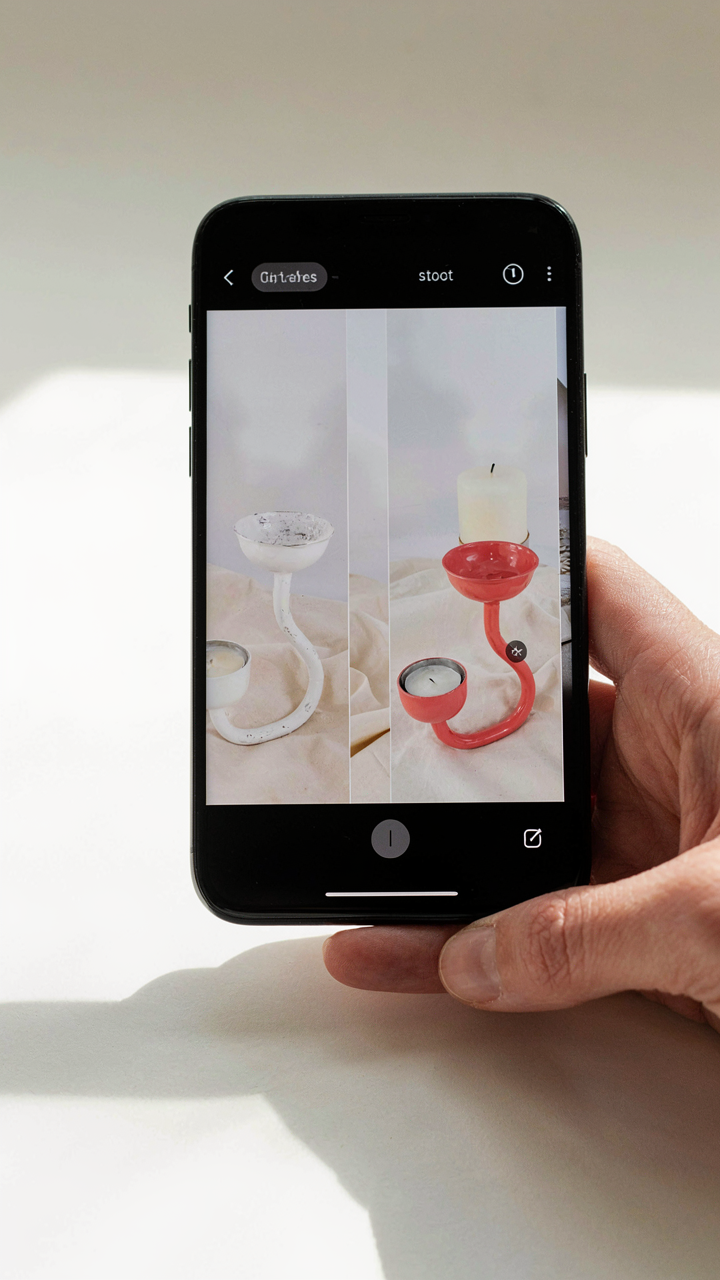
Assess What Actually Changed
You want to know if your makeover worked because you need proof you didn’t waste time and money on something that looks worse than before. Here’s the mechanism: design iteration requires measurable reference points, not feelings. Take a photograph of the candlestick before any work, then photograph it after each major step—paint application, finish addition, styling adjustment. This creates a visual log that kills subjective judgment. Compare the original to your current result. Does the proportional weight feel balanced? Has the color shifted the room’s focal point? Did the finish catch light differently than you intended? Answer these questions with images, not opinions.
Most people skip documentation and rely on memory, which corrupts itself immediately. You cannot iterate on what you cannot clearly see. Store your before and after photos in a folder labeled by date. This archive becomes your decision record. Six months later, when you’re considering another candlestick project, you’ll reference what worked and what didn’t. The feedback mechanism works only if you create evidence. Without it, you’re guessing on the next project.
Refine One Variable At A Time
The urge to change everything at once is strong and kills your ability to learn what works. If you repaint, add wax, and restyle the placement simultaneously, you won’t know which action produced the result. Pick one element—surface texture, color tone, or display context—and adjust only that. Live with it for a week. Does the candlestick fit your space better? Does it hold attention or blend into the background? Then move to the next variable.
This discipline compounds over multiple projects. Each makeover becomes data, not a one-off experiment. You start recognizing which finishes age well, which paint colors demand specific lighting, and which heights actually work in different rooms. The second candlestick you restore takes half the time because you’ve eliminated uncertainty through controlled iteration. Document which variable moved the needle toward your aesthetic goal. That’s the protocol.
The Real Obstacle Was Never The Budget; It Was Your Fear Of Looking Ridiculous
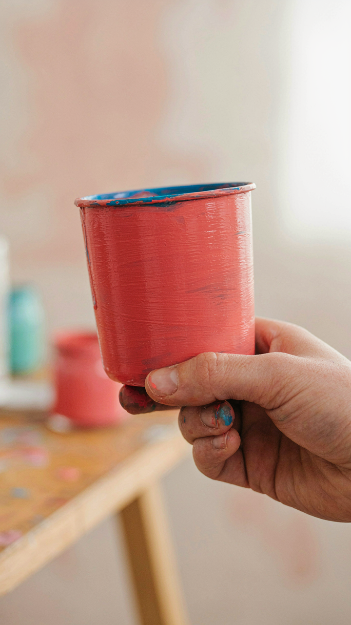
You already own the candle holder. You already have the materials. The ten dollar limit isn’t real. What’s real is the voice in your head saying this won’t turn out Instagram-worthy, so why bother trying. That voice is a liar. Go buy one thrifted candle holder today. Spray paint it, wrap it, refinish it. You don’t need it perfect. You need it done. Done beats perfect every single time.