The Contrast Conundrum: Why Most DIY Two Tone Furniture Fails
When Color Weight Destroys Balance
You want the finished piece to look intentional, not like you ran out of paint halfway through. The real problem isn’t picking two colors—it’s ignoring visual weight, which is borrowed from graphic design. Visual weight means how heavy a color feels to the eye, determined by saturation and value. Pair a dark navy base with a bright white top, and the white steals dominance even if it covers less surface area. Your eye lands there first and stays there. The piece becomes lopsided.
Most DIY approaches treat two tone furniture like simple math: pick colors you like, apply them, done. Wrong. You need to calculate which color should command attention based on what you want the piece to do in the room. A dark, saturated color on a smaller surface can outweigh a pale, desaturated color on a larger surface. Get the weight distribution backward and the piece visually collapses.
Separation Requires Intention, Not Hope
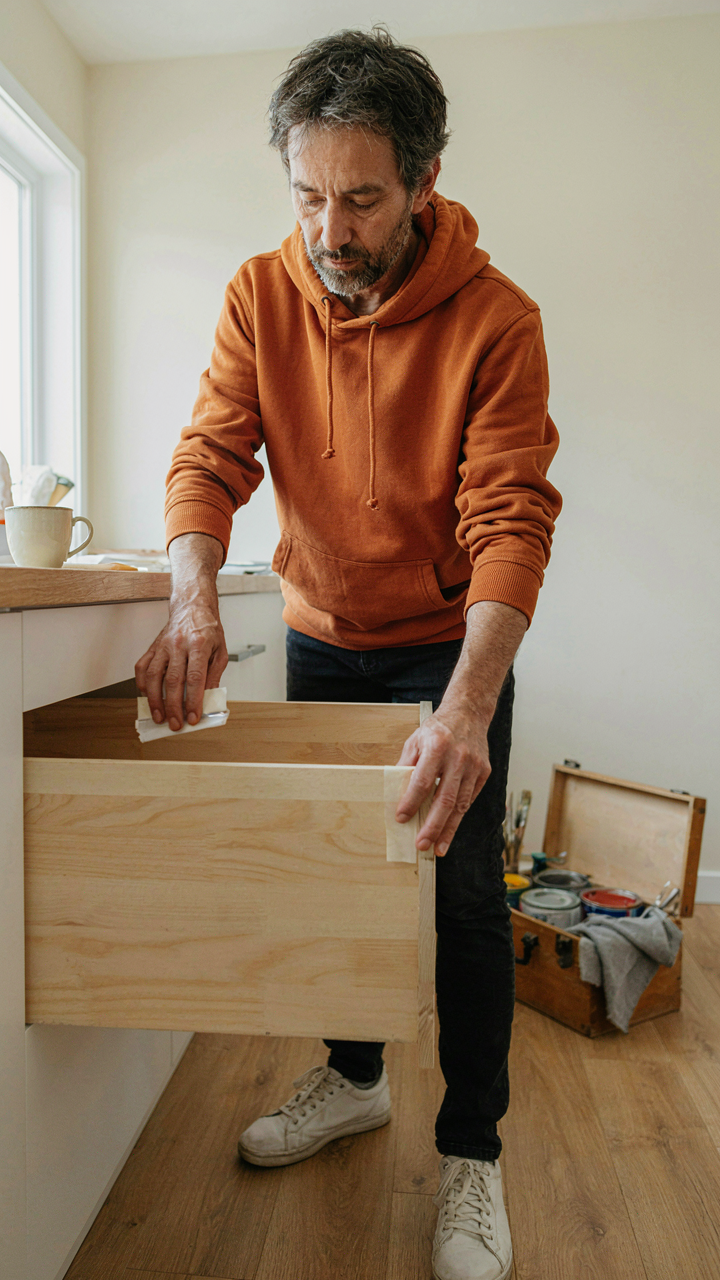
The gap between accident and design lives in the edge. Most failed two tone pieces blur where one color ends and another begins because people sand, prime, and paint as if it’s a single continuous surface. Furniture with intentional contrast uses a hard line—either a literal division created during construction or a sharp paint boundary enforced with tape and multiple coats. You can’t hope contrast emerges. You have to build it in.
Paint bleed under masking tape is the silent killer. One sloppy line and the contrast reads as careless rather than considered. Use quality painter’s tape, press it down firmly for a full minute, and apply a primer coat along the edge before your color coats. This seals the tape and prevents paint migration. The separation between your two tones becomes the defining feature. Execute the boundary or surrender the entire effect.
The Value Equation: How Two Tone Furniture Elevates Perception

Form Breaks The Eye’s Default Path
You want people to notice your furniture costs money even when it doesn’t. That’s the real driver here. Two tone finishes work because they interrupt visual continuity, forcing the eye to process the piece as intentional rather than standard.

This is contrast in the design physics sense. A single color allows the viewer’s brain to file a chair away as “chair.” A color break at the leg, seat, or back edge creates a visual boundary that demands categorization. The brain treats this as evidence of deliberate choice, which signals investment and taste.
The mechanism works because solid wood furniture traditionally costs more than veneer or particleboard. Mid-century manufacturers applied two tones to highlight joinery and frame structure, exposing where pieces connected. Modern two tone makeovers reverse this: they add visual breaks where none existed structurally, creating the appearance of construction-aware design without changing the actual build.
Apply this directly: identify the furniture’s natural stopping points. Legs meeting apron. Seat meeting back. Drawer face meeting frame. Paint or stain one zone a contrasting shade to these boundaries. This works whether you’re working with a dresser, nightstand, or dining chair.
Attention Demands A Visual Anchor
Most makeover advice says to pick colors you like, then apply them. That’s backwards. Your job isn’t aesthetic pleasure. Your job is control where people look first.
Two tone furniture creates a focal point hierarchy. The darker or more saturated tone acts as the visual weight, pulling attention to that zone. This same principle guides page design, photography composition, and retail merchandising. One zone becomes the anchor; everything else becomes context.
The contrast ratio matters more than specific colors. Dark walnut legs on a cream body creates stronger attention pull than sage green legs on cream. If your goal is a furniture piece that registers as intentional and expensive, maximize contrast at the visual anchor point. Subdued contrasts read as accident or age rather than design choice.
The simplest protocol: choose your two tone zones, then test samples in your actual room lighting. Select the ratio that makes one zone visually jump away from the other. That’s your anchor. Apply it consistently across all pieces in the space to create visual rhythm.
The Disruption Method: Redo Furniture For Maximum Impact
Why Contrast Actually Works In Your Space
You want people to notice what you’ve done. That’s the real reason you’re reading this section. Contrast creates energy transfer in a room the same way physics describes it: two opposing forces meeting at a boundary release potential. In furniture, that boundary is where dark meets light, matte meets gloss, or one material collides with another. The observer’s eye doesn’t settle. It tracks the edge. The room stops being invisible background.
Most furniture sits in a room doing nothing. It occupies space. A two tone makeover forces the eye to work, which makes the brain register the piece as intentional, designed, worth attention. You’re not adding more furniture. You’re weaponizing what’s already there by creating a visual interruption that demands processing. The contrast itself becomes the message that someone made a choice here.
The Pattern Interrupt In Plain View
Pattern interruption isn’t a design buzzword. Psychology has studied it for decades: the brain stops tuning out repeated stimuli the moment something breaks the pattern. A solid colored sofa disappears into the wall. A sofa with a contrasting color block, a different tone on the legs, or alternating panels forces recalibration. The viewer can’t filter it as background noise. The break in uniformity commands attention at a subconscious level before conscious thought even arrives.
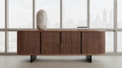
The mechanism is simple. Paint the lower third of a dresser a darker shade while keeping the top light. Your eye no longer reads it as one object. It reads it as two objects stacked, creating visual weight at the base and lift at the top. This isn’t decoration. It’s structural perception. Apply this same principle systematically across a room’s major pieces, and the space stops feeling accidental. It feels designed because contrast creates layers, and layers create depth where flatness existed before.
Beyond Color: Texture And Finish In Two Tone Furniture Make Over
Matte And Gloss Combinations Explained
You want this section because you suspect finish choices matter more than color, and you’re right. Most people treat matte and gloss as aesthetic preferences. They’re actually optical physics. Matte absorbs light scattering across the surface, gloss reflects it concentrationally. In two tone furniture, this contrast creates dimensional depth without adding a second color. A matte base with gloss accent reads as intentional separation. The eye tracks the shift instantly.
The mistake is assuming matte looks cheaper or dated. It doesn’t. Matte finishes hide imperfections, dust, and fingerprints better than gloss. Gloss demands perfection. On a two tone piece, deploy gloss strategically on the accent section only, where you can maintain it. Matte on the dominant section gives you breathing room and practical durability. This reverses conventional wisdom about gloss meaning “premium.” Here it means “high maintenance on purpose.”
Raw Wood For Organic Contrast
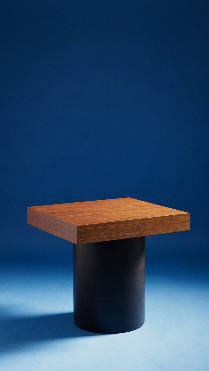
Unfinished or lightly finished wood operates as a third visual language within two tone design. You’re not adding a color. You’re introducing a textural honesty that reads as restraint, which costs more to execute than it appears. Raw wood breaks the symmetry of manufactured finishes and anchors a two tone piece in material reality rather than styling.
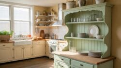
The mechanism is simple: raw wood shows grain variation, which your eye reads as authenticity. Place raw wood as an accent on geometric sections, tabletops, or drawer fronts. Seal it minimally to preserve the grain texture while protecting against stains. This creates visual weight without visual noise. The combination of sealed color, high gloss, and raw wood accents gives you three distinct materials competing fairly for attention on one piece.
The Architectural Blueprint: Two Tone Dresser Makeover Strategies

Segmenting For Structural Emphasis
You want this to look intentional, not like you ran out of paint. Here’s the real mechanism: two tone furniture uses the principle of load bearing from architecture. Just as a building’s structure determines where walls matter most, a dresser’s visual weight follows its functional zones. The top third holds less, the base holds more. Paint accordingly.
Most people slap color on randomly and call it design. Wrong move. The drawer stack creates natural horizontal breaks. Use those breaks as your segmentation points. Paint the top section one color, drawers another. This mirrors how your eye actually reads the piece’s structure, making the makeover look planned instead of desperate.
Creating Visual Anchors With Dark Bases
Dark bases ground furniture psychologically because we associate weight with darkness, not lightness. Paint the bottom third or bottom two drawers in a deep tone—charcoal, navy, or forest green. This creates a visual anchor that makes the entire dresser feel stable and intentional.
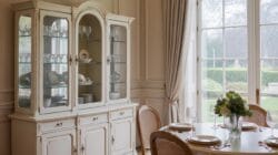
The common advice says “balance it out.” That’s incomplete. A dark base does two things: it anchors the eye downward so the piece doesn’t feel top-heavy, and it hides wear on the surface where hands actually touch. Spray the base first, let it cure fully, then paint upper sections in a lighter complementary tone. This sequence prevents bleed-through and gives you crisp lines where the colors meet.
The 2 Tone Dresser Protocol: A Step By Step Execution
Prep Work That Actually Matters
You want the finished piece to look intentional, not like you tried and failed. Surface preparation determines whether your paint adheres or peels off in sheets within months. This is adhesion science: paint bonds through mechanical grip and chemical compatibility, not hope. A poorly prepped surface is a timer counting down to failure.
- Sand the entire dresser with 120-grit paper: Removes the factory finish and opens the wood grain so primer grabs hold. Skip this and primer slides off like water on glass.
- Fill gaps and imperfections with wood filler: Sand smooth once dry. Two tone designs expose every flaw, so gaps between sections read as sloppiness.
- Wipe down with a tack cloth: Removes all dust. Dust particles get trapped under paint and create a gritty, unprofessional texture underneath.
- Apply primer to bare wood: Use a bonding primer designed for furniture. This fills microscopic voids and prevents stain bleed-through when you apply topcoat colors.
- Let primer cure the full recommended time: Most primers need 24 hours minimum. Rushing this step is where most people lose quality without knowing why.
The common advice says “just sand and paint.” That’s incomplete. You’re building layers with purpose. Each step removes obstacles between the wood and a finish that lasts. Skipping primer or sanding creates a surface that looks good for three months, then reveals itself as amateur work when edges lift and color starts to dull.
Sharp Lines Without The Guesswork
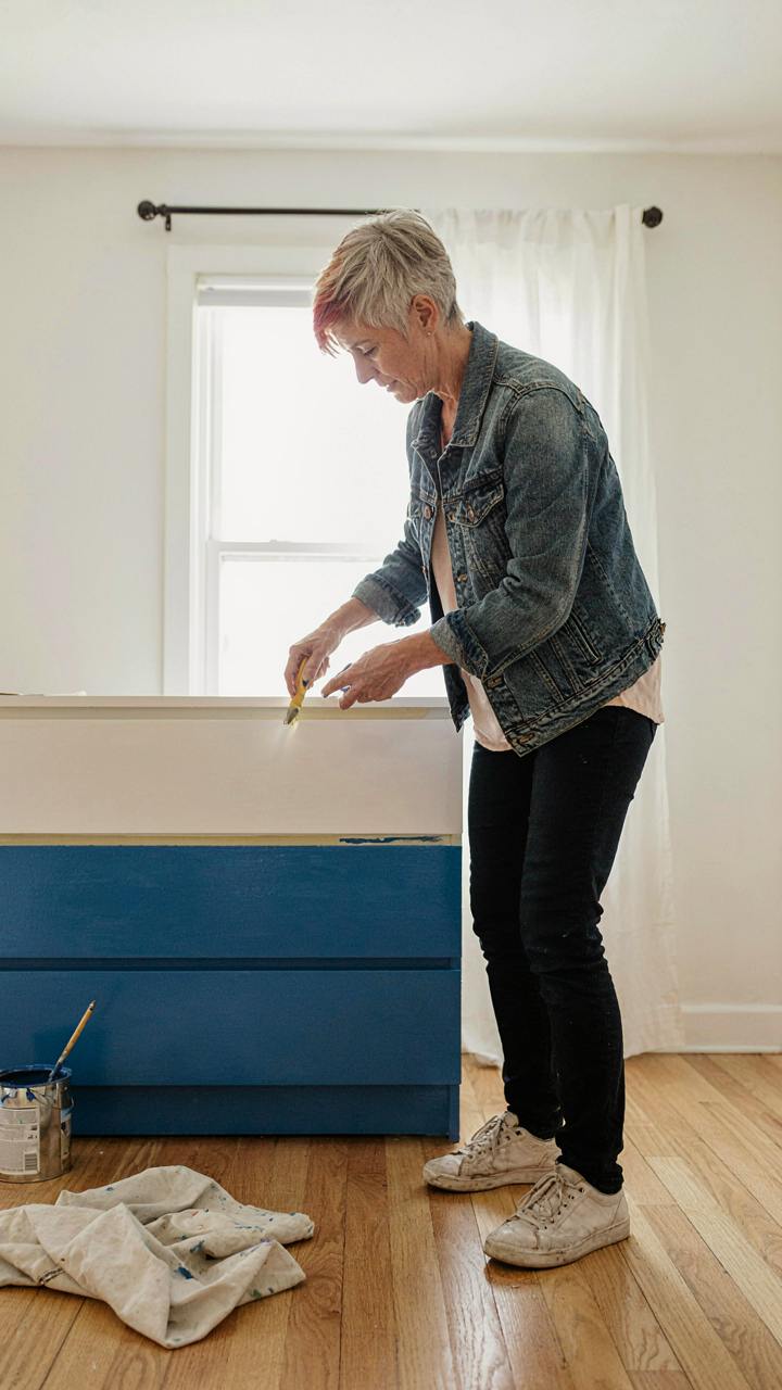
Masking tape doesn’t create clean lines by itself. The mechanism is simple: tape seals the boundary, but only if you compress it properly against the surface. Most people apply tape loosely, and paint creeps underneath during application.

Apply painter’s tape along your color division line, then press it down hard with a plastic squeegee or card. Run it along the entire edge multiple times. This compression seals micro-gaps that paint would otherwise exploit. Paint only stops where tape physically blocks it. Before opening paint, run a knife along the tape edge to cut through any adhesive that might have lifted slightly during application. This prevents paint from wicking under the tape and bleeding into your second color zone.
Furniture Rehab: When To Salvage, When To Strip
Know Your Finish Before You Commit
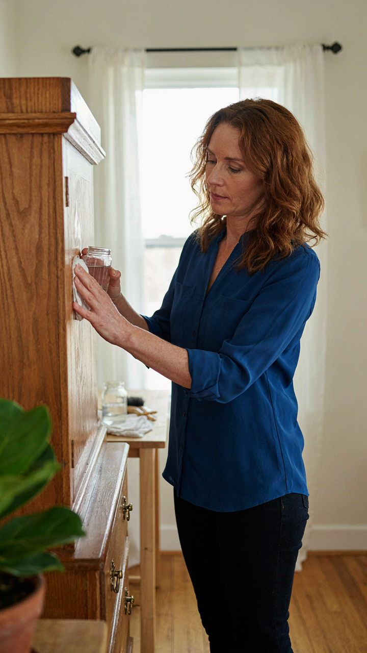
You want to believe the piece is worth saving because throwing it away feels wasteful. Here’s the mechanism: old finishes behave differently under new paint or stain, and incompatibility wastes more time than starting fresh. Chemistry matters. Lacquer over varnish fails. Water-based paint on shellac peels. You need to identify what’s actually on the wood before you plan your two-tone approach.
Run the acetone test first. Apply acetone to an inconspicuous spot. If it dissolves the finish immediately, you have lacquer. If it softens it slightly, that’s varnish or polyurethane. Shellac wrinkles under acetone. This sixty-second test determines whether you can paint over the existing finish or must strip to bare wood. Stripping takes time. Painting over incompatible layers wastes more.
Strategic Removal Gets You To Contrast Faster
The common advice says sand everything down to bare wood for a clean canvas. That’s incomplete. You only strip what prevents adhesion for your two-tone design. Chemical strippers, orbital sanders, and media blasting each serve different finishes and different speed requirements. Know which one matches your timeline and the piece’s condition before you start.
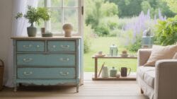
Lacquer and shellac respond to strippers within hours. Polyurethane and modern varnishes need aggressive sanding or prolonged stripper contact. Bare wood beneath multiple layers takes days to fully prepare. The mechanism is simple: incompatible layers create adhesion failure, not cosmetic problems. Your new paint or stain bonds to the last layer, not to what’s underneath. Strip only what prevents your new finish from gripping the surface properly.
The Unspoken Rules Of Diy Furniture Renovation
Timeless Color Over Trend Cycles
You want permission to skip the current color palette everyone’s using, because following it makes you feel safe. Here’s the mechanism: trend cycles operate on visibility decay, not quality. A two tone furniture makeover using colors that trendy last season already reads as dated because your brain has seen it saturate social feeds. Timeless appeal survives saturation because it was never built on novelty.
The practical move is selecting color pairs with historical staying power. Navy and cream worked in the 1960s, the 1990s, and still work now because the contrast solves a functional problem: visual hierarchy. Charcoal and natural wood read across decades because wood itself doesn’t trend. When you pick colors that solve contrast problems instead of chase trends, your piece stays relevant because it was never dependent on the cycle.
Hardware Is The Mechanism
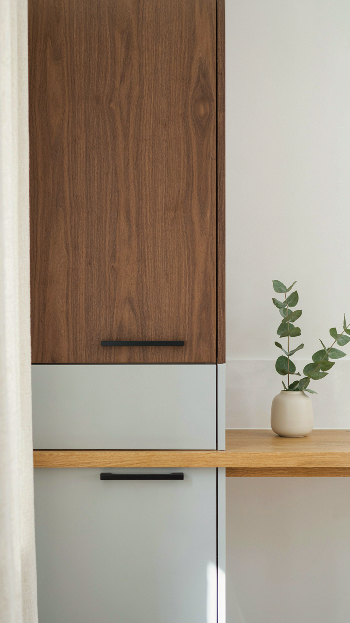
Hardware selection isn’t decoration. It’s the invisible logic that either ancheres your two tone contrast or sabotages it. Wrong hardware breaks the visual weight distribution you built into your color choice. A delicate brass knob on a heavy two tone cabinet with dark wood and light paint pulls the eye to the wrong place and makes the whole piece feel unresolved.

Match hardware finish to your dominant tone or to a true neutral like matte black. If your two tone piece splits 60/40 between two colors, hardware should echo the 60 percent side or sit outside the contrast entirely in charcoal or oil rubbed bronze. This anchors the visual hierarchy instead of competing with it. Install hardware first during planning, not as an afterthought.
The Investment Mindset: Your Two Tone Furniture Makeover As Asset
Market Value Compounds When Contrast Works
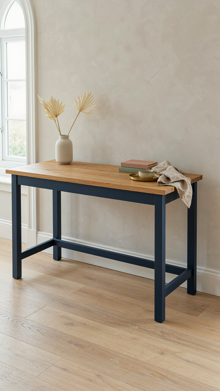
You want to know this because resale anxiety runs deeper than taste. Here’s the mechanism: two tone furniture functions like currency in the used furniture market because it signals deliberate design intent rather than decay or default. A single finished piece looks either dated or broken. A strategically contrasted piece looks chosen.
Buyers perceive contrast as evidence of craftsmanship and planning. Dark wood legs with a light upholstered seat costs nearly nothing to execute but shifts perceived value upward by 20 to 40 percent in secondary markets. The market doesn’t care about your emotional attachment. It values visibility of intentional choice. That distinction moves price.
Contrasting Finishes Weather The Test
The common advice that two tone furniture is trendy and therefore temporary misses the actual durability advantage. Using economics language: two tone creates redundancy. If one finish deteriorates, the piece doesn’t read as “broken” because the contrast preserves visual hierarchy and design logic.
A light wood top with dark stained legs won’t reveal water rings or dust the way a single pale surface would. Scratches and wear patterns actually reinforce the intentional visual separation rather than destroying it. Test durability by choosing finishes with opposing maintenance profiles: pair natural wood tops with sealed and lacquered bases. This creates both aesthetic separation and practical isolation of high-wear zones from high-visibility zones. Inspect your base finish every six months and reseal annually if traffic justifies it.
Your Next Furniture Project Isn’t About Paint; It’s About Outmaneuvering Mediocrity. The Obstacle Is Never The Piece, Always The Mindset
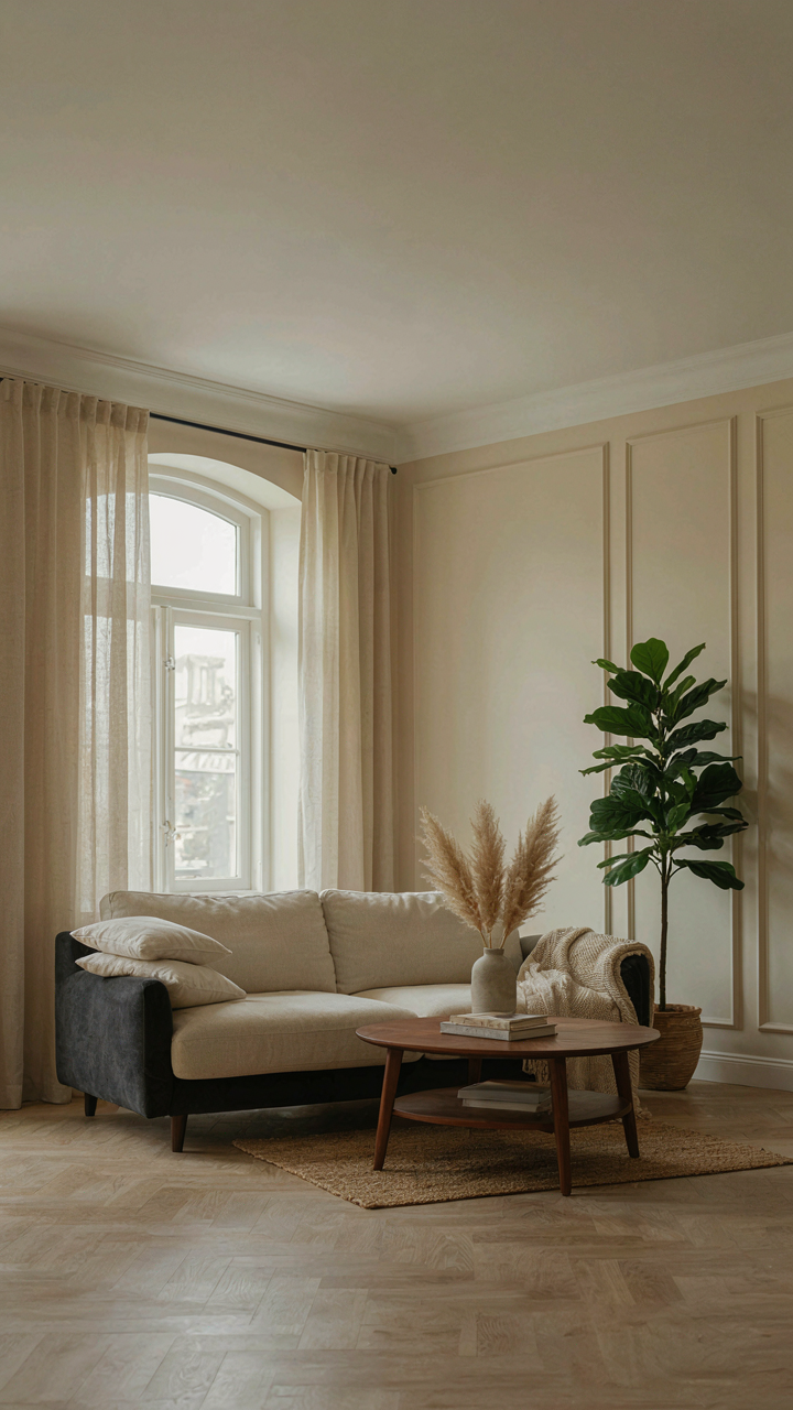
Most people fail at two tone furniture makeovers because they treat it like decoration instead of decision-making. You’re not choosing colors. You’re choosing contrast. You’re choosing to reject the beige default that everyone else settled for. Pick one piece in your home right now. Sketch two colors on it mentally. Stop waiting for permission or the perfect moment. Your space won’t transform until you do. Mediocrity doesn’t need your furniture to stay the same, it only needs you to never start.