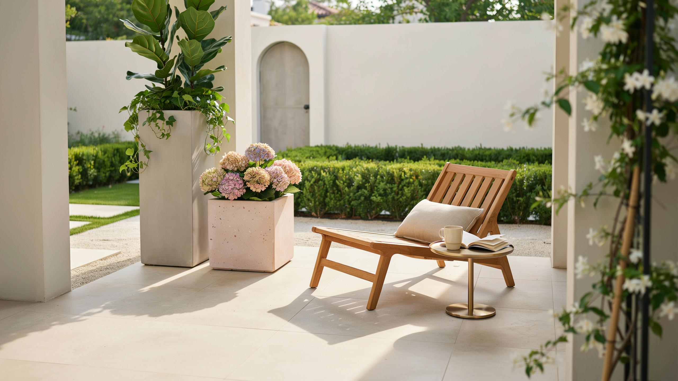
Defining The Modern Garden Aesthetic Color Palette
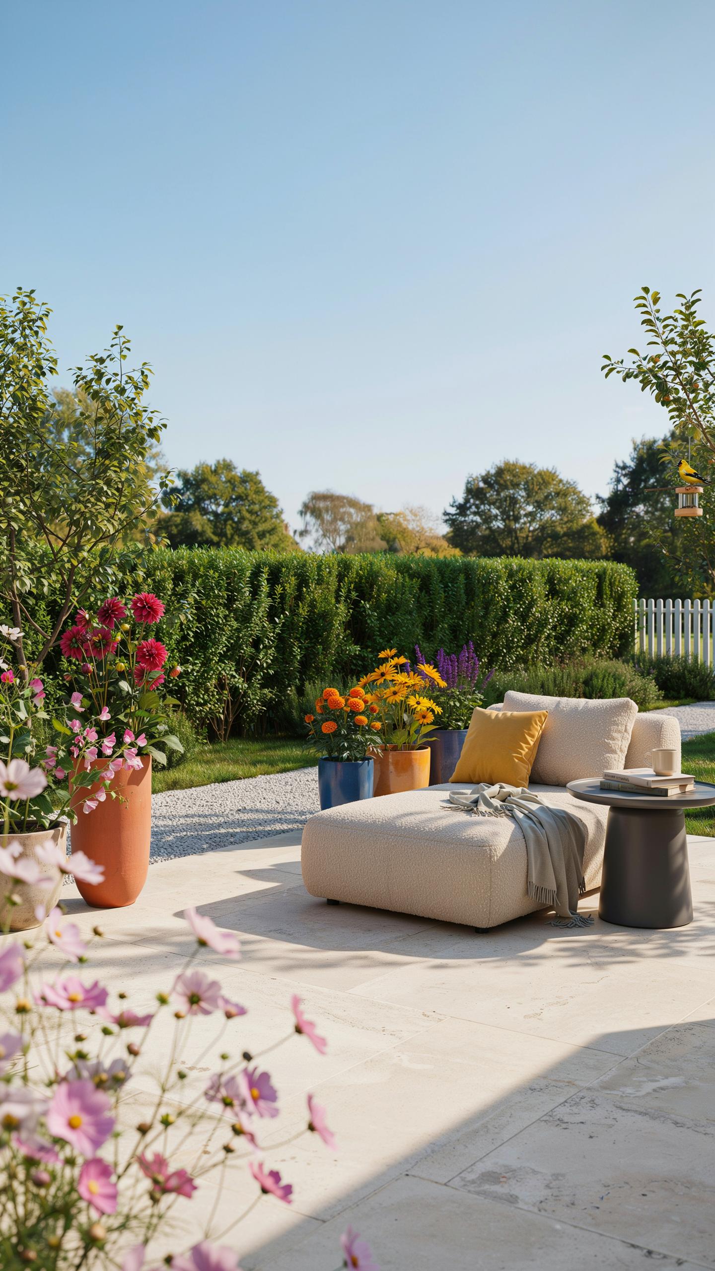
Core Design Principles Shape Color Strategy
Modern garden design draws from mid-century modernism and contemporary minimalism. These movements prioritize clean lines, reduced ornamentation, and functional beauty. The color palette reflects this restraint. Architectural foliage takes visual priority over flower volume. Plants with bold forms, structured growth patterns, and interesting textures become the design foundation. Color choices support these structural elements rather than dominate them.
Minimalist principles directly influence palette decisions. Every plant and color earns its place through form or function. This approach eliminates visual noise and creates intentional focal points. Gray-toned leaves, dark evergreens, and white-flowering specimens work together as a system. The result feels deliberate and controlled, not random or cluttered.
Neutral Backdrops Enable High Impact Choices
Neutral backgrounds establish visual calm and expand perceived space. Soft grays, warm taupes, and pale earth tones create sophisticated foundations. These colors come from hardscaping materials like concrete, gravel, stone, and fencing. Neutral foliage plants amplify this effect. Ornamental grasses, silver-leafed shrubs, and deep green evergreens provide color stability without overwhelming the eye.
Strategic plant placement against neutral backgrounds increases impact. A single specimen with vibrant foliage or flowers commands attention when surrounded by restraint. This contrast creates luxury through subtraction rather than abundance. Structural harmony emerges when color supports architectural lines and spatial flow. The garden reads as composed and intentional rather than decorative.
Developing A Sophisticated Green Colour Palette
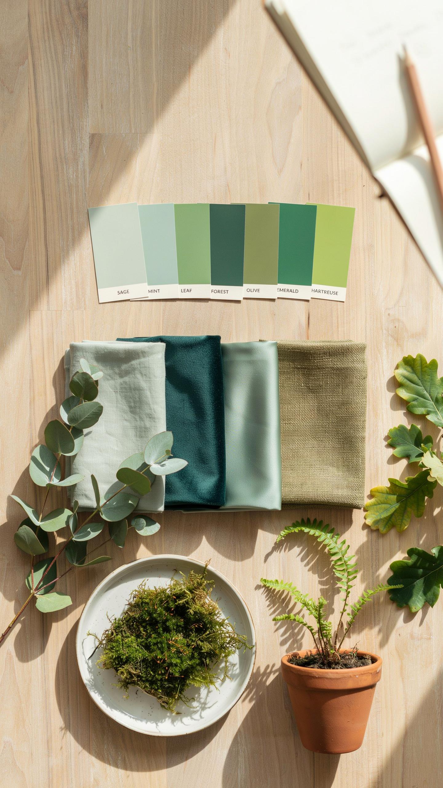
Understanding Foliage Texture Layering
Layering foliage textures creates visual depth through contrast. Glossy broadleaf evergreens like cherry laurel reflect light and anchor garden spaces. Fine-textured ornamental grasses introduce movement and soften hard edges. This combination prevents monotony and establishes a garden framework that works across seasons. Texture variation matters more than color variation in green palettes.
Successful layering requires deliberate plant placement. Position dense, glossy plants as backdrops or focal points. Use fine-textured grasses in front or as transitional elements between structures and bolder plantings. This arrangement guides the eye through the garden logically. The interplay between textures creates perceived depth even in compact spaces.
Selecting Key Evergreen Specimen Plants
Evergreens maintain structure year-round when deciduous plants lose foliage. Choose specimens that hold their form without constant pruning. Specimen plants serve as anchors that stabilize the entire garden composition.
- Boxwood: Dense, slow-growing shrub with fine foliage. Handles shaping well and maintains deep green color in winter. Works as hedging, edging, or standalone specimens.
- Japanese Holly: Compact form with small, glossy leaves. Tolerates shade better than many evergreens. Provides year-round structure without aggressive growth.
- Dwarf Conifers: Include varieties like Hinoki cypress or dwarf spruce. Offer varied forms from columnar to mounding. Maintain color and shape through harsh winter conditions.
- Yew: Extremely hardy with dark green needles. Adapts to shade and poor soil. Provides dense, formal appearance when mature.
- Holly cultivars: Dense foliage with architectural branching patterns. Many varieties sustain color without supplemental feeding. Work as screens or focal point plantings.
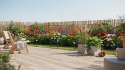
These specimens eliminate seasonal gaps in visual interest. They provide the backbone that allows seasonal plantings and color accents to stand out. Investing in quality evergreen specimens reduces maintenance while increasing garden polish.
Creating Cohesive Color Schemes Colour Palettes
Balancing Cool And Warm Tones For Contemporary Impact
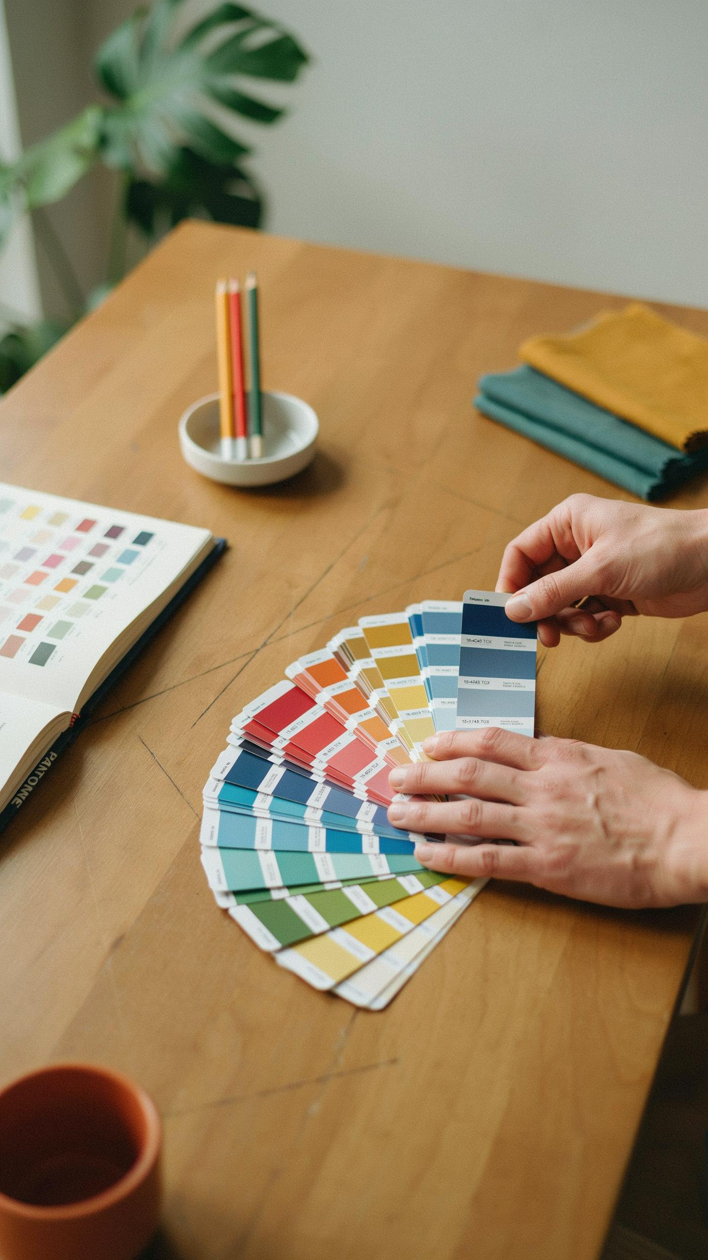
Cool tones like slate grey and icy blue ground modern gardens in restraint. These colors recede visually, creating depth and preventing the space from feeling cluttered. Warm accents in bronze and terracotta punctuate the palette strategically. This contrast prevents monotony while maintaining the clean aesthetic contemporary design demands. The balance prevents gardens from reading as cold or sterile.
Deploy warm tones through metal fixtures, planters, and specimen plants with autumn foliage. Bronze hardware and terracotta vessels become functional anchors that warm the overall composition. Restrict warm colors to 20 to 30 percent of your visible palette. This ratio keeps the contemporary mood intact while adding visual interest. Strategic placement matters more than quantity when mixing temperature ranges.
Anchoring Plantings With Hardscaping Surfaces
Hardscaping materials set the saturation baseline for all plantings. Polished concrete, dark steel, and natural basalt provide neutral grounds that intensify nearby plant colors. Light foliage reads richer against dark surfaces. Dark plantings gain definition against lighter hardscape. This relationship drives the entire visual hierarchy of your garden.
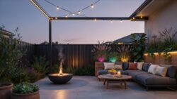
Select hardscape finishes based on the plant colors you want to emphasize. Matte basalt intensifies green tones and cool-colored foliage effectively. Polished concrete brightens variegated and silvery plants through reflected light. Dark steel frames darker plantings without competing. Hardscape becomes the supporting actor that elevates the entire performance of your color scheme.
Selecting The Ideal Color Palette For Flowers
Embrace Monochromatic White And Silver Schemes
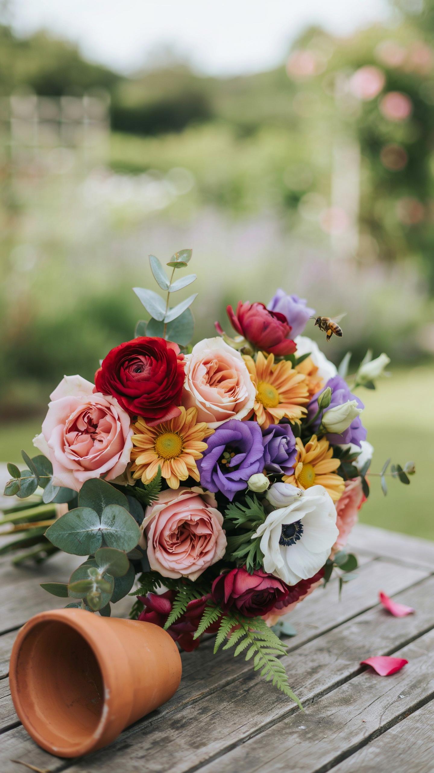
White flowers paired with silver foliage create visual coherence in modern garden design. This combination works because white reflects light and reads as clean and organized, while silver foliage provides textural contrast without introducing competing hues. The result feels intentional rather than sparse. Deploy white blooms like gaura, white roses, and flowering ornamental grasses. Layer in silver plants such as artemisia, dusty miller, and senecio to build depth through form alone.
Monochromatic schemes reduce visual noise and allow structural elements to dominate your garden composition. This approach aligns with contemporary minimalist design principles where restraint creates impact. White and silver plantings photograph well and maintain consistency across seasons. The palette works in both small urban gardens and larger landscapes. Maintenance becomes easier when you focus on one color range rather than managing multiple hues.
To create a garden is to search for a better world through the soft harmony of colors and time. In the garden of memory, a simple palette creates the most enduring elegance.
Introduce Muted Pastels For Subtle Depth
Dusty lavender, soft mauve, and pale buttercream add visual interest without disrupting modern garden calm. These muted tones sit between pure white schemes and bold color statements. They work because pastel flowers read as understated and sophisticated rather than decorative or busy. Choose varieties like pale lavender catmint, mauve phlox, and cream colored yarrow. These plants tolerate typical garden conditions and don’t demand excessive maintenance.
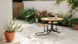
Muted pastels complement modern hardscaping through their recessive quality. They don’t compete with gravel, concrete, or wood finishes but rather enhance them through gentle contrast. This color strategy works particularly well in contemporary gardens where plants function as supporting elements rather than focal points. The palette appeals to designers seeking warmth without saturation or visual aggression.
Inspirational Color Schemes Palettes For Outdoor Living
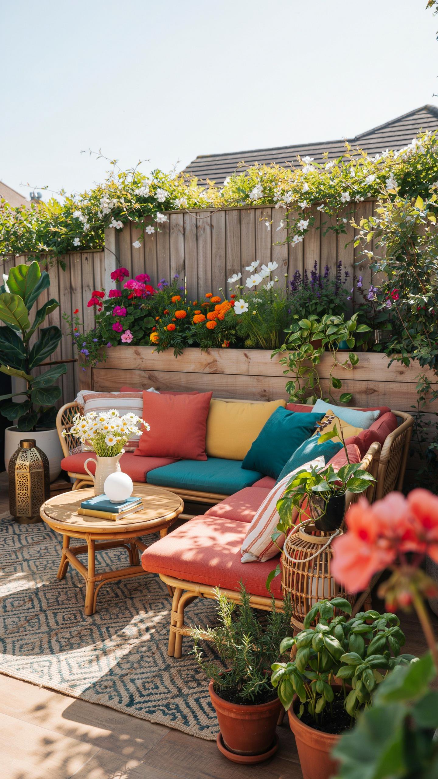
Harmonize Outdoor Furnishings With Natural Blooms
Match your outdoor furniture fabrics, throw pillows, and umbrellas to the plants already growing in your space. This approach eliminates color conflict between hardscape elements and living plants. Your eyes register the cohesion immediately. When fabric tones echo bloom colors, the entire outdoor area reads as intentional rather than assembled.
Tie specific fabric selections to seasonal plant cycles in your region. Spring bulbs offer purples and yellows. Summer perennials deliver blues and pinks. Fall plantings provide deep oranges and burgundies. Select neutral base fabrics in white, gray, or beige, then layer in accent pieces that shift with blooming seasons. This strategy keeps your space fresh without replacing core furniture.
Define Visual Focal Points With Contemporary Containers
Use matte black, charcoal gray, or raw concrete planters to create strong visual anchors in your outdoor layout. These finishes read as deliberate design choices rather than afterthoughts. Position statement pots at entry points, corners, or along sight lines. The dark tones ground lighter plant material and prevent the space from feeling chaotic.
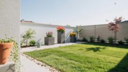
Architectural planters in these finishes work across modern, minimalist, and transitional design styles. Matte surfaces reduce glare and feel intentional compared to glossy alternatives. Raw concrete develops patina over time, adding visual depth without maintenance. Cluster three to five planters of varying heights in these tones to establish a curated composition that anchors your outdoor color scheme.
Curating Striking Flower Color Schemes By Season
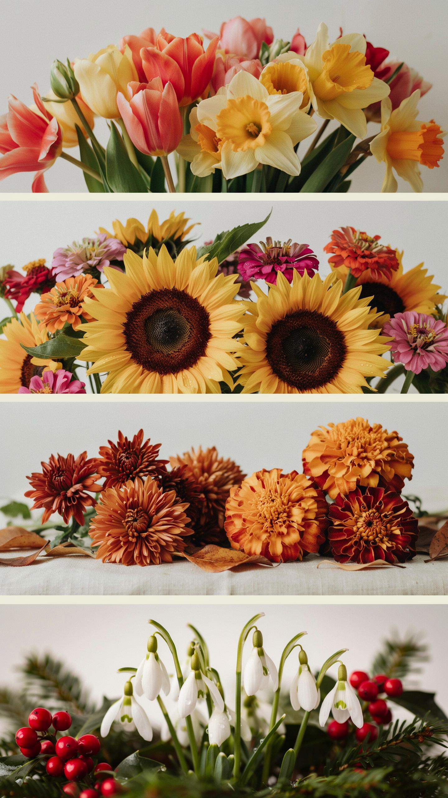
Spring And Summer Whites Blues And Creams
White flowers anchor a modern garden during spring and summer months. They reflect light, reduce visual clutter, and create breathing room in dense plantings. White blooms like hydrangeas, roses, and dahlias pair effectively with soft blue companions such as delphiniums and agapanthus. This combination holds visual weight without demanding attention. Cream-toned flowers bridge white and warmer palettes, offering flexibility for transitional spaces.
Soft blue flowers enhance the airy quality of white-dominated schemes. Blues recede visually, pushing boundaries outward and expanding perceived space. This matters in smaller gardens where depth feels limited. Pairing these cool tones creates a cohesive, intentional look that reads as modern rather than accidental. The palette demands restraint but delivers polished results when executed with discipline.
Autumn And Winter Structural Elements And Deep Tones
Structural interest sustains the modern palette when flowers fade. Ornamental grasses with mahogany-tinged seed heads remain standing through winter, providing form and texture. Their vertical lines complement hardscape elements like fencing and pergolas. This approach shifts focus from color abundance to architectural quality. Winter berries in deep mahogany and crimson tones replace flower color while maintaining visual engagement.
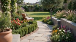
Plant selection determines winter success. Viburnum, ilex, and cotoneaster produce berry crops that persist through cold months. Their dark fruits contrast effectively against bare branches and frost-touched foliage. This strategy eliminates the need for forced color and aligns with modern design principles emphasizing structure over decoration. The result maintains garden presence without appearing neglected during dormancy.
Discovering Classic And Good Colour Combos For Borders
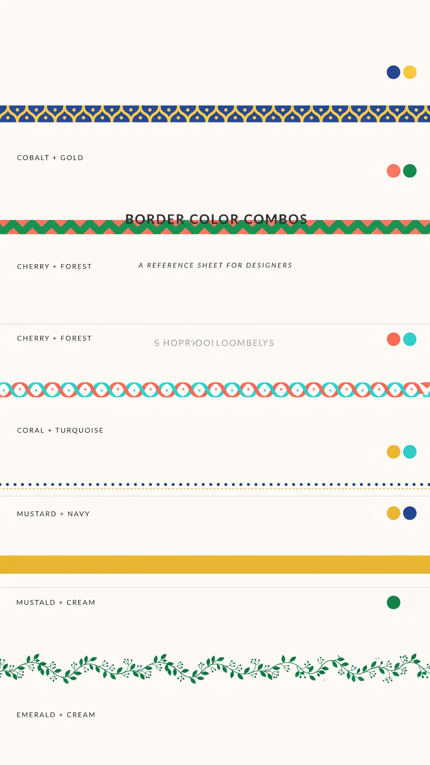
Pair Cool Blue Green Foliage Plants With Warm Metallic Tones
Cool blue-green foliage plants like hostas and eucalyptus create visual depth through their recessive color properties. These plants sit back in space, allowing warmer elements to advance forward. Metallic tones, whether from copper plant supports or bronze garden fixtures, anchor the scheme and prevent the cool palette from feeling flat or retreating entirely.
This contrast works because warm and cool colors activate each other. Hostas with their broad blue-tinged leaves read as stable anchors. Eucalyptus foliage adds fine texture while maintaining coolness. Metallic accents positioned among plantings draw the eye and create focal points that guide viewing throughout the border zone.
Combine Deep Violet Salvia With Lavender And Pale Lemon Yarrow
Deep violet salvia flowers establish the darkest value in this scheme, creating structure through color weight. Structural lavender provides mid-tone continuity while offering textural variation through its spike form. Pale lemon yarrow introduces the lightest value, breaking up density and preventing visual monotony across the planting bed.
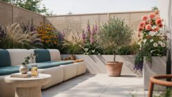
This three-tier value system creates geometric clarity without requiring rigid plant placement. Violet and lemon sit as complements on the color wheel, generating natural contrast. Lavender functions as the transition tone, allowing your eye to move smoothly between extremes. The result reads as intentional rather than accidental.
Implementing 6 Color Combinations For Instant Polish
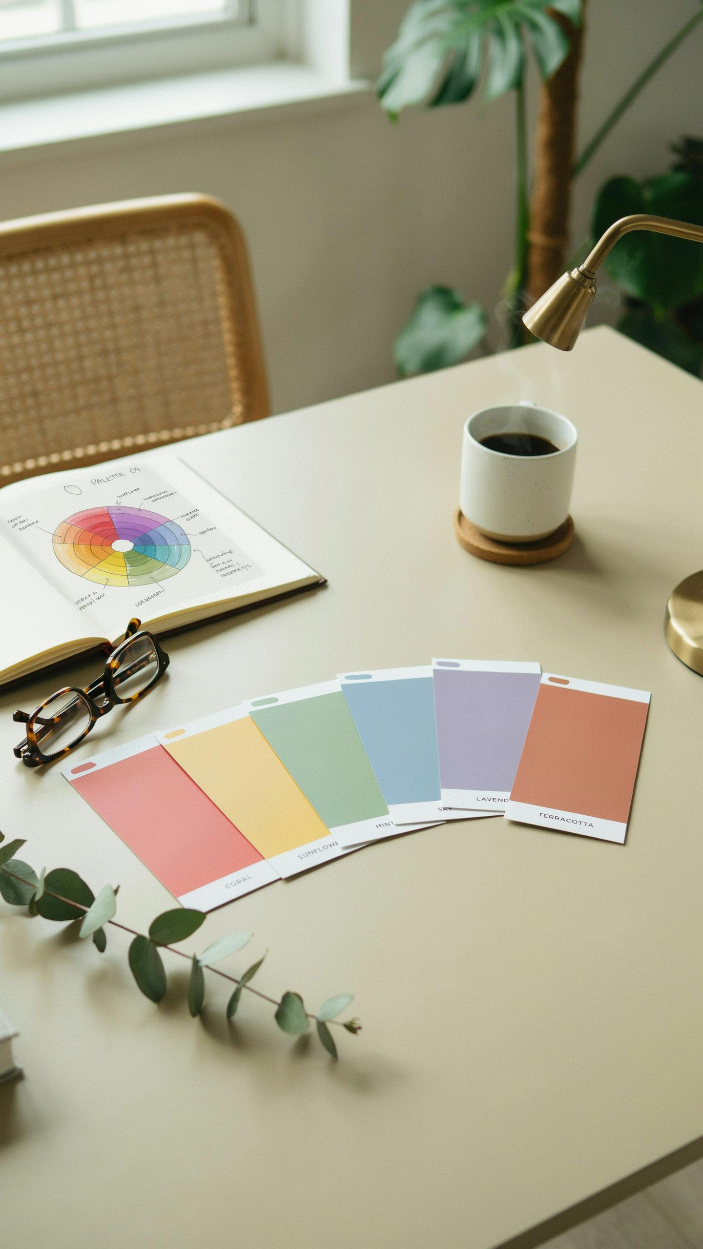
Six Highly Recommended Modern Plant Combinations
Modern garden design pulls from minimalist principles that emerged in the mid-20th century. These combinations pair plants with contrasting foliage colors and textures. The goal is visual impact without chaos. Each pairing works because the plants share similar growing requirements and mature sizes.
- Dark Purple and Silver Foliage: Combines plants like Heuchera ‘Obsidian’ with dusty miller or artemisia. The contrast creates definition and structure in garden beds. Both tolerate dry conditions and require minimal maintenance once established.
- White Variegated and Deep Green: Pairs variegated hostas or euonymus with solid green conifers like dwarf Alberta spruce. This combination adds brightness without introducing new colors. Works effectively in shaded areas where color is limited.
- Black and Chartreuse: Uses dark-leaved plants like Heuchera ‘Black Pearl’ beside golden duranta or Spiraea japonica ‘Gold Mound’. The yellow-green foliage pops against dark backgrounds. Both plants handle full sun exposure well.
- Blue-Gray and Burgundy: Combines blue spruce or blue fescue grass with deep red Japanese maple or Loropetalum. This pairing creates sophisticated depth and visual weight. Works year-round since both plants maintain color through seasons.
- Cream Variegated and Charcoal: Pairs variegated ivy or Carex with dark ornamental grasses or nearly-black mondo grass. The contrast guides the eye through the garden intentionally. Both options grow slowly enough to stay under control.
- Soft Gray-Green and Rust Tones: Combines santolina or germander with coppery-toned sedum or Heuchera ‘Caramel’. This pairing reflects warm and cool tones simultaneously. Both plants thrive in well-draining soil with minimal water needs.
These six combinations deliver immediate visual polish because they rely on foliage rather than seasonal flowers. Each pairing remains relevant across all seasons. Deploy these strategically throughout your borders for consistent impact.
Distributing Color Pairings Along Garden Pathways
Position your color combinations so they frame and guide movement along pathways. Place contrasting pairings at transition points where the path shifts direction. This stops viewers and creates natural pause points. Spacing matters more than quantity. Three well-placed combinations outperform six randomly distributed ones.
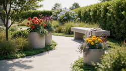
Alternate your pairings as you move down the pathway to maintain visual rhythm without repetition. Start with a bold contrast at the garden entrance to establish the design language. Use softer pairings in the middle sections to sustain interest. End with another strong combination at the pathway’s terminus. This structure gives the garden a beginning, middle, and conclusion.
Finding Fresh Color Design Inspiration In Nature
Study Existing Ecosystems For Proven Color Combinations
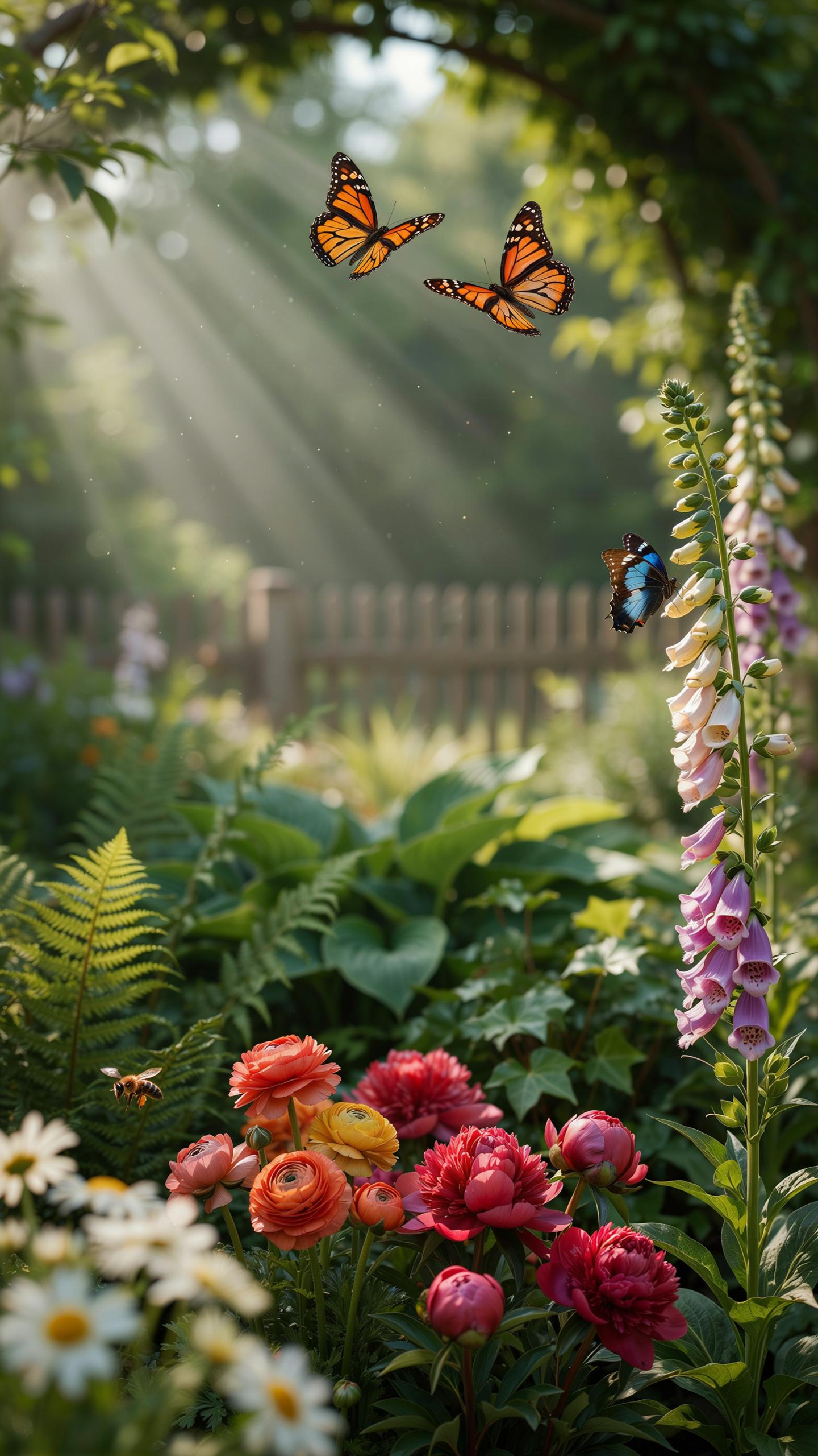
Coastal cliffs deliver grays, whites, and muted blues that work across climates. Desert environments provide warm taupes, sandy neutrals, and dusty greens. Woodland floors offer dark browns, moss greens, and charcoal tones. These ecosystems developed their color schemes through centuries of environmental pressure. Your garden succeeds faster when you adopt these tested combinations rather than inventing new ones.
Nature’s color relationships solve practical design problems automatically. Colors that coexist in one ecosystem perform together visually and functionally. Cliff-side palettes handle wind and salt spray. Desert schemes tolerate drought stress. Woodland combinations thrive in shade and moisture variation. Pull directly from these systems to build resilient gardens that require less maintenance and look intentional immediately.
Choose Native Plants To Lock In Color Consistency
Native species produce the exact foliage and flower colors your region naturally supports. Your local ecosystem already validated these hues for your climate zone. Native plants establish faster and demand fewer resources than adapted species. They maintain consistent color performance across seasons because they evolved within your specific conditions. This approach removes guesswork and guarantees your palette stays cohesive year after year.
Installing native plants creates self-sustaining color layers without constant intervention. Local wildlife recognizes native species, which builds ecological function into your garden design. The plant populations remain stable across seasons because they evolved to thrive in your location. Your color palette actually deepens and improves over time as plants mature. You build a garden that sustains itself while delivering the modern aesthetic you selected.
Finishing Touches On Your Color Palette Design
Strategic Lighting To Extend Visual Impact
Low-voltage LED lighting serves a specific function in modern garden design. These systems highlight plant textures and maintain color visibility after dark without introducing harsh glare. Position lights at ground level or beneath foliage to accentuate form. This approach preserves your palette’s integrity throughout evening hours and extends the garden’s usable viewing window.
Color perception shifts dramatically in low light conditions. Warm-toned LEDs between 2700K and 3000K kelvin maintain the sophistication of your palette when natural light fades. Cooler temperatures wash out the refined tones you’ve carefully selected. Strategic placement prevents light pollution while keeping focal plants visible and your design cohesive after sunset.
Maintenance Systems That Preserve Design Integrity
Systematic pruning and weeding directly protect your color composition. Overgrown plants obscure intentional color relationships and disrupt clean lines. Establish a regular schedule to remove dead growth and competing vegetation. This discipline keeps your palette readable and prevents aesthetic drift that accumulates over seasons.
Dark mulch materials in uniform depth anchor your design at ground level. Use materials like charred bark or dark wood chips in consistent 2 to 3 inch layers. These neutral tones recede visually while highlighting your planted colors. Neat edging and uniform mulch coverage reinforce the contemporary aesthetic and ensure your color choices remain the focal point.
Frequently Asked Questions

What are the best base colors for a modern garden?
To achieve a sophisticated look, start with a neutral modern garden aesthetic color palette consisting of charcoal grey, slate, and crisp white. These foundational tones provide a clean backdrop that makes greenery pop. By choosing understated hardscaping materials like basalt or light concrete, you create a seamless transition between your home’s architecture and the natural world, resulting in a cohesive and contemporary outdoor living space.
How do I incorporate accent colors without breaking the minimalist vibe?
The secret lies in restraint and repetition. Once you have established your modern garden aesthetic color palette, select one or two accent shades, such as deep plum or electric blue. Introduce these through seasonal blooms or high-quality textiles like outdoor pillows. By repeating these colors in small clusters throughout your garden beds and seating areas, you maintain a polished, intentional look that feels curated rather than cluttered.
Can I create a modern garden look on a limited budget?
Absolutely! You can achieve a high-end feel by focusing on monochromatic plantings and affordable paint. Transform old terracotta pots or wooden fences with a coat of matte black or soft grey paint to instantly modernize your space. Grouping plants with similar foliage textures—like ornamental grasses—creates a high-impact, architectural feel that looks expensive but stays affordable. Stick to a simple palette to ensure everything looks unified and professional.