The Illusion Of Pop Why Most Home Exterior Colors Combinations Fail
Commodity Palettes Kill Distinction
You want your house to stand out without risking money or reputation on an unconventional choice. That fear locks you into the same five color combinations every real estate agent recommends. The mechanism is simple: when advice becomes generic, it stops working as differentiation. Beige with white trim. Gray with charcoal shutters. Cream with black doors. These combinations “pop” in theory only because they’re safe, which means every neighborhood is drowning in them. Sameness isn’t pop. It’s invisibility dressed as strategy.
The real problem isn’t the colors themselves. It’s that most homeowners treat exterior paint combinations like a multiple choice test instead of a site-specific decision. You see a color palette online, match it to your house, and assume the result will work. It won’t. The photograph was taken in different light, on a different house, surrounded by different architecture. Your brain registers the palette as successful because it passed the basic visual test. That’s not pop. That’s acceptable mediocrity with good lighting.
The Surrounding Environment Sets The Actual Rules
Context isn’t a design suggestion. It’s the variable that determines whether a color combination reads as intentional or tone-deaf. Most exterior paint advice ignores this entirely, treating house color as an isolated object instead of part of a visual system. Your lot sits in a neighborhood with specific material conditions: the trees around it, the roofline angles of adjacent houses, the underlying soil tone visible in landscaping, the prevailing light direction. These aren’t aesthetic preferences. They’re constraints that determine which combinations will actually work.
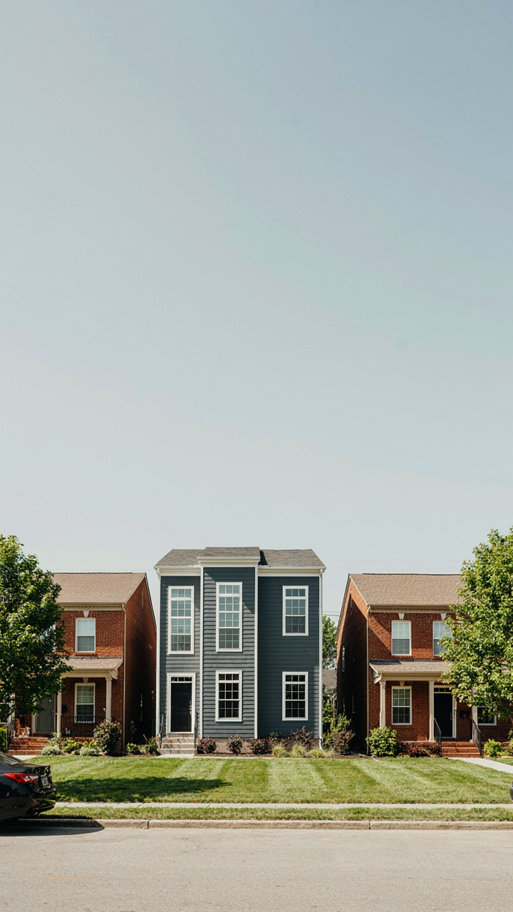
The common recommendation is to “coordinate with your roof and surroundings.” That’s incomplete. You need to map the dominant colors in your immediate environment first, then use contrast and proportion as your actual tools. A charcoal gray exterior might read as sophisticated on a modern colonial surrounded by older red brick homes. On the same street in a development full of tan and beige houses, it reads as aggressive or arbitrary. The color didn’t change. The context did. Identify what’s already visually dominant in your three-house radius, then choose a combination that either complements or deliberately contrasts with it, not one that tries to exist independently.
The Contrast Coherence Protocol For Outdoor Wall Color Combination

How Light Changes Everything On Your Walls
You want your house to look intentional from the street, not like you guessed. The real mechanism here is borrowed from physics: refraction. Light doesn’t hit your walls evenly. Morning sun, afternoon glare, shadow cast by trees, overcast days, artificial light at night—each changes how your color actually appears. A color that reads as one thing at noon reads as something else entirely in shadow. Most people pick colors in showroom lighting, then act surprised when the house looks wrong.
Your color combination only works if it accounts for how light moves across your specific site throughout the day. East-facing walls get hit hard by cool morning light. West-facing walls cook in warm afternoon sun. North-facing walls live in shadow and appear darker and cooler than their name suggests. South-facing walls in colder climates lighten and warm. Before you commit to any combination, observe the wall at three separate times: early morning, midday, and late afternoon. This is not optional.
The 60 30 10 Split Applied Without Waste
Everyone talks about the 60-30-10 rule. Most people apply it wrong. The rule states: 60 percent dominant color, 30 percent secondary color, 10 percent accent. But here’s what fails: people treat it as decoration advice instead of a legibility protocol. Your house exterior isn’t an interior room. It competes for attention from fifty yards away, moving cars, and people who glance for two seconds. The ratios exist to create hierarchy, not balance.
Your dominant color should cover primary wall area—the front facade, the largest visible expanse. The 60 percent is your base legibility. The secondary color (30 percent) typically hits your trim, garage door, or second wall plane. This creates definition without chaos. The 10 percent accent goes on details: shutters, a single door, soffit accents. This accent does real work—it anchors the eye and prevents the combination from looking flat. Make the accent color the most saturated and contrasting of the three. If it doesn’t pull your eye immediately, it’s not doing its job.
Beyond The Swatch: Psychology Of Exterior Color Combinations
Your Brain Decides Before You Do
You want your house to signal something about you without looking like you tried. Your brain processes color combinations in milliseconds, long before conscious thought arrives. Exterior paint operates like a signal in evolutionary biology: contrast, saturation, and placement trigger subconscious judgments about competence, taste, and status in under three seconds.

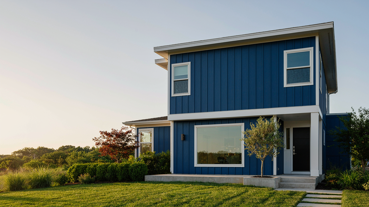
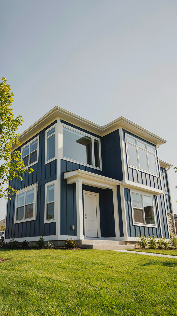
The common advice says “pick colors you love.” That’s incomplete. What you love is shaped by what your nervous system reads as safe, trustworthy, or elevated. A navy base with cream trim reads differently than cream with navy trim, even though the colors are identical. One feels grounded and intentional. The other feels reversed and uncertain. Your eye processes the darker element as foundational first, which changes the entire psychological weight of the combination.
What Actually Lasts Versus What Fades
Historical precedent shows that combinations survive decades only when they align with material reality, not trend cycles. Craftsman-era homes paired deep greens and earth tones with natural wood because those colors weathered visibly and masked oxidation. Victorian homes used contrasting trim colors because paint application technology required it as a structural detail, not purely as decoration. The combinations that endured were mechanical necessities first, aesthetics second.
Modern paint doesn’t fade the way it did seventy years ago. UV inhibitors and acrylic chemistry mean your colors stay true far longer than they used to. This breaks the old design logic. Trendy combinations fail faster now because they were never built to survive material aging. Instead, test combinations against your climate’s actual light intensity, your home’s material substrate, and how reflectance shifts during different seasons. Pick combinations that look intentional when the paint shows honest wear.
The “Starbucks Effect”: Building Paint Colors As Brand
How Iconic Palettes Engineer Recognition
You want your house to say something about you without saying anything at all. That’s the real mechanism here. Corporate brands solved this decades ago by locking into two or three colors that became inseparable from identity. Starbucks didn’t invent green, but green became Starbucks in your brain because of relentless consistency. Your exterior paint works the same way: repeated color choices create pattern recognition that registers as intentionality, taste, and status before anyone walks up your driveway.

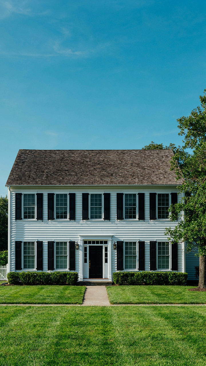
Apple’s color restraint taught design culture that limitation equals sophistication. Most homeowners do the opposite—they chase variety and end up forgettable. Colonial homes anchored themselves to deep blacks and whites for 200 years. Mid-century modernists committed to warm grays paired with bold door colors. Contemporary builders standardized greige and navy. The ones you remember aren’t the ones with six colors competing—they’re the ones where the trim, body, accent, and roof form a coherent system that feels inevitable rather than decorated.
Architectural Harmony: Color Meets Structure
Borrowing from proportion theory in architecture, your paint colors function like visual load-bearing walls. They don’t just sit on the surface—they either reinforce or contradict the lines and masses you’ve already built. A low, horizontal ranch house needs colors that emphasize that stretch. A vertical farmhouse demands colors that pull your eye upward. Wrong color on the right house creates cognitive dissonance. You see it immediately but can’t name it.
The common mistake is treating color as independent from form. It isn’t. Your trim color either clarifies your home’s structural edge or blurs it. A soft white trim on a modern slab-sided home disappears the geometry. A sharp, contrasting trim articulates every corner. Roof color carries as much weight as wall color in the overall read. A dark roof on a light body grounds it. A light roof on a dark body makes it float. Start by identifying your home’s dominant line, then choose colors that either amplify or intentionally contradict that line as a strategy, not an accident.
The “Ecological Niche” Approach To Outside House Colour Combination
Nature’s Palette Demands Specificity
You want to believe color theory alone will solve this. It won’t. Ecology teaches us that organisms survive by fitting into specific niches, not by being generically attractive, and your house exterior operates under the same constraint: a color combination works when it responds to the actual environment it occupies, not when it matches some universal palette. That distinction matters because most homeowners apply colors based on what looks good in magazines under neutral lighting, then watch those same colors shift, flatten, or clash the moment sun angle, surrounding foliage, and architectural context enter the equation.

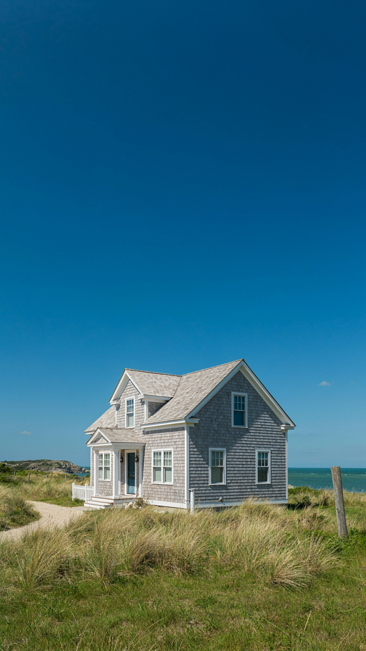
The mechanism ecology reveals is constraint-based design. A coastal property in New England doesn’t use the same dominant hue as a canyon-adjacent home in Arizona because the light wavelengths, reflective surfaces, and vegetation backdrop differ fundamentally. You cannot separate color choice from latitude, season length, building materials that already exist on the property, and what grows or surrounds the structure. This isn’t aesthetic preference. It’s optical physics meeting environmental reality.
Color Responsiveness Over Rigid Rules
The common advice here is wrong: pick your trim color first, then choose a body color that complements it. That inverts the actual constraint. Your primary color should respond to what you cannot change—existing materials, the dominant natural backdrop, and light conditions at different times of year—and your accent colors layer in second. Adaptation means observing before deciding, not importing a palette you like and forcing the house to fit it.
- Existing Material Integration: Roof color, foundation stone, or brick already present determines your body color’s value range. A dark-shingled roof absorbs and reflects different light than a light one, constraining your options from the start.
- Seasonal Light Angle: Winter and summer sun hit your façade at different angles and intensities. Colors that harmonize in June may separate visually in December. Test samples over weeks, not days.
- Vegetation Backdrop: Trees and shrubs behind or adjacent to the house create a living context that shifts monthly. A trim color that pops against bare branches may flatten against full summer green.
- Neighboring Structures: The color of adjacent houses, garages, and fences creates visual pressure that either helps or fights your selection. Harmony or contrast requires knowing what surrounds you first.
- Material Finish: Matte paint reads darker and more muted than semi-gloss under identical light. Finish choice directly alters how your selected color performs on the actual surface.
Paint samples on your house in full sunlight and observe them across at least two weeks and two different times of day. Move the samples to different sections of the façade to test against the specific architectural planes and shadows where that color will live. Only after this observation period should you finalize the combination, because the interaction between paint color and site-specific conditions is irreversible once applied.
The Myopia Of “Curb Appeal”: House Paints Outside For Longevity
How UV Light Degrades Paint Into Gray
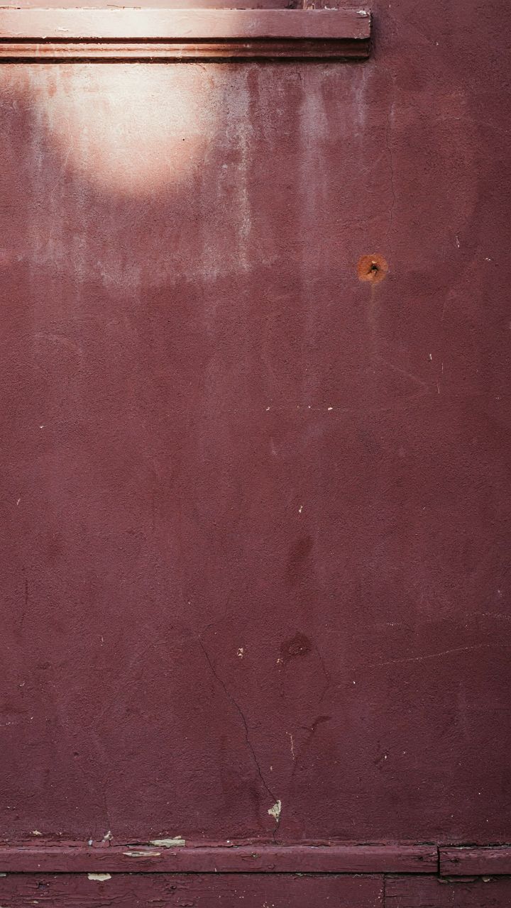
You want your paint to last because repainting costs money and time, not because you’ve internalized some design principle. The mechanism is simple: ultraviolet radiation breaks chemical bonds in paint binders. This isn’t theoretical. UV exposure fades pigments and causes the binder to fail, which is why painted surfaces don’t just lose color—they chalk, peel, and expose bare substrate. South and west-facing walls degrade faster than north-facing ones because they receive more direct sun hours annually.
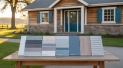
Paint durability hinges on binder quality and pigment load, not color choice alone. Premium acrylic latex paints resist fading better than budget formulas because they use superior resins and UV-blocking additives. Matte finishes show degradation more visibly than satin or semi-gloss because they scatter light and reveal surface deterioration. When a painter quotes a twenty-year warranty on one product and five years on another, they’re betting on binder chemistry, not hype.
When Light And Dark Paint Demand Different Labor
Dark colors absorb heat and accelerate moisture cycling underneath the paint film. This thermal stress causes expansion and contraction that eventually cracks the coating and lets water behind it. Light colors reflect heat and minimize this cycling, which extends paint life in direct sun. The maintenance implication reverses what most people assume: dark colors require more frequent inspection and earlier repainting cycles despite looking “richer” longer.
- Black and Deep Navy: Absorb 85-90% of solar radiation, peak substrate temperatures 150°F+, accelerate thermal failure in seven to ten years in full sun.
- Charcoal and Dark Gray: Similar absorption to black but slightly slower thermal stress, still require inspection every five to seven years if south-facing.
- White and Off-White: Reflect 80%+ of solar radiation, remain stable for twelve to eighteen years before showing chalk or fade on quality formulations.
- Light Gray and Tan: Moderate reflectance (60-70%), balance durability with aesthetic versatility, typically need repainting every ten to twelve years.
- Medium Red and Burgundy: Expensive pigments fade predictably, require premium paint stock to hold color past eight years, show fading before structural failure occurs.
Painting a south-facing wall dark means you’re committing to exterior inspection every two years and repainting by year eight or nine. Light exteriors with quality paint skip that cycle. Choose dark only if you prioritize initial visual impact over maintenance cost.
Mastering The Matrix: Exterior House Paint Color Combinations For Resale
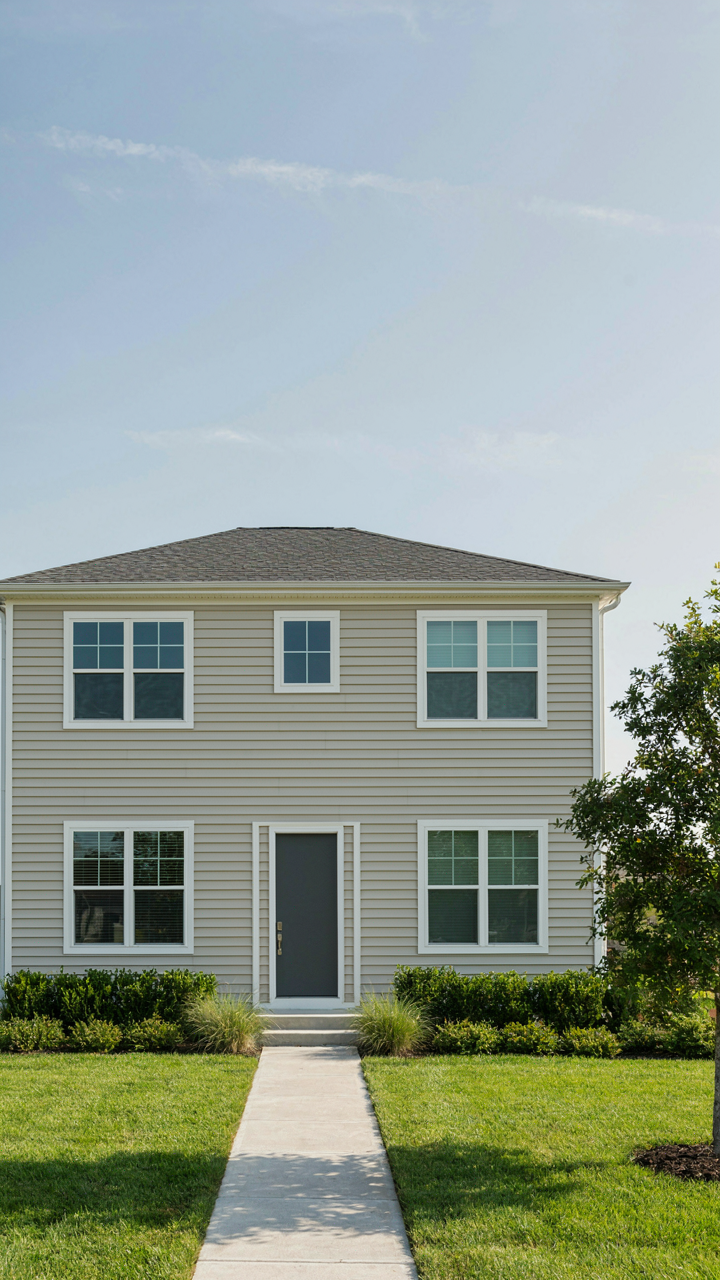
The Investor Calculus Behind Color
You’re not really worried about which colors look good together. You’re worried about leaving money on the table when you sell. The mechanism is simple: resale value correlates directly with how many buyers your color combination eliminates from consideration, not how many it attracts. Most people reverse this logic and pick colors they love, which is why most houses sit longer on market than they should.

Neutral doesn’t mean beige. Neutral means your color combination doesn’t trigger a visceral rejection in the buyer’s mental model of what their house should look like. The data on exterior repaints after purchase is consistent: buyers repaint exterior colors at higher rates than any other home feature. This tells you the real game isn’t picking the “perfect” combination. It’s picking the combination that requires the fewest buyers to imagine a different version of the house.
Blending In While Breaking Even
Integration is the economics term, but in this context it’s visual anchoring to neighborhood precedent. Don’t study design theory, study what the top three percent of properties in your neighborhood actually painted their exteriors. Not what designers recommend. What’s actually there, holding value, selling fast. Your color combination succeeds when a buyer driving through perceives your house as a natural extension of the block, not a statement piece.
Standing out subtly means one accent element that signals maintenance and intentionality without broadcasting personal taste. This is typically the front door or trim on a house that uses the established color palette for siding and secondary surfaces. The mechanism: buyers interpret subtle variation as sophistication, while aggressive variation reads as risk. Paint your trim a historically accurate color that complements your siding shade, then stop. The specificity of restraint is what moves properties.
The Unspoken Rules Of House Paint Exterior Ideas Color Combinations Home
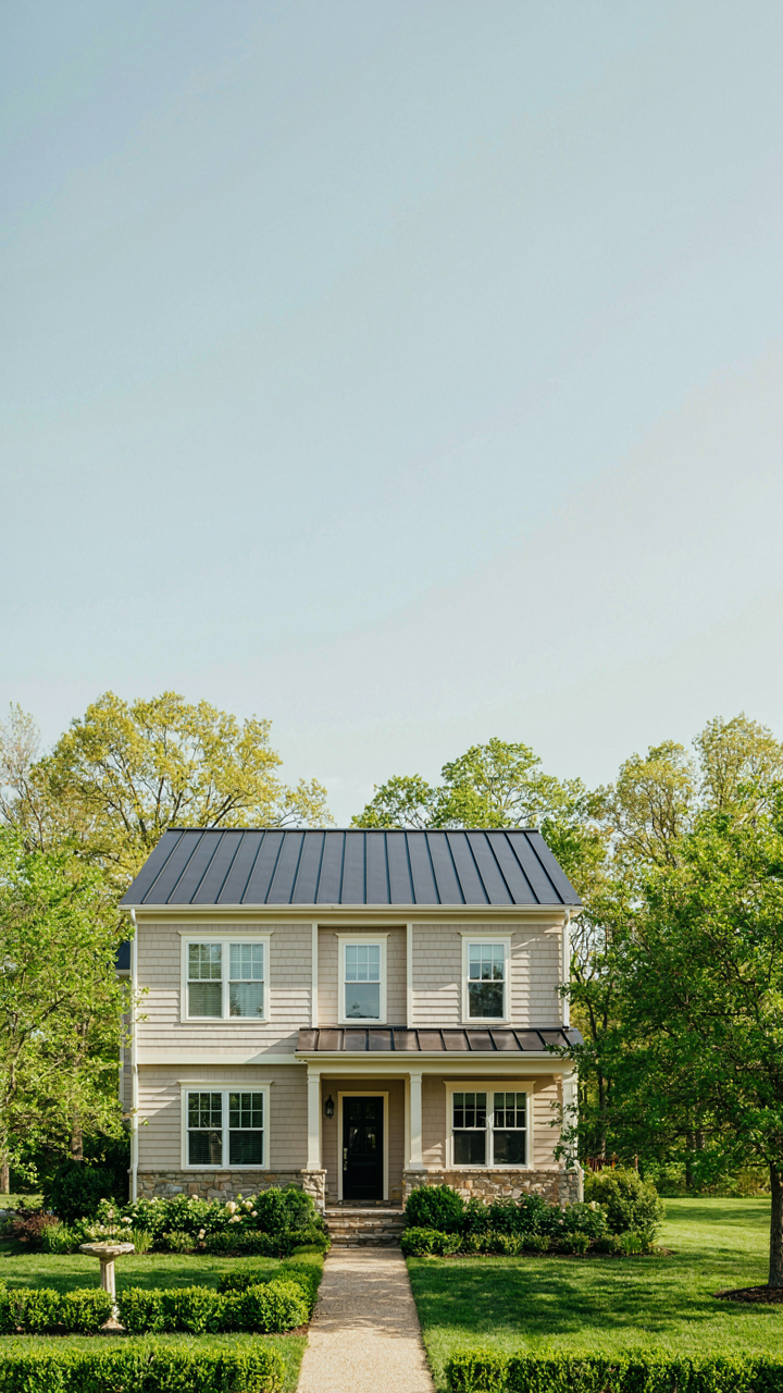
Work Within What Already Exists
You want people to think you made a deliberate choice, not that you got lucky. The truth is simpler: your roof, stone, and landscaping aren’t variables you control once paint hits the wall. They’re constraints that determine everything. Treating them as fixed elements means you stop fighting physics. A charcoal roof doesn’t pair with every wall color. Warm red brick doesn’t accept cool undertones the same way. Your landscaping—evergreens, deciduous trees, mature shrubs—creates a color field that either amplifies or kills your paint choice before you even open the can.

Start by photographing your house from the street at midday, overcast day, and golden hour. Document the actual color of your roof in different light. Note whether your stone or brick leans warm or cool. Identify dominant landscape colors in summer and winter. These become your non-negotiable anchors. Paint selection happens inside these boundaries, not against them. Skip the rule that says “choose your colors first.” That rule exists for design blogs, not for houses that sit on actual land with actual materials already fighting for attention.
The Restraint Principle Wins Every Time
Most people think contrast means more impact. They’re wrong. Design borrows from signal theory: the more noise you introduce, the weaker every signal becomes. Paint your body one color and your trim another, then add a third for accents, and suddenly nothing reads as intentional. It all just reads as trying. Restraint means choosing one dominant wall color, letting the trim either match or sit in clear contrast, and stopping. The houses that photograph well and hold value share this pattern: they don’t have more colors, they have fewer.
One dominant color, one trim approach, one accent if you must. That’s the protocol. If your roof is dark, your walls work best in a mid to light range with white or cream trim. If you have natural stone, match your wall undertone to it rather than fighting it. The visual weight shifts with subtraction, not addition. You notice restraint because it’s rare. Most houses scream. Yours will speak.
The Real Obstacle Isn’t Paint, It’s Your Fear Of Committing To A Distinct Vision
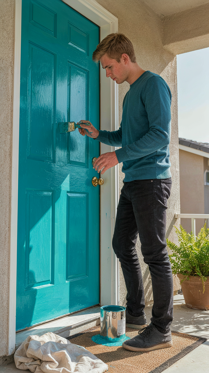
Most people don’t fail at house colors. They fail at deciding. You scroll color swatches for months, play it safe with beige, then resent your house for looking like everyone else’s. The shift you need isn’t aesthetic knowledge. It’s permission to look different. Stop researching and pick a combination that makes you slightly uncomfortable. That discomfort is the signal you’re onto something. Buy a quart, paint your front door this week, and live with it for two days. Your instinct will either confirm it or kill it. Either way, you’ll finally stop overthinking and start building a home that actually reflects who you are instead of who you think you should be.