The Mid Century Deception: Beyond Palm Springs Clichés
Why Generic Advice Fails Your Unique Home
You want permission to copy what worked somewhere else and call it original. The mechanism is simple: mid-century design rules get flattened into templates because they’re easy to teach. A courtyard entry isn’t a style—it’s a functional decision about how people move through space, how light enters, and what the exterior says before anyone crosses the threshold. Your home’s orientation, climate, lot size, and existing structure all matter more than the aesthetic you’re chasing.
Most courtyard advice treats mid-century homes like a monolith. They aren’t. A 1952 Eichler in California differs fundamentally from a 1960s ranch in the Midwest. Regional materials, local building codes, and climate demands shaped these homes differently. Copying a magazine photo misses the engineering logic that made the original work. You need to reverse-engineer why that courtyard functioned, not just replicate its appearance.
The Real Currency In Courtyard Design
Authenticity isn’t about being historically pure—it’s about solving the actual problem your home presents. A courtyard entry that contradicts your home’s existing logic looks like an afterthought, not an upgrade. Mid-century designers used courtyards to manage privacy, control sunlight, create outdoor rooms, and blur interior-exterior boundaries. Each served a specific mechanical purpose tied to the house’s layout and the owner’s daily routine.
The courtyard you design should emerge from your site’s constraints, not from Pinterest. Study how sunlight moves across your front yard at different seasons. Map sightlines from the street and neighboring properties. Identify whether your entry needs screening, shade, or expansion of usable space. These observations dictate material choices, planting patterns, and spatial proportions. The courtyard becomes authentic when every element answers a question your home actually asks. Start by documenting existing conditions for one full week, noting light, shadow, weather patterns, and how you naturally move through the space.
The Visitor Flow Protocol: Guiding The Gaze
Plants As Silent Directional Markers
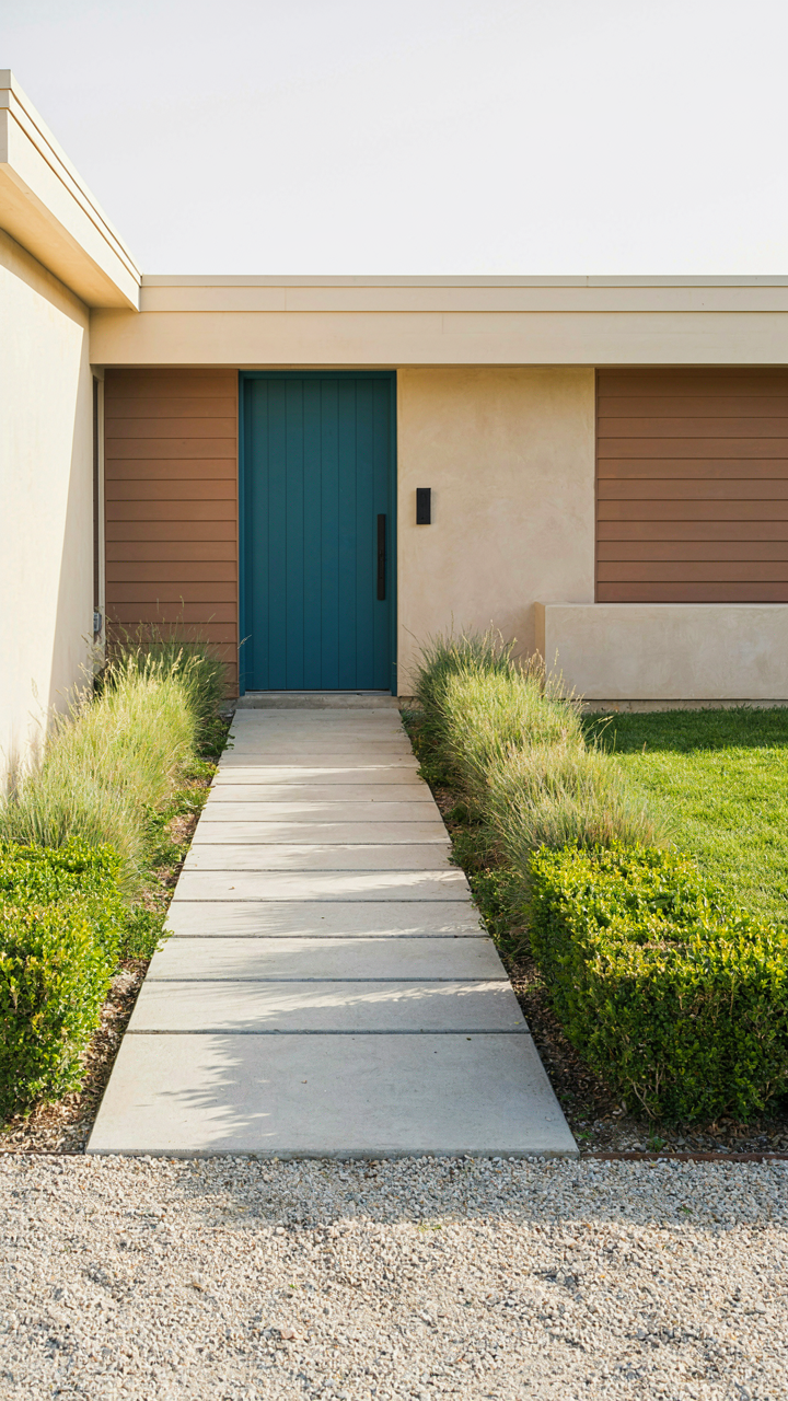
You want people to know where to go without you having to tell them. That’s the real reason you care about this section. The mechanism is simple: plants function as visual anchors that compress decision-making at the entrance. Mid-century homes often have ambiguous front entries—no clear path from driveway to door. Strategic planting solves this by creating a sightline. Tall plantings frame the entry, shorter ones guide the eye forward.
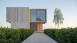
Place specimen plants at decision points, not randomly across the courtyard. A columnar juniper or boxwood hedge on the left of the entry stairs tells the visitor exactly where to step. The plant becomes the punctuation mark in the spatial sentence. This isn’t decoration. It’s navigation made invisible.
The Hardscape Line
Hardscaping works like trajectory in ballistics: materials shape the path a visitor must take. Instead of telling visitors where to walk, the courtyard floor tells them. Concrete pavers, gravel, or stone laid in a clear line from the street to the front door eliminate hesitation. Mid-century design emphasized clean geometry—use this principle.
Offset the hardscape line slightly from the direct street-to-door route if your courtyard has depth. This creates perceived formality and control. A curved paver path reads as intentional design; a straight one reads as utilitarian. Finish the hardscape terminal point at the front door threshold. The visitor’s journey ends where the material stops.
The Illusion Of Space: Maximizing Front Courtyard Impact
Build Vertical Before You Build Out
You want people to think your courtyard is bigger than it actually is. That’s the real reason you’re reading this section. The mechanism is borrowed from physics: perspective. Objects closer to the viewer’s eye occupy more visual real estate than distant objects. Walls, screens, and trellises exploit this by creating layered depth. Mid-century homes respond well to this because their clean lines already establish visual rhythm.

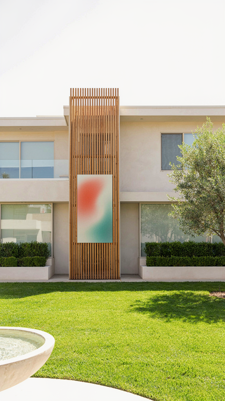
A vertical screen positioned mid-courtyard doesn’t block sight lines, it fragments them. Your eye stops at the screen, resets, then travels beyond it, making the space feel segmented and therefore larger. Thin wooden lattice or metal frameworks work better than solid walls because they preserve sight lines while creating division. The screen becomes a compositional tool, not a barrier. Place it perpendicular to your entry axis to maximize this effect.
Light Reflects Distance
Reflective surfaces don’t add square footage. They add apparent square footage, which is the only measurement that matters psychologically. Mirrors, polished concrete, light-colored stone, and water all bounce light and create visual repetition. Mid-century design already embraced this with clean horizontal planes and glazed surfaces. The mechanism is optical repetition: your brain interprets repeated imagery as spatial extension.
Position a reflective surface where it echoes the courtyard’s dominant axis. If your entry walks north to south, place a mirror or water feature on the east wall at a 45-degree angle. This reflects the opposite wall back into the space, doubling perceived depth without adding maintenance. A shallow fountain or polished aggregate concrete slab serves the same function. The key is placement that creates visual feedback, not decoration that sits unused.
Material Honesty: The Mid Century Palate
Concrete, Wood, And Stone: Their Raw Power
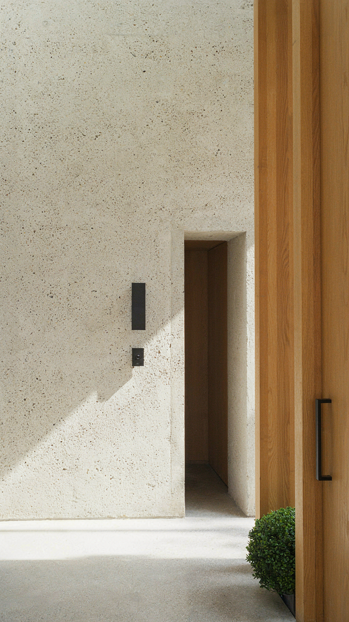
You want permission to spend money on materials that look expensive but feel timeless, so you don’t regret the investment. The mechanism is material honesty: mid-century design borrowed from industrial production, where each material does one job without pretense. Concrete holds structure. Wood frames space. Stone anchors permanence. When you stack these visibly in a courtyard entry, you’re not decorating—you’re showing the building’s logic.

Mid-century architects stopped hiding what materials were. They exposed concrete aggregate, left wood grain visible, and set stone without mortar joints disguised. This wasn’t restraint. It was brutality. The materials speak their weight and cost directly to the eye, which is why these courtyards still read as intentional decades later.
- Exposed concrete: Cast in place or precast, left unsealed or with light sealer. Shows aggregate and pour lines as design, not flaw. Weathers authentically without staining that reads as neglect.
- Solid wood screens and decking: Teak, cedar, or local hardwoods. Mid-century preferred woods that age visibly. Rot and silver patina become part of the courtyard’s timeline, not signs of failure.
- Quarried stone paving: Flagstone, slate, or cut granite. Laid with minimal mortar to show the stone’s edges. Unpolished surfaces grip foot traffic and age without becoming slick.
- Steel frames and railings: Blackened or naturally rusted mild steel. Mid-century didn’t paint over steel—they let oxidation become visual texture. Requires maintenance but reads as deliberate restraint.
- Brick and mortar contrast: Roman brick proportions with recessed mortar joints. The joint becomes negative space that defines the brick’s volume. Typically used as interior courtyard walls or accent zones.
The trap most people fall into is mixing these materials without hierarchy. Put concrete, wood, and stone in the same ten feet without a clear reason why each one belongs there, and the courtyard reads as indecisive. Mid-century designers gave each material a functional zone and let it dominate that zone completely.
The Counterfeit Problem: Fake Materials That Ruin The Effect
Most advice says to “choose quality materials for longevity.” That’s incomplete. The real problem is synthetic materials that mimic the originals but don’t age the same way. Stamped concrete that tries to look like slate. Wood-look composite decking. Stone veneers over foam. These fail because mid-century style depends on how materials change over time, not how they look new.
Fake stone veneers and synthetic wood literally can’t weather. They fade uniformly, peel at edges, and reveal their plastic core when damaged. Real stone chips at corners and looks intentional. Real wood splits along grain and gains character. Your courtyard entry announces itself as fake the moment water hits it the wrong way or sun exposure hits for five years. Stick to raw materials or accept that your entry looks like a catalog image that can’t age into authenticity.
Integrated Lighting: Function Over “Feature”
Ambient Versus Task Lighting: Where The Work Actually Happens
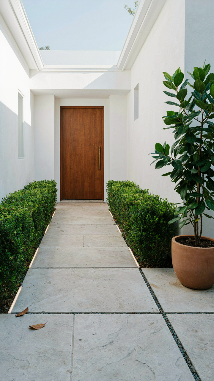
You want your courtyard to look good at night because you think that’s what good design is. Here’s the mechanism: your eye needs different light levels for different tasks, and mid-century homes either nail this or fail spectacularly because they lack the layering. Ambient lighting sets the baseline brightness across the entire entry zone. Task lighting handles what you actually do there: unlock your door, find your keys, read an address number, navigate uneven pavers. The common mistake is treating them as interchangeable. They’re not.

Mid-century courtyards worked best when designers separated these functions intentionally. Ambient came from overhead or perimeter sources that didn’t create pools of darkness. Task lighting concentrated near the entry door and pathways without spilling waste light into neighboring properties or washing out the architecture. A single overhead fixture trying to do both jobs creates harsh shadows or over-illuminates everything equally, destroying the spatial definition the courtyard was designed to have. Install ambient at 10-15 footcandles and task lighting at 20-30 footcandles around functional zones.
Security And Experience: The Actual Reason You’re Installing This
The real reason you’re thinking about courtyard lighting is fear of vulnerability at the entry point, though you’d frame it as aesthetics. Security lighting and experiential lighting follow the same physics principle as perimeter defense: eliminate dead space where an intruder could hide while making the space feel open, not exposed. The mechanism: consistent, moderate illumination across the courtyard removes shadows completely while soft-edged light prevents the “stage spotlight” effect that reads as harsh and unwelcoming.
Mid-century homes benefited from low-voltage uplighting on architectural features and ground-level markers along the path. These approach was practical, not decorative. The uplighting revealed the home’s angles while lighting the walking surface itself, not the sky. Ground-level LED strips or recessed path lights work identically now. Motion detection should augment, not replace, ambient lighting. The detection triggers task lighting only where movement occurs, preserving the overall calm aesthetic while instantly responding to actual entry activity. Set motion sensors to activate for 30-60 seconds at task zones only.
Water Features: Not Just A Pretty Sound
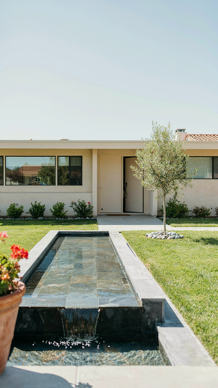
Strategic Sound Masking Changes Your Perimeter Defense
You want a water feature because you think it looks sophisticated. The real reason you need one is acoustic control. Your mid-century courtyard sits exposed to street noise, neighbor conversation, and traffic. Water masks these intrusions by introducing a competing sound source at a frequency the human ear processes as natural rather than intrusive. This is acoustic masking, borrowed from environmental psychology. Place your feature near the courtyard entry, not the center, so sound disperses across the threshold where noise penetration happens first.

The mechanism is simple: moving water produces frequencies between 1,000 and 4,000 Hz that overlap with speech and traffic noise. Your brain deprioritizes those external sounds because the water occupies the same frequency band. Position a fountain or small recirculating basin 8 to 12 feet from your front entry door, slightly elevated or on grade, so water sound travels toward the street instead of bouncing into your living space. Test volume at different times of day. Too loud becomes annoying. Too quiet fails to mask anything.
Reflection Creates Thermal Regulation Without Talking About It
Most courtyard advice treats water as decoration. The actual function is microclimatic adjustment through reflection and evaporative cooling. Mid-century homes lack the deep overhangs that deflect summer heat. Water surfaces bounce light across hard surfaces, reducing the radiant temperature spike that makes courtyards unusable in afternoon sun. Evaporation from exposed water lowers ambient air temperature by 3 to 5 degrees Fahrenheit when air circulation exists. This isn’t hypothetical. It’s thermodynamics applied to site design.
Orient your water feature so its surface faces south or southwest in summer conditions. Dark stone or tile beneath and around the feature absorbs heat during morning hours, then releases it slowly at dusk, extending the courtyard’s usable evening window. Keep water depth shallow, between 12 and 18 inches, to maximize surface area and evaporative effect. Combine this with an open courtyard layout that allows cross-ventilation. The water feature becomes active thermal management, not scenery.
The Plant Selection Fallacy: Beyond Aesthetics

Native Plants Build System Resilience
You want plants that look intentional without admitting you’re betting against your own follow-through. Here’s the mechanism: ecology teaches us about carrying capacity, the maximum population a system sustains without external input. Your courtyard is a closed system. Native plants already evolved to thrive in your region’s rainfall, soil pH, and temperature swings. They don’t require constant intervention to survive. Everything else is a slow drain on your attention and budget.

Mid-century design favored clean lines and reduced ornament, but the plant palette reflected whatever grew locally without fuss. Desert homes used desert natives. Temperate zones used regional species. This wasn’t sentiment. It was efficiency. Non-native plants demand fertilizer, amended soil, supplemental water, and pest management when they weaken under stress. Native plants establish themselves and outcompete weeds through adaptation. Pick species that already exist within fifty miles of your address, not plants that photograph well on Instagram.
Low Maintenance Wins Through Design, Not Hope
The common advice is wrong: “choose drought-tolerant plants and you’re done.” You’re not done. You’ve just delayed the problem. Real maintenance reduction happens through layering. Mulch suppresses weeds and retains soil moisture. Hardscape (gravel, stone, pavers) reduces plantable area, which means fewer things to manage. Grouping plants by water need prevents the spray-everything-equally trap that kills half your courtyard. Spacing matters. Crowded plantings create humidity pockets that invite disease. Proper spacing lets air move through the system.
Mid-century courtyards succeeded because they treated plants as architectural elements, not decoration. A single specimen tree cast shade and structured the space. Ground cover filled the base. Ornamental grasses or shrubs provided texture. No chaos. No overplanting. The mechanism is simple: fewer plants, better placed, all native to your region, means the courtyard functions with minimal input after year two. Audit your plan before installation. If you can’t describe what each plant does structurally or ecologically, remove it.
Privacy As A Premium: Redefining Front Courtyard Ideas Entrance
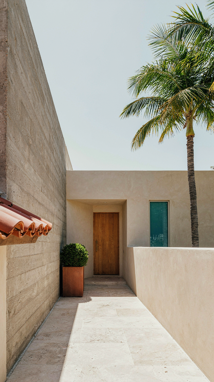
The Moat Principle In Modern Courtyards
You want privacy without looking paranoid. Military strategy calls this a “buffer zone”—controlled distance that stops threats before they reach the inner sanctum. Mid-century architects borrowed this concept directly. They placed courtyards as perimeter defenses, forcing visitors through graduated zones before reaching the actual entry door. Each layer strips away sight lines to your interior.

The mechanism is simple: distance plus obstruction equals privacy. A mid-century courtyard doesn’t just sit there looking pretty. It performs work. Trees planted eight feet from the property line block street-level sightlines. A sunken court drops your front door below grade, making it invisible from the sidewalk. Walls perpendicular to the street capture and redirect views. The visitor moves through architectural channels, not straight shots to your window.
Walls That Work Without Talking
Most advice tells you to add a fence. That’s lazy. A fence announces privacy. It signals something worth hiding. Better builders in the mid-century period used layered barriers that control sound and vision without broadcasting restriction. A solid wall blocks line-of-sight. A perforated screen diffuses it. A combination of both kills both acoustic and visual intrusion.
Sound travels in straight lines until it hits mass or gets broken up. Thick courtyard walls (8 inches minimum concrete or brick) absorb traffic noise. Perforated metal screens angled inward bounce sound waves down, not toward windows. Strategic plantings fill gaps where sound leaks through. Position barriers so they face the noise source directly, not at angles. The result: your front entry becomes an acoustic dead zone, separate from street chaos.
Curated Vignettes: The Power Of Intentional Emptiness
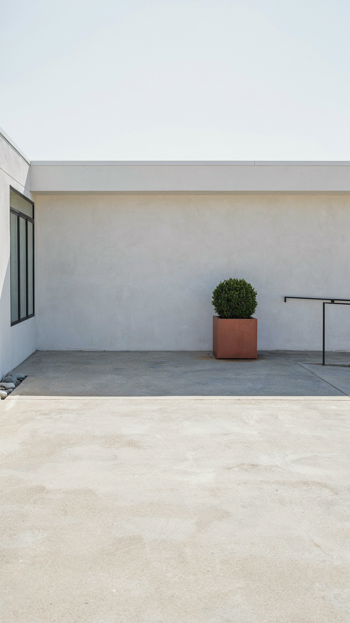
Every Object Earns Its Place
You want permission to buy less stuff and feel like you made a design choice instead of a budget constraint. Here’s the actual mechanism: mid-century homes already fight visual noise because of their open floor plans and glass walls. Add clutter to the courtyard entry and you’ve collapsed the entire spatial logic the architects built. Restraint isn’t minimalism for its own sake. It’s structural necessity.

Mid-century design borrowed from Japanese spatial philosophy, where negative space functions as pressure. Emptiness isn’t absence. It’s active material. Every planter, stone, or fixture you place must do three jobs: frame the view, define movement, or anchor the eye. If an object only looks nice, it fails. Strip your courtyard entry to the functional minimum, then add one element that strengthens the whole composition.
Open Space As Active Geometry
The common advice says “leave room to breathe.” Wrong framing. Open space isn’t breathing room. It’s the skeleton that makes the bones visible. In mid-century courtyards, empty ground plane amplifies the architecture. It forces the eye upward to the overhang, sideways to the entry door, forward through the threshold. You’re designing sight lines, not decorating.
Calculate what you actually need: transition zone, water feature or not, one focal point. Everything else is tax on attention. Concrete or gravel surfaces keep the courtyard legible. Walls contain and direct movement. The entry disappears when it competes with visual clutter. Your job is to remove obstacles to the view, not add reasons to look down.
Front Yard Patio: An Extension, Not An Afterthought
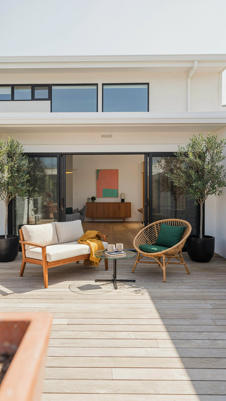
When Thresholds Matter More Than Square Footage
You want the patio to feel intentional because you’re afraid it’ll look like wasted space. The real mechanism is threshold psychology. Mid-century design borrowed from Japanese spatial theory: the value of a space multiplies when you acknowledge the boundary between inside and outside. Most patios fail because they sit as orphaned concrete slabs. The transition zone is what converts dead frontage into functional living area.
The best mid-century front patios align their floor plane with the interior finish height, or offset it by a standard 8-inch step. Flooring material continuity matters. If your interior uses concrete or polished terrazzo, extend it outside without breaking the visual line. If you break the material abruptly, the eye reads two separate spaces instead of one expanded room.
Anchoring The Gathering Points
Front patios work when seating creates actual reason to occupy them. The mistake is treating seating as decoration. You need programmatic density: the patio must serve a function beyond “somewhere to stand.” Mid-century homes often placed conversation areas at entry courtyards to buffer the street, create privacy, and establish social hierarchy.
- Built-in benches along perimeter walls: Bench depth of 18-24 inches pairs with a 15-18 inch seat height. Anchors people without requiring moveable furniture. Define edge boundaries that frame the patio as distinct zone.
- Central planter islands: A raised planter 24-30 inches tall acts as both focal point and impromptu seating ledge. Breaks the visual flatness and creates micro-zones within the courtyard.
- Wall-mounted planters and shade devices: Vertical elements pull the eye upward and reduce the exposed feeling of front-facing spaces. Screens or slatted overheads drop the ceiling psychologically.
- Hardscape seating elements: Low stone walls, stepped platforms, or terraced levels create natural gathering spots. Every elevation change gives people a reason to orient themselves differently.
- Firepit or focal furnace: A contained fire feature (built-in chimney or steel bowl) centers activity around a point. Draws people into the space and activates it after hours.
The second layer is visual weight distribution. Don’t cluster all seating on one side. Stagger seating heights and depths so multiple people can occupy the space without forcing eye contact. Mid-century design solved this through asymmetrical balance, not symmetrical placement. One person sits, two others stand, one leans on a planter edge. The zone becomes activated because there are multiple valid postures and positions.
The Real Obstacle Isn’t Design, It’s The Fear Of Committing To A Distinct, Unfashionable Vision

You’re not stuck because you lack front entry courtyard ideas. You’re stuck because you want permission to build something that won’t photograph well for Instagram. Stop waiting for validation. Pick one material, one plant, one focal point, and commit to it completely. Your neighbors’ opinions have zero correlation with how good your entrance actually feels. Today, sketch your courtyard without consulting Pinterest once. The homes people remember aren’t the ones that played it safe.