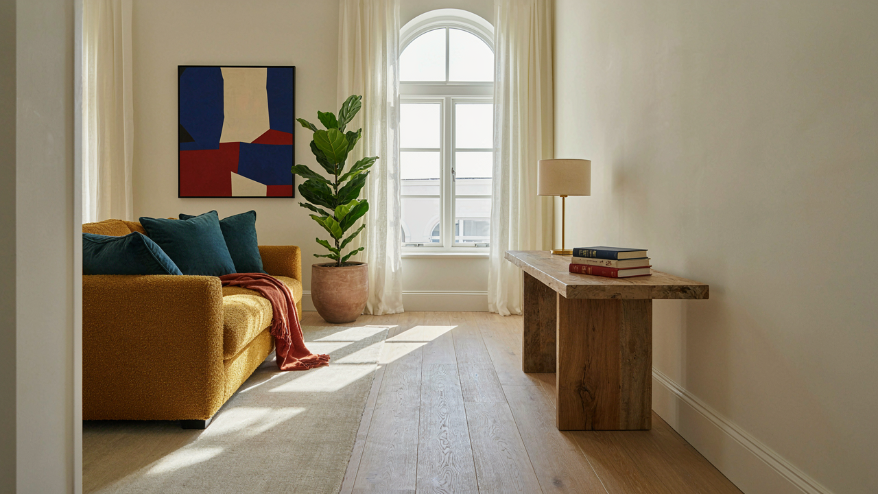
The Faux Designer Fallacy: Why Most DIY End Table Makeover Ideas Fail

You’re Chasing The Wrong Signal
You want people to think you have taste without spending money or time learning actual design. The real mechanism behind failed DIY table makeovers is that most people treat surface decoration as a substitute for structural integrity and material quality. Slapping paint or contact paper over a wobbly, cheap table doesn’t make it designer. It makes it a painted cheap table. Designer work starts with a piece that functions well, then enhances it. Most DIY efforts do the opposite.
The gap between Pinterest results and actual execution destroys projects. People buy a thrifted table held together by staples and particle board, apply trendy finishes, then wonder why it looks amateur in their home. The finish reveals every flaw underneath. Cheap materials photograph well in styled shots under controlled lighting. In your living room at 3 PM, they expose themselves immediately. Investing in the base object matters more than the transformation technique.
Temporary Fixes Masquerading As Updates
Cosmetic upgrades with short shelf lives plague DIY makeovers. Contact paper, removable wallpaper, and spray paint applied directly to varnished surfaces peel, fade, or chip within months. These aren’t updates. They’re Band Aids with an expiration date. Real design changes require prep work most people skip: sanding, priming, proper sealants. Without them, you’re building on quicksand.
The cost of doing it right versus doing it twice gets ignored in the moment. A proper wood stain or quality acrylic paint system costs slightly more upfront but lasts years. Cheap solutions create repeat projects that waste time and money. Stop treating the makeover as the finish line. The real work happens in material selection and surface preparation. You either prepare correctly now or redo everything in eighteen months.
The Unfinished Edge Protocol: Crafting Impact With Deliberate Imperfection

Where Raw Meets Intention
You want the table to look expensive without looking staged, which means you need to stop treating every surface like it needs polish. Borrowed from industrial design, the concept of “negative space” applies here: the unfinished edge isn’t absence, it’s contrast. A side table with deliberately exposed wood grain or an unpainted metal leg registers as curated, not neglected, because the rest of the piece is intentional. The mechanism is simple: finished surfaces draw attention inward while raw edges create visual weight and authenticity that mass-produced tables cannot replicate.

Start by identifying which edges will stay visible. Not all of them. A tabletop’s perimeter, the base where it meets the floor, or internal joints become your raw material canvas. Sand these edges to smooth roughness without sealing them. Leave the wood grain exposed or let metal oxidize naturally. The contrast between a polished top and raw legs signals that someone made deliberate choices rather than accepting defaults.
Texture Layering Through Contrast
Designer furniture uses texture contrast strategically, not randomly, because monotony reads as unfinished rather than refined. If your table has a smooth lacquered top, rough texture on the base becomes a design element, not a flaw. Conversely, a raw wood surface needs at least one refined element to anchor it, whether that’s a brushed metal frame or a polished concrete shelf. The rule: never leave raw texture alone.
Apply this directly. Pair unfinished wood legs with a sealed top. Add woven cane panels to a metal frame. Use reclaimed materials for the base and contemporary finishes for the work surface. Each raw texture must be balanced by something refined. This prevents the table from reading as incomplete. The balance is what communicates intentionality to anyone looking at it.
Strategic Subtraction: What To Remove For Maximum Impact In Table Makeover

Stripping Away Visual Clutter First
You want your side table to signal taste without effort. The real mechanism is this: clutter reads as indecision, and indecision reads as low status. Start by removing everything. Not temporarily. Permanently. The items that don’t return after a week are the ones creating visual noise, not serving function.
Most design advice tells you to curate what stays. That’s incomplete. You need to identify what actively works against the table’s purpose. Decorative objects stacked without breathing room, mismatched frames, expired items lingering from prior seasons—these create cognitive friction the eye processes as disorder. Remove them first, then rebuild intentionally.
Brutalism’s Constraint Applied To Tables
Borrowed from architecture, brutalism teaches that constraint creates presence. A brutalist structure removes ornament ruthlessly, leaving only essential mass and proportion. Apply this to your table: identify the single structural element—the table itself—and ask what else deserves to exist in its visual field.
A side table’s power comes from what surrounds the object, not what clutters its surface. One lamp. One book. One item with texture. The gaps between objects matter more than the objects themselves. This isn’t minimalism as aesthetic. It’s minimalism as clarity. Remove every item that doesn’t either function or create spatial rhythm, then stop there.
The Material Intelligence Method For Upcycled End Table
Choose Materials By Their Actual Performance
You want this table to look intentional, not like you raided a thrift store. The real motive is status through restraint, and restraint only works when you understand what each material actually does instead of what Pinterest says it should do. Material selection in design works like structural engineering: load-bearing capacity determines what survives. Pick materials based on how they age, how they handle weight, and whether they require maintenance you’ll actually perform.
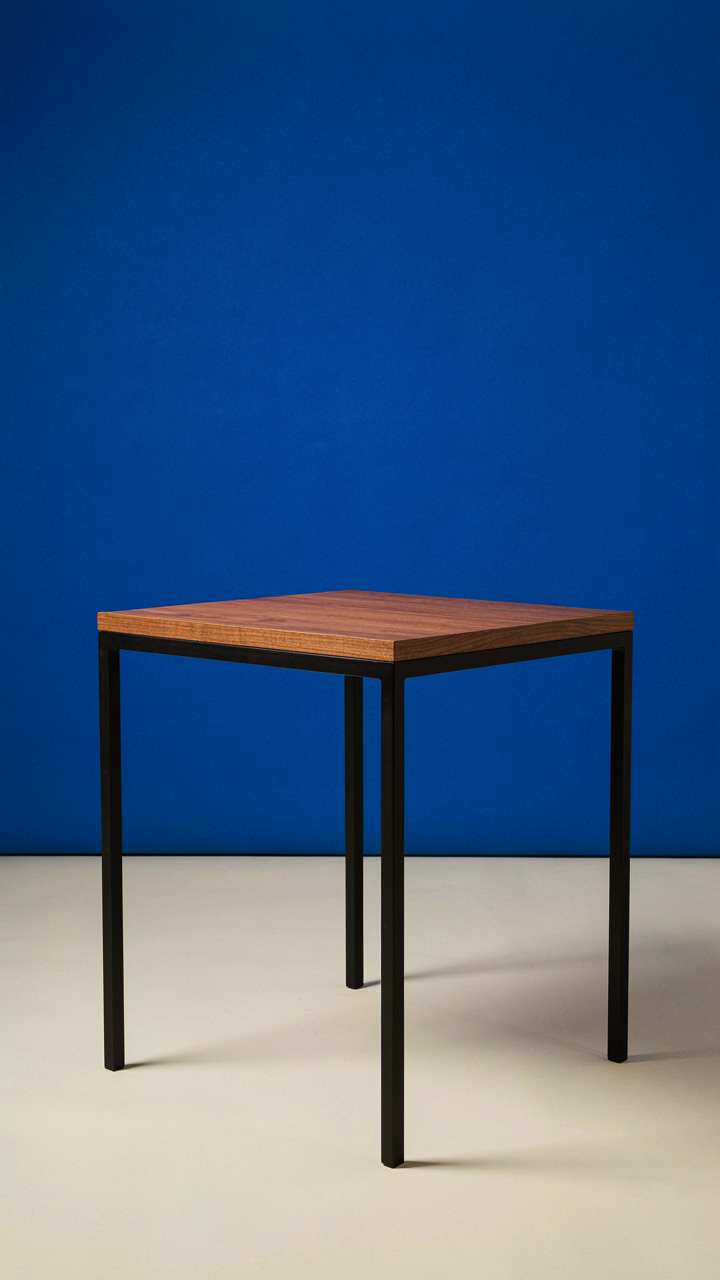
Wood grain darkens with UV exposure. Metal oxidizes predictably. Concrete cracks under thermal stress. Marble stains from acidic liquids. These aren’t design flaws to hide—they’re properties to work with or against intentionally. A walnut top paired with a steel frame doesn’t just look good because of contrast. It works because walnut’s density handles weight distribution, and steel’s rigidity prevents wobble. The table functions before it ever gets photographed.
Tension Through Material Mismatch
The consensus says mix textures and finishes for interest. That’s incomplete. Real visual tension comes from materials with opposing structural logic living in the same object. Pairing a soft material with a hard one creates cognitive friction, the same friction that makes you look twice at a room instead of scrolling past it. A chunky stone top on spindly brass legs shouldn’t work structurally, yet it reads as intentional because the materials argue with each other.
The mechanism is this: your eye expects materials to match their visual weight to their actual weight. Break that expectation deliberately. A reclaimed wood base supporting a polished brass or copper tabletop creates friction because wood reads as organic and temporary while metal reads as industrial and permanent. Start by identifying one material that feels heavy and one that feels light, then pair them so neither dominates. Finish one with matte, the other with gloss, to amplify the opposition further.
The Painted End Tables Paradox: Less Is More In Color Application
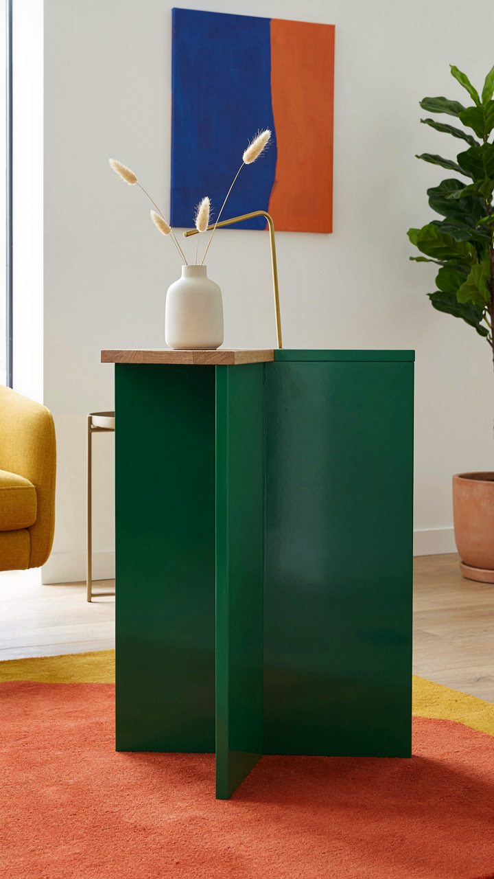
One Color Wins Every Time
You want the table to signal taste without screaming for attention. That’s the real calculation here. The mechanism is simple: your brain processes a single bold color as intentional. Multiple colors read as indecision, which kills the designer effect instantly.
Painting a side table one solid color forces constraint. High-gloss black, deep forest green, or warm terracotta each work because they commit. The common advice says “add personality with patterns or gradients.” That’s wrong. Patterns on small surfaces look cramped. Gradients look like mistakes. One color applied evenly reads as control, which is what expensive furniture communicates.
Natural Wood As The Reset Button
Design borrows from contrast theory in visual hierarchy. Think of untreated wood as the visual anchor that stops your eye from sliding past the table into dead space. When you paint a side table, leaving the top or legs in natural wood creates a pause point that makes the painted section feel intentional rather than total.
The wood doesn’t need to match your flooring or existing pieces. It needs to break the monochrome. A painted base with a natural wood top works because the human eye reads this as deliberate layering, not lazy execution. Leave the wood sealed but unfinished for maximum impact. This combination signals you made a choice, not filled a gap.
Surface Alchemy: Refinished Tables Beyond The Sand And Stain
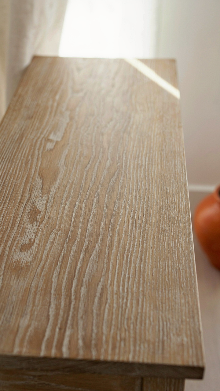
Finishes That Signal Intentionality
You want people to know you didn’t just buy something off a showroom floor. The mechanism is simple: traditional stain and polyurethane announce mass production. Non-traditional finishes announce choice. Oil-rubbed bronze, cerused wood, lacquered surfaces, and hand-applied waxes read as deliberate because they require knowledge most people lack. The finish is the signal. A side table with a properly executed oil finish or cerused oak veneer tells the room you understood what you were doing.
Cerusing, a Scandinavian technique from the mid-century era, fills wood grain with white or pigmented paste, then sands flush. The grain stays visible but elevated. Lacquer, borrowed from Japanese craftsmanship, builds depth through multiple thin coats instead of one thick one. Both require technique, but neither requires professional equipment. The payoff is tables that photograph well and hold their visual weight in a room because the surface genuinely changes how light interacts with the wood.
Patina As Structural Design
Patina isn’t nostalgia. In materials science, patina is a protective oxidation layer that develops when metal or wood surfaces interact with air and use over time. A designer-level side table uses this principle intentionally. You’re not trying to hide aging. You’re controlling the pace and character of how the surface breaks down. This is where generic advice fails: most people treat patina as something that happens to old tables. The real move is engineering it into new ones.
Hand-applied wax finishes age visibly and beautifully. Dark wax over light wood, applied unevenly and burnished by hand, creates depth that single-coat finishes cannot match. The surface becomes richer each time it’s touched. Oil finishes do the same thing but more subtly. Lacquer doesn’t patina in the traditional sense, but layering translucent lacquers with subtle color shifts creates visual complexity that reads as heirloom immediately. The mechanism: visible depth signals time and intention in under five seconds.
Hardware As Narrative: Elevating Your DIY Side Table Makeover
When Hardware Becomes The Story
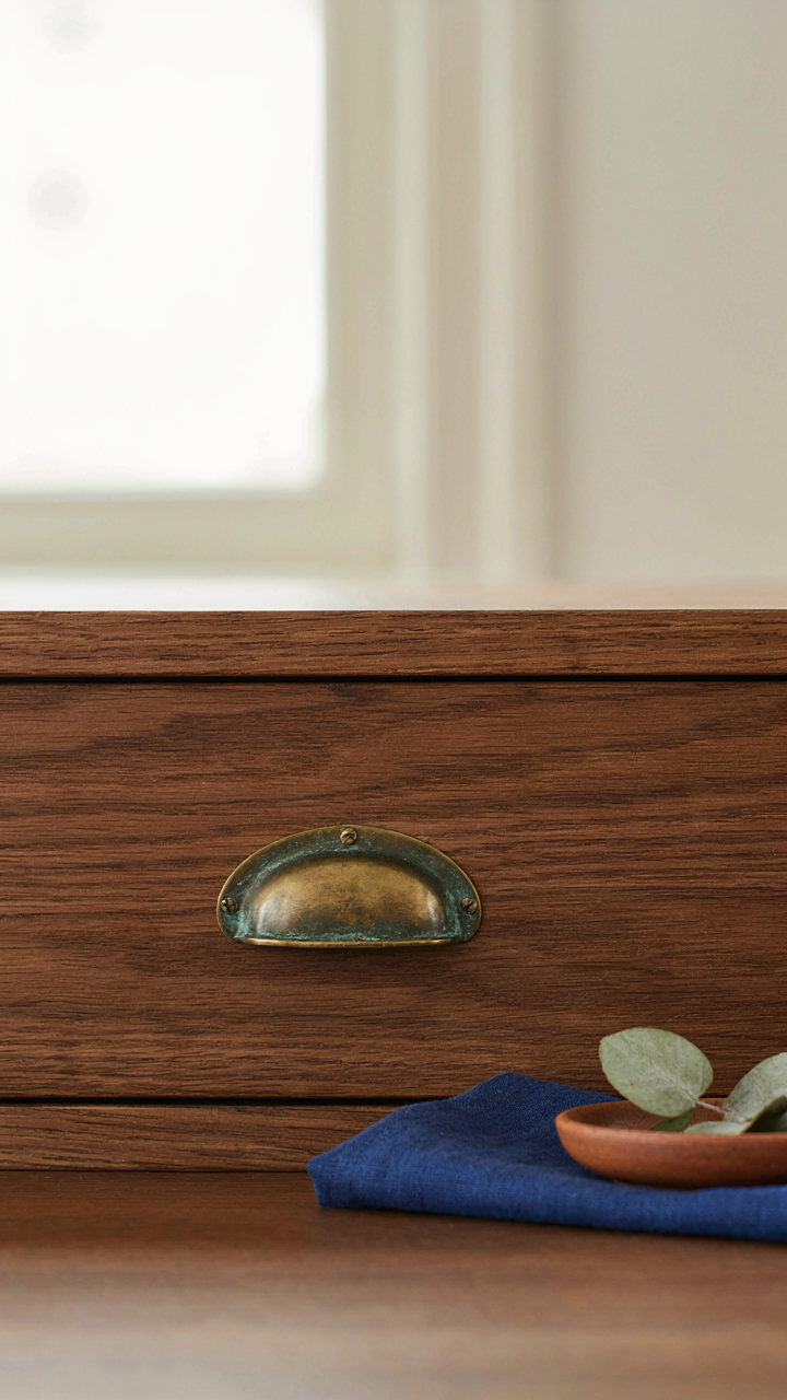
You want people to notice the craftsmanship without knowing you did it yourself. That’s the real reason you care about hardware. The mechanism is simple: hardware is the one element on a side table that reads as intentional. A drawer pull, a decorative corner bracket, or a leg cap signals deliberation. Most people treat hardware as functional afterthought. They bolt on whatever matches the wood stain and call it done. That’s lazy. Strategic hardware transforms a table from assembled to designed.
- Brass Cup Pulls With Patina: Vintage or reproduction brass signals restraint and quality. The patina communicates age and authenticity, not shiny newness.
- Steel Ring Pulls: Modern and minimalist. They work on mid-century and contemporary tables. Choose forged steel over stamped for visible craft marks.
- Leather-Wrapped Hardware: Leather straps around wood pulls add texture and break the visual uniformity of metal alone. Pair with natural wood finishes for cohesion.
- Cast Iron Brackets: Load-bearing corner reinforcements that read as industrial heritage. Real craftspeople use them. They’re not decorative unless you make them visible on the piece’s exterior.
- Reclaimed Wrought Iron Handles: Forged by hand in previous eras, these have irregularities that screams authenticity. Search architectural salvage yards or specialized hardware vendors.

Hardware placement matters as much as selection. Put pulls or brackets where they catch light and draw the eye. A single strategic detail beats uniform hardware around all four sides. Consistency bores. Hierarchy commands attention.
Salvaged Pieces And The Constraint Of Authenticity
When you source salvaged hardware, you’re working inside a constraint that forces better design. You cannot buy fifty identical pieces. This limitation becomes your creative edge. Most DIYers see this as a problem. It’s actually the foundation of a designer finish. You’re forced to make intentional choices instead of defaulting to matching sets.
Hunt architectural salvage yards for pulls, hinges, and legs from deconstructed furniture. Mix metal tones intentionally, not accidentally. A brass pull on one drawer, a steel ring on another, an iron bracket as reinforcement. This reads as collected over time, not purchased in one shopping trip. Source pieces across different finishes to suggest a table that has evolved. The visual effect communicates depth and intention. The mechanism works because your eye expects uniformity from mass production. When uniformity breaks, your brain registers care.
The Illumination Imperative: Ideas For End Tables And Lighting

Light Creates Perceived Value
You want your side table to look expensive without spending like it. Here’s the mechanism: light hits surfaces at angles, and your brain reads shadows and highlights as depth, craftsmanship, and intentionality. A table under harsh overhead light reads as flat and cheap. The same table with directional light becomes an object. This isn’t opinion—it’s how human perception processes three-dimensional form. A designer lamp on a basic table transforms the entire surface into a display. The light does the work your budget couldn’t.

Placement matters more than the lamp itself. A task light positioned to the side of your table creates shadow lines that define edges and texture. This directional approach comes from theatrical lighting design, where “accent lighting” highlights specific objects to draw focus. Your side table needs that same focused beam. Without it, everything reads as equally important, which means nothing stands out. Position your light source low and angled—not centered above the table like an interrogation room.
Shadow Lines Define Form
Strategic placement uses a principle from chiaroscuro painting: the contrast between light and shadow creates perceived complexity and intentionality. Dark shadows beside bright surfaces trick the eye into seeing more dimension than exists. A lamp six to twelve inches from the table edge throws shadow across the surface while illuminating the tabletop’s opposite side. This contrast makes a flat IKEA table read as sculptural. The mechanism is simple: your brain interprets shadow depth as intentional design rather than basic furniture.
Angle your light source at forty-five degrees from horizontal when possible. This creates shadow without making the table itself disappear into darkness. A brass or ceramic lamp body that catches light adds another layer—the object itself becomes part of the visual story. The goal is making viewers register the table as a curated element, not a functional necessity. Place the lamp on the table itself or on a nearby surface at similar height. This keeps light vectors consistent and readable to the eye.
The Environmental Leverage Model For Painting End Tables Ideas
How Surfaces Adapt To Their Context
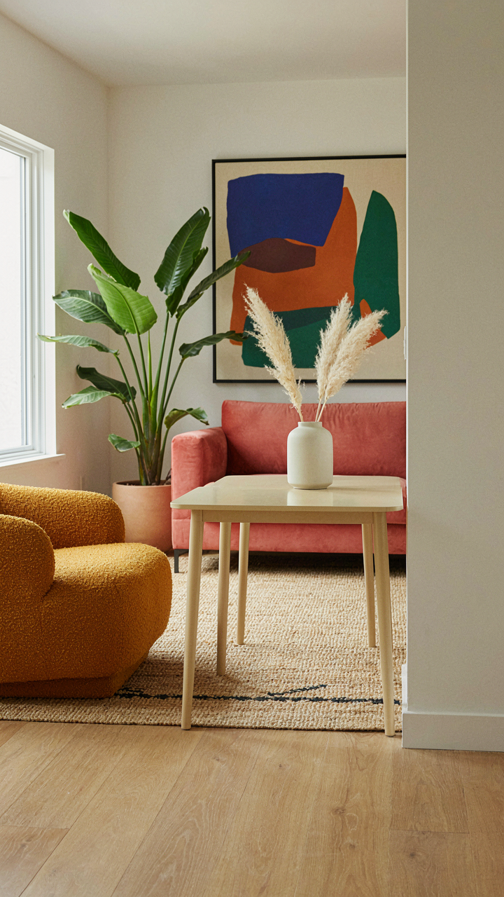
You want your side table to look expensive without spending like it. The real mechanism: surfaces that respond to their environment cost less to maintain and age better visually. In biology, organisms survive by adapting to their surroundings rather than fighting them. Apply this to your paint choice. A matte finish on a side table in a high-traffic living room will show dust and fingerprints constantly, forcing maintenance. Semi-gloss or satin finishes self-regulate: they reflect light variably depending on angle and time of day, masking minor wear and dust accumulation naturally.

The finish you choose determines whether your makeover looks intentional or neglected six months in. Matte finishes demand perfect cleanliness to read as designer. They’re actually the harder sell if your table gets daily contact. Satin finishes age gracefully because they don’t telegraph every imperfection. Pick the paint sheen that matches your actual living pattern, not the aesthetic you wish you had. This single decision prevents your makeover from looking cheap after the first season of use.
Material Density As Your Force Multiplier
Physics teaches that denser materials require less force to create lasting impressions. Your side table’s wood density determines whether paint adheres, how it scratches, and whether you need primer. Softer woods like pine need primer and sanding because the paint has nothing dense to grab. Hardwoods like oak or maple accept paint directly because their grain structure provides mechanical grip. Don’t sand aggressively hoping to compensate. Instead, choose paint formulated for your wood type. Semi-solid stains on dense wood outperform thin acrylics on soft wood every time.
The primer decision is where most makeovers fail. Skipping primer on soft wood means your paint will chip within months because it never bonded structurally. Primer fills the wood’s pores and creates a uniform surface for paint adhesion. On dense hardwoods, a quality acrylic paint bonds directly without primer, saving a step. Test your table’s wood by pressing your fingernail into an inconspicuous spot. If it dents easily, primer is mandatory. If it resists, you can apply quality paint directly and achieve durability that lasts years.
Beyond Trends: Cultivating A Timeless Aesthetic
Material Quality Over Visual Novelty
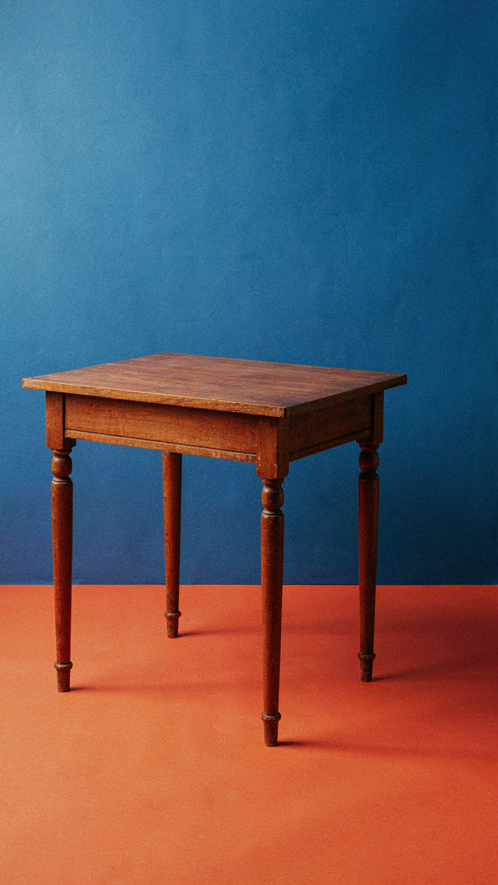
You want your makeover to justify itself five years from now, not feel like a mistake in two. The mechanism is simple: trends are visual, but durability is structural. Solid wood ages better than veneer. Brass develops patina that reads as intentional. Natural stone doesn’t date. These materials cost more upfront because they actually survive use. A side table remake built on cheap materials will force you to remake it again.
The common advice says “invest in classics.” That’s incomplete. Classics aren’t classics because they look timeless. They’re classics because they perform consistently across decades. A walnut side table with turned legs from 1970 works in 2024 not because the aesthetic survived, but because the construction didn’t fail. Choose materials that improve with age, not materials that photograph well in styling shoots.
Building Your Own Visual Language
Don’t borrow a designer’s entire vocabulary. Take one element that works for your space and repeat it deliberately across the table’s surface, legs, or hardware. If you respond to mid-century proportions, use those proportions consistently. If natural wood grain appeals to you, choose finishes that expose grain rather than hide it. Signature doesn’t mean unique. It means coherent.
Most people copy a whole room aesthetic and wonder why it feels hollow in their space. The mechanism is scale and context. A design works in a professional shoot because every element was chosen for that exact moment. Your home has different light, different walls, different objects around the table. Extract one principle from what you admire, then build from your constraints, not from Instagram. That’s how a makeover becomes yours instead of a replica.
The Real Obstacle Isn’t Your Budget; It’s Your Refusal To See Design As A System, Not A Splurge
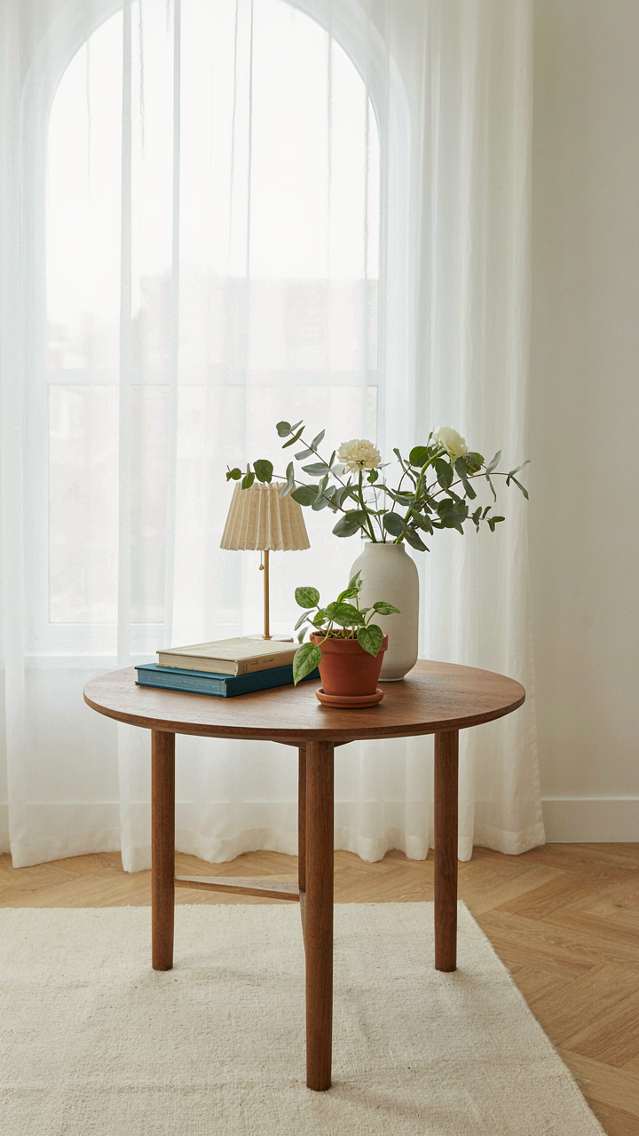
Most people treat a side table makeover like a one-off purchase. They buy a piece, slap some decor on it, call it done. That’s backwards. Your table works inside a room that works inside your life. Start by picking one design principle you see in rooms you actually like, then hunt for a table that echoes it. Color, material, shape, height. Pick one today and build from there. Design isn’t about spending more; it’s about seeing how pieces talk to each other instead of screaming alone.