Introduction
Vertical garden design brings greenery into small spaces by growing plants on walls. It transforms blank walls into lush living green walls. To make these walls beautiful and appealing, it matters how you choose colors and textures of plants. This article covers vertical garden design principles focused on balancing color and texture to create walls that delight the eyes.
You will learn practical ways to pick plants that work well together by their color shades and leaf shapes. We also discuss arranging plants with different textures to add depth and interest. Whether you want a small indoor garden or a large outdoor living wall, this guide gives you simple steps to plan your vertical garden with balance and style.
Understanding Vertical Gardens
What is a Vertical Garden
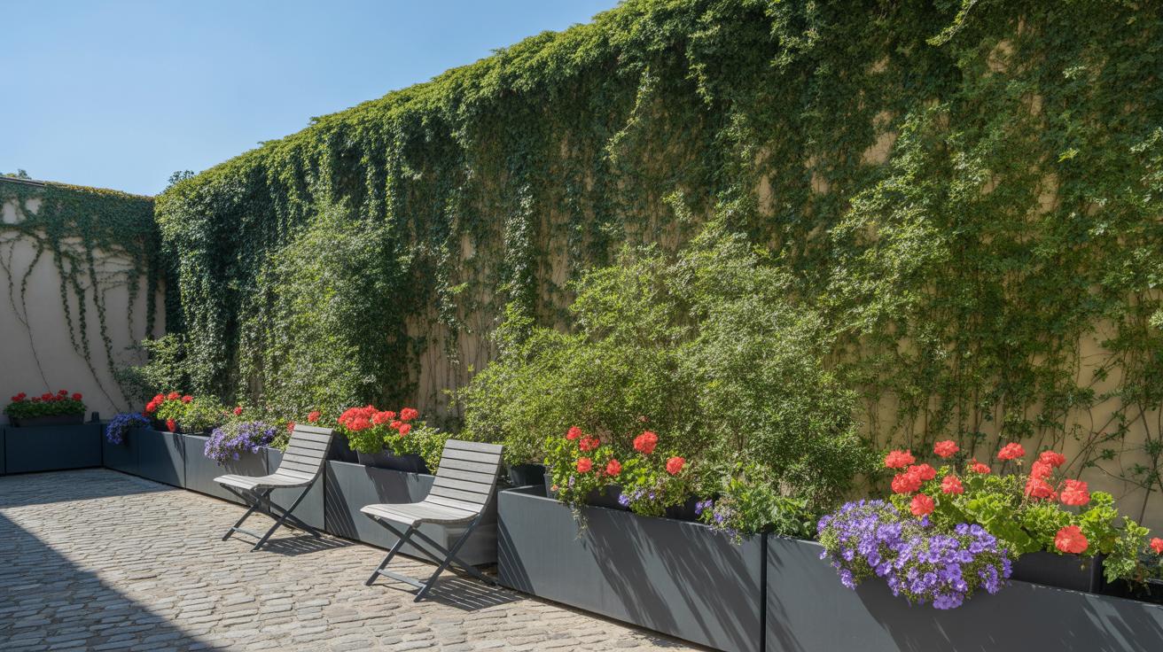
A vertical garden is basically a way to grow plants on a vertical surface instead of spreading them out on the ground. Think of it as a living wall—plants arranged upward rather than outward. This setup can be as simple as a mounted pocket planter or as complex as modular panels with built-in irrigation systems. Unlike traditional gardens, vertical gardens use the vertical dimension, allowing you to bring greenery to narrow spaces, fences, or even indoor walls.
The core components usually include a support structure, a growing medium like soil or felt, and a water delivery system, whether manual watering or drip irrigation. Some setups rely on hydroponics, using nutrient-rich water instead of soil. The setup idea you pick often depends on the space available, plant types, and how much maintenance you’re ready for.
Why Choose a Vertical Garden
Vertical gardens save space—no surprise there. But beyond fitting into small areas, they can make a noticeable difference in air quality by filtering pollutants and releasing oxygen. I remember once going into a small apartment with a vertical garden near the window; it felt fresh in a way that standard houseplants just don’t achieve.
They also add a unique aesthetic dimension. Instead of a flat splash of green, you get layers and textures that draw the eye upward. You might pick vertical gardens to hide a dull wall, reduce noise, or simply bring nature indoors where there’s no yard. In cities especially, where space is scarce, they offer a green touch without needing a big patch of soil. So, it’s not all just about looks—there’s a practical side that’s quite compelling if you think about it.
Basics of Color Theory for Gardens
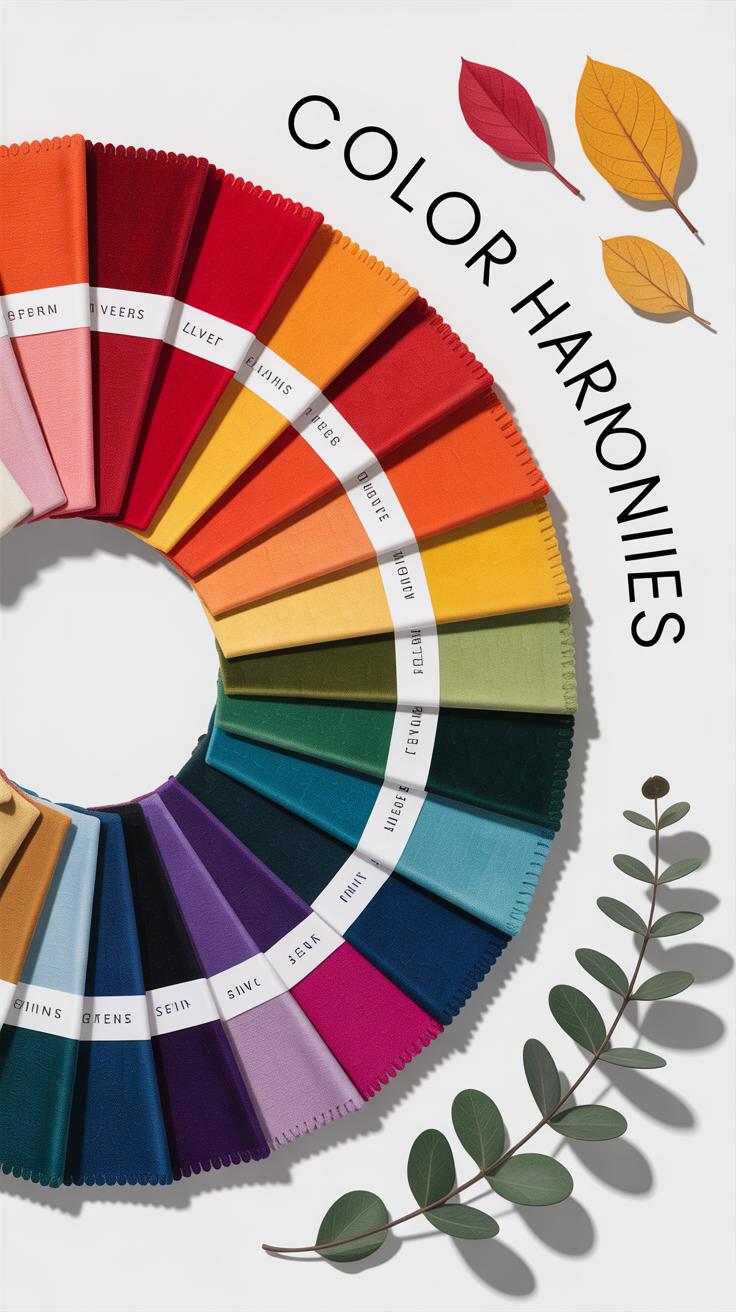
When designing a vertical garden, understanding some color theory basics can really help you put together plants that feel right together. You might already know about primary and secondary colors from art class—red, yellow, and blue—and how mixing these creates others, like orange or green. But applying this to plants is a bit different and kind of fun.
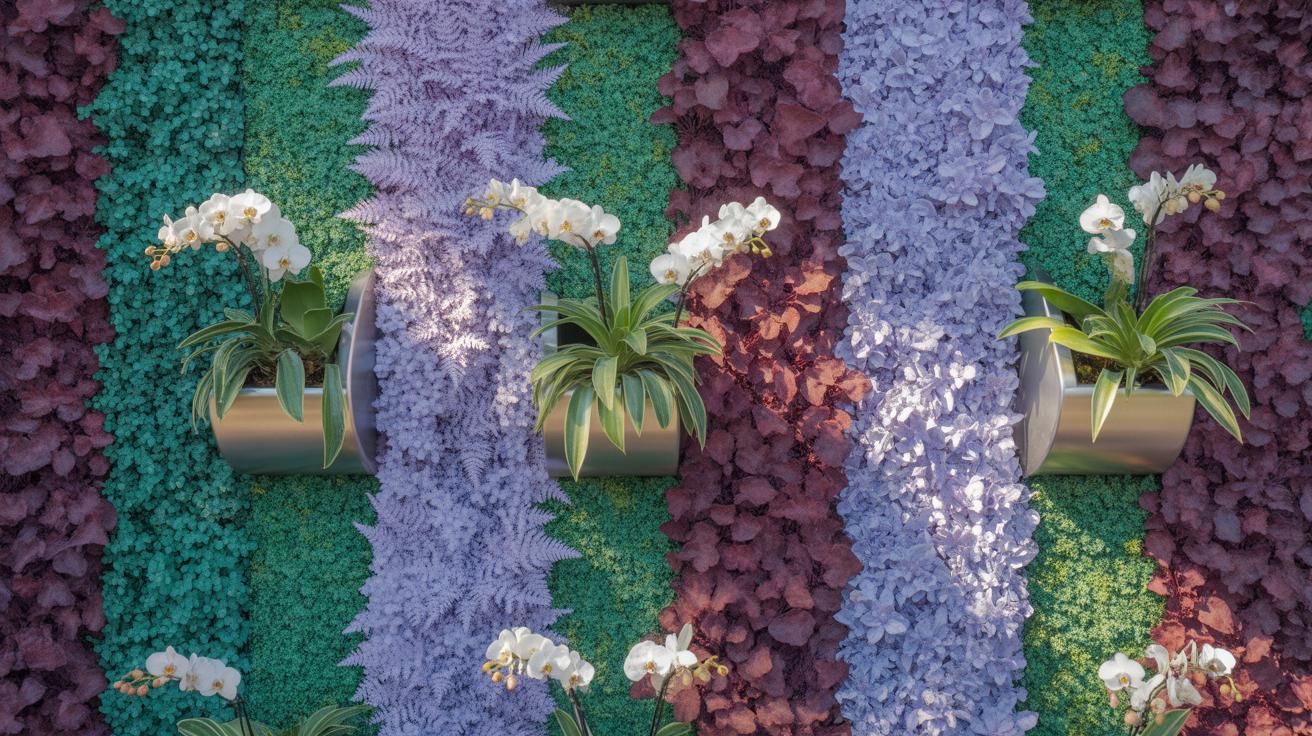
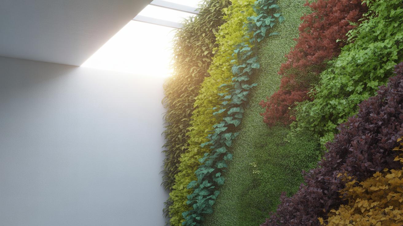
Complementary colors—those opposite each other on the color wheel—like red and green, can make each other stand out sharply. Imagine a patch of deep green fern leaves next to bright red begonias. The contrast grabs your attention, but sometimes it can feel a bit intense if overdone.
Then there are analogous colors, which neighbor each other on the wheel, like yellow, yellow-green, and green. These offer a softer, more harmonious look. Think of a gradient from chartreuse to olive, calming and continuous.
When selecting plants, you don’t have to stick strictly to these rules—sometimes breaking them can create interest too. But knowing these principles can guide you to avoid clashes that might unsettle the eye.
Primary and Secondary Colors In Plants
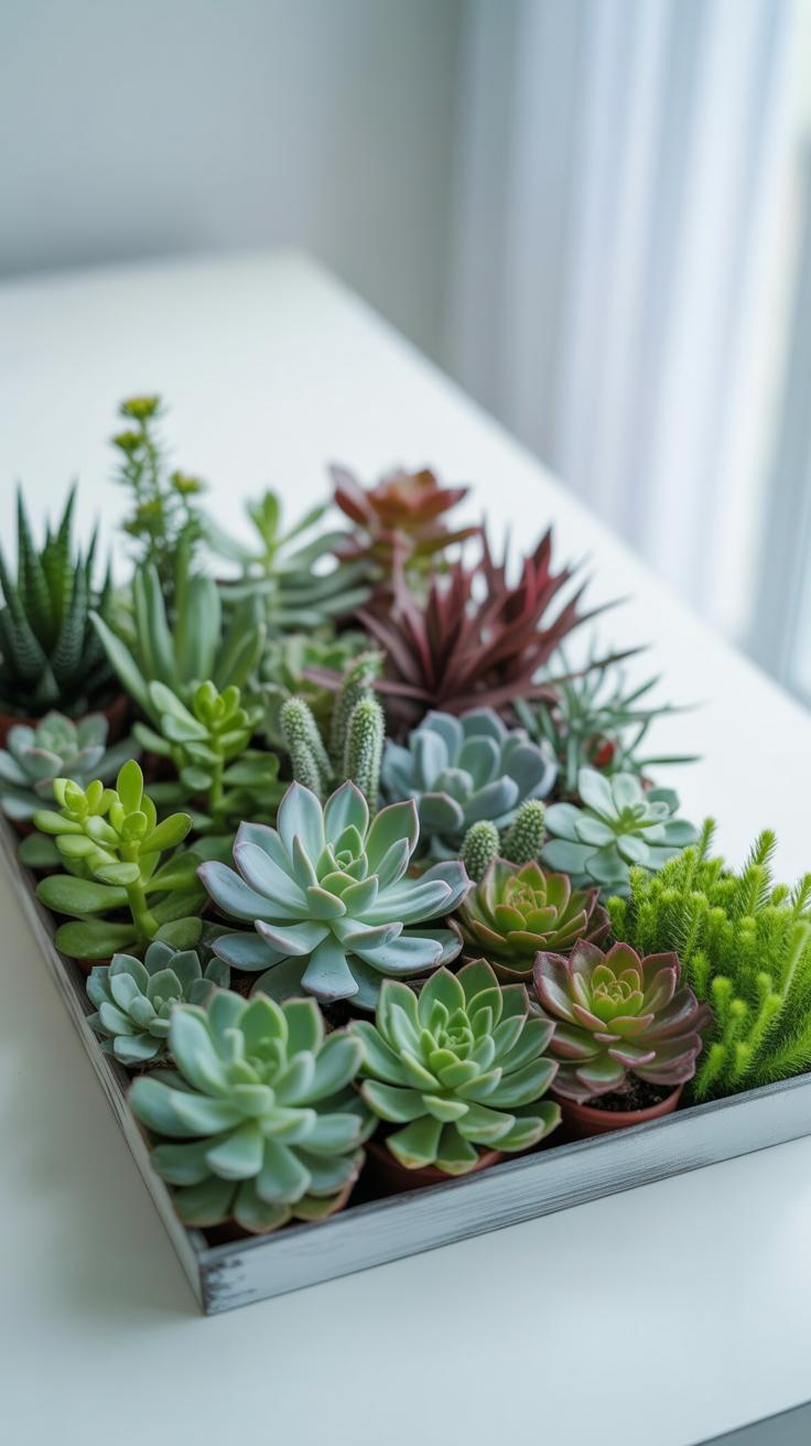
Plants show colors in many ways—flowers, leaves, stems. Usually, the primary plant colors match the classic red, yellow, and blue families, but they show up differently. Bright red petunias, golden marigolds, and blue-purple lobelias all fit.
Secondary colors in plants come from blending those basics. Orange nasturtiums, for example, combine red and yellow influence. Greens dominate leaf colors but vary a lot—from lime to dark forest shades. Blues are less common in foliage but appear vividly in flowers or succulents.
Don’t forget textures play a part too; rough, smooth, glossy, or hairy surfaces interact with colors to create a fuller sensory experience.
How Colors Affect Mood and Space
Colors aren’t just about beauty. They influence how you feel and how space feels around you. For instance, cool colors like blues and greens tend to relax you and make spaces seem bigger, which might be useful in a small balcony garden.
Warm tones—red, orange, yellow—can make a vertical garden feel cozy or energetic. But too much can overwhelm or even make a confined area feel tighter. It’s about balance, maybe a little warmth here, coolness over there.
I sometimes wonder if the mood effect depends on personal taste too; what feels calming to one might feel dull to another. So, experimenting with colors in a vertical garden can also be about discovering what works for your own space and mood.
Choosing Plants With Balanced Colors
When picking plants for your vertical garden, the goal isn’t just to toss together a bunch of colorful species. It’s about finding harmony—a sort of visual rhythm that feels intentional rather than random. Think about how each color interacts and whether the overall palette feels calm or chaotic.
You might lean towards grouping cooler greens with soft blues or mixing warm yellows with subtle reds, but try to avoid overcrowding your garden with too many competing tones. Balance doesn’t mean equal parts of everything. Sometimes a splash of bold color against more muted hues can create a better sense of unity.
It helps to consider the size of the vertical space too. Larger areas might carry stronger contrast, while smaller ones often benefit from restrained, balanced color groupings. I once tried a very bright palette for a small wall—it didn’t feel quite right, maybe too overwhelming? So, balance also means adjusting to context and scale.
Creating Contrast With Color Choices

Contrast guides the eye. When you place colors that oppose or differ markedly—like a deep purple next to a bright yellow—you highlight certain garden sections. This makes the whole design more lively and less monotonous.
But you don’t have to use screaming differences. Even subtle contrasts, like soft pinks against pale greens, can work well if the goal is to create quiet emphasis rather than visual noise.
Contrast can also define pathways or focal points in your vertical garden. Ask yourself: which plants do I want to pop out? Which should fade to the background? Play with these decisions carefully or your garden might feel disorganized or flat.
Using Repetition To Create Harmony
Repeating colors throughout the garden is one of the simplest ways to unify the design. When you see a splash of red, for example, in several spots, the eye connects those areas effortlessly. It ties everything together.
Repetition doesn’t mean monotony though. Vary the plant types or shades of similar colors to keep things interesting while maintaining a sense of order. For instance:
- Place clusters of lavender in the upper sections and scattered touches near the base.
- Repeat a calm green from one species in the leaves of another, smaller plant.
Sometimes I find myself repeating colors unintentionally, but it usually helps the design feel intentional even if I wasn’t fully aware at first.
Considering Texture in Plant Selection
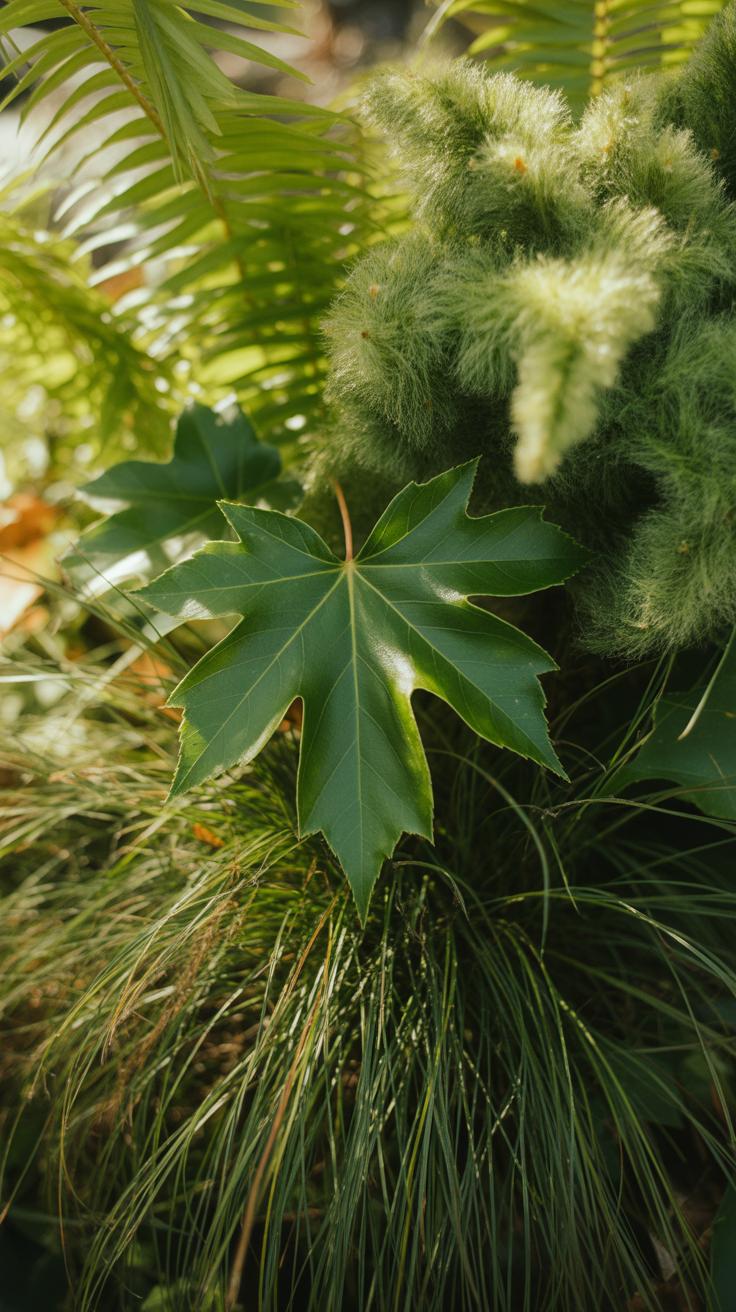
Texture in gardening isn’t just about touch; it’s about visual feel—how leaves appear through their shape, size, and surface quality. Think of it like fabric in fashion. You wouldn’t combine three shiny silks and expect an interesting outfit, right? Texture works similarly in your vertical garden. It plays a role just as important as color does.
Texture includes everything from jagged edges to smooth curves, tiny leaf blades to broad leaves, shiny surfaces to matte finishes. When you consider these details, your plant choices become richer and more engaging. Sometimes, I find myself staring at a plant just because of its leaf texture—it can be oddly hypnotic.
So don’t overlook texture. It breaks monotony and introduces subtle contrasts that hold your gaze longer than color alone might.
Types of Plant Textures
Textures generally fit into a few broad categories:
- Smooth: These leaves often have a shiny or waxy finish. Think of plants like pothos or philodendrons.
- Rough: Leaves with a coarse, sometimes hairy surface, like lamb’s ear or dusty miller.
- Soft: Usually fuzzy or velvety leaves, as you’d find in African violets.
- Spiky: Plants with pointed, sometimes stiff leaves, like agave or certain succulents.

Each texture carries a different visual weight and emotion. For instance, soft leaves suggest calmness, whereas spiky leaves feel more energetic, maybe even aggressive.
How Texture Adds Depth and Interest
Mixing textures matters because without it, even a colorful wall might feel flat and dull. Texture creates layers—not in height alone, but in visual complexity. If you just combine smooth leaves, your garden could lack contrast. Adding rough or spiky textures interrupts this smoothness and gives your eyes places to rest—and places to explore.
This variation also helps individual plants stand out rather than blur into the background. I’ve noticed that when I add a rough-textured plant near smooth-leafed ones, the whole panel instantly seems more three-dimensional. The eye lingers, and your garden feels alive in a quieter, less obvious way than bright colors do.
So, ask yourself: What textures are missing in your vertical garden? Are you balancing those details with your color choices? Mixing textures thoughtfully could be the subtle trick your design needs.
Arranging Plants For Color And Texture Balance
When planning a vertical garden, putting plants together isn’t just about picking nice colors or interesting leaves. Think about how colors will interact side by side. Try grouping cooler tones like blues and purples with warmer greens or yellows to soften the contrast. If your plants have bold textures, pairing them with smoother or finer leaves can prevent one element from overpowering the other. I’ve noticed that combining too many rough textures in one spot often feels overwhelming, but mixing textures carefully brings a nicer rhythm to the view.
Lay out your plants not just in rows but in clusters that feel balanced. Odd numbers tend to work well—groups of three or five create a more natural appearance. Before planting, sketch a rough plan or even arrange pots on the floor. This way, you can see how colors and textures combine and adjust if something feels off. It’s less about strict rules and more about what pleases your eye.
Layering Plants For Visual Impact
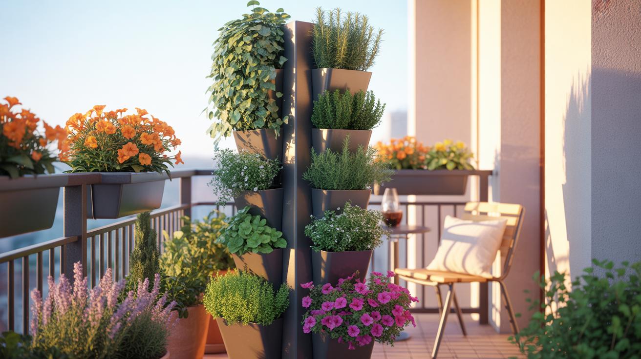
Height and leaf size are great tools for creating depth. Put taller plants with large leaves near the top or back so they don’t block smaller ones. Smaller, fine-leaved plants can sit in front to draw your eye gently down the garden. Color placement ties right into height—you might place bright or intense colors in the middle to act like a visual “anchor,” with softer shades surrounding them.
In one garden I worked on, moving a tall, dark-leafed plant slightly to the side rather than dead center transformed the whole wall. It stopped the design from feeling flat and gave a little surprise element. Experiment with layering until you get a sense of how your vertical space flows. Don’t be afraid to shift things a bit as the plants grow.
Avoiding Overcrowding And Clashing
Leaving enough space between plants matters more than many realize. Plants need room to expand without suffocating each other, which also helps maintain the neatness of colors and textures. When placed too close, leaves can overlap awkwardly, smudging colors and mixing textures in ways that look messy.

Watch how much each plant spreads as it matures—that can be different from seed catalog descriptions. If you feel torn between placing more plants for fullness or spacing for balance, favor space. This often feels emptier at first but will look better in the long run. Sometimes I’ve learned letting a section breathe makes the whole vertical garden calmer to look at.
Maintaining Your Vertical Garden
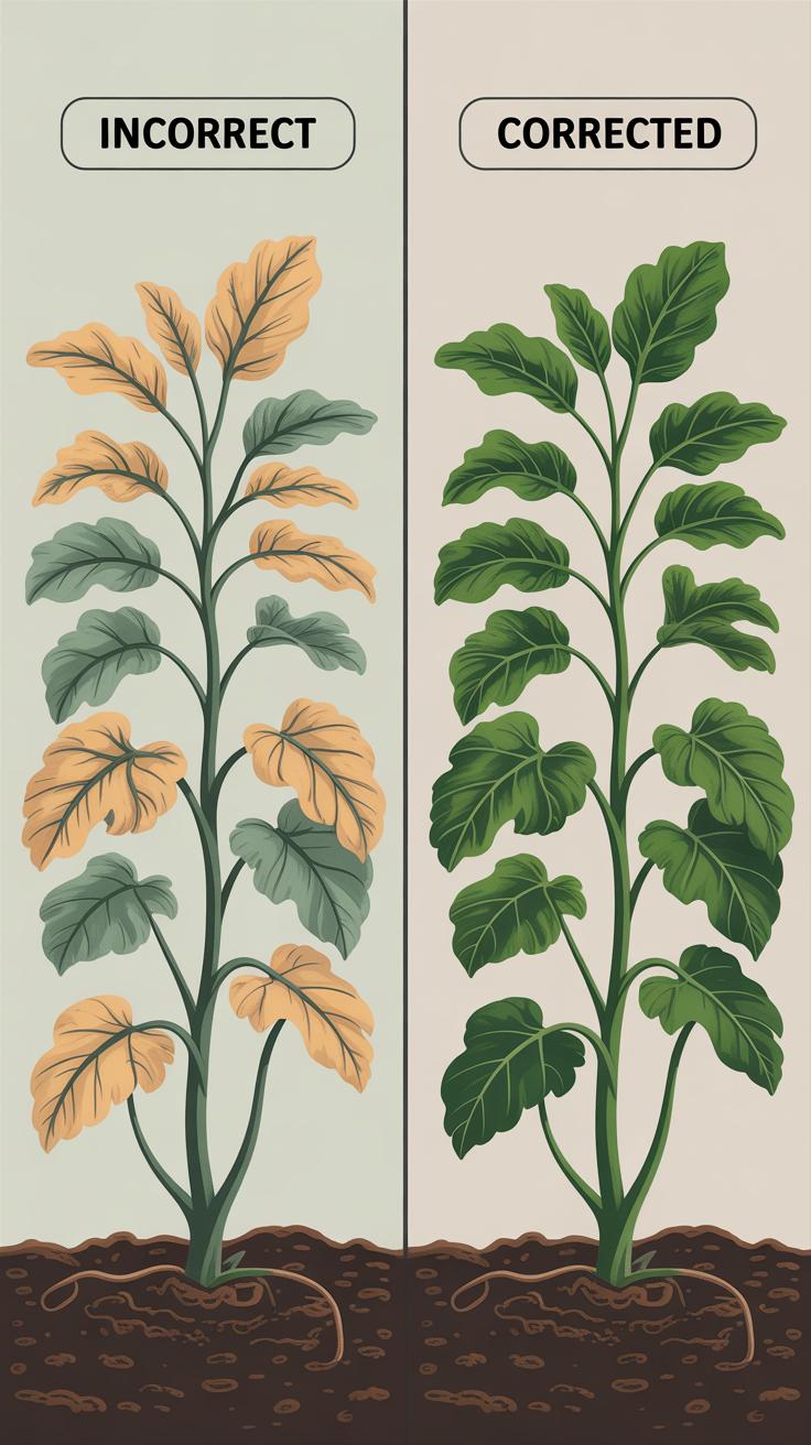
Keeping your vertical garden healthy isn’t as straightforward as sticking a hose to it and walking away. These gardens rely on careful balance—too much water can drown roots, too little leaves plants thirsty. Light can be tricky too; shadows cast by one plant might starve another.
Watering needs depend on your plant selection and system type. Most vertical gardens benefit from drip irrigation or a soaker system that delivers water slowly to all roots without pooling. It’s tempting to soak everything evenly, but some species prefer drier pockets. Observing your plants will help you adjust.
Feeding is another attention point. Regular, light applications of liquid fertilizer often work better than large doses, which may overwhelm the confined roots. Slow-release pellets can help, but they sometimes miss the subtle shifts plants need through changing seasons.
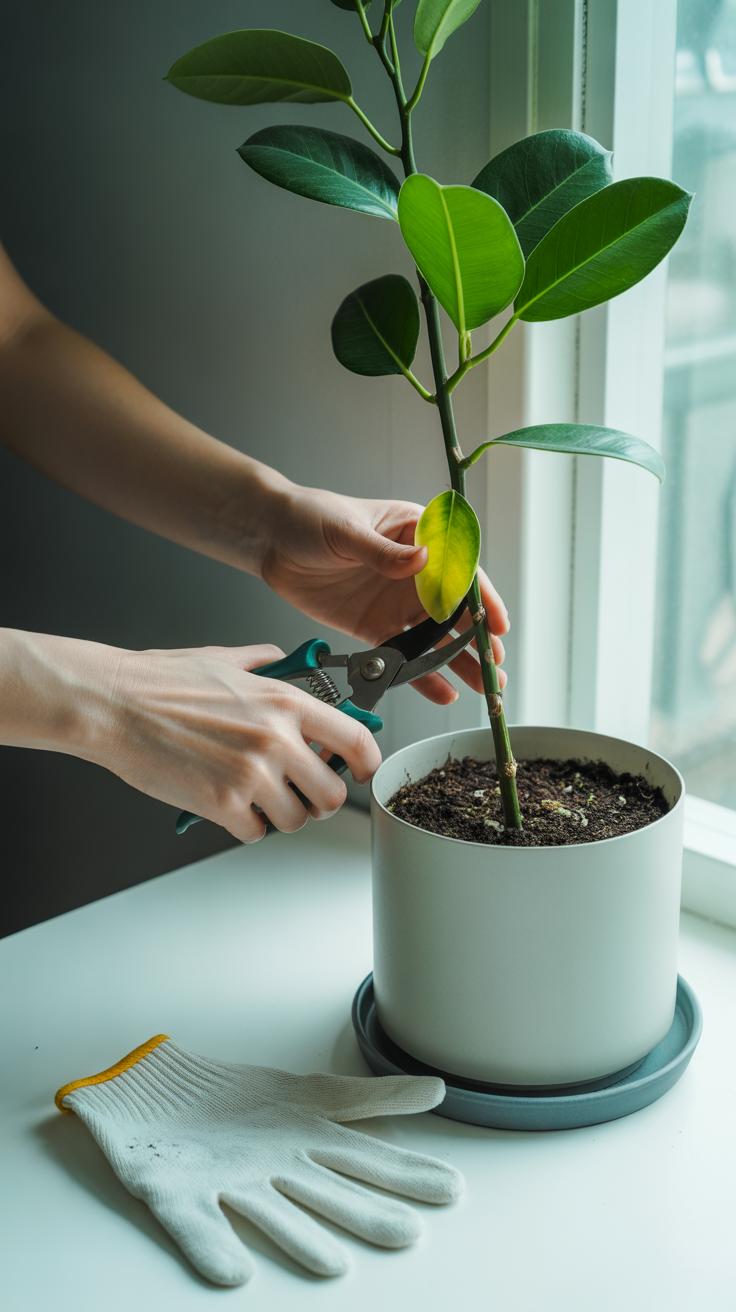
Pruning shapes your garden’s look and vitality. Trimming back overgrown stems keeps growth balanced and invites air circulation, which cuts disease risks. Yet, too much pruning can shock plants or ruin your carefully planned composition—watch those cuts carefully.
Light levels matter. Many vertical gardens thrive in indirect sunlight. Yet, some plants tolerate or prefer fuller sun. Mixing species with similar light requirements reduces competition for light, though it’s fine if you like experimenting a bit—I’ve seen mix-ups work out, oddly enough.
Common Challenges And Solutions
Vertical gardens come with their own set of headaches. Plant health can be tricky because roots don’t spread out as they do in traditional beds. Sometimes plants wilt unexpectedly, even when you think you’re doing everything right. One simple fix is to pick plants suited for tight spaces—succulents or ferns often cope better. Also, check moisture levels more often than you might with regular soil; the vertical setup dries unevenly.
Pests can sneak in faster than you expect. Since vertical gardens often have dense foliage, insects find hiding spots easily. Try inspecting leaves regularly and remove any damaged parts. Introducing natural predators like ladybugs or using mild insecticidal soaps can help without harming your plants. But, honestly, sometimes you’ll need to accept a few bugs as part of the deal.
Structural stability can feel like a puzzle. Your supports need to handle weight plus some tugging when you water or tend your garden. Securing plants with soft ties or clips prevents damage and keeps things tidy. Don’t rely solely on gravity; use sturdy frameworks attached firmly to walls or stands. Double-check mounts every so often because even small shifts can lead to bigger problems down the line.
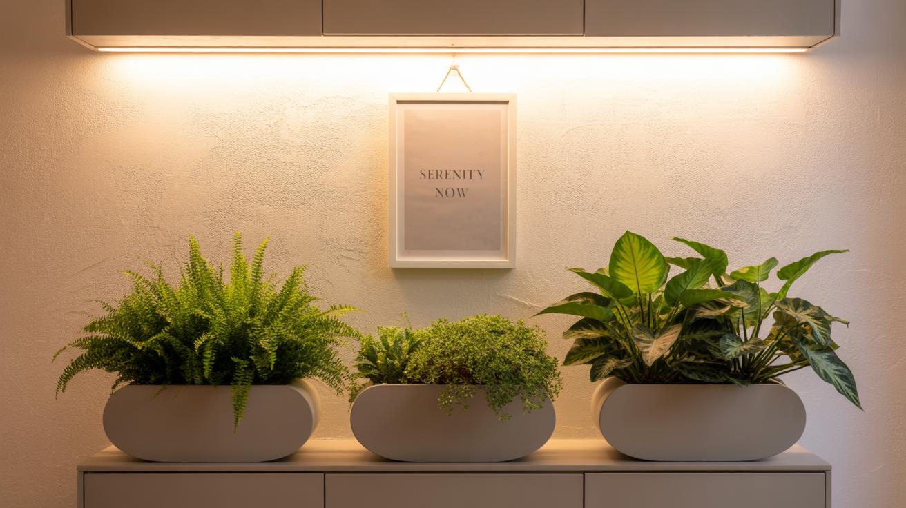
Creative Ideas To Personalize Your Vertical Garden
Personalizing a vertical garden goes beyond just picking plants. You can introduce decorative pots to break up the green and add interest. Think about containers in different shapes and materials—ceramic, metal, or even reclaimed wood—that bring extra texture without overwhelming the design. Mixing these with your plants can create a rhythm or focal points that catch the eye.
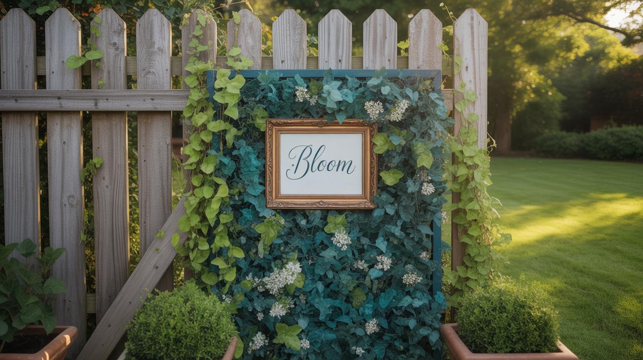
Non-plant elements also play a subtle but important role. Adding small sculptures, mirrors, or even a simple piece of weather-resistant artwork can introduce new texture and color contrasts. These features don’t have to be large or flashy. Sometimes, a carefully positioned object can balance a dense cluster of foliage or brighten a shadowy corner.
Lighting is another layer you might explore. Soft, warm lights can highlight leaves’ variegation or flower colors in the evening, while cooler daylight bulbs might keep textures visible without washing out subtle hues. Try spotlights aimed from below or subtle string lights threaded among pots. I once tried a rotating spotlight around dusk—it changed the garden’s mood completely, which was both surprising and delightful. Have you considered how your garden looks after dark? Lighting could be the secret to showcasing color and texture all day long.
Conclusions
Balanced color and texture bring life and harmony to your vertical garden walls. Choosing the right mix of plant colors, from bright to soft greens, helps create mood and focus in your design. Adding variety in leaf shapes and textures adds visual interest and avoids a flat look. This approach turns any wall into an inviting green space.
Use these principles as a base to explore your creative ideas. Small thoughtful choices in your plant selection and arrangement can make big differences. With time, you will find a style that fits your space and lifestyle. Start your vertical garden journey with color and texture in mind, and enjoy the beauty of nature on your walls every day.